Tag Archives: xlv

Valuation Dashboard: Healthcare – November 2015

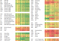
Summary 4 key factors are reported across industries in the Healthcare sector. They give a valuation status of industries relative to their history. They give a reference for picking stocks in each industry. This article is part of a series giving a valuation dashboard by sector of companies in the S&P 500 index (NYSEARCA: SPY ). I follow up a certain number of fundamental factors for every sector, and compare them to historical averages. This article is going down at industry level in the GICS classification. It covers Healthcare. The choice of the fundamental ratios has been justified here and here . You can find in this article numbers that may be useful in a top-down approach. There is no analysis of individual stocks. A link to a list of individual stocks to consider is provided at the end. Methodology Four industry factors calculated by portfolio123 are extracted from the database: Price/Earnings (P/E), Price to sales (P/S), Price to free cash flow (P/FCF), Return on Equity (ROE). They are compared with their own historical averages “Avg”. The difference is measured in percentage for valuation ratios and in absolute for ROE, and named “D-xxx” if xxx is the factor’s name (for example D-P/E for price/earnings). The industry factors are proprietary data from the platform. The calculation aims at eliminating extreme values and size biases, which is necessary when going out of a large cap universe. These factors are not representative of capital-weighted indices. They are useful as reference values for picking stocks in an industry, not for ETF investors. Industry valuation table on 11/2/2015 The next table reports the 4 industry factors. For each factor, the next “Avg” column gives its average between January 1999 and October 2015, taken as an arbitrary reference of fair valuation. The next “D-xxx” column is the difference as explained above. So there are 3 columns for each ratio. P/E Avg D- P/E P/S Avg D- P/S P/FCF Avg D- P/FCF ROE Avg D-ROE HC Equipment&Supplies 34.5 27.18 -26.93% 4.12 3.18 -29.56% 45.64 30.51 -49.59% -20.09 -12.14 -7.95 HC Providers&Services 28.81 20.88 -37.98% 1.09 0.85 -28.24% 22.4 17.75 -26.20% 7.46 5.78 1.68 HC Technology* 56.41 56.13 -0.50% 4.11 3.39 -21.24% 32.35 35.77 9.56% -15.66 -6.2 -9.46 Biotechnology 47.8 39.78 -20.16% 50.92 29.01 -75.53% 41.33 43.74 5.51% -62.42 -64.42 2 Pharmaceuticals 32.96 26.26 -25.51% 12.28 8.25 -48.85% 29.82 32.55 8.39% -38.03 -30.3 -7.73 Life Sci. Tools&Services* 31.78 29.52 -7.66% 2.89 3.39 14.75% 32.39 27.28 -18.73% -8.87 -18.37 9.5 * Averages since 2006 Valuation The following charts give an idea of the current status of industries relative to their historical average. In all cases, the higher the better. Price/Earnings: Price/Sales: Price/Free Cash Flow: Quality Relative Momentum The next chart compares the price action of the SPDR Select Sector ETF (NYSEARCA: XLV ) with SPY (chart from freestockcharts.com). It also includes the iShares Nasdaq Biotechnology ETF (NASDAQ: IBB ) and the SPDR S&P Pharmaceuticals ETF (NYSEARCA: XPH ) as industry benchmarks. (click to enlarge) Conclusion The broad Healthcare ETF has almost the same return as SPY in the last 6 months, with large discrepancies between industries. The biotechnology index has underperformed by about 4%, the pharmaceutical index by about 14%. Two series of news have hit the latter: political announcements on overpriced legacy drugs initiated by Mrs Clinton, then suspicions of unduly inflated sales involving specialty pharmacies. Valeant Pharmaceuticals Intl (NYSE: VRX ) is at the core of both cases, but the market has punished most names linked to generic drugs and specialty pharmaceutical products. As it includes hedge fund darlings, an ETF replicating famous managers’ holdings has also suffered from this: the AlphaClone Alternative Alpha ETF ( ALFA). Taking into account valuation charts above, all healthcare industries look overpriced. There is no contradiction with the positive value score reported for Healthcare in my latest S&P 500 sector dashboard . Here, mid and small caps have been added in calculations. It is a clue of a significant discrepancy between market cap segments inside the sector. The most influential valuation factor from a statistical point of view is P/FCF, and it is more optimistic than other ratios. It points out to a slight under-pricing in 3 industries: Healthcare Technology, Biotechnology and Pharmaceuticals. However, there may be quality stocks at a reasonable price in any industry. To check them out, you can compare individual fundamental factors to the industry factors provided in the table. As an example, a list of stocks in Healthcare beating their industry factors is provided on this page . If you want to stay informed of my updates, click the “Follow” tab at the top of this article. You can choose the “real-time” option if you want to be instantly notified.

Lipper Fund Flows: Gains For All Groups

By Patrick Keon Lipper’s fund macro-groups (including both mutual funds and exchange-traded funds [ETFs]) experienced aggregate net inflows for the fourth consecutive week-taking in over $56 billion of net new money during that time. The groups had positive flows of $24.8 billion for the fund-flows week ended Wednesday, October 28, paced by money market funds, which had net inflows of $15.7 billion. The other macro-groups all posted gains for the week as well; equity funds took in $8.4 billion of net new money, while taxable bond funds (+$432 million) and municipal bond funds (+$349 million) recorded more modest increases. The Dow Jones Industrial Average (+3.6%) and the S&P 500 Index (+3.5%) both posted strong performance numbers for the week. The indices were bolstered by improving economic data on the home front, stronger-than-expected corporate earnings reports from the technology sector, measures to ease global growth concerns, and the Federal Reserve’s leaving the window open to a possible interest rate hike before year-end. The week got off to a roaring start as both indices pocketed roughly 2.8% in combined gains during the first two trading days. Strong U.S. economic data and talk of more quantitative easing in Europe were the triggers on Day One. U.S. existing-home sales posted strong numbers for September (+4.7%), while new applications for unemployment benefits were at near-40-year lows. Across the pond, European Central Bank President Mario Draghi stated that the central bank may extend stimulus measures if global growth continues to be a concern. The rally continued on Day Two as tech companies Alphabet Inc., Microsoft Corp., and Amazon.com all posted stronger-than-expected earnings, while China announced a surprise interest rate cut (its sixth in less than a year) in an attempt to revive its slumping economy. The market experienced another bump on the last trading day of the week when the Fed hinted that the long-awaited interest rate increase may finally arrive in December. The Fed indicated that the global landscape will become less of a concern in December’s discussion, and the determining factors will be the next two monthly jobs reports (the Fed is looking for some additional improvement) and the inflation rate (for which the Fed has set a 2% target). The week’s net inflows for money market funds (+$15.7 billion) represented the fifth week in six of positive flows, which brought over $55 billion of net new money into the group. Institutional money market funds (+$11.6 billion) and institutional U.S. government money market funds (+$8.6 billion) were the two largest contributors to the week’s gains. Equity ETFs were responsible for the lion’s share of the net inflows (+$8.2 billion) for the equity group, while equity mutual funds contributed $221 million to the total. The SPDR S&P 500 Trust ETF (NYSEARCA: SPY ) (+$2.5 billion) and the Health Care Select Sector SPDR ETF (NYSEARCA: XLV ) (+$769 million ) had the two largest individual increases on the ETF side. For mutual funds-contradicting the trend we’ve seen all year-nondomestic equity funds had net outflows for the week (-$339 million), while domestic equity funds had positive net flows (+$560 million). Mutual funds were responsible for all the net inflows for taxable bond funds (+$660 million), while ETF products saw $228 million leave their coffers. Lipper’s High Yield Funds and Core Plus Bond Funds classifications (+$787 million and +$570 million, respectively) recorded the two largest net inflows on the mutual fund side. For ETFs, two Treasury products had the largest individual net outflows: The iShares 7-10 Year Treasury Bond ETF (NYSEARCA: IEF ) (-$602 million) and the iShares 3-7 Year Treasury Bond ETF (NYSEARCA: IEI ) (-$410 million). Municipal bond mutual funds took in $148 million of net new money-for their fourth consecutive week of positive flows. Funds in Lipper’s High Yield Municipal Bond Funds classification (+$181 million) accounted for all of the week’s net inflows.

Long-Term ETF Performance

We post the ETF matrix below on a regular basis to highlight short-term movements in various asset classes. But today we’ll take a look at long-term performance: YTD, over the last 3 years, and since the bull market began on March 9th, 2009. Keep in mind that these are simple price returns and don’t include dividend payments. Over the last 3 years, the US Health Care ETF (NYSEARCA: XLV ) is up the most of any ETF in our matrix with a gain of 101.5%. Consumer Discretionary (NYSEARCA: XLY ) is up the second most with a gain of 80%, and the Nasdaq 100 (NASDAQ: QQQ ) ranks third at +77.8%. Not all sectors are up significantly over the last 3 years – the Energy ETF (NYSEARCA: XLE ) is up just 4.39%. And not all ETFs in our matrix are in the green over the last 3 years either. The yen ETF (NYSEARCA: FXY ) is down 37.5%, while Brazil (NYSEARCA: EWZ ) and Russia (NYSEARCA: RSX ) are both down 30%+ as well. Commodities ETFs are also deep in the red across the board, with oil (NYSEARCA: USO ) leading the way lower at -50%. During the current bull market going back to March 2009, the Consumer Discretionary ETF ( XLY ) is up the most at +391.25%. The Nasdaq 100 ( QQQ ) is up 343%), while the S&P 500 (NYSEARCA: SPY ) is up 211.9%. Outside of the US, India (NYSEARCA: INP ) has done the best at +201.9%, followed by Hong Kong (NYSEARCA: EWH ) at 157%. Brazil ( EWZ ) is actually down 5% since 3/9/09. Out of the entire ETF matrix, the UNG natural gas ETF is down the most since 3/9/09 with a decline of 89%. Hopefully you’ve avoided that one! Share this article with a colleague