Tag Archives: worst

Best And Worst Q3’15: All Cap Blend ETFs, Mutual Funds And Key Holdings

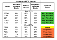
Summary The All Cap Blend style ranks third in Q3’15. Based on an aggregation of ratings of 66 ETFs and 675 mutual funds. DGRW is our top-rated All Cap Blend ETF and MFVZX is our top-rated All Cap Blend mutual fund. The All Cap Blend style ranks third out of the 12 fund styles as detailed in our Q3’15 Style Ratings for ETFs and Mutual Funds report. It gets our Neutral rating, which is based on aggregation of ratings of 66 ETFs and 675 mutual funds in the All Cap Blend style. See a recap of our Q2’15 Style Ratings here. Figure 1 and 2 show the five best and worst-rated ETFs and mutual funds in the style. Not all All Cap Blend style ETFs and mutual funds are created the same. The number of holdings varies widely (from 4 to 3794). This variation creates drastically different investment implications and, therefore, ratings. Investors seeking exposure to the All Cap Blend style should buy one of the Attractive-or-better rated ETFs or mutual funds from Figures 1 and 2. Figure 1: ETFs with the Best & Worst Ratings – Top 5 (click to enlarge) * Best ETFs exclude ETFs with TNAs less than $100 million for inadequate liquidity. Sources: New Constructs, LLC and company filings The ValueShares U.S. Quantitative Value ETF (BATS: QVAL ) is excluded from Figure 1 because its total net assets are below $100 million and do not meet our liquidity minimums Figure 2: Mutual Funds with the Best & Worst Ratings – Top 5 (click to enlarge) * Best mutual funds exclude funds with TNAs less than $100 million for inadequate liquidity. Sources: New Constructs, LLC and company filings The Walden Asset Management Fund (MUTF: WSBFX ) and the Jensen Quality Value Fund ( JNVIX , JNVSX ) are excluded from Figure 2 because their total net assets are below $100 million and do not meet our liquidity minimums. The WisdomTree U.S. Dividend Growth ETF (NASDAQ: DGRW ) is the top-rated All Cap Blend ETF and the MassMutual Select Focused Value Fund (MUTF: MFVZX ) is the top-rated All Cap Blend mutual fund. Both earn a Very Attractive rating. The PowerShares FTSE RAFI US 1500 Small-Mid Portfolio ETF (NASDAQ: PRFZ ) is the worst-rated All Cap Blend ETF and the Forward Dynamic Income Fund (MUTF: FDYAX ) is the worst-rated All Cap Blend mutual fund. PRFZ earns a Dangerous rating and FDYAX earns a Very Dangerous rating. Intel Corporation (NASDAQ: INTC ), is one of our favorite stocks held by All Cap Blend funds and earns our Very Attractive rating. Since 2009, Intel has grown after-tax profit (NOPAT) by 13% compounded annually. Much of this NOPAT growth can be attributed to Intel maintaining NOPAT margins upwards of 18% every year since 2008. The company currently earns a top-quintile return on invested capital ( ROIC ) of 21%, which is a slight improvement from 17% in 2013. Despite the fundamental strength of the business, the stock remains undervalued. At its current price of ~$29/share, Intel has a price to economic book value ( PEBV ) ratio of 0.8. This ratio implies that the market expects Intel’s NOPAT to permanently decline by 20%. If the company can grow NOPAT by just 3% compounded annually over the next ten years , the stock is worth $42/share – a 45% upside. Arbor Realty Trust, Inc. (NYSE: ABR ) is one of our least favorite stocks held by All Cap Blend funds and earns our Dangerous rating. Arbor Realty Trust never quite recovered from the financial crisis in 2008 and NOPAT has declined 55% compounded annually ever since. As opposed to Intel, Arbor Realty Trust has been unable to preserve its once-impressive NOPAT margin of 25% achieved in 2008 as it has since declined to 0.5% in 2014. The market has overlooked the declining nature of the business in favor of focusing on ABR’s 9% dividend yield. To justify its current price of $6/share, Arbor Realty Trust must grow NOPAT 29% compounded annually over the next 17 years . Almost no level of dividend yield can protect investors from the capital loss that would occur if ABR traded at its economic book value of ~$1/share. Figures 3 and 4 show the rating landscape of all All Cap Blend ETFs and mutual funds. Figure 3: Separating the Best ETFs From the Worst Funds (click to enlarge) Sources: New Constructs, LLC and company filings Figure 4: Separating the Best Mutual Funds From the Worst Funds (click to enlarge) Sources: New Constructs, LLC and company filings D isclosure: David Trainer and Max Lee receive no compensation to write about any specific stock, style, style or theme. Disclosure: I/we have no positions in any stocks mentioned, and no plans to initiate any positions within the next 72 hours. (More…) I wrote this article myself, and it expresses my own opinions. I am not receiving compensation for it. I have no business relationship with any company whose stock is mentioned in this article.
Best And Worst: Mid Cap Blend ETFs, Mutual Funds And Key Holdings

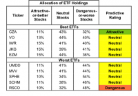
Summary Mid Cap Blend style ranks ninth in 2Q15. Based on an aggregation of ratings of 19 ETFs and 328 mutual funds. CZA is our top rated Mid Cap Blend ETF and TMPIX is our top rated Mid Cap Blend mutual fund. The Mid Cap Blend style ranks ninth out of the 12 fund styles as detailed in our 2Q15 Style Ratings report . It gets our Dangerous rating, which is based on an aggregation of ratings of 19 ETFs and 328 mutual funds in the Mid Cap Blend style. Figures 1 and 2 show the five best and worst rated ETFs and mutual funds in the style. Not all Mid Cap Blend style ETFs and mutual funds are created the same. The number of holdings varies widely (from 25 to 3264). This variation creates drastically different investment implications and, therefore, ratings. Investors seeking exposure to the Mid Cap Blend style should buy one of the Attractive-or-better rated ETFs or mutual funds from Figures 1 and 2. Figure 1: ETFs with the Best & Worst Ratings – Top 5 (click to enlarge) * Best ETFs exclude ETFs with TNAs less than $100 million for inadequate liquidity. Validea Market Legends (NASDAQ: VALX ) and ProShares S&P MidCap 400 Dividend (NYSEARCA: REGL ) are excluded from Figure 1 because their total net assets are below $100 million and do not meet our liquidity minimums. Figure 2: Mutual Funds with the Best & Worst Ratings – Top 5 (click to enlarge) * Best mutual funds exclude funds with TNAs less than $100 million for inadequate liquidity. Johnson Mutual Funds Opportunity Fund (MUTF: JOPPX ) is excluded from Figure 2 because its total net assets are below $100 million and do not meet our liquidity minimums. Guggenheim Mid-Cap Core (NYSEARCA: CZA ) is our top-rated Mid Cap Blend ETF and Touchstone Mid Cap Fund (MUTF: TMPIX ) is our top-rated Mid Cap Blend mutual fund. CZA earns our Attractive rating and TMPIX earns our Very Attractive rating. The Progressive Corp. (NYSE: PGR ) is one of our favorite holdings of Mid Cap Blend ETFs and mutual funds, despite being a large cap stock. Progressive earns our Attractive rating. Since 1998, Progressive has grown after-tax profit ( NOPAT ) by a steady 7% compounded annually. Progressive also boasts a top-quintile return on invested capital ( ROIC ) of 22%. The company counts rising economic earnings and strong free cash flow among its many other strong points. At ~$28/share, PGR trades at a price to economic book ( PEBV ) ratio of only 0.9. This valuation implies that Progressive’s NOPAT will permanently decline by 1c0% from current levels. However, if Progressive can grow NOPAT by just 5% compounded annually for the next five years , the stock is worth $41/share today — a 46% upside. Russell Small Cap Completeness ETF (NYSEARCA: RSCO ) is our worst rated Mid Cap Blend ETF and Saratoga Advantage Mid Cap Portfolio (MUTF: SPMAX ) is our worst rated Mid Cap Blend mutual fund. RSCO earns our Dangerous rating and SPMAX earns our Very Dangerous rating. One of the worst stocks held by Mid Cap Blend ETFs and mutual funds despite being a small cap stock, is Black Diamond Inc. (NASDAQ: BDE ). Black Diamond earns our Very Dangerous rating. In 2014 the company earned a negative NOPAT of $4 million, the company’s worst single year in our model. This negative NOPAT is particularly alarming since it represents the third consecutive year of declining NOPAT. Compounding this issue is Black Diamond’s value destroying -2% ROIC. Black Diamond’s economic earnings have also been negative for five consecutive years. Despite the poor financial state of the company, the stock has risen to unwarranted values and is now awfully overvalued. To justify its current price of ~$10/share, Black Diamond would need to achieve positive NOPAT margins (-2% in 2014) and grow revenue by 29% compounded annually for the next 16 years . With revenue growth below these expectations and actually declining in 2014, there remains significant downside risk in BDE shares. Figures 3 and 4 show the rating landscape of all Mid Cap Blend ETFs and mutual funds. Figure 3: Separating the Best ETFs From the Worst ETFs (click to enlarge) Figure 4: Separating the Best Mutual Funds From the Worst Funds (click to enlarge) Sources Figures 1-4: New Constructs, LLC and company filings Disclosure: David Trainer owns PGR. David Trainer and Allen L. Jackson receive no compensation to write about any specific stock, style, style or theme. Disclosure: I am/we are long PGR. (More…) I wrote this article myself, and it expresses my own opinions. I am not receiving compensation for it. I have no business relationship with any company whose stock is mentioned in this article.
Balanced Portfolio By Age: How To Find Your Perfect Portfolio

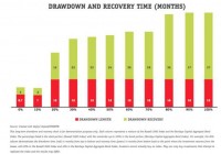
Does having a balanced portfolio by age lead to a desired portfolio? We have the answer for you. The question of optimum portfolio mixture based on your age comes up frequently. The general concept seems to be that the older we are, the more conservative we have to be because we do not have as long to recover from losses. On average, a 20 year-old has a lot longer to recover from a market downturn than an 80 year-old. We have done some research on how long it took to recover from major downturns with different stock and bond mixtures. What many may find surprising is how similar the recovery time has been for the different portfolio mixtures. See “How to Make an Investment Portfolio: 6 Steps to Better Investing” for a description of portfolio design. Balanced Portfolio by Age – Drawdown and Recovery To represent the stock market, we used the Russell 3000 Index, which makes up a majority of the United States stock market. We used the Barclays Capital Aggregate Bond Index to represent the bond market, which makes up most of the United States bond market. The chart shows the worst time frame (max drawdown) for each mixture from January 1979 to September 2013. Each column shows the percentage in Russell 3000 Index. The unstated remaining portion is the amount in the Barclays Capital Aggregate Bond Index. The chart below shows how long in months each mixture dropped. This is shown in red. Then how many months it took to recover, which is shown in green. Investors can add both the drawdown months and the recovery months to figure out how long it would take to get back to where they started in each of these portfolios. For example, the 70% mixture, which is 70% Russell 3000 Index and 30% Barclays Capital Aggregate Bond Index, fell for 16 months and then took 26 months to recover, which means your investment would have taken 42 months (16 down+26 up) to fully recover during the worst fall, for this mixture, since January 1979. See “Best Method to Evaluate Investment Risk” for complete information on how to evaluate the risk of your portfolio. (click to enlarge) What conclusions can we draw from this research? First, the future may not be like the past, although since we do not have a crystal ball or a time machine, looking back is often the best tool we have available. Next, we find the most interesting portion of this research was to discover how many of the portfolios were so similar in terms of total recovery time. Historically, there were three main groupings: 0 to 10% stock 30 to 70% stock 80 to 100% stock In each one of these groupings, you almost had the same total recovery time. It would seem to make sense to take the higher stock percentage portfolio in each grouping because over a longer period of time, the more stock in the portfolio the more total return. Balance Portfolio by Age – More Stock Market Exposure Equals More Money Over The Long-Term You can see that relationship between more stock market exposure and more money in this next chart, which shows the value of each of the above portfolio if you invested $100,000 in January 1979. Most investors do not think about investing for the next 35 years, but looking at long-term data can be useful because they capture more market cycles. This chart shows a perfect long-term correlation between more stock market exposure and more money. On average, the more stock market exposure you have the more you make. See “The 5 Pillars of Effective Asset Management” for a series of articles on how to maximize your returns. (click to enlarge) For example, you can see historically, it would have been much better to take the 70% stock portfolio than the 30% stock portfolio, especially when you consider the total recovery time was only four months longer for the 70% stock portfolio during the worst time period for each portfolio. Balance Portfolio by Age – Finding Your Personal Risk Tolerance There is a catch. Each person has to consider age, especially when considering how long it will take your portfolio to recover, but more importantly you need to consider personal risk tolerance. How much risk can you take before you panic and sell? This chart shows the low value for a $100,000 investment made just before the max drawdown started in each of the above mixtures. This effectively shows what would have happened if you invested $100,000 in each of the above portfolios just before the worst downturn for each of these portfolios. This chart shows you what your worst monthly statement would have been before it finally recovered many months later. (click to enlarge) As you can see, there is a fairly significant difference in the low value between the 30% stock portfolio and the 70% stock portfolio. Incredibly, even with that difference it only took four months longer for the 70% portfolio to recover, but if the account fell more than you could tolerate, you’re never going to see that recovery. The most important part of finding a balanced portfolio by age is finding your personal risk tolerance at your current age. Examine the historical maximum drawdown periods for the portfolio mixtures you are considering. See how much you can lose and how long it takes to recover. Lastly, see how much you might make. This full examination of the possibilities will help you determine the perfect portfolio for your age.