Tag Archives: send-xhr-start

Top Investments For 2015, A Followup – Bank Of America And Citigroup

This is a follow up on my last post Top Investments for 2015 . I was asked the following question in the comment section. This answer is a little more than a comment so I decided to post it here. Anonymous January 10, 2015 at 7:15 AM Hi Kevin, Could you please share with us your thoughts on the current tangible book value of C and BAC and why you still see a discount on their current price? Hi Anonymous. Thanks for your question. The price to tangible book value for C and BAC can be calculated to be 0.9 and 1.2, respectively. Whether or not that is cheap enough for you is something you will need to decide. Let me offer some additional thoughts on BAC first and then on C. BAC has paid out around $100 billion in legal expenses over the past 5 years. Their tangible book value has risen slightly over that same time. Given the fact the company has close to $150 billion in tangible book value, legal expenses of this magnitude are not insignificant. The next fact I would point out is that in Q3 2014, the company earned $5.0 billion in profits excluding the consumer real estate services (CRES) division. Annualized, this works out to just about $20 billion per year or $1.88/share. Let me be clear. Bank of America earns this amount of profit already today. They are earning this amount in a sub-optimal economy, a low interest rate environment, and with many regulatory headwinds. All you have to do is wait for the dust to settle and the earnings power of the company will come shining through. Now this $20 billion in profits works out to be approximately 0.9% return on assets (ROA). On a comparable basis, Wells Fargo (NYSE: WFC ) is earning 1.3% on their assets. I believe that with strong management BAC can earn above 1% on their assets, just like WFC does. The reason for this is that BAC, just like WFC, has a large, low cost deposit base supporting their assets. Including non-interest bearing liabilities, both companies have access to over a trillion dollars in deposits at a cost of 0.1% (10 basis points). Coming back to the returns on tangible common equity, we have established that BAC has a number of businesses that together are already earning 13.4% on tangible common equity (TCE). This is interesting because WFC is earning 13.8% on TCE, and JPM is earning 13.5% on TCE and C is earning 6.5% on TCE. If BAC was valued on the same P/TBV multiple as WFC or JPM, the stock would sell for between $19-25/share. So nothing has to happen and the value of BAC’s stock will rise somewhere between 15% and 50% as the underlying earnings emerge. Any help from a rise in interest rates and it will have real liftoff potential. Oh and perhaps the CRES division will turn a profit and the company will be able to utilize their deferred tax assets (> $30 billion). If the company earns $80 billion over the next 4 year, it isn’t hard to make the case that the common shares will sell for between $35-40/share. Of course a large portion of these returns will likely be dividends and share repurchases but the net result is the same, the common shareholders will realize over 20% annually over that time period. Turning to Citigroup, they are selling at a much lower price to TBV. As noted above that is warranted because of they are earning only 6.5% on TCE. Their ROA is only 0.6%, lower than BAC (ex CRES) and JPM at 0.9% and WFC at 1.3%. Don’t let this fool you; they have higher earnings potential just like BAC. As the real earnings power of the company emerges, they will earn around 1% on assets. If you apply a 1% ROA to C, the net result is an EPS of $6.21/share. First Call analyst estimates are for $5.41/share in 2015 and $6.52 in 2016, so we are right in the ballpark. Citi also has over $50 billion in deferred tax assets. In today’s markets there are few companies that can be purchased at less than 10x normal earnings and C is one of them. In the future the shares will sell more in line with BAC and JPM at 1.3 P/TBV, or around $75/share. So the upside is easily 50% and all shareholders have to do is be patient and watch the earnings rise. Hope this helps. Disclosure: I own BAC common, BAC Class A Warrants, JPM and WFC.
Where To Look For Cheap Stocks In 2015: CAPE Around The World

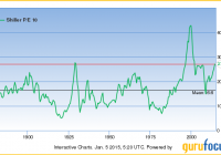
2014 was a lousy year for global value investors. Cheap markets, as measured by the cyclically-adjusted price/earnings ratio (“CAPE”) got even cheaper, while expensive markets got even pricier. (Note: the CAPE takes a ten-year average of earnings as a way of smoothing out the economic cycle and allowing for better comparisons over time.) I expect this to reverse in 2015. At some point – and I’m betting it could be as early as the first quarter – global market valuations should start to revert to their long term averages. That’s fantastic news if you’re invested in cheap foreign markets. It’s not such fantastic news if your portfolio is exclusively invested in high-CAPE American stocks. Let’s take a look at just how skewed the numbers are. The S&P 500 managed to produce total returns of 13.7% in 2014. But as quant guru Meb Faber pointed out in a recent blog post , globally, the median stock market posted a loss of 1.33%. The cheapest 25% of countries saw declines of 12.88%, while the most expensive markets actually gained 1.36%. I should throw out a couple caveats here. These were the returns of U.S.-traded single-country ETFs, which are priced in dollars, and not the national benchmarks. The strength of the U.S. dollar relative to virtually every other world currency last year was a major contributor to the underperformance of the rest of the world. All the same, it’s worth noting that we’re in uncharted territory here. As Faber noted in a recent tweet , U.S. stock valuations relative to foreign stock valuations closed 2014 at the highest spread over the past 30 years. Four out of the five biggest relative valuation gaps resulted in outperformance by foreign stocks the following year. The only exception was 2014. Let’s dig into the numbers. The CAPE for the S&P 500 is now 27.2. That’s a full 63.9% higher than the historical average of 16.6 , more expensive than at the 2007 peak, and close to the 1929 peak. The only time in U.S. history where the S&P 500 was significantly more expensive based on CAPE was during the peak of the 1990s tech bubble. Sure, the “fair” CAPE is going to be a little higher today than in decades past due to record low bond yields (all else equal, lower yields mean higher “correct” valuations). But I should point out that yields are even lower in most of Europe and Japan, yet valuations are significantly cheaper. So while low bond yields might partially explain why U.S. stocks are expensive relative to their own history, it doesn’t explain why the U.S. is expensive relative to the rest of the world. No matter how you slice it, U.S. stocks aren’t the bargain they were a few years ago. Research Affiliates calcuates that U.S. stocks are priced to deliver returns of about 0.7% over the next 10 years. Using a similar methodology, GuruFocus calculates an expected return of about 0.3% . I’ve driven home how expensive U.S. stocks are. Now, let’s take a look at other global markets. Here are the world’s markets as measured by the CAPE and sister valuation metrics cyclically-adjusted price/dividend (“CAPD”) cyclically-adjusted price/cash flow (“CAPCF”) and cyclically-adjusted price/book (“CAPB”). All figures reported in Meb Faber’s Idea Farm using original data from Ned Davis Research. Country CAPE CAPD CAPCF CAPB Average Rank Greece 2.8 6.5 1.5 0.4 1 Austria 7.3 21.6 3.0 0.7 3.75 Portugal 7.7 12.9 3.2 1.0 4.25 Hungary 5.9 23.0 3.0 0.9 4.75 Italy 9.6 16.6 3.7 0.9 5.25 Russia 5.2 29.8 3.5 0.8 7 Czech Republic 10.3 15.3 5.3 1.6 7.75 Poland 10.8 22.9 5.0 1.5 8.75 Brazil 10.0 23.2 6.4 1.5 9.25 Spain 11.6 19.4 5.7 1.6 10.25 Ireland 11.0 24.7 7.7 1.3 11 France 13.8 29.3 7.6 1.5 15 Norway 12.1 29.2 6.6 1.9 15 New Zealand 14.6 18.2 7.5 1.9 15.25 U.K. 12.1 26.9 8.1 1.9 17.25 Egypt 13.2 27.7 7.9 2.1 18.25 Turkey 11.3 39.5 8.0 1.9 19 Korea 12.4 73.3 7.3 1.5 19.25 Finland 14.5 24.3 8.6 2.1 19.75 Singapore 13.8 32.6 10.3 1.7 20 Belgium 14.6 30.3 9.4 1.8 20.25 Germany 15.8 37.8 7.8 1.8 21 Australia 15.7 22.8 11.3 2.1 23 Netherlands 15.5 35.9 10.1 2.1 24.75 Israel 14.8 38.8 11 1.9 25.5 China 14.3 43.3 9.2 2.2 25.75 Chile 17.4 40.9 10.2 1.9 26.25 Hong Kong 18.2 40.1 13.8 1.7 27.5 Peru 14.3 33 12.2 3.5 28.25 Japan 23.4 69 8.8 1.6 28.5 Taiwan 19.7 30.8 9.7 0 30.25 Thailand 17.8 41.6 11.5 2.9 31 Canada 19.2 45 10.5 2.4 31.5 Sweden 19.1 39.8 13.6 2.8 31.75 Malaysia 19 42.7 12.8 2.5 32 Colombia 23.1 43.7 18.8 2.2 36.25 South Africa 20.9 45.3 14.8 3.4 36.5 Switzerland 22.4 47.9 17.4 3.2 37.25 Mexico 22.6 73.6 12.4 3.6 38 Indonesia 20.9 52.6 14.3 5.0 38 U.S. 23.6 69.0 14.7 3.4 38.75 Philippines 26.1 65.9 16.1 3.9 40 Denmark 30 99.4 18.6 3.9 42.25 (Note: The U.S. figures use the MSCI U.S. index rather than the S&P 500, hence the difference in CAPE value.) We see some familar names on the list. Greece remains the world’s cheapest market by a wide margin. Of course, Greece is also in the middle of an election cycle that may well result in the country getting booted out of the eurozone. Interestingly, Russia is cheap following Western sanctions and the collapse in the price of oil, yet there are several far more stable countries that are cheaper, such as Austria, Portugal, Hungary and Italy. Two countries that I’ve liked for years based on valuation – Brazil and Spain – round out the top ten. To put things in perspective, the most expensive market on this list–Spain–trades at nearly a 60% discount to the U.S. market based on CAPE. Yes, Spain has its problems. Its economy is stuck in a slow-growth rut, and unemployment remains over 20%. But Spain is also home to some of the world’s finest multinationals, such as banks BBVA (NYSE: BBVA ) and Banco Santander (NYSE: SAN ), telecom giant Telefonica (NYSE: TEF ) and fashion retailer Inditex ( OTCPK:IDEXY ). There are different ways to use this data. You could buy and hold country ETFs, such as the Global X FTSE Greece 20 ETF (NYSEARCA: GREK ), the Market Vectors Russia ETF (NYSEARCA: RSX ) or the iShares MSCI Spain ETF (NYSEARCA: EWP ). Or you could go with a convenient one-stop shop like Faber’s Cambria Global Value ETF (NYSEARCA: GVAL ). GVAL is nice collection of cheap stocks from around the world. As of last quarter, GVAL’s largest country weightings were to Brazil, Spain and Israel. Disclosures: Long GVAL, EWP, BBVA, SAN, TEF This article first appeared on Sizemore Insights as Where to Look for Cheap Stocks in 2015: CAPE Around the World Disclaimer : This site is for informational purposes only and should not be considered specific investment advice or as a solicitation to buy or sell any securities. Sizemore Capital personnel and clients will often have an interest in the securities mentioned. There is risk in any investment in traded securities, and all Sizemore Capital investment strategies have the possibility of loss. Past performance is no guarantee of future results.

Utilities ETF: XLU No. 1 Select Sector SPDR In 2014

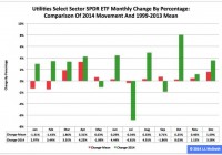
Summary The Utilities exchange-traded fund finished first by return among the nine Select Sector SPDRs in 2014. As it did so, the ETF posted the best annual percentage gain in its 16-year history. However, seasonality analysis indicates it could be facing a tough first quarter. The Utilities Select Sector SPDR ETF (NYSEARCA: XLU ) in 2014 ranked No. 1 by return among the Select Sector SPDRs that break the S&P 500 into nine chunks. On an adjusted closing daily share price basis, XLU rocketed to $47.22 from $36.68, a zooming of $10.54, or 28.74 percent. Accordingly, the ETF outdistanced its parent proxy SPDR S&P 500 ETF (NYSEARCA: SPY ) by an extraordinary 15.27 percentage points. (XLU closed at $47.35 Wednesday.) XLU also ranked No. 1 among the sector SPDRs in the fourth quarter, as it outpaced SPY by 8.28 percentage points. In addition, XLU ranked No. 1 among the sector SPDRs in December, as it outran SPY by 3.83 percentage points. Overall, XLU posted the best annual percentage return in its 16-year history: Its previous record was set in 2003, when it swelled 26.46 percent. XLU appears key to analysis of market sentiment based on the comparative behaviors of the Select Sector SPDRs . If XLU ranks near No. 1 by return during a given period, then I believe market participants are in risk-off mode; if XLU ranks near No. 9 by return over a given period, then I think market participants are in risk-on mode. Figure 1: XLU Monthly Change, 2014 Vs. 1999-2013 Mean (click to enlarge) Source: This J.J.’s Risky Business chart is based on analyses of adjusted closing monthly share prices at Yahoo Finance . XLU behaved a lot better in 2014 than it did during its initial 15 full years of existence based on the monthly means calculated by employing data associated with that historical time frame (Figure 1). The same data set shows the average year’s weakest quarter was the first, with a relatively small negative return, and its strongest quarter was the second, with an absolutely large positive return. The ETF’s October 8.03 percent gain was its sixth-highest monthly return ever. Figure 2: XLU Monthly Change, 2014 Versus 1999-2013 Median (click to enlarge) Source: This J.J.’s Risky Business chart is based on analyses of adjusted closing monthly share prices at Yahoo Finance. XLU also performed a lot better in 2014 than it did during its initial 15 full years of existence based on the monthly medians calculated by using data associated with that historical time frame (Figure 2). The same data set shows the average year’s weakest quarter was the first, with a relatively small positive return, and its strongest quarter was the second, with an absolutely large positive return. Clearly, this means there is no historical statistical tendency for the ETF to explode in Q1. Figure 3: XLU’s Top 10 Holdings and P/E-G Ratios, Jan. 7 (click to enlarge) Note: The XLU holding-weight-by-percentage scale is on the left (green), and the company price/earnings-to-growth ratio scale is on the right (red). Source: This J.J.’s Risky Business chart is based on data at the XLU microsite and Yahoo Finance (both current as of Jan. 7). In the wake of the sea change in bias at the U.S. Federal Reserve , away from loosening and toward tightening, XLU’s record-setting performance in 2014 kind of makes sense, at least in an equity market where share prices are primarily driven by the ebb and flow of asset purchases made by the central bank under one or another of its so-called quantitative-easing programs. It is worth mentioning in this context that the Fed announced the conclusion of purchases under its latest QE program Oct. 29 and that the ends of purchases under its previous two formal QE programs are associated with both a correction and a bear market in large-capitalization stocks, as evidenced by SPY’s dipping -17.19 percent in 2010 and dropping -21.69 percent in 2011. It is also worth mentioning that XLU’s big-time performance last year means that I, as a growth-and-value guy, see neither growth nor value in most of the utilities sector, as indicated by the above chart (Figure 3) and numbers released by S&P Senior Index Analyst Howard Silverblatt Dec. 31. At that time, Silverblatt pegged the P/E-G ratio of the S&P 500 utilities sector as 3.43. In the current environment, I therefore would be completely unsurprised should XLU continue to behave well in the current quarter, not on an absolute basis but on a relative basis (i.e., in comparison with the other Select Sector SPDRs and with SPY). On balance, the ETF may not produce gains, but it might produce losses smaller than those of its siblings. Disclaimer: The opinions expressed herein by the author do not constitute an investment recommendation, and they are unsuitable for employment in the making of investment decisions. The opinions expressed herein address only certain aspects of potential investment in any securities and cannot substitute for comprehensive investment analysis. The opinions expressed herein are based on an incomplete set of information, illustrative in nature, and limited in scope. In addition, the opinions expressed herein reflect the author’s best judgment as of the date of publication, and they are subject to change without notice.