Tag Archives: onload

3 Best-Rated Utilities Mutual Funds To Invest

Even during a market downturn, the demand for essential services such as those provided by utilities remains virtually unchanged. Utilities funds are therefore an excellent choice for investors seeking a steady income flow through consistent yields from dividends. This is also why they are primarily considered to be a relatively more conservative investment option. In recent times, their forays into emerging markets have led to appreciably higher returns and they offer superior returns at a relatively lower level of risk. Below, we will share with you 3 top rated utilities mutual funds. Each has earned a Zacks #1 Rank (Strong Buy) as we expect the fund to outperform its peers in the future. To view the Zacks Rank and past performance of all utilities funds, investors can click here to see the complete list of funds . Fidelity Select Utilities Portfolio (MUTF: FSUTX ) seeks capital growth over the long run. The fund invests a lion’s share of its assets in common stocks of companies primarily involved in utilities sector, and companies that derive major portion of its revenue from operations related to this sector. The fund invests in both U.S. and non-U.S. firms. The fund considers factors such as financial strength and economic condition to invest in companies. The non-diversified utilities mutual fund has a three year annualized return of 17.8%. The utilities mutual fund has a minimum initial investment of $2,500 and an expense ratio of 0.80% compared to a category average of 1.28%. Fidelity Advisor Utilities A (MUTF: FUGAX ) invests a major portion of its assets in utilities companies or carry out operations related to the utilities industry. Factors such as industry position and market condition are considered to invest in companies throughout the globe. The fund seeks long-term capital growth. The non-diversified utilities mutual fund has a three-year annualized return of 16.9%. The fund manager is Douglas Simmons and he has managed this utilities mutual fund since 2006. Fidelity Telecom and Utilities Fund (MUTF: FIUIX ) seeks total return with current income and capital growth. It invests heavily in companies from telecommunications services and utilities sector. The fund invests in companies all over the globe by analyzing factors which include company’s economic condition and financial strength. The non-diversified utilities mutual fund has a three-year annualized return of 15.4%. As of October 2014, this utilities mutual fund held 36 issues, with 19.96% of its total assets invested in Verizon Communications (NYSE: VZ ). Now that you’ve read this, are you Bullish or Bearish on ? Bullish Bearish Sentiment on ( ) Thanks for sharing your thoughts. Why are you ? Submit & View Results Skip to results » Share this article with a colleague

Cambria Introduces A Global Core Portfolio ETF With Zero Management Fees

Summary Mebane Faber’s Cambria Funds has added another ETF to its stable. The fund is a fund-of-funds comprising a core global portfolio of stocks, bonds, commodities and real estate. Cambria charges no management fees for the ETF. Acquired fees for the component funds are 0.29%. A Global Core Portfolio ETF With Zero Management Fees The latest ETF from investment iconoclast Mebane Faber is poised to be an industry disrupter. The Cambria Global Asset Allocation ETF (NYSEARCA: GAA ) is a fund of funds offering a global portfolio of stocks, bonds, commodities and real estate. “So,” you say, “what’s so disruptive about that?” Well, the ETF has no management fee beyond the acquired fees of the component funds. None. Acquired fund expenses amount to a mere 0.29%. Fig. 1. Still from Treasure of the Sierra Madre (1948). More on the fee structure later, let’s take a look at the fund first. The Fund The fund is a designed as a core global market portfolio, what Faber describes on ETF.com as a “one-stop shop for core global allocation… for super-low cost.” He goes so far as to ordain the fund the “global benchmark.” The table below lists the current portfolio. Fund Ticker Percent of Holdings Vanguard Tot Bond Mkt ETF (NYSEARCA: BND ) 8.09% Vanguard Emerging Mkt ETF (NYSEARCA: VWO ) 6.75% United States Comm Index (NYSEARCA: USCI ) 6.58% Vanguard Intl Bond ETF (NASDAQ: BNDX ) 5.07% Vanguard Emerg Mkts Gov B (NASDAQ: VWOB ) 4.90% Ishares MSCI USA Momentum (NYSEARCA: MTUM ) 4.09% Vanguard Mid-Cap ETF (NYSEARCA: VO ) 4.08% Vanguard Viper (NYSEARCA: VTI ) 4.07% Vanguard Europe Pac ETF (NYSEARCA: VEA ) 3.94% Mkt Vectors Em Lc Bd ETF (NYSEARCA: EMLC ) 3.85% Cambria Gloabl Value ETF (NYSEARCA: GVAL ) 3.80% Market Vectors Emer Hy (NYSEARCA: HYEM ) 3.77% Vanguard Reit ETF (NYSEARCA: VNQ ) 3.10% Cambria Shrhldr Yld ETF (NYSEARCA: SYLD ) 3.04% Ishares Lehman 7-10yr Trs (NYSEARCA: IEF ) 3.04% Ishares Iboxx Inv Gr Corp (NYSEARCA: LQD ) 3.03% SPDR Barclays TIPS ETF (NYSEARCA: IPE ) 3.00% Schwab U.S. TIPS ETF (NYSEARCA: SCHP ) 3.00% Vanguard Gbl X U.S. Re ETF (NASDAQ: VNQI ) 2.95% Ishares 20+Yrs Treas ETF (NYSEARCA: TLT ) 2.07% Vanguard St Bond ETF (NYSEARCA: BSV ) 2.01% Vanguard-S/T Corp ETF (NASDAQ: VCSH ) 2.01% Cambria Forgn Shrhldr ETF (NYSEARCA: FYLD ) 2.00% SPDR Barclays Int Corp (NYSEARCA: IBND ) 1.99% Vanguard Ftse All World (NYSEARCA: VSS ) 1.99% Spdr Barclays High Yield (NYSEARCA: JNK ) 1.99% Wisdomtree Em Small Cap (NYSEARCA: DGS ) 1.96% Market Vectors Intl (NYSEARCA: IHY ) 1.94% Cash 0.97% Wisdomtree Emg Mkts Eq (NYSEARCA: DEM ) 0.94% Here’s a couple of charts breaking the portfolio down at high-level geographic and asset class allocations. In the charts I’ve categorized the funds as Global (all-world), International (global ex. U.S.), Developed Markets ex. U.S., Emerging Markets, and Domestic (US) based on the individual funds’ mandates. I’ve not made any effort to break down the holdings by sub-categories within the funds. Obviously, Global would encompass all of the funds and International would encompass the two ex. U.S. categories but I’ve not done that here. (click to enlarge) Fig 2 and 3. Portfolio composition of Cambria Global Asset Allocation ETF . Charts by author. Data from Cambria . As we see, the portfolio breaks down to about half U.S. and half international. Slightly under half of the holdings is in bonds which cover sovereign and corporate debt at a full range of durations. There’s a 6.6% allocation to commodities, and 6% to real estate split equally between U.S. and international. The 36.7% that’s in stocks is split with about half in U.S. equity. If one adds the U.S. portion of the global funds, the mix would be slightly more than half in domestic securities. Zero Management Fee Now, about those fees. Or shall I say, the lack of fees? Surely no one opens an ETF without some reasonable expectation of turning a profit on it. How can they do that without charging fees? Two factors contribute to answer this question. First, according to Faber, this is an extremely low-cost fund to manage. GAA is essentially buy and hold. Although one assumes there will be some periodic rebalancing, the details are not discussed in the literature I examined. Furthermore, Faber claims that management is sufficiently lean and the fund is sufficiently cost-efficient that should it fails to raise a single dollar, the cost to Cambria will only be about $100,000. Or, to put it another way, the fund need only generate that $100,000 for Cambria to break even on it. But, with no fees, how can they generate even that amount? This raises the second point, and it is the key to making GAA viable. Three of the holdings are Cambria funds: SYLD, FYLD and GVAL, representing 8.84% of the portfolio. Faber claims that for a fund value of about $100M for GAA, the fees from those funds will generate sufficient revenue to Cambria for GAA to break even. To sum up, I see GAA an intriguing experiment. It provides exposure to a core global portfolio of 29 ETFs at absolutely minimal cost. An investor could buy the world market in its entirety with this single fund and simply forget about it. Doing so provides a truly passive, index investment. It will be interesting to follow how investors respond. If it succeeds it may well be remembered as the disruptive force Faber considers it to be.

History Shows That Silver Prices Should Start To Grow

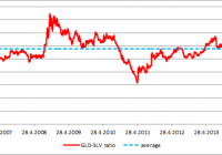
Summary The historical analysis of the gold-silver ratio shows that silver price should start to grow. The value of the gold-silver ratio is almost 75 which is significantly above the long term average. The last two tops (2003 and 2008) were just shy of the 80 level and they were followed by significant increases of the silver price (180% and 315%). There is a significant potential of another huge gains for the iShares Silver Trust ETF shareholders. Historical analysis shows that the iShares Silver Trust ETF (NYSEARCA: SLV ) shareholders may see some interesting gains in the coming years. There are two generally recognized wisdoms that contradict each other. The first one says that the historic results are no guarantee of future performance; the second one says that only a fool repeats the same thing and expects different results. Both of them are applicable to financial markets. Although you can be never sure what the markets will do, there are some patterns that tend to repeat themselves. When you follow such a pattern there is a high probability that the performance of the asset will be similar to the previous cases. There is approximately 19 times more silver than gold in nature. This number was somehow reflected in the historical fixed gold-silver ratios. The ratio was set at 12 in the Roman Empire and at 15 during the era of bimetallism in the 19th century. Today the ratio is not fixed, but moves according to the actual gold and silver prices. The average gold-silver ratio was approximately 55 during the last 44 years. But this is only the average value, the actual values ranged from 17 in January 1980 to 97 in February 1991. The current high valuations don’t reflect the difference in the abundance of gold and silver in the nature and moreover they, don’t reflect even the difference in the abundance of the disposable mined silver and gold. Almost all of the mined gold is being hoarded and most of the mined silver is being consumed by various industrial applications. As a result there is less disposable silver than gold in the world. The GLD-SLV ratio The gold-silver ratio can be tracked also using the SPDR Gold Trust ETF (NYSEARCA: GLD ) and the iShares Silver Trust ETF. During the lifetime of both (chart below), the average GLD-SLV ratio has been 5.77. The highest value was recorded on October 10th, 2008. The GLD price of $83.22 and SLV price of $9.8 resulted in the GLD-SLV ratio of 8.49. The lowest value (3.20) was recorded on April 25th, 2011 at the GLD price of $146.87 and SLV price of $45.83. As we can see, the way from the top to the bottom took 639 trading days. During this time period GLD gained 76.5% and SLV increased by whopping 440%. On the other hand, from April 2011 to present SLV lost 67% of its value while GLD declined only by 22%. (click to enlarge) Source: own calculations The outperformance of SLV during precious metals bull markets and its underperformance during precious metals bear markets is caused by its volatility, which is significantly higher compared to gold. The chart below shows the 20-day moving coefficients of variation for GLD and SLV. The volatility of SLV is significantly higher compared to GLD, regardless of the actual market trend. Source: own calculations But the changing GLD-SLV ratio itself doesn’t tell us anything about the market direction without a further analysis. It is a ratio which means that it is impacted by the price moves of both of the assets. When the GLD-SLV ratio grows it doesn’t mean that the GLD price must grow. The ratio can grow when GLD price declines, but the SLV price must decline even stronger and vice versa. The behavior of both of the assets during particular phases of the GLD-SLV ratio development are shown by the chart below. The chart shows that the declines of the GLD-SLV ratio are related to the growth phases of the gold and silver price cycle and the increases of the ratio usually happen during the decline phases of the gold and silver price cycle. (click to enlarge) Source: own calculations The Long term picture The chart below shows the long term development of the gold-silver ratio calculated from the average monthly gold and silver prices. The chart shows the major tops and bottoms of the gold-silver ratio as well as the metal prices related to the particular local extremes (gold price : silver price). The color of the number shows whether the price of the metal increased or decreased compared to the preceding extreme. (click to enlarge) Source: own calculations Thanks to this chart we can come to three important conclusions: The most important tops of the ratio are almost always associated with a decline of the silver price. The most important bottoms of the ratio are always related with an increase of the silver price. While the direction of the silver price is quite reliably predictable (as shown by points 1. and 2.), predictions of the gold price direction based on the gold-silver ratio development are much less reliable. We can also see that the ratio is approaching 80 right now. The last two approaches to this border were followed by strong declines of the gold-silver ratio and huge silver bull runs, when the silver price increased by 180% and 315% respectively. Conclusions The historical records show that the gold-silver price ratio as well as the GLD-SLV ratio should start to decline in the coming months and years. The major declines of this ratio are always accompanied by a strong silver bull market. The current value of the ratio is approximately 75. The last two times when the ratio attacked the level of 80, the value of the ratio collapsed and silver achieved triple digit gains. If the history should repeat itself once again, the holders of physical silver, SLV or another ETF that tracks the price of the physical silver, should record significant profits. Additional disclosure: The author is long physical silver.