Tag Archives: onload

2 Weeks Later: Did Mean Reversion Of CEFs Take Place?

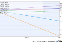
Summary Annual rebalancing in YYY/CEFL led to systematic inflation and suppression of CEF prices. A previous article suggested to sell the CEFs that were added to the index and to buy the CEFs that were removed, after the rebalancing date. Two weeks later, some evidence of mean reversion is observed, though most of these effects were not statistically significant. Introduction In a previous series of articles, we explored interesting events that happened to the YieldShares High Income ETF (NYSEARCA: YYY ), a CEF “fund-of-funds,” and the ETRACS Monthly Pay 2xLeveraged Closed-End Fund ETN (NYSEARCA: CEFL ), the 2X leveraged version of YYY, at the end of the year. Both funds are based on the ISE High Income Index [YLDA], which rebalances annually on the last trading day of each year. After ISE gave notice of the proposed changes that it planned to make to the index on 12/24/2014, we observed high-volume buying of CEFs that were to be added to YYY/CEFL, and high-volume selling of the CEFs that were to be removed. The latter acted to depress the prices of existing constituents in the fund, causing YYY to significantly underperform the PowerShares CEF Income Composite Portfolio ETF (NYSEARCA: PCEF ), a CEF fund-of-funds that tracks a different index. Moreover, we observed price “spikes” for the underlying CEFs at the close of 12/31/2014, suggesting that YYY/CEFL were forced to rebalance at unfavorable prices. On the next day, 1/2/2015, YYY fell 1.25% (and CEFL fell 2.96%) on a day where stocks, bonds and PCEF held relatively flat. YYY Total Return Price data by YCharts The second of the articles suggested a third possible way in which YYY/CEFL investors could lose money: reversion of premium/discount values of the CEFs that had been added to the index. The heavy buying of these CEFs had pushed the premium/discount values of those funds to higher (i.e. more expensive) levels, leaving investors in those funds susceptible to reversion in premium/discount values. Thus, the article suggested to sell the CEFs that were added to the index and to buy the CEFs that were removed from the index to take advantage of mean reversion. This article provides an update on whether that hypothesis played out. Results and discussion The second of the articles was published on 1/6/2015, as it took me a few days to piece together the events surrounding the rebalancing event. Nevertheless, I will be using 1/2/2015 as the starting point for the performance comparisons as this is the day after the rebalancing took place. CEFs that were added We first consider the 10 CEFs that had the highest increases in allocation upon YYY rebalancing. Those 10 CEFs had increases ranging from 3.52% for ISD to 4.59% for DSL. The following graph shows the total return performance for those 10 CEFs from 1/2/2015 to 1/16/2015 (just over two weeks). EDD Total Return Price data by YCharts Those 10 CEFs had an average performance of -1.26%. The following table shows the premium/discount values for those 10 CEFs two weeks ago (1/5/2015) and today. CEFs are arranged in order of increasing premium/discount on 1/5/2015. Two weeks ago Today Change EDD -10.51 -10.42 0.09 GLO -10.2 -11.39 -1.19 PCI -9.43 -9.64 -0.21 HYT -9.22 -9.02 0.20 MCR -8.47 -11.98 -3.51 DSL -7.9 -8.06 -0.16 GHY -7.51 -5.13 2.38 ISD -7.11 -6.88 0.23 AWP -7.04 -11.52 -4.48 FPF -6.68 -7.85 -1.17 Average -8.41 -9.19 -0.78 We can see that premium/discount value of these 10 CEFs decreased by an average of -0.78%. The following chart displays the change in premium/discount values graphically, with CEFs arranged from the largest change to the smallest. We can see that 4 of the CEFs saw an increase in premium/discount value, while 6 of the CEFs saw a decrease in premium/discount value. Notably, the four funds that had the greatest decrease in premium/discount values (FPF, GLO, MCR and AWP) were the exact same funds that had the greatest positive deviation from 1-year historical premium/discount value two weeks ago (the largest white bars in this chart linked from my previous article). Overall, these data appear to support the hypothesis that the CEFs that were added to the index saw an inflation of value before rebalancing, making them susceptible to losses (average performance = -1.26%) as their premium/discount values reverted (average change in premium/discount = -0.78%). However, neither the average performance or the average change in premium/discount values were found to be statistically significant. CEFs that were removed We next consider the 10 CEFs that underwent the largest decreases in allocation upon rebalancing. Those 10 CEFs had decreases ranging from -4.18% for BOE to -5.76% for BCX. The following graph shows the total return performance for those 10 CEFs from 1/2/2015 to 1/16/2015 (just over two weeks). BOE Total Return Price data by YCharts Those 10 CEFs had an average performance of -0.08%. The following table shows the premium/discount values for those 10 CEFs two weeks ago (1/5/2015) and today. CEFs are arranged in order of increasing premium/discount on 1/5/2015. Two weeks ago Today Change BCX -16.01 -15.23 0.78 BOE -13.30 -12.27 1.03 ETJ -10.19 -9.82 0.37 JGH -9.59 -12.62 -3.03 MIN -9.29 -8.01 1.28 ETW -9.04 -7.75 1.29 NFJ -7.61 -6.57 1.04 ETV -4.11 -3.54 0.57 GAB -3.85 -2.75 1.10 PHK 48.45 55.84 7.39 Average -3.45 -2.27 1.18 We can see that premium/discount value of these 10 CEFs increased by an average of 1.18%. The following chart displays the change in premium/discount values graphically, with CEFs arranged from the largest change to the smallest. We can see that 9 of the CEFs saw an increase in premium/discount value, while 1 of the CEFs saw a decrease in premium/discount value. Overall, these data appear to partially support the hypothesis that the CEFs that were removed from an index saw a suppression of value before rebalancing. While the majority of CEFs saw an increase in premium/discount value (average change = 1.18%), this did not translate into a higher performance (average performance = -0.08%). As before, neither the average performance or the average change in premium/discount values were found to be statistically significant. Personal trade I also described my personal trade in the previous article: At the open of 1/5/2015, I sold all but a token position in CEFL, and instead replaced the position with ETW, ETV, NFJ, PHK and PTY. All five CEFs were removed from the index, and the first four were among the top 10 funds undergoing the largest decreases in allocation. The following chart shows the total return performance for CEFL and those 5 CEFs from 1/2/2015 (the close of this day roughly corresponds to the open of 1/5/2015) to today (about two weeks). ETW Total Return Price data by YCharts Happily, my selection of CEFs that I purchased at the open of 1/5/2015 did much better than CEFL over the past two weeks. The average of the 5 CEFs was +0.59%, while CEFL fell -3.75%. Summary Two weeks after rebalancing, the 10 CEFs that were added to the index saw an average decline of -1.26%, while the 10 CEFs that were removed from the index saw an average decline of -0.08%. Meanwhile, 8 CEFs that were not substantially impacted by rebalancing exhibited an average gain of +0.35%. However, a statistical test showed that none of these average performances were significantly different from 0%, with the -1.26% decline for the 10 CEFs that were added being the closest to significance (p-value = 0.066). Moreover, we saw some evidence of mean reversion in premium/discount values taking place. The average change in premium/discount of the 10 CEFs that were added was -0.78%, while that for the 10 CEFs that were removed was +1.18%. However, these average changes were again not significantly difference from 0%. The difference between the average premium/discount change of -0.78% for the 10 CEFs added compared with +1.18% for the 10 CEFs removed was close to being significant (p-value = 0.069). Has mean reversion for these batch of CEFs been fully played out? For CEFs like AWP, the answer is probably yes, as its premium/discount dropped 4.48 percentage points (from -7.04% to -11.52%) over the course of two weeks, and is now once again close to its 1-year average of -11.21%. One must look at each CEF individually to evaluate its deviation from its historical premium/discount averages. Hopefully, we will have a chance to revisit this idea at the end of 2015 to see if the same phenomenon occurs or whether these artificial deviations, being now more well-known, will be arbitraged away.
The Indexer Who Was Saved By His Stock Picks

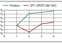
I am an indexer who completely understands that most professionals and most retail investors do not match the simple long term market index gains available. Benchmarking is important even for those with lower risk balanced portfolios. I have been correcting my Canadian home bias by dollar cost averaging portfolio income into U.S. holdings, that is starting to pay off. In 2014, ironically it was my 5 individual stock picks that carried the day for this indexer. 2014 was a very solid year for the stock markets and a very solid year for those with balanced portfolios. In fact, many investors with balanced portfolios were able to obtain near market gains, or market beating gains with much lower volatility. Based on risk adjusted returns, 2014 was certainly the year of the balanced portfolio. In 2014 and according to low-risk-investing.com the U.S. markets (NYSEARCA: SPY ) delivered 13.5%, a broad based bond index (NYSEARCA: AGG ) delivered 6%, long term Treasuries (NYSEARCA: TLT ) delivered 27.3%, International Markets (NYSEARCA: EFA ) delivered -6.2% and the Canadian Markets (NYSEARCA: EWC ) delivered 1.1%. Most of the poor results in the Canadian and International holdings for US investors were courtesy of the very strong US dollar. The Canadian markets (TSX capped composite) actually delivered 7.4% to a Canadian in 2014 according to Standard and Poor’s. On the dividend growth front the dividend aristocrats (NYSEARCA: NOBL ) delivered 15.6% while the Dividend Achievers (NYSEARCA: VIG ) delivered 9.5% in 2014. Higher yielders (NYSEARCA: VYM ) delivered 13.5%. A simple balanced portfolio with 66.6% SPY and 33.3% comprised of AGG and TLT would have delivered a very healthy 14.5% in 2014. A 50/50 stock to bond portfolio of same parts would have delivered 15.1% in 2014, and that’s with a portfolio of a volatility level of 4.8% compared to 8.2% based on the beta metrics applied on low-risk-investing.com. TLT delivered on so many fronts in 2014. I often suggest that readers consider TLT as portfolio insurance as long term treasuries often offer an inverse relationship to the equity markets in modest to severe market corrections. Here’s my article , “The Best Market Correction Insurance”. Certainly not many would have predicted that TLT would beat the pants off of the equity markets in 2014 but that was the case. I suggest TLT for periods such as this example when the markets were throwing a little tantrum. Here’s TLT vs. SPY from January 1 of 2014 to March 30 2014. The x axis represents months in duration, the y axis represents returns. TLT is in racing green. The markets are skittish, and TLT delivered in 2014 even in the most minor of corrections. TLT finished the year very strong as oil price concerns added some uncertainty. In 2014 I put my Cranky Maneuver into play with respect to our discount brokerage accounts at TD Waterhouse. For context, this investment story begins in the early to mid part of the 2000s when my approach involved a combination of ETFs and a few individual company holdings. I did very well approaching and moving through the market correction, yes I beat the broad market indices by a very large degree by buying when markets corrected and by taking on even more risk by investing in small cap and higher risk sectors such as materials and developing markets. I was also lucky enough to invest in one of Canada’s best managed funds ever – Sprott Canadian Equity. I was also lucky enough to make a mistake and have a terrible Canadian home bias. Canadian markets did very well in the last decade for U.S. 2000-2009. I was also lucky enough to have Barrick Gold (NYSE: ABX ) as a client at the time, and as I was hanging around with and befriending gold bugs they encouraged me to buy a healthy allotment of gold investments. I sold out of those toward the top of the gold price trend. Here’s Barrick from early 2002 to year end 2011. (click to enlarge) When all was said and done, I found myself with meaningful monies (well at least to me) moving out of the recession. I quickly, and early in the recovery, began moving to a more balanced approached to protect those gains. I will admit that my very conservative approach has left some money on the table if I consider the market gains that have been available from 2011. But my goal was to protect assets and create a very low volatility portfolio. Even entering 2014 our discount brokerage accounts were in the area of only 30-40% equities, and they entered the year with a still pronounced Canadian home bias (not enough US or International exposure). The portfolios displayed a very crazy low beta of .2 through any market turbulence in the years approaching 2014. In retrospect I was too conservative, especially considering that I had displayed a very high risk tolerance level through the market corrections of 2000 and the Great Recession. That said, my goal for 2014 was to ‘fix’ my home bias on the fly by investing all portfolio income into the US holdings. That strategy was designed to perform 2 functions, it would increase my equity exposure and growth potential, and it would also gradually increase my US exposure. It is also an interesting risk management tool or strategy. In rising equity markets the portfolio is obviously increasing in value while the volatility level also increases with that added equity exposure. Two measures are increasing the equity component, new monies put into the equities and those rising equity prices. The risk is managed by way of that higher portfolio value. I can look at my portfolio and say that based on historical performance of certain stock to bond allocations, my portfolio value might only drop by 15% in a 50% stock market correction. If a portfolio value went from $220,000 to $250,000 in the year and that $250,000 portfolio might potentially only fall to $212,500 in a severe correction – that draw down might be easy to stomach. The increased risk is managed by a rising portfolio value. In 2014 I was able to move the brokerage accounts to the area of 50% equities – I am happy to play this market scenario down the middle. The portfolios are set up to protect capital and they are also set up to take advantage of any real market correction that might occur. Based on the teachings of Benjamin Graham I am more than willing to move my portfolio back to 75% equities or more if ‘normal’ valuations ever return. I would or will even borrow $250,000 to invest in equities if a real opportunity presents itself. OK, to the returns for this Scaredy Cat investor. Our discount brokerage accounts offered returns in the area of 8.4% to 21% based on the return calculation function on TD Waterhouse accounts. With the best news first here’s the chart for that best performing account. Here are the returns for calendar year 2014 at 20.6%. What’s of interest in that chart is the currency adjusted benchmark of the S&P 500, it shows returns above 20% for Canadian investors. (click to enlarge) We can see that the healthy returns in this account are related to an event in August of 2014, and that event was the purchase of Tim Hortons (THI) by Burger King (BKW). I sold out all of my Tim Hortons at silly profits. As you may know Tim Hortons is the only individual pick that I hold “on purpose”. I knew the company well having been a creative director of the business back in the day when they were originally spun off from Wendy’s (NASDAQ: WEN ) in 2007; then I was a buyer. As I wrote in this article selling all of my Tim’s was a no brainer, I then put some of the profits into Berkshire Hathaway (NYSE: BRK.B ). From September of 2014 BRK.B also had a healthy beat of the market delivering a 9.4% return compared to 3.5% for SPY according to low-risk-investing.com. This Canuck of course also had an additional currency boost included in those BRK.B dollars thanks to the U.S. dollar. Do I wish I had put all of my Tims’ profits into BRK.B? Yes. And here are the returns for one of our other discount brokerage accounts. (click to enlarge) Solid returns for a very low beta portfolio, but I certainly paid for my Canadian home bias. I would have been in better shape to cut the Canadian cord and move to a more sensible US and international equity exposure at the end of 2013. But I have no regrets having recognized my ‘mistake’. I openly admit to fixing my mistakes on the fly. Sometimes your mistakes pay off (the lost decade for me) and sometimes they don’t. But the key might be that benchmarking allows you to recognize your shortcomings and fix your portfolio. So why do I think I underperformed the benchmark in that account when my incredibly low beta portfolio beat the Canadian Stock Market Benchmark? Because of this chart showing the returns for the Tangerine Portfolios. The returns are for the calendar year 2014. (click to enlarge) I would consider the Tangerine Portfolios a benchmark. They are comprised of the market indices of Canada, U.S., International along with a broad base Canadian bond index. The portfolios are rebalanced. Most of our new monies are invested into the Tangerine Balanced Portfolio in a Tax Free and RSP (Retirement Savings Plan). The Balanced Income Portfolio holds 70% bonds, the Balanced Portfolio holds 40% bonds. I have similar returns (to the 8.39% annual) in our third major discount brokerage account, but those returns were aided by the three individual stock holdings of Enbridge (NYSE: ENB ), TransCanada (NYSE: TRP ) and Apple ( AAPL ) all of which outperformed the Canadian and U.S. market indices. Apple was added in June – let’s call that a company I hold on purpose as a growth candidate. Enbridge and TransCanada are simply companies that I could not bring myself to sell when I made the switch to indexing. Apple was purchased with the same reasoning that was behind the Tim Hortons purchase – it is a company with incredible sales and profit growth and is one of the strongest brands on the planet. As a still recovering Ad Guy I don’t mind using brand strength as a guideline for a stock pick or two (I allow myself to have a little fun when investing) and I hope that Apple turns out to be as profitable as the Tim Hortons venture. So far, so good. Here’s Enbridge and TransCanada combined total return vs. SPY over the last 10 years, courtesy of low-risk-investing.com. The time horizon is January 1, 2005 to December 31, 2014. Those two dividend challengers can stay around as long as they like – but I don’t pay them much attention. All combined, our 3 major discount brokerage accounts delivered just over 11% in 2014. Of course on a risk-adjusted return evaluation that’s more than good. I beat the Canadian index with portfolios that started year with beta(s) in the area of .2. But I did give up some gains with that tardy rebalancing. I would estimate that it cost me several thousand dollars. It’s best to use benchmarking to identify weakness and put those mistakes into dollars and cents and then extrapolate those lost returns into the future. We should know the cost of our mistakes and underperformance. Moving forward I plan to continue to invest new monies into the Tangerine Balanced Portfolio, and all portfolio income in the discount brokerage accounts will be invested into U.S. equities. It’s possible that if there is a major drop in the Canadian markets some portfolio income (in the name of rebalancing) will be redirected to Canadian ETFs. Energy is certainly taking its toll on Canadian energy companies and potentially the Canadian economy. My “Learnings” Moving to eliminate my Canadian home bias was a common sense decision. A tardy rebalancing approach led to two self-directed portfolios underperforming their assigned benchmark. The non-thinking Tangerine Balanced Portfolio continues to teach me lessons that I do not always respond to. I am comfortable making a stock selection or three. A future article will explore that strategy of holding a market index as a core and then confining a few stock selections to what an investor actually knows quite well. If one is going to be a “stock picker” perhaps there is value in buying fewer companies; but companies that an investor can hold with extreme confidence. Thanks for reading, happy benchmarking, be careful out there and always know your risk tolerance level. And I’ll add “Got International?”.

Investing Lessons And Portfolio Update

Never go “all-in”, no matter how tempting it may be. Many forex traders got wiped out by using too much leverage trading the Swiss franc last week. “Protect the downside” and “regular re-balancing” have kept my portfolio from big drawdowns and losses. We have added multiple equity positions and precious metal positions to our 1% income portfolio. First thing, let’s go through what happened with the Swiss franc last Friday. The currency’s value had been pegged to the euro since 2011. The pegged price was “1.2:1”, which meant 1.2 Swiss francs bought you 1 euro. Last Friday, the Swiss National Bank announced that it was going to break the peg and allow its currency to trade freely. The franc rallied strongly on the news, and at one point last Friday, the franc was worth 0.85 euro cents, before finishing at practically parity with the euro. The Swiss stock markets fell sharply, but when you factored in the added strength of the franc, the losses in real terms were much less than reported. So why did the Swiss bank announce such a measure? Well, I believe there could be 2 answers. Firstly, the franc has lost a lot of purchasing power since the middle of last year, as the dollar has made massive gains against the euro. Also, secondly, is the Swiss central bank sniffing our quantitative easing in the near future by the European central bank? If QE gets the go-ahead in Europe, then all currencies that are pegged to the euro will also have to undergo devaluation. However, the Swiss franc is seen as a safe haven internationally, so it would have definitely lost its prestige if the currency continued its devaluation against other currencies such as the dollar. The Swiss economy may hurt for a while, but the right decision was made, in my opinion. The purchasing power of the franc has been prioritised, and this is excellent news for its citizens. So what’s the lesson to be learned here? Well, many currency traders got their portfolios wiped out because of last Friday’s action. An investor or trader can never go “all-in”, no matter how tempting the investment or trade may be. I spoke about this in one of my previous articles . Greed can destroy a portfolio overnight, if it is allowed to. The dollar has been rallying strongly since the middle of last year. Moreover, many currency traders thought that the impending QE in Europe would strengthen the dollar even more against the euro and the Swiss franc. Some shorted the Swiss franc en masse in the hope of making a killing. Unfortunately, all that was “killed” was their portfolios. Re-balancing your portfolio is one of the best techniques out there for controlling greed and keeping your portfolio fresh. If you are holding US stocks, the US dollar or US bonds in your portfolio, I would recommend that you rebalance your portfolio. These 3 sectors have risen a lot in the last 12-18 months. Smart investors would take some money off the table in these sectors and deploy extra capital in more depressed sectors. I am not advocating withdrawing all your capital from these sectors, as there may be many more months of upside, but now may be the time to lighten up instead of doubling down. We are living in volatile times, where any move by a country or central bank could have devastating effects on your portfolio if it is not set up correctly. I say all of the above because the sentiment on the US dollar at the moment is extremely bullish. Everyone expects the dollar rally to continue (and it may very well continue) as Europe tries to get a grip on deflation. Nevertheless, surprises can happen in any market, as we witnessed last week. Could China, for example, break its currency’s peg against the US dollar? Many would say this is highly improbable, as China owns huge amounts of dollar reserves. What if the US announced QE4 in the coming months? Would the Chinese let their currency weaken alongside the dollar? These scenarios may never happen, but position sizing and diversification in your portfolio would protect you from all possible outcomes. Another valuable lesson in investing which ties in well with my last point is “protecting the downside”. Professional investors are far more concerned with the downside (risk) than the upside. Losing money is not an option for them. So let’s look at what an investor can do when he or she is sitting on some nice profits. Let’s take a look at the SPDR S&P 500 Trust ETF (NYSEARCA: SPY ), for example. This ETF has gained 80% over the last 5 years, which is a fantastic return for an ETF. How do we protect the downside? (click to enlarge) 1. We take some money off the table and deploy it into a depressed sector, such as the gold mining sector. 2. We buy a put option (like insurance). If the ETF drops, our put option will go up in value. The net result is that we will lose less if the market falls sharply. If the market continues to rise, we will only lose what we paid for the put option. 3. We place a stop loss under the present price of the ETF (the 200-day moving average is used often by professionals). The problem with a stop loss is that it is less effective when there is volatility in the market (violent swings both ways). Protecting the downside and rebalancing my portfolio every once in a while has not only protected my portfolio, but also has grown it. Finally, we added many positions to our 1% portfolio last Thursday and Friday (see screenshot below). We now have in the region of $130k invested in stocks, but will not be investing more into this asset class for the moment, as we feel other asset classes can give us higher returns going forward (rebalancing). We will fill up our Precious Metals & Commodities asset classes with the full $180k each soon enough, as we have unearthed depressed companies in these sectors and low-cost indexes. Stay tuned. (click to enlarge) Editor’s Note: This article covers one or more stocks trading at less than $1 per share and/or with less than a $100 million market cap. Please be aware of the risks associated with these stocks.