Tag Archives: onload

Does ‘Sharpe Parity’ Work Better Than ‘Risk Parity?’

By Wesley R. Gray Strategies employing Risk Parity have been favored by mutual funds and other market participants the past few years. The attraction of risk parity strategies is the great story associated with the approach and the historical performance over the past 30 years has been favorable. However, there is an argument that historical risk parity performance has been driven by leveraged exposure to Treasury Bonds, which have been on an epic tear the past ~30 years. Nonetheless, good stories such as risk parity never die on Wall Street, they merely adapt and overcome. This white paper by UBS highlights skepticism around risk parity and presents a different, but related asset allocation method: Sharpe Parity. Risk Parity Background: As you may recall, risk parity identifies weights that equalize “risk” across asset classes. Let’s first review a simple risk parity example. Here is a visual interpretation of how risk parity works. If we allocate to a 60/40 stock/bond portfolio on a dollar-weighted basis, on a risk-contribution basis, we might be getting 90% of our risk from stocks and 10% of our risk from bonds. Risk parity comes to the so-called rescue. Risk parity suggests that we rejigger the dollar-weighted 60/40 portfolio in such a way that the risk contributions end up being 50% driven by bond exposure and 50% driven by stock exposure. In other words, our “risk contributions” are at parity, hence the title “risk parity.” How does this work in practice using the most basic version of risk parity outlined in the Asness, Frazzini, and Pedersen paper: (click to enlarge) Source: Leverage Aversion and Risk Parity (2012), Financial Analysts Journal, 68(1), 47-59 But UBS Doesn’t like Risk Parity. Why? As per their own research: Risk Parity ignores return and focuses only on risk; Risk Parity uses volatility as the sole measure of risk, while neglecting other credit-related risks, such as default risk and illiquidity; Risk Parity encounters huge drawdowns if bonds and equity sell off together; A low nominal return world makes recovery from risk parity drawdowns difficult. UBS proposes a new asset allocation strategy, which shares some concepts with risk parity, but in their approach risk parity’s “standard deviation” is replaced with an estimate for an asset’s Sharpe Ratio. Here’s an explanation of the concept: “Think about it this way: if asset X has a Sharpe ratio of 2 it means that we have two units of return for 1 unit of risk, while asset Y with a Sharpe ratio of 1 gives us only 1 unit of return for the same amount of risk. In that case we construct a portfolio with the weight for asset X being double the weight of asset Y.” Strategy Background: This approach makes some sense, as it seems to account for return as well as risk. This approach is also in line with modern portfolio concepts such as mean-variance analysis, where investors want to maximize marginal Sharpe Ratios to create the so-called “tangency portfolio” that all MBA 101 students know and love. But how does “Sharpe Parity” stand up to empirical scrutiny? In order to address this question, we compare 4 asset allocation approaches: Equal-weight allocation , an equal-weight allocation with a Simple Moving Average rule , simple Risk Parity , and Sharpe Ratio Parity . Equal-weight (EW_Index): monthly rebalanced equal-weight portfolios. Simple Moving Average (EW_Index_MA): calculate a simple moving average each month (12 month average); if the MA rule is triggered (when the current price > 12 month moving average), buy risk, or else, allocate to the risk-free asset. Risk Parity: follow the simple risk parity algorithm; use a look-back period of 36 months for the “standard” risk parity model. Sharpe Parity: use a look-back period of 36 months for the Sharpe Parity model; if an asset has a negative Sharpe Ratio, this asset’s weight will be 0; note that if all the assets’ Sharpe Ratios are negative, the strategy will allocate 100% to the risk-free asset. Data Description: To test these 4 strategies, we apply them to the “IVY 5” asset classes: SP500 = SP500 Total Return Index EAFE = MSCI EAFE Total Return Index REIT = FTSE NAREIT All Equity REITS Total Return Index GSCI = GSCI Index LTR = Merrill Lynch 7-10 year Government Bond Index (click to enlarge) The “IVY 5” Concept. Click to enlarge. Our simulated historical performance period is from 1/1/1980 to 7/31/2014. Results are gross, and thus do not include the effects of fees. All returns are total returns and include the reinvestment of distributions (e.g., dividends). Data was obtained via Bloomberg. Indexes are unmanaged, do not reflect management or trading fees, and one cannot invest directly in an index. Please see the disclosures at the end of this document for additional information. Sharpe Parity has a slightly higher CAGR. However on a risk-adjusted basis, Equal Weight MA and Risk Parity outperform the Sharpe Parity system, as reflected in their higher sharpe and sortino ratios. The simple moving average technique has the lowest drawdown and the best overall risk-adjusted performance. (click to enlarge) The results are hypothetical results and are NOT an indicator of future results and do NOT represent returns that any investor actually attained. Please see disclosures for additional information. Additional information regarding the construction of these results is available upon request. Does Lookback period matter? Next, we change the look-back period from 36 months to 3 months, which is identical to the lookback period used in the UBS whitepaper. Here’s the result: Sharpe Parity based on a 3 months lookback period has larger CAGR, but also has larger drawdowns, on a monthly, worst case, and cumulative basis. Sharpe and sortino ratios are worse than the 36 month lookback version. (click to enlarge) The results are hypothetical results and are NOT an indicator of future results and do NOT represent returns that any investor actually attained. Please see disclosures for additional information. Additional information regarding the construction of these results is available upon request. Conclusions Based on these results, it seems hard to conclude that Sharpe Parity, particularly with a 3 month look-back period, offers a clear-cut advantage over traditional Risk Parity approaches. In fact, on a risk-adjusted basis, it compares poorly. Based on this analysis, it would appear that simple equal-weight portfolios with trend-following rules have worked better than more complicated risk parity or sharpe parity systems. Original Post
How To Analyze Insider Selling

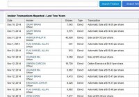
Summary Insider activity can be an extremely valuable tool when analyzing an investment. Insider buying is typically straight-forward, while insider selling is trickier to analyze. Insider sells should be analyzed by their size and frequency, the number of insiders selling, and insiders’ overall holdings and wealth. First Solar in 2007 – 08 provides a classic illustration of how large amounts of insider selling can be a red flag. If you told me that I had to invest in a portfolio of any 10 American companies for the next 3-5 years and I was only allowed to look at one metric or one data piece to make my decision, the choice would be a simple one. There’s no metric that can tell you more about a company that insider activity. In a world where corporate officers and directors are coached to “spin” their performance like politicians and are often incentivized to exaggerate results, insider activity lets you cut through the bullcrap and see what officers and directors of the company truly believe. Insider activity is often under-utilized by investors. Two likely reasons for this: (1) it’s inconclusive in the vast majority of cases and (2) it’s sometimes difficult to analyze. If you gave me a random sample of 100 companies, it’s likely that we would not be able to form a legitimate preliminary thesis on any more than 20 of these companies. And that’s being generous. In reality, no more than 3-10 will likely have significant activity in either direction. Yet, the few cases where there is significant insider activity provide us more insight than any other metric or data point out there. Analyzing insider buys can be reasonably straight-forward. If you see 2+ officers or directors buying significant amounts of shares at prices similar to the current stock price in the past six months, that’s generally a good sign. It means that these key individuals believe the company’s stock is undervalued and represents a good bargain. Of course, anyone can be wrong even about their own company, so it’s no guarantee of superior performance. Nevertheless, insiders know more about the company than anyone else and while their buying might not tell you much about macro conditions or the future price environment for their products, it does tell you what the insider think about their own company’s relative position. In most cases, that’s quite valuable information. Insider selling, however, is a much trickier piece of data to analyze I’ve heard many individuals discount the idea of looking at it entirely, but I think this is because people often find themselves frustrated with complex data series. Insider sales can be quite meaningful if you know how to analyze them. Diversification of Assets The first thing to note with insider sales is that they aren’t automatically “bad news.” Many insiders sell shares for perfectly legitimate reasons that have nothing to do with the stock’s valuation or company fundamentals. Put yourself in the shoes of an executive that has 90% of his or her wealth invested in one company. No matter how much you believe in your company and no matter how much of a bargain you believe the stock to be, it still makes sense to diversify a bit, so if the worst case scenario does happen, you still have a considerable bit of wealth. For this reason, it should be no surprise that executives at companies that have had good runs sell out of some of their shares in order to diversify wealth. Likewise, many executives and directors simply have other uses for the cash. This could include investments in other potential business opportunities, philanthropy, or real estate purchases. Indeed, it’s fairly common for high-level company stakeholders to sell shares, and that’s why insider selling can be tricky to analyze. This doesn’t mean it’s impossible, however. Insider Dumping There are several pieces of data to analyze when examining insider selling. I focus on: (1) Size of insider sells, (2) The number of insiders selling, (3) Frequency of selling activity, (4) Insider buys, and (5) Insider sells relative to total inside ownership Companies with consistent insider sells of large amounts by at least 3+ officers or directors, with little or few offsetting buys are the ones that give me cause for skepticism. This is particularly true with a company where inside ownership is fairly low to begin with (e.g. 2% – 3% of outstanding shares). That a director might need to take money out now and again is no surprise. Several officers and directors taking out large amounts of money in a short time frame, on the other hand, indicates a general pessimism on the company’s future stock prospects. Even in the odd event that company execs are selling large numbers of shares and the stock is undervalued, it would lead me to question management’s abilities. Management has a greater level of knowledge on a company than anyone else. If management can’t tell when their own stock is a good bargain, I have to suspect that they are also not good at understanding value in their own business, as well. Example #1: American Capital (NASDAQ: ACAS ) The reason this topic was on my mind was an excellent article from Stanislav Ermilov on American Capital . Stanislav’s thesis is that there is considerable hidden value at ACAS. He believes that once they spin off some of their assets, the much of that value will be unlocked. I found Stanislav’s case compelling enough to start looking at it myself. The first thing I did, naturally, was take a look at insider buying activity . I reasoned that if the officers of the company understood the “hidden value”, there would likely be a few that had been buying the hypothetically undervalued shares. Unfortunately, what I discovered was the exact opposite: officers have been dumping shares like mad. (click to enlarge) The screenshot above shows the past couple of months, but the track record of insider selling has been consistent over the past few years. Since December 2012, I estimate that there was a total of over $80 million in insider sales by at least 7 different officers and directors. Almost all of these sales have come at prices close to the current market price. I see no insider buying activity at all. No matter how compelling the thesis for ACAS might seem, I have to think there are some significant risks being missed. Unless Yahoo Finance is inaccurate (and it sometimes is), it also states that there is only 2% inside ownership for ACAS, which has a market cap of about $4 billion. 2% of $4 billion is $80 million. In other words, the insiders have sold off nearly half the shares in the past two years. I’m not necessarily suggesting that ACAS’s management is poor. Given that they make a lot of higher-risk investments, the company’s value would naturally suffer in market downturns. Perhaps, management merely thinks we’re near a cyclical peak. It is worth noting, however, that the stock lost 97% of its value during the last financial crisis. I have no opinion on ACAS and have done little research, but I know that the insider selling alone is enough to keep me away from it, even with a compelling “buy” thesis. Example #2: Zillow (NASDAQ: Z ) I’ve been skeptical of Zillow’s valuation for quite awhile. Indeed, I wrote an article, ” 7 Reasons Why Zillow is Extremely Overpriced ” back in August 2013. At the time I penned the article, Zillow sold for around $91 per share. As I’m writing this, it sells for $103, which is arguably a poor return over that 16-month period (13.1% versus 23.1% for the S&P 500), but hardly disastrous. However, this ignores the wild ride it’s taken in that timeframe, skyrocketing to $160 back in July, before plunging down to its current price. My thesis on Zillow hasn’t changed one bit. It still looks significantly overvalued to me at over 14x revenue, it is at best a break-even company, and its competitive position is weaker than typically imagined by investors (an issue repeatedly hammered on by short-selling outfit , Citron Research). Nevertheless, I’ve never recommended shorting it for precisely the reasons elucidated in the famous J.M. Keynes quote: ” the market can stay irrational longer than you can stay solvent .” While there are numerous reasons I view Zillow’s stock as overvalued, the insider sells paint a story that the officers of the company believe it’s overvalued, as well. Assuming my data is correct, I calculated over $1.4 billion in insider sales over the past 2 years, with a large chunk coming at lower prices than the current one (with the selling spree beginning around $40). The current market cap of Zillow is $4.2 billion, so the total insider selling amounts to 33.3% of the company’s current value. There are some differences between Zillow and ACAS. For one, the officers and directors of Zillow owned a much larger percentage of shares than their equivalents at ACAS. Moreover, it’s likely that many of the major stakeholders had a significant bit of their wealth tied up in Zillow. At the same time, once an officer sells over $20 million in shares in a few years, you have to think they have a pretty sizable cushion of safety and that insider selling becomes a statement on the value of the stock, rather than merely a “diversification strategy.” Even if 50% of your wealth is tied up in one company, that’s not a huge deal when your total wealth exceeds $50 million. I have and continue to view Zillow’s massive insider selling as a signal for long-term shareholders to get out until the price has significantly corrected; below the $50 range at a minimum. I personally wouldn’t even consider it unless the price fell below $35. Example #3: First Solar (NASDAQ: FSLR ) in 2008 Thus far, I’ve given you two current examples of stocks where the insider selling activity raises questions about valuation risks. But I also want to give you a historical example where massive insider dumping was quite predicative of an eventual crash in a stock. First Solar in 2008 is one of the most dramatic examples I can recall. First Solar peaked at over $310 in May 2008. It gave up 72% of its value in six months, plunging all the way to $87 in late November 2008 before rebounding. Since that point, it continued to lose value till bottoming out in June 2012 around $13. Today, it’s trading back at $44 meaning that if you bought at the peak and held, you would’ve lost over 85% of your investment. (click to enlarge) The dramatic insider selling activity in FSLR in 2007 and 2008 was a clear message that the stock was significantly overvalued. From May 2007, when FSLR sold in the $60 – $70 range, till August 2008, before the stock crashed, there were over $1.5 billion in insider sales. While that figure might arguably be inflated due to sales by the Estate of John T. Walton, there was considerable activity amongst the executives, as well, with CEO Michael Ahern selling over $350 million in shares in that 15-month window. When an executive holding a massive stake in his or her own company sells off $5 or $10 million in a year, it’s reasonable in many cases to assume that he or she is diversifying their portfolio. When he sells off $350 million, that’s a statement on the value of the stock! Conclusions In most instances, insider activity doesn’t tell us much about a stock. For the average company, there is little activity, or a handful of small sells. In the few instances, however, where there is a significant amount of insider activity, it can tell us quite a bit about management’s perception of valuation. Insider buying is relatively straight-forward to analyze. Significant buys by multiple insiders show that the people running the company have confidence in their performance and view the stock as undervalued. Insider selling is much trickier to analyze, but an equally valuable tool. In most cases, the activity that you see will be inconclusive at best. However, when there is significant activity, it should be analyzed by the size and frequency of sells, the number of insiders selling, and the overall context (e.g. overall stake in company by insider, portion of total wealth, relationship to company). When you see a clear and consistent pattern of share dumping by officers and directors, this is more often than not, a clear indication that a stock is overvalued.

Tech ETF IBB Brings Plenty Of Risk But It Fits Nicely In A Portfolio

Summary IBB has a respectably low correlation to SPY, but the ETF is quite volatile on its own. The ETF doesn’t make sense for investors that are retiring, but it works fine for investors not seeking yield. I’d rather see lower expense ratios, but they aren’t bad enough to make the ETF unattractive. I’ll share my findings on ideal exposure levels. Investors should be seeking to improve their risk adjusted returns. I’m a big fan of using ETFs to achieve the risk adjusted returns relative to the portfolios that a normal investor can generate for themselves after trading costs. I’m working on building a new portfolio and I’m going to be analyzing several of the ETFs that I am considering for my personal portfolio. A substantial portion of my analysis will use modern portfolio theory, so my goal is to find ways to minimize costs while achieving diversification to reduce my risk level. In this article I’m reviewing the iShares Nasdaq Biotechnology ETF (NASDAQ: IBB ). What does IBB do? IBB attempts to track the investment results of an index composed of pharmaceutical and biotechnology equities. The ETF falls under the category of “Health”. Does IBB provide diversification benefits to a portfolio? Each investor may hold a different portfolio, but I use (NYSEARCA: SPY ) as the basis for my analysis. I believe SPY, or another large cap U.S. fund with similar properties, represents the reasonable first step for many investors designing an ETF portfolio. Therefore, I start my diversification analysis by seeing how it works with SPY. I start with an ANOVA table: (click to enlarge) The correlation is about 69%, which is low enough that I’m expecting to see significant diversification benefits. Standard deviation of daily returns (dividend adjusted, measured since January 2012) The standard deviation isn’t going to make a strong case for investing in IBB. For the period I’ve chosen, the standard deviation of daily returns was 1.391 %. For SPY, it was 0.736% over the same period. Clearly, SPY appears to be the safer of the two investments. Mixing it with SPY I also run comparison on the standard deviation of daily returns for the portfolio assuming that the portfolio is combined with the S&P 500. For research, I assume daily rebalancing because it dramatically simplifies the math. With a 50/50 weighting in a portfolio holding only SPY and IBB, the standard deviation of daily returns across the entire portfolio is 0.987%. The risk level on the portfolio drops relative to only holding SPY because of the diversification benefits that come from the 69% correlation. If the position in SPY is raised to 80% while IBB is used at 20% the standard deviation of daily returns drops down to 0.807%. In practice, I think the best way to use IBB is a position smaller than 20% and used in a diversified portfolio. The low correlation makes a very strong case for using IBB in a small position to enhance diversification. I would lean to limiting exposure to around 5%. At 5%, the standard deviation of the portfolio would have been 0.749%. Compared to SPY at .736%, this is a fairly low increase in the risk level measured by the standard deviation. Most of the additional deviation introduced by IBB has been effectively diversified away once the position hits 5% in a portfolio that is primarily SPY. Why I use standard deviation of daily returns I don’t believe historical returns have predictive power for future returns, but I do believe historical values for standard deviations of returns relative to other ETFs have some predictive power on future risks and correlations. Yield & Taxes The distribution yield is .15%. Simply put, the ETF doesn’t make much sense for a retiring investor that wants to use portfolio yields as a large part of their retirement income. Sure, they could sell shares to generate income, but that may create a temptation to change the portfolio strategy at the wrong time. Expense Ratio The ETF is posting .48% for an expense ratio, which is higher than I’d like to see. Unfortunately, most ETFs have expense ratios higher than I’d like to see. This isn’t bad compared to other ETFs, though it is substantially higher than SPY at .09%. Market to NAV The ETF is trading at a .01% premium to NAV currently. I think any ETF is significantly less attractive when it trades above NAV. A .01% premium is not enough to matter though. Investors should check prior to placing an order, but the liquidity in IBB should be a great hedge against any meaningful premiums or discounts. Largest Holdings The diversification within the ETF is pretty weak. For a very long term holder it might make sense to replicate the ETF by just buying the underlying securities and taking higher trading costs to eliminate the expense ratio. (click to enlarge) Investing in the ETF is largely relying on modern portfolio theory. The argument for the investment is the respectably low correlation of the portfolio to the major U.S. index funds. Making an investment requires a belief that markets are at least somewhat efficient so that the companies within the portfolio will be reasonably priced. Conclusion The trading volume for the ETF is fairly solid. Recently the average volume was about 1.7 million shares per day. During my three year sample period there were 0 days in which no shares were trading hands. Based on that solid liquidity, I think the statistics are fairly reliable and find the ETF appealing under modern portfolio theory if investors have a large enough portfolio have less than 5% invested in IBB and still have the position be meaningful. Due to the small percentage of the portfolio that I would suggest for such a volatile portfolio, it makes more sense for investors that have access to some free trading on IBB or investors that have a portfolio large enough that the trading costs are inconsequential. The ETF has been on a tear over the last 3 years. During the period the ETF is up about 190%, but since it still trades at NAV that is simply reflecting the incredible growth of the underlying companies. Investors doing some quick research may see that the Beta of the ETF is .83. That value depends on measuring the ETF relative to a benchmark associated with the index rather than comparing the risk level to SPY.