Tag Archives: nysefcx

How To Catch A Falling Knife

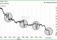
Summary The “falling knife” stock is increasingly common. The current economic environment increases risk in falling stocks. One long-established investment technique can minimize the risk. Falling knife: A security or industry in which the current price or value has dropped significantly in a short period of time. A falling knife security can rebound, or it can lose all of its value, such as in the case of company bankruptcy where equity shares become worthless. –Investopedia Remember Boston Chicken? Inspired by the heady days of the late ’90s and my personal effort to improve their top line, I watched BOST decline in price and finally made a major share purchase when it was so low I could not resist. To this day I maintain that no company can go broke trying to sell too much fat, salt, and sugar to the American public. This axiom was overcome by BOST’s incestuous finances and the practice of selling one dollar of chicken for 95 cents, which led to bankruptcy in 1998. A $50 check from the subsequent class action lawsuit did little to assuage my five figure loss. There were many lessons to be had from this experience. The one I want to concentrate on is the value of dollar cost averaging, or DCA, in purchasing stocks that are declining in price. DCA refers to planned purchases in multiple increments over time, in contrast to a one time purchase of the full investment. If I had used DCA with Boston Chicken, my loss would have been much less severe. DCA is useful in many circumstances, but its benefits are magnified in cases where a stock is in a significant decline. The Falling Knife Scenario The classic falling knife scenario consists of an abrupt price change. Yelp is a particularly hair-raising example: A broader definition of “falling knife” is any stock that is in a clear price decline over a period of time. Under this definition there are many falling knives among today’s investment choices. Every day articles appear on Seeking Alpha enthusiastically recommending a purchase because stock X is N per cent off its high. Readers will often note that such articles have appeared since a decline began. Here are three companies in the falling knife category that have had bullish articles all the way down: American Capital Agency (NASDAQ: AGNC ), Emerson Electric (NYSE: EMR ), Chevron (NYSE: CVX ): How long and how severe these declines will be no one knows. At losses from 52 week highs of 22%, 19%, and 30% for EMR, AGNC and CVX there could still be a lot of air underneath them. Other widely held falling knives include: Exxon Mobil (NYSE: XOM ). Intel (NASDAQ: INTC ), Caterpillar (NYSE: CAT ), Freeport-McMoRan (NYSE: FCX ), BHP Billiton (NYSE: BBL ) (NYSE: BHP ), National Oilwell Varco (NYSE: NOV ), and 3M (NYSE: MMM ). The DCA Effect Using Chevron as an example the usefulness of DCA is clear. An investment of $30,000 when CVX had declined 10% from its high of $130 would buy 256 shares: Date Price Investment Shares 10/02/2015 $117 $30,000 256 Value 08/01/15 $88 $22,528 256 An investment in three increments over equal time periods would buy 293 shares: Date Price Investment Shares 10/02/2015 $117 $10,000 85 03/01/2015 $105 $10,000 95 08/01/20015 $88 $10,000 113 Value 08/01/15 $88 $25,784 293 The DCA approach buys 37 more shares, $3,256 more in value, and $159 more in annual income. If CVX returns to $130, the price at which it started, the difference in total value rises to $4,810. It is true that there is a possibility of losing out on some gains if a stock rises in value between purchases. But as Daniel Kahneman wrote in classic book Thinking, Fast and Slow : Losses loom larger than gains. The “loss aversion ratio” has been estimated in several experiments and is usually in the range of 1.5 to 2.5. For the average investor, the good feelings you get from gains are more than wiped out by the bad feelings from losses. Perhaps humans have an instinctual aversion to loss of capital. Why is DCA important now? DCA has strengths that apply to all circumstances, such as reducing risk and replacing emotion with discipline. In today’s markets its benefits are particularly important. After six years of almost uninterrupted rise in stock prices, recency bias is very strong. Recency bias causes investors to believe trends and patterns have observed in the recent past will continue in the future. Investors look at where a stock has been, not where it is going. Complacency among investors is high. New investors have with no experience of a declining market have an inflated sense of their stock-picking ability. Older investors, with six years of mostly positive experience, may think that their prowess has improved more than it has. Price declines reflect changes in the macroeconomic situation. Global growth estimates continue to be lowered. Money is no longer being added to the US system through quantitative easing, and as shown by Eric Parnell and others there has been a strong relationship between QE and stock market performance. In addition, numerous indicators have been flashing warning signs for some time. DCA is agnostic concerning market projections but economic changes do affect results. Conclusions The falling knife conundrum — what to do when a stock we like is falling — is increasingly common. The angel on one shoulder tells us to buy and the angel on the other shoulder tells us not to lose money. Dollar cost averaging is a way to resolve these different impulses. DCA is helpful in many situations, but particularly today when uncertainty is increasing and six years of successful stock-picking may have inflated both our confidence in the market and the perception of our abilities. DCA takes away the pressure of having to make a one-time purchase decision, allows us to act independently of market noise, and reduces risk. Disclosure: I/we have no positions in any stocks mentioned, but may initiate a long position in XOM EMR over the next 72 hours. (More…) I wrote this article myself, and it expresses my own opinions. I am not receiving compensation for it (other than from Seeking Alpha). I have no business relationship with any company whose stock is mentioned in this article.
Freeport-McMoRan: A Lesson In Listening To The Model

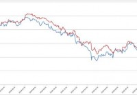
Summary After I designed a model that was surprisingly effective at predicting movements in Freeport-McMoRan, I stopped listening to it. The model was clearly predicting the latest crashes in Freeport-McMoRan. As bad as things are for Freeport-McMoRan, the commodities suggest current pricing is pretty fair. Freeport-McMoRan (NYSE: FCX ) has been in freefall for the last month or so. There have been great opportunities to get out, but I missed them because I was focused on doing analysis on other parts of the market. This is a story of the massive mistake I made and how easily it could have been prevented. Predicting Commodity Prices From the start, I’ve said that my goal is not to predict commodity prices because predicting which way the prices will move is not within my skill set. When I make investing decisions, I want to be functioning within my area of expertise. When it comes to Freeport-McMoRan my area of expertise was building a model that was vastly better at predicting returns than I could be relying on any other tool. Despite knowing that my area of expertise was in building the model, I allowed myself to be swamped with work and didn’t return to regularly run my model the way I did during my first stint investing in Freeport-McMoRan. How I Should Have Done It The best method for me would have been to write it into my schedule that at least every week I had to completely rerun my model and decide if the stock was worthy of investment at that point given the results. Unfortunately, I didn’t do that. I ran the model around June 7th, decided it was getting risky and posted my downgrade and intent to keep running the model and watching for strong indicators to get out. The proper choice, clearly, would have been to sell out immediately rather than looking to get a tiny bit of extra return relative to my index by holding the position. Let this be a lesson to all investors to keep a close eye on those volatile investments. At the same time, it would have been wise for me to make some improvements to make the model easier to update. That may have encouraged me to keep checking it every day rather than allowing my early summer days to become swamped with other activities. I’ve taken both of those lessons to heart. The saddest irony, as you’ll see, is that the spread widened further, precisely as I predicted over the next couple weeks. Part of that time was when I was out of the state and away from my model. Clearly, I should have closed out the position before I left. Getting Up to Date I reran my model which uses the opening values for shares of Freeport-McMoRan along with the opening values for different ETFs that track 4 of the 5 commodities Freeport-McMoRan produces. I use those ETFs to track the estimated price change in futures contracts on the commodities as a way of seeing where commodity prices are going. Occasionally Freeport-McMoRan will move before the futures prices on the commodities but a large divergence has been a clear sign that a correction is coming. In using those commodities I built my model to predict average annual EBITDA for FCX over the next couple of years and then set a standard deduction from that value to estimate the other necessary cost implications because interest, depreciation and amortization are very real costs. Taxes is also a real cost, but will generally scale in such a way that it is automatically accounted for in my model. That should sound very complex to readers that didn’t see my previous work on Freeport-McMoRan, but the charts are easy enough to read. The chart below shows the values for EBITDA minus the static. As you can see, the lines show a very strong connection. (click to enlarge) While I like that method for looking at the correlation over the long term, I prefer to actually read the output using bar charts. The following chart shows the values for the last seven months: (click to enlarge) I designed these charts using the opening values for each ticker. We don’t have the opening value for Monday, so I inserted the closing prices for Friday, July 24th as “July 25th”. As you can see, over the last couple months the shares have fallen significantly but not by near as much as the expected earnings. Contrary to popular belief, Freeport-McMoRan stock was actually holding up well if we compare it to the fundamental earning power of the company. You may notice the left side of the chart is done in percentage terms. I standardized all the values in that chart based off the values from the start of 2014. There is no reason to think that the values from the start of 2014 were perfectly aligned, but it made it possible to reliably get both bars onto the same scale to compare relative strength. Relative Strength I put together another chart that makes it even easier to read. This chart standardizes based off percentage change from the values on May 20th. (click to enlarge) Had I been disciplined enough to force myself to update the spreadsheet more regularly, I would have been out without a problem. I’m providing an even larger version of the very clear “Get the **** out” signal: By the middle of June the model was sending off extremely strong sell signals. When I tried to do an eyeball test of the movement by simply looking at price charts in early July, I thought the commodities were moving before Freeport-McMoRan and started to doubt my model. If I had updated it completely, I would have seen that Freeport-McMoRan was simply catching up with the losses the model was predicting and I would’ve got the heck out. What Does It All Mean for Freeport-McMoRan? Based on my model, the closing values put us fairly close to fairly priced. That makes decisions to buy or sell fairly neutral. The biggest concern on buying is that the volatility is enormous. I’ll be putting in some work to make the model easier for me to update and then I’ll be watching for another one of those clear buying or selling signals. At the moment the model is quite neutral since the red line is only mildly taller than the blue. This wasn’t a case of my model failing me, it was me failing the model and paying dearly for it. I designed my system around having an index of ETFs that I could use as my benchmark. This is the same batch of ETFs that I use in estimating EBITDA based off commodity futures contracts. Relative to the benchmark, I’m “winning”. The benchmark is down 52.4% and FCX is down 48.4%. Somehow, this doesn’t feel like winning. Disclosure: I am/we are long FCX. (More…) I wrote this article myself, and it expresses my own opinions. I am not receiving compensation for it (other than from Seeking Alpha). I have no business relationship with any company whose stock is mentioned in this article. Additional disclosure: Information in this article represents the opinion of the analyst. All statements are represented as opinions, rather than facts, and should not be construed as advice to buy or sell a security. Ratings of “outperform” and “underperform” reflect the analyst’s estimation of a divergence between the market value for a security and the price that would be appropriate given the potential for risks and returns relative to other securities. The analyst does not know your particular objectives for returns or constraints upon investing. All investors are encouraged to do their own research before making any investment decision. Information is regularly obtained from Yahoo Finance, Google Finance, and SEC Database. If Yahoo, Google, or the SEC database contained faulty or old information it could be incorporated into my analysis.