Tag Archives: nysearcaxlf

Dogs Of The Dow Part II And The Return Of The Goldbugs?

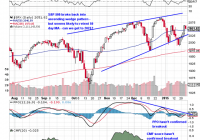
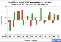
Summary SunAmerica Focused Dividend has turned it around in 2015, are the Dogs of the Dow back? Can active managers catch up after a disastrous 2014? Can the Goldbugs find a way to shine in 2015? It has only been three weeks since our posting on SunAmerica Focused Dividend (MUTF: FDSAX ) and while the ‘Dogs of the Dow’ may have continued to slumber since then, something is definitely working for the fund. In the 7th percentile on a YTD basis, the fund has delivered a solid 2.79% return since our posting compared to 1.55% for the S&P 500 and .82% for the Russell 1000 Value iShares. While we always like to see ourselves proven right (who doesn’t?), the reasons why FDSAX has outperformed so far in 2015 could spell more trouble for active management in the year to come. The secret to FDSAX’s strong performance in 2015 really isn’t that hard to figure out; just head over to Morningstar.com and check it out. What’s in the secret sauce? Well it’s not the Dogs of the Dow although only 4 of the Dogs it holds are underperforming the Dow Jones Industrial Average so far this year. The secret to their success; video games and cigarettes or put another way a deeply discounted retailer (Gamestop (NYSE: GME )) and the 4 largest remaining cigarettes manufactures in the world, the foundations of the consumer staples category. What’s made FDSAX so successful is that incredible difference in performance between the different sectors of the market with a spread of nearly 800 bps between utilities (the Utilities Select Sector SPDR ETF ( XLU) – up 4.07%) and financials (the Financial Select Sector SPDR ETF ( XLF) – down 3.88%) in 2015. For the same period of 16 trade days at the start of 2014, the spread between healthcare and consumer cyclicals was only 594 bps. If the trend continues, 2015 is shaping up to be another year that separates the true active managers from the closer indexers. Let’s start by taking a look at the broader market to see what we can make of the situation. Starting with a daily chart, the S&P 500 was pulled back into the late 2014 ascending wedge on the promise of the new ECB QE program along with a spate of negative economic reports here at home that lite the hope that the Fed’s anticipated rate hike program is on hold. (click to enlarge) While Thursday’s price action was a welcome change, all things considered the weekly action was unimpressive. The volume heading into Thursday was steadily diminishing and Friday’s close just off the lows failed to confirm the move higher. Today’s election of a new leftist government in Greece probably won’t help the open on Monday. As of press time (10:30), the VIX futures had jumped although we backing off the highs. On a weekly basis, you can see the S&P bounced off the first potential stopping out point, but we’ll need to see follow through this week to confirm whether this is just a bounce off one day’s positive news. The fact that the news that lifted the market originated overseas rather than here doesn’t strike me as particularly positive. (click to enlarge) What’s more worrying for trying to separate the closet cases from the true active managers is that the internal make-up of the market doesn’t show any signs of improving although the recent trend towards defensive sectors might be running out of steam. First let’s start with this chart showing the percentage of stocks above their 200 day moving average. You can see that the percentage is way off, even after Thursday’s big one day spike but you have to consider what did well versus what lagged last week. (click to enlarge) Sector wise, Healthcare and Financials make up nearly 30% of the S&P 500 and both lagged noticeably; the financials have been hit hard on weak earnings and healthcare stocks are showing signs that they’re running on fumes after so many years of strong performance. That strong performance is probably the biggest detractor to stronger returns going forward as long term investors have serious gains to protect. Consumer defensive’s and healthcare stocks also underperformed for the week although they make up a much smaller portion of the index at a little more than 12% while high flying REIT’s make up only around 2%. (click to enlarge) (click to enlarge) (click to enlarge) (click to enlarge) For the S&P 500 to really breadth stabilize and give the market a fighting chance to making serious gains, the last need to become the first. Consumer cyclicals and industrials make up over 22% of the S&P 500 and have had…well mixed performance following tough 2014’s. And the best that can be said about energy stocks is that they haven’t gotten lot worse. This is why market prognosticators always say defensive-led rallies are doomed to failure in the long run. They make up such a relatively small part of the market that as long as they’re pulling the market higher, the advance will be tepid and unstable. Goldbugs Take Heart: What about the Yinzer Analyst’s favorite wager of 2015, European equities? Well you can see that the unhedged iShares MSCI EMU ETF ( EZU) managed a decent advance for the week although it underperformed SPY, up 1.36% to 1.66%. On a daily chart basis, the advance off a retesting of the downtrend line was confirmed by a shift in momentum and the sharp rise in the CMF (20) score although the failure to break above the 50 day moving average was disheartening. (click to enlarge) On a weekly basis, the sharp uptick in volume was offset by a middling CMF score for the week leading to a decline in the CMF 20 and failing to confirm the breakout. With Sunday’s election in Greece, the most likely direction will be lower to retest the downtrend line. (click to enlarge) Who has enjoyed a seriously strong and undeniably positive start to 2015 are the gold miners. After so many bad years, could the global uncertainty over deflation and equity weakness here at home be ready to push the miners back towards their 2014 highs? Take a look at the daily chart below, you can see the Market Vectors Gold Miners ETF ( GDX) managed to push back into its 2014 trading range before getting stuck at the 200 day moving average, but the real handicap for the week wasn’t profit taking (we hope) or covering old losses, but a positive week for the S&P 500. Despite the best efforts of the Permanent Portfolio Fund (MUTF: PRPFX ) which is killing it in 2015, gold has lost its luster for most investors and the miners especially aren’t playing a big role in their portfolios anytime soon. But hey, room to grow right? (click to enlarge) Longer term, the miners are still stuck in the falling wedge pattern that has been guiding its destiny ever downwards since 2012. This week GDX ran smack into the upper boundary and managed to push through it before running out of steam and closing below the trend line. For those gold bugs out there, take heart. Volume was lower on the week and didn’t damage the uptrend line while the MACD seems to be in the early stages of rolling over to turn positive. Even if the move turns out to be another false rally, take heart goldbugs, the pattern continues to narrow indicating a breakout could be in the cards later in 2015. (click to enlarge) That’s it for the Yinzer Analyst tonight; he’s going to need his rack time before getting up to clear some snow. But tomorrow is a new day and another change to make some money, make sure you’re ready for whichever way the market bends.

Financial ETF: XLF No. 5 Select Sector SPDR In 2014

Summary The Financial exchange-traded fund finished fifth by return among the nine Select Sector SPDRs in 2014. Along the way, the ETF had its roughest month of the year in January, when it dipped -3.63 percent. Seasonality analysis indicates the fund could have a tough first quarter. The Financial Select Sector SPDR ETF (NYSEARCA: XLF ) in 2014 ranked No. 5 by return among the Select Sector SPDRs that divide the S&P 500 into nine portions. On an adjusted closing daily share-price basis, XLF blossomed to $24.73 from $21.49, a burgeoning of $3.24, or 15.08 percent. As a result, it behaved better than its parent proxy SPDR S&P 500 Trust ETF (NYSEARCA: SPY ) by 1.61 percentage points and worse than its sibling Utilities Select Sector SPDR ETF (NYSEARCA: XLU ) by -13.66 points. (XLF closed at $23.92 Monday.) XLF also ranked No. 5 among the sector SPDRs in the fourth quarter, when it led SPY by 2.39 percentage points and lagged XLU by -5.89 points. And XLF ranked No. 2 among the sector SPDRs in December, when it performed better than SPY by 2.11 percentage points and worse than XLU by -1.72 points. Figure 1: XLF Monthly Change, 2014 Vs. 1999-2013 Mean (click to enlarge) Source: This J.J.’s Risky Business chart is based on analyses of adjusted closing monthly share prices at Yahoo Finance . XLF behaved a lot better in 2014 than it did during its initial 15 full years of existence based on the monthly means calculated by employing data associated with that historical time frame (Figure 1). The same data set shows the average year’s weakest quarter was the third, with a relatively small negative return, and its strongest quarter was the fourth, with an absolutely large positive return. Generally consistent with this pattern, the ETF had a huge gain in the fourth quarter last year. Figure 2: XLF Monthly Change, 2014 Versus 1999-2013 Median (click to enlarge) Source: This J.J.’s Risky Business chart is based on analyses of adjusted closing monthly share prices at Yahoo Finance. XLF also performed a lot better in 2014 than it did during its initial 15 full years of existence based on the monthly medians calculated by using data associated with that historical time frame (Figure 2). The same data set shows the average year’s weakest quarter was the first, with a relatively small positive return, and its strongest quarter was the fourth, with an absolutely large positive return. Clearly, this means there is no historical statistical tendency for the ETF to explode in Q1. Figure 3: XLF’s Top 10 Holdings and P/E-G Ratios, Jan. 9 (click to enlarge) Notes: 1. “NA” means “Not Available.” 2. The XLF holding-weight-by-percentage scale is on the left (green), and the company price/earnings-to-growth ratio scale is on the right (red). Source: This J.J.’s Risky Business chart is based on data at the XLF microsite and FinViz.com (both current as of Jan. 9). Three massive equity-market bubbles are associated with the 21st century. The technology sector was ground zero when the first one burst, and the financial sector was ground zero when the second one burst. In the former case, the Technology Select Sector SPDR ETF ( XLK ) had double-digit percentage losses in each of three consecutive years (2000-2002). In the latter case, XLF had double-digit percentage losses in each of two straight years (2007-2008). It plunged by more than one-half in 2008 alone, which means the ETF is distinguished by delivering the worst annual performance by any of the sector SPDRs since their launch in December 1998. With the third massive stock-market bubble associated with the 21st century apparently in the early stage of its own bursting, I anticipate XLF will continue to be a middle-of-the-pack performer among the sector SPDRs, with the biggest risk to this expectation in the short term being the Federal Open Market Committee announcement April 29. On the one hand, the valuations of XLF’s top 10 holdings appear unlikely to function as tailwinds for the ETF’s price appreciation in the foreseeable future (Figure 3). On the other hand, numbers on the S&P 500 financial sector reported by S&P Senior Index Analyst Howard Silverblatt Dec. 31 suggested it is not all that overvalued, with its P/E-G ratio at 1.31. Disclaimer: The opinions expressed herein by the author do not constitute an investment recommendation, and they are unsuitable for employment in the making of investment decisions. The opinions expressed herein address only certain aspects of potential investment in any securities and cannot substitute for comprehensive investment analysis. The opinions expressed herein are based on an incomplete set of information, illustrative in nature, and limited in scope. In addition, the opinions expressed herein reflect the author’s best judgment as of the date of publication, and they are subject to change without notice.

Generating Alpha With A 2015 Model Portfolio

Summary 2015 will be a volatile year, and only the great stock pickers will come out significantly ahead. Don’t look for the needle in the haystack. Just buy the haystack! Taking the Jack Bogle approach might be the best way to mitigate risk and avoid unnecessary volatility. The first (and only) email request sent to SAFoundationalResearch@gmail.com was a request to create a model portfolio against the S&P 500. The weightings below are what we recommend for 2015: S&P 500 Recommendation Equity Sectors Weight Weight Difference Consumer Discretionary 12.0% 12.0% 0.0% Consumer Staples 9.9% 10.9% 1.0% Energy 8.3% 10.3% 2.0% Financials 16.5% 18.0% 1.5% Heathcare 14.5% 16.0% 1.5% Industrials 10.4% 8.9% -1.5% Information Technology 19.7% 19.7% 0.0% Materials 3.2% 3.2% 0.0% Telecom 2.3% 0.0% -2.3% Utilities 3.2% 1.0% -2.2% We fundamentally believe that 2015 will be a volatile year, and only the great stock pickers will come out significantly ahead. That being said, this portfolio will take the Jack Bogle approach and will strictly purchase SPDR ETFs. “Don’t look for the needle in the haystack. Just buy the haystack!” – Jack Bogle Some other rules for this $100,000 model portfolio: Opportunity to rebalance quarterly (but not required) Must be within +/-3% of the sector benchmark Must be at least 80% invested at all times Recommended $100,000 Model Portfolio Ticker Price as of Jan 2, 2015 Number of Shares Consumer Discretionary Select Sector SPDR ETF (NYSEARCA: XLY ) 72.15 166 Consumer Staples Select Sector SPDR ETF (NYSEARCA: XLP ) 48.49 224 Energy Select Sector SPDR ETF (NYSEARCA: XLE ) 79.16 130 Financial Select Sector SPDR ETF (NYSEARCA: XLF ) 24.73 727 Health Care Select Sector SPDR ETF (NYSEARCA: XLV ) 68.38 233 Industrial Select Sector SPDR ETF (NYSEARCA: XLI ) 56.58 157 Technology Select Sector SPDR ETF (NYSEARCA: XLK ) 41.35 476 Materials Select Sector SPDR ETF (NYSEARCA: XLB ) 48.58 65 Utilities Select Sector SPDR ETF (NYSEARCA: XLU ) 47.22 21 Cash 244.31 244.31 After this article, Foundational Research will post a series of articles for each sector and the respective industries. Below are some highlights on half of the sectors: Technology Sector Highlights We remain cautious on the technology sector, and recommend an equal weight. Although the sector, as measured by the XLK, has outperformed the broader market in 2015, much of that is due to AAPL, which accounts for more than 16% of the XLK index. We also believe the shift to cloud computing will have a negative impact on earnings for most large-cap technology companies, especially over the next few years, when the highest switching over/expenditure costs are expected. Valuations are also higher than they used to be, with overall tech trading at a 22% premium to the 5-year median P/E and a 70% premium to trough valuation, but the Technology sector still trades at a -9% discount to the S&P 500. Telecommunications Sector Highlights News flow continues to be almost exclusively negative in the telecommunications sector. Pricing is likely to continue to be a problem in wireless, and the wireline business is in secular decline. The negative pricing/promotion backdrop in wireless accelerated this past year. While the competitive condition may take a seasonal respite early this year following the holidays, the intermediate-term prospects in this regard is for more of the same, in our opinion. That is, more brutal competition. Energy Sector Highlights The downturn in crude oil prices and the prices for oil & natural gas-related stocks accelerated to the downside over the two quarters. Demand continued to suffer from weak economic conditions and/or slowing economic growth, particularly in the eurozone and China. At the same time, investors were spooked by ongoing strong oil production growth from US unconventional basins and the recovery of disrupted output from Libya. There was also the risk that the sanctions on Iran might be reduced or eliminated, potentially opening the way for increased production (approx. +500,000-700,000 barrels/d). Finally, OPEC was not able to come to an agreement to cut production to balance the market, leading to a sizeable drop in oil prices the day after Thanksgiving. We believe that the share prices have over-reacted to the crude oil price drop. Historically speaking, whenever energy stocks have lead decline for six months, they then lead for the following six months. “This time is different” often leads investors astray. Industrial Sector Highlights We are concerned that reductions to oil & gas capital spending budgets will have an outsized impact on the machinery and electrical equipment industries. There appears to be an expectation that better consumer spending trends following cheaper gasoline prices will spur further capital spending from the consumer discretionary sector. This may be the case, but we’d expect any pickup in capex from the discretionary sector to take time, while the cuts from the oil & gas complex will be more immediate. Additionally, sales into the oil & gas complex are among the most profitable for our companies, and will be difficult to replace (even if there is a pickup in consumer discretionary capex). Consumer Discretionary Highlights The market weight recommendation on the consumer discretionary sector reflects a more balanced view of the tailwinds and headwinds facing the group over this year. Fairly significant 2014 underperformance in the group has led to more reasonable relative valuations of late, and that, coupled with falling gas prices (a potential benefit to the consumer) and easing top line/margin comparisons in F15 have resulted in a more balanced risk/reward. That being said, many near-term macro data points remain mixed (i.e. jobs, housing, food commodity costs) and could keep a lid on overall earnings growth, which prevents a more constructive view on the group, for now. Material Sector Highlights Downstream is the new upstream. While we retain our neutral recommendation on the complex, we favor downstream/processed/refined-related commodity companies that benefit from the decline in upstream pricing. The perfect storm of increased production, stemming from higher prices, followed by slowing demand growth has resulted in a backdrop where many upstream commodities are in “oversupply.” The stronger United States dollar is only adding fuel to the fire. We would remain positioned in those commodities that benefit from falling inputs and oligopolic behavior. Our two preferred commodities are steel and aluminum, with the former capitalizing on falling iron ore prices, and the latter on falling power prices. We would avoid copper and iron ore where we have yet to see price support, as the cost curve continues to decline. Consumer Staples Highlights The third-quarter earnings results certainly did not encourage us to change our view. The operating environment remains challenging for packaged goods companies, especially so for food companies, yet the consumer staples sector continues to make new highs. Investors seem to continue to seek out yield, and probably even more so, stability, as we move toward year-end. Category growth remains sluggish in developing markets, and has slowed in emerging markets. The currency headwinds have intensified for many companies. Domestic attempts to drive volume with more promotions have not been as successful as in the past. The debate continues as to whether there has not been enough innovation or the consumer is still in a constrained in spending mode – we believe it has. Healthcare Highlights We continue to believe the Patient Protection and Affordable Care Act (ACA) will be a positive force in healthcare for the next 3-5 years, with some potential ramifications that need to be watched. As we approach year 2 of the expansion part of the law, Republicans have taken control of the Senate, and the Supreme Court has decided to review another case relating to the legislation. Scientific breakthroughs are creating a cornucopia of new biopharmaceuticals for unmet or poorly served medical needs. The demographics of the major industrialized nations, including North America, Europe, and Japan, are changing to larger populations of elderly patients, who are major consumers of drugs. Utilities Highlights We see nothing operationally wrong with the Utilities sector. The reach for yield has caused share prices to increase. Without a capex increase, and with prices as high as they are, we believe they will not appreciate any further. The last time the Utilities sector lead the market over the course of a year, as it did in 2014, it only returned 1% total return the next year. Over the next few weeks, we will go in-depth on each sector, so please remember to “Follow” us to not miss anything!