Tag Archives: nysearcaxle

A Red Flag On The S&P 500 Index

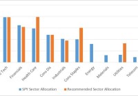
Summary The U.S. Economy is growing at an above trend pace over the last 2 quarters. Despite this there has been recent volatility in U.S. equity markets and there was a shift in sector performance. Nonetheless the trend in the S&P 500 remains intact with a 3 month outlook on the S&P 500 at 1170. A Red Flag On The S&P 500 I love the beach. Almost every weekend I would go on afternoons and take a swim. I would build sand castles and often times swim in the water and if I were hungry I would go by the local kiosk and eat some delicacies such as “Bake & Shark” or “pholouri”. Those were fun times. Even now when I get an opportunity I would spend some of my vacation days by the beach relaxing on the sand. But every time by the beach wasn’t always pristine. On some days there would have been rough waters or areas of roughness by the bay. The lifeguards would put up these red flags by the areas that were not safe for swimming. The red flags were a warning for swimmers so that drowning would be prevented. On the Friday 16th January 2015 close of the U.S. equity market, I observed a red flag on the S&P 500 Index. While the U.S. economy has been moving at an above trend pace over the past couple of quarters and the risk premium for investing in U.S. stocks are at 1-year lows, there has been a shift in sector performance, showing that the S&P 500 Index is becoming defensive. As such a new asset allocation is recommended. While still being overweight in U.S. equities by having a position in the SPDR S&P 500 Trust ETF (NYSEARCA: SPY ), a heavy overweight position in the health care sector is recommended, through the Health Care Select Sector SPDR Fund (NYSEARCA: XLV ). Slightly overweight positions are proposed in the Consumer Staples Select Sector SPDR ETF (NYSEARCA: XLP ) and the Utilities Select Sector SPDR ETF (NYSEARCA: XLU ) . Neutral positions should be observed in info tech through the Technology Select Sector SPDR ETF (NYSEARCA: XLK ) and the Consumer Discretionary Select Sector SPDR ETF (NYSEARCA: XLY ). Finally underweight positions in the energy sector through the Energy Select Sector SPDR ETF (NYSEARCA: XLE ), the materials sector through the Materials Select Sector SPDR Fund (NYSEARCA: XLB ) and telecoms through the SPDR S&P Telecom ETF (NYSEARCA: XTL ) are also recommended. The table below illustrates the recommendations. Chart 1 – Recommended Portfolio Allocation Versus S&P 500 Index as at Jan 9 th 2015 (click to enlarge) Source: Cerebro Recommendation using Microsoft Excel By looking at the allocation the portfolio is prepped for rough waters. On a weekly basis the portfolio metrics utilized to derive the portfolio allocation will be analyzed to determine whether another shift in asset allocation is required. Economic Activity Over the past couple of quarters the U.S. economy has been operating at an above trend pace. Latest figures show that U.S. GDP grew 2.7% year over year in the 3rd quarter of 2014, 0.4% higher when compared to the previous comparable quarter. U.S. GDP growth is also moving above its 4 quarter moving average of 2.6%. Chart 2 – U.S. GDP Growth (Y-o-Y %) as at Sept 2014 (click to enlarge) Source: Bloomberg The U.S. has been one of the leaders of growth from the developed economies and this trend is expected to continue, with its consumers obtaining a stronger purchasing power due to a strengthening U.S. Dollar. One of the more visible aspects of an appreciating U.S. Dollar was the decline in WTI Crude Oil. The over 50% decline in oil should bode well for the U.S. consumer. The uptrend in growth is also expected to continue as the slack in the U.S. labor market recedes. Chart 3 – U.S. Unemployment Rate (%) as at Dec 2014 (click to enlarge) Source: Bloomberg The U.S. unemployment rate stood at 5.6% at the end of the year, below the 12 month average of 6.2% and it is the lowest rate over the past 5 years. The “weather” in the U.S. appears to be just fine. Things appear to be going so well in the U.S. that the Fed ended its Q.E. program in October 2014. Also analysts expect the Fed to be raising its benchmark rate by the 3rd quarter of 2015. The Fed has continuously reiterated that it is data dependent and it will not make a move in rates unless the data corroborates the move. This is why the rate increase is expected 6 months ahead because the inflation data does not reflect a hike in rates. Over the month of November, U.S. CPI had the largest decline since December 2008. The retreat was attributed to the precipitous fall in fuel. U.S. CPI fell to 1.3% year-over-year in November 2014. The less volatile core CPI fell 0.1% year-over-year to 1.7%. Energy costs fell 3.8% versus a month earlier, led by a 6.6% decline in gasoline. While rent, medical care and airline fares rose, it was negated by the largest drop in clothing costs in 16 years and the largest fall in prices in used cars & trucks in September 2012. The declining energy & transportation costs will help both companies and consumers, improving the expectations for an increase in the S&P 500 Index in the short to medium term. Chart 4: 5-Year Chart of U.S. CPI (Y-o-Y %) as at Nov 2014 (click to enlarge) Source: Bloomberg Relative Asset Allocation & Sector Rotation Metrics By looking at the performance of bonds, stocks and commodities, a next move in the asset class performance of stocks can be forecasted as all these assets are related. Table 1: Total Returns of SPY, the iShares 7-10 Year Treasury Bond ETF (NYSEARCA: IEF ) & the PowerShares DB Commodity Index Tracking ETF (NYSEARCA: DBC ) ETFs Over Various Time Periods as at Jan 16 th 2015 Source: Bloomberg Chart 5: 6-Stage Business Cycle Source: StockCharts Based on the total returns of the ETFs above, the commodities are in a bear market while stocks and bonds are performing positively. Based on the above data it can be said that we are in stage 2 of the business cycle, with stocks and bond prices expected to continue to increase. Given that U.S. yields are expected to decline, stocks remain favored over bonds with the earnings yield of the S&P 500 at 5.58% as at January 16th 2015 while the U.S. 10-Year yield is at 1.84%. The difference between the 2 asset classes is 3.74%. On average, over the past year, the S&P 500 made a daily low when the difference or spread was 3.49%. Another point to note is that on average, over the past 12 months, the spread when the S&P 500 made a daily high was 3.09%. Thus one can deduce that the S&P 500 is closer to making a new low than a new high and that this low would be made soon (and perhaps around the 2040 to 2015 price zone). A daily price high can be deduced when the spread between the S&P 500 earnings yield and the U.S. 10 Year yield nears or is less than 3.09%. It can be construed that investors are not prepared to invest in U.S. equities as the risk premium (the value attained for buying such a risky asset as U.S. equities) for investing in U.S. equities heads below 3.09%. While the “weather” appears good, the waters are rough and it triggered a red flag. This red flag was derived from the shift in sector performance over the last couple of weeks. The tables below denote the shift. Table 2: S&P 500 Sector Total Returns Over Various Time Periods as at January 9 th 2015 Source: Bloomberg Table 3: S&P 500 Sector Total Returns Over Various Time Periods as at January 16 th 2015 Source: Bloomberg The health care, consumer staples and utilities all became leaders, indicating that the market is defensive, despite the S&P 500 Index having a larger than average risk premium. This move in sector performance complemented the move in the VIX, a measure of volatility for the S&P 500, which made a daily high of 23.34, which is below the 1 year October 2014 high of 31.06. Chart 6: Daily VIX Candlestick Chart as at 16 th Jan 2015 (click to enlarge) Source: Bloomberg Despite the shift in total returns of the sectors, when the returns are weighed versus the S&P 500, which smoothens the data, the shift is not so drastic. Chart 6: S&P 500 Sector Relative Rotation Graph as at January 16 th 2015 (click to enlarge) Source: Bloomberg From the relative rotation graph above we can see that info tech and health care are the leaders while telecom, materials & telecom are the laggards. Utilities & consumer staples are neutral with positive momentum while financials and consumer discretionary are also neutral, with negative momentum. By marrying the two concepts, total return sector performance & sector relative rotation, the recommended sector allocation in chart 1 was derived. Technical Analysis Based on the chart analysis as well as the risk premium in the S&P 500, support is seen around the 2040 to 2015 price region, with the S&P 500 expected to reach 1170 over the next 3 months. Chart 7: S&P Index 500 Candlestick Chart as at Jan 16 th 2015 (click to enlarge) Source: Bloomberg
What’s Hot, What’s Not: SPY And Select Sector SPDRs At The Dawn Of 2015

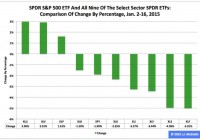
Summary The SPDR S&P 500 ETF has not had a happy new year thus far, shedding 1.90 percent in the first 11 trading days of 2015. During this period, the Utilities exchange-traded fund was first by return among the Select Sector SPDRs, rising 2.96 percent. Over the same time frame, the Financial ETF was last by return among the sector SPDRs, falling -5.01 percent. The U.S. equity market’s large-capitalization segment has been characterized by the relative overperformance of low-beta Select Sector SPDRs and the relative underperformance of high-beta sector Select Sector SPDRs in 2015 year to date, just as it was in 2014. Meanwhile, their parent proxy, the SPDR S&P 500 Trust ETF (NYSEARCA: SPY ) has struggled this year, as it dipped to $201.63 from $205.54, a drop of -$3.91, or -1.90 percent. This long-term sector rotation appears important for multiple reasons at this late stage of the economic/market cycle. With respect to economic matters, the International Monetary Fund cut its forecast Tuesday for global growth this year, to 3.5 percent from 3.8 percent, and the World Bank Group did likewise Jan. 13, to 3.0 percent from 3.4 percent. With respect to market matters, the S&P 500’s cyclically adjusted price-to-earnings ratio is at the historically lofty level of 26.77, according to 2013 Nobel Prize-winning economist Robert J. Shiller . Appearing below are comparisons of changes by percentages in SPY and all nine sector SPDRs in 2015 year to date, last month, last quarter and last year. Figure 1: XLU No. 1 Among Select Sector SPDRs This Year (click to enlarge) Source: This J.J.’s Risky Business chart is based on analyses of adjusted closing daily share prices at Yahoo Finance . In 2015, the Utilities Select Sector SPDR ETF ( XLU ), Health Care Select Sector SPDR ETF (NYSEARCA: XLV ) and Consumer Staples Select Sector SPDR ETF (NYSEARCA: XLP ) have been not only the best behaved but also the only ones with positive returns among the sector SPDRs that break the S&P 500 into nine chunks. Elsewhere, I indicated it is an article of faith (and statistical interpretation) hereabouts that so-called PUV analysis is better than psychoanalysis in determining Mr. Market’s state of mind. What is PUV analysis? It is basically the study of the behaviors of XLP, XLU and XLV in comparison with their sibling sector SPDRs. If the PUV cluster of ETFs ranks in or near the top third of the sector SPDRs by return during a given period, then I believe market participants are in risk-off mode; if the PUV cluster of ETFs ranks in or near the bottom third of the sector SPDRs by return over a given period, then I think market participants are in risk-on mode. Given the relative performances of XLP, XLU and XLV that have them in the top three spots among the sector SPDRs this year, I believe market participants are in risk-off mode. And I think they will continue to be so, with changes in policy at the U.S. Federal Reserve the biggest reason why. In this context, I note the Fed announced the conclusion of purchases under its latest QE program Oct. 29 and that the ends of purchases under its previous two formal QE programs are associated with both a correction and a bear market in large-cap stocks, as evidenced by SPY’s dipping -17.19 percent in 2010 and dropping -21.69 percent in 2011. Figure 2: XLU No. 1 Among Select Sector SPDRs In December (click to enlarge) Source: This J.J.’s Risky Business chart is based on analyses of adjusted closing daily share prices at Yahoo Finance. XLU also was the big winner among the Select Sector SPDRs last month, when the Technology Select Sector SPDR ETF (NYSEARCA: XLK ) was the big loser in the group. I suspect XLK may continue to struggle this year, with one large reason being the bias divergence in monetary policy at major central banks around the world. On the one hand, the U.S. Federal Reserve is oriented toward tightening; on the other hand, the Bank of Japan, European Central Bank and People’s Bank of China are oriented toward loosening. This divergence has led to significant movements in exchange rates, such as in the euro and U.S. dollar currency pair, or EUR/USD. The EUR/USD cross fell from as high as $1.3992 May 8 to as low as $1.1459 Jan. 16, a tumble of -$0.2533, or -18.10 percent, based on data at StockCharts.com. The change in EUR/USD and similar moves in other currency pairs indicate a strengthening greenback and a weakening everything else could pressure earnings of U.S. companies in sectors with substantial international businesses, which most likely will be a headwind for many of XLK’s components. Anyone doubting the effects of central-bank policy on financial markets should take a close look at the impacts associated with the Swiss National Bank’s surprise decision to discontinue its fixing of the minimum exchange rate between the Swiss franc and the euro last week, which I briefly covered in a piece at the International Business Times . Figure 3: XLU No. 1 Among Select Sector SPDRs In Q4 (click to enlarge) Source: This J.J.’s Risky Business chart is based on analyses of adjusted closing daily share prices at Yahoo Finance. XLU also ranked No. 1 among the Select Sector SPDRs last quarter, while the Energy Select Sector SPDR ETF (NYSEARCA: XLE ) ranked No. 9 in the group. Recently, I argued lockstep movements of the EUR/USD currency pair, the commodity price of crude oil and the share price of XLE appear likely to continue unless the Federal Open Market Committee makes clear it will delay the anticipated announcement of its interest-rate hikes April 29 and that it is preparing to carry out asset purchases under its fourth formal quantitative-easing program of the 21st century, aka QE4. I also argued the FOMC may be hard-pressed to present a convincing rationale for those actions, given the conditions described in “SPY Slips And U.S. Economic Index Slides In December” and that, without them, XLE might continue to be the equivalent of a canary in coal mine where things are looking darker by the day. These arguments still make sense to me. Meanwhile, I anticipate being underwhelmed by the ECB action or inaction on its own QE to come Thursday, and I expect Mr. Market will be so, too, except on a short-term trading basis, with plenty of sound and fury, signifying (nearly) nothing. Figure 4: XLU No. 1 Among Select Sector SPDRs In 2014 (click to enlarge) Source: This J.J.’s Risky Business chart is based on analyses of adjusted closing daily share prices at Yahoo Finance. I am detecting a pattern here: XLU also led the way among the Select Sector SPDRs last year, when XLE lagged the rest of its siblings. Consistent with the above discussion of PUV analysis, I consider XLU key to the assessment of market sentiment based on the comparative behaviors of the sector SPDRs. If XLU ranks near No. 1 by return during a given period, then I believe market participants are in risk-off mode; if XLU ranks near No. 9 by return over a given period, then I think market participants are in risk-on mode. In the current environment, I therefore would be completely unsurprised should XLU continue to behave well this quarter and this year, not on an absolute basis but on a relative basis (i.e., in comparison with the other sector SPDRs and with SPY). The ETF may not produce gains, but it might produce losses smaller than those of its siblings, which is another way of saying SPY looks vulnerable, right here, right now. (Unless, of course, the Federal Reserve comes riding to the rescue, as it did in 2010, 2011 and 2012.) Disclaimer: The opinions expressed herein by the author do not constitute an investment recommendation, and they are unsuitable for employment in the making of investment decisions. The opinions expressed herein address only certain aspects of potential investment in any securities and cannot substitute for comprehensive investment analysis. The opinions expressed herein are based on an incomplete set of information, illustrative in nature, and limited in scope. In addition, the opinions expressed herein reflect the author’s best judgment as of the date of publication, and they are subject to change without notice.

Don’t Rely On Your Emotions To Trade The Oil Patch

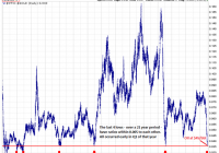
An inflection point has been reached in oil’s valuation per barrel. The Oil/Gold ratio at this level has historically confirmed a trend change. The supply/demand news cycle is beginning to turn. (The Oil/Gold Ratio: click to enlarge) The first thing one sees in the chart (above) is an almost perfect symmetry, with each low point occurring early in Q1 on the red line (excepting 1986, 88, 89). It begs a question for the curious: Under what previous economic conditions did the oil/gold ratio reach today’s extremes? What is the correlation in barrels per oz. of gold?” “How far into this drop are we currently?” We are at Financial Crisis lows (2008-09); and the deep devaluations of the late-1980s are the only levels remaining to be pierced. The oil/gold ratio has been at this level three times in the last two decades, and each time it rallied. The current comparison clocks in at $45/bbl. How cheap is oil? Early this morning you could buy 28 barrels of oil with a single oz. of gold, the most in the modern era (excepting 1988). I am using the price of gold to value a barrel of crude because gold is a storage of value. Oil is a cultural commodity and the substrate of modern industrial society. In terms of financial comparisons, gold retains its value, oil we use ubiquitously. The ratio measures the cost of that use. Observe the parabolic surges in the chart below. Excepting the go-go years of impossibly cheap oil (1986 and 1989), each one of these telephone-pole tops flamed-out quickly. (click to enlarge) If zoomed-in for a closer look (below), you can see that the final weeks of the surge (red boxes) were composed of unsustainable, soaring price-gaps. For example, an ounce of gold this morning could buy you 33% more oil than on January 1, 2015, less than 3 weeks ago; or 60% more oil than in November, 2014! Is this any way to price a commodity that’s used 91ML bbl a day? In just the last week we have had several 5% up and down days close-by in sequence, resulting in single-session half-trillion dollar gains or losses for crude oil. This kind of price discovery only occurs near turning-points – when the market can’t figure out what something is worth – when all the news and analysis is clouded in total confusion – and hence the focus of this article. For ages, if you wanted to figure out what something was worth, you compared it to gold; and at this point, oil is as cheap as it gets. (click to enlarge) In my previous articles, I have used a pressure-cooker model to scale into positions through dollar-cost averaging, buying at gradual intervals over a few weeks time. This method sometimes takes weeks, even months, to fulfill, but in the end it works, because every tick down lowers the cost-basis before the eventual turn. The important thing is to begin near the extremes. Crude oil is selling for less than it takes to drill, ship and deliver it almost anywhere in the world. Some OPEC countries could actually default on their debts if crude oil remains in this state of devaluation. But there is hope on the horizon. An upcoming storm of lay-offs, falling rig counts, and production cuts is beginning to slash into the North American crude suppliers (the source of oversupply), and by 2Q’2015 this pullback should be in full swing. SA author Wolf Richter fully describes this retrenchment in his fiery articles . The trade here is to gradually buy into a crude oil ETF, for example, XLE , OIL , or USO , and hold until oil hits $70/bbl. For the more speculative investor, the leveraged ETFs – UCO (2x crude), or UWTI (3x crude) are also an option.