Tag Archives: nysearcaspy

What’s Hot, What’s Not: SPY And Select Sector SPDRs At The Dawn Of 2015

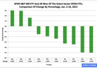
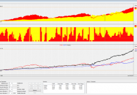
Summary The SPDR S&P 500 ETF has not had a happy new year thus far, shedding 1.90 percent in the first 11 trading days of 2015. During this period, the Utilities exchange-traded fund was first by return among the Select Sector SPDRs, rising 2.96 percent. Over the same time frame, the Financial ETF was last by return among the sector SPDRs, falling -5.01 percent. The U.S. equity market’s large-capitalization segment has been characterized by the relative overperformance of low-beta Select Sector SPDRs and the relative underperformance of high-beta sector Select Sector SPDRs in 2015 year to date, just as it was in 2014. Meanwhile, their parent proxy, the SPDR S&P 500 Trust ETF (NYSEARCA: SPY ) has struggled this year, as it dipped to $201.63 from $205.54, a drop of -$3.91, or -1.90 percent. This long-term sector rotation appears important for multiple reasons at this late stage of the economic/market cycle. With respect to economic matters, the International Monetary Fund cut its forecast Tuesday for global growth this year, to 3.5 percent from 3.8 percent, and the World Bank Group did likewise Jan. 13, to 3.0 percent from 3.4 percent. With respect to market matters, the S&P 500’s cyclically adjusted price-to-earnings ratio is at the historically lofty level of 26.77, according to 2013 Nobel Prize-winning economist Robert J. Shiller . Appearing below are comparisons of changes by percentages in SPY and all nine sector SPDRs in 2015 year to date, last month, last quarter and last year. Figure 1: XLU No. 1 Among Select Sector SPDRs This Year (click to enlarge) Source: This J.J.’s Risky Business chart is based on analyses of adjusted closing daily share prices at Yahoo Finance . In 2015, the Utilities Select Sector SPDR ETF ( XLU ), Health Care Select Sector SPDR ETF (NYSEARCA: XLV ) and Consumer Staples Select Sector SPDR ETF (NYSEARCA: XLP ) have been not only the best behaved but also the only ones with positive returns among the sector SPDRs that break the S&P 500 into nine chunks. Elsewhere, I indicated it is an article of faith (and statistical interpretation) hereabouts that so-called PUV analysis is better than psychoanalysis in determining Mr. Market’s state of mind. What is PUV analysis? It is basically the study of the behaviors of XLP, XLU and XLV in comparison with their sibling sector SPDRs. If the PUV cluster of ETFs ranks in or near the top third of the sector SPDRs by return during a given period, then I believe market participants are in risk-off mode; if the PUV cluster of ETFs ranks in or near the bottom third of the sector SPDRs by return over a given period, then I think market participants are in risk-on mode. Given the relative performances of XLP, XLU and XLV that have them in the top three spots among the sector SPDRs this year, I believe market participants are in risk-off mode. And I think they will continue to be so, with changes in policy at the U.S. Federal Reserve the biggest reason why. In this context, I note the Fed announced the conclusion of purchases under its latest QE program Oct. 29 and that the ends of purchases under its previous two formal QE programs are associated with both a correction and a bear market in large-cap stocks, as evidenced by SPY’s dipping -17.19 percent in 2010 and dropping -21.69 percent in 2011. Figure 2: XLU No. 1 Among Select Sector SPDRs In December (click to enlarge) Source: This J.J.’s Risky Business chart is based on analyses of adjusted closing daily share prices at Yahoo Finance. XLU also was the big winner among the Select Sector SPDRs last month, when the Technology Select Sector SPDR ETF (NYSEARCA: XLK ) was the big loser in the group. I suspect XLK may continue to struggle this year, with one large reason being the bias divergence in monetary policy at major central banks around the world. On the one hand, the U.S. Federal Reserve is oriented toward tightening; on the other hand, the Bank of Japan, European Central Bank and People’s Bank of China are oriented toward loosening. This divergence has led to significant movements in exchange rates, such as in the euro and U.S. dollar currency pair, or EUR/USD. The EUR/USD cross fell from as high as $1.3992 May 8 to as low as $1.1459 Jan. 16, a tumble of -$0.2533, or -18.10 percent, based on data at StockCharts.com. The change in EUR/USD and similar moves in other currency pairs indicate a strengthening greenback and a weakening everything else could pressure earnings of U.S. companies in sectors with substantial international businesses, which most likely will be a headwind for many of XLK’s components. Anyone doubting the effects of central-bank policy on financial markets should take a close look at the impacts associated with the Swiss National Bank’s surprise decision to discontinue its fixing of the minimum exchange rate between the Swiss franc and the euro last week, which I briefly covered in a piece at the International Business Times . Figure 3: XLU No. 1 Among Select Sector SPDRs In Q4 (click to enlarge) Source: This J.J.’s Risky Business chart is based on analyses of adjusted closing daily share prices at Yahoo Finance. XLU also ranked No. 1 among the Select Sector SPDRs last quarter, while the Energy Select Sector SPDR ETF (NYSEARCA: XLE ) ranked No. 9 in the group. Recently, I argued lockstep movements of the EUR/USD currency pair, the commodity price of crude oil and the share price of XLE appear likely to continue unless the Federal Open Market Committee makes clear it will delay the anticipated announcement of its interest-rate hikes April 29 and that it is preparing to carry out asset purchases under its fourth formal quantitative-easing program of the 21st century, aka QE4. I also argued the FOMC may be hard-pressed to present a convincing rationale for those actions, given the conditions described in “SPY Slips And U.S. Economic Index Slides In December” and that, without them, XLE might continue to be the equivalent of a canary in coal mine where things are looking darker by the day. These arguments still make sense to me. Meanwhile, I anticipate being underwhelmed by the ECB action or inaction on its own QE to come Thursday, and I expect Mr. Market will be so, too, except on a short-term trading basis, with plenty of sound and fury, signifying (nearly) nothing. Figure 4: XLU No. 1 Among Select Sector SPDRs In 2014 (click to enlarge) Source: This J.J.’s Risky Business chart is based on analyses of adjusted closing daily share prices at Yahoo Finance. I am detecting a pattern here: XLU also led the way among the Select Sector SPDRs last year, when XLE lagged the rest of its siblings. Consistent with the above discussion of PUV analysis, I consider XLU key to the assessment of market sentiment based on the comparative behaviors of the sector SPDRs. If XLU ranks near No. 1 by return during a given period, then I believe market participants are in risk-off mode; if XLU ranks near No. 9 by return over a given period, then I think market participants are in risk-on mode. In the current environment, I therefore would be completely unsurprised should XLU continue to behave well this quarter and this year, not on an absolute basis but on a relative basis (i.e., in comparison with the other sector SPDRs and with SPY). The ETF may not produce gains, but it might produce losses smaller than those of its siblings, which is another way of saying SPY looks vulnerable, right here, right now. (Unless, of course, the Federal Reserve comes riding to the rescue, as it did in 2010, 2011 and 2012.) Disclaimer: The opinions expressed herein by the author do not constitute an investment recommendation, and they are unsuitable for employment in the making of investment decisions. The opinions expressed herein address only certain aspects of potential investment in any securities and cannot substitute for comprehensive investment analysis. The opinions expressed herein are based on an incomplete set of information, illustrative in nature, and limited in scope. In addition, the opinions expressed herein reflect the author’s best judgment as of the date of publication, and they are subject to change without notice.

What Does History Tell Us About Consolidated Edison’s Valuation?

Shares of Consolidated Edison have previously traded at a valuation comparable to today’s mark. This article looks at what happened then, noting that while the P/E ratios are similar, today’s dividend yield is lower. In the end it comes down to your expectations, but it appears as though shares of ED are exchanging hands at the upper end of their historical range. Shares of Consolidated Edison (NYSE: ED ) increased in price by about 19% during 2014 — moving from $55.28 at the beginning of the year to $66.01 at year-end. If you add in dividends received, equating to $2.52 per share , your total return would have been roughly 24% — a full 10% higher than the S&P 500 index (NYSEARCA: SPY ). Despite the strong underlying business, this wouldn’t be something that you would expect moving forward. Utilities don’t routinely provide market-beating returns, at least not year-in and year-out. During the past 12 months the company reported earnings per share of $4 . With today’s share price around $68, this translates to a P/E ratio nearing 17, a dividend yield of 3.7% and payout ratio of 63%. The valuation approached similar levels during 2012 and 2013, but really you have to go back to 2007 to make a reasonable historical comparison — one or two years of history isn’t as telling as eight might be. At the end of 2006 the company reported adjusted earnings per share around $3 . During March of 2007, shares were changing hands around $51 resulting in a trailing P/E ratio near 17 — much like today. The dividends declared that year equaled $2.32, for a dividend yield of 4.6% and a payout ratio near 80%. Today the dividend yield and payout ratio is lower, but has a similar earnings multiple. So how did things end up for the investor of 2007, partnering with the company at a higher valuation and lower dividend yield than what was recently available? As previously mentioned, the stock price went from $51 to $66 — a 29% total increase or an annual increase of about 3%. Here’s a look at the dividends received: 2007 = $1.74 2008 = $2.34 2009 = $2.36 2010 = $2.38 2011 = $2.40 2012 = $2.42 2013 = $2.46 2014 = $2.52 Note that this particular investor would have missed a dividend payment in 2007 due to the March purchase date. In total you would have collected $18.62 per share in dividends for a total value of roughly $85 or a 6.8% annualized compound return. Earnings per share grew by nearly 4% over this time, while the dividend grew by just over 1% per year. Shares would have traded at roughly the same beginning and end P/E, which means the return was a function of earnings growth and an above average dividend. If the company is able to grow earnings and dividends by a similar amount moving forward, you might expect returns to be in the 6% to 8% range — quite reasonable for a slow growing utility with a steady eddy dividend. However, these assumptions are based on the same historical growth and the same future earnings multiple. Let’s look at different possibilities to get a better feel for where shares to stand today. Although Consolidated Edison has previously traded with a similar valuation as it does today — call it 17 times trailing earnings — it hasn’t traded much higher than this, at least not in the last few decades. So it wouldn’t be especially prudent to suggest that shares might trade at 22 times earnings next year or something of the sort. It’s possible, sure, but that wouldn’t be a particularly cautious expectation. Instead, you might imagine that an earnings multiple closer to 14 or 15 would be more appropriate — as has been the historical norm. Analysts are expecting intermediate-term earnings growth to be in the 2% to 3% range — let’s call it 3%. While the dividend could grow at a faster rate, the company’s recent history isn’t especially impressive in this regard. For illustration, let’s use a dividend growth rate of 2%. If the dividend per share were to grow by 2% annually, this could mean collecting 20% of your original investment in the form of dividends within five years. However, 3% earnings growth and future P/E of 15 would mean that the share price would effectively stagnant. As such, your total return expectation would be entirely dependent on the dividend resulting in roughly 4% returns on an annualized basis. Of course all of this is speculation — Consolidation Edison could grow much faster or even slower in the future. However, using information like this can better prepare you for making financial expectations. In a reasonably rosy “good case” an investor of today could see total annual returns in the 6% to 8% range. These returns are dependent on shares either trading with a higher than normal P/E ratio or else seeing the business perform better than expected. Your base case would be 3% to 5% yearly returns, effectively collecting the dividend payment along the way. This payment would be expected to grow — as it has for the last 40 years — albeit at a relatively slow pace. Finally, a downside case — say 1%-2% earnings growth and a 14 P/E — might indicate yearly returns of just 1%-2%. Whether or not today’s price is “too high” for Consolidation Edison is up to you, but keep in mind that its more difficult to “grow out of overpaying” for a slower growth utility. What does history tell us about Consolidated Edison’s current valuation? By starting with a higher earnings multiple, it’s possible to see reasonable returns in the future but not altogether prudent to expect them.

SPY-TLT Universal Investment Strategy 20 Year Backtest

20 year strategy backtest using Vanguard VFINX/VUSTX index funds as a proxy for SPY/TLT. The strategy uses an adaptive SPY/TLT allocation, depending of the market environment. The strategy achieves 2x the return to risk ratio and a 5x smaller max drawdown than a buy and hold S&P 500 investment. In a previous article ” The SPY-TLT Universal Investment Strategy ” I presented a simple strategy which allowed to obtain an excellent return to risk ratio only by investing in variable allocations to the SPDR S&P 500 Trust ETF ( SPY) and the i Shares 20+ Year Treasury Bond ETF (NYSEARCA: TLT ) allocations. The allocation of the SPY/TLT pair is rebalanced monthly using a modified sharpe formula. For the new month, the strategy always uses the allocation ratio which achieved the highest modified sharpe ratio for a given lookback period. Here the algorithm uses a 72 day lookback period and a volatility factor of 2.5 in the modified sharpe formula: sharpe=72 day return/72 day standard deviation ^ 2.5. Several readers asked me now to present a longer backtest of this strategy. Using the Vanguard Five Hundred Index Fund Inv ( VFINX) and the Vanguard Long Term Treasury Fund Inv (MUTF: VUSTX ) as a proxy to the SPY/TLT ETFs, here is now a 20 year backtest for the UIS strategy. These index funds are only used to do the 20 year backtest. To run the strategy you would still invest using SPY and TLT. You can also use futures (ES/UB) or leveraged ETFs ( Direxion Daily S&P 500 Bull 3X Shares ETF ( SPXL)/ Direxion Daily 30-Year Treasury Bull 3x Shares ETF ( TMF) or Direxion Daily S&P 500 Bear 3X Shares ETF ( SPXS)/ Direxion Daily 30-Year Treasury Bear 3x Shares ETF ( TMV)) instead. This is explained in detail in my previous article. With these two Vanguard funds, this is now one of the rare strategies which can be easily backtested for such a long period. In general however, I think that it is much more important, how a strategy performed after 2008. The market has changed considerably during these last years, and if you would only invest in strategies which can be backtested 20 or more years, then you would have missed most of the investment opportunities of the recent years. For the backtest, I use our QuantTrader software. This software is written in C# and allows to backtest and optimize investment strategies using this sharp maximizing approach. You see the screenshot of the results below. The upper chart shows the VFINX/VUSTX performance. The middle chart shows the allocation with red=treasury and yellow=S&P500. If you look at this allocation, then you see that the market is in fact oscillating between “risk on” bull stock markets and “risk off” bear stock markets (= bull treasury market). Overall, you can say that for buy and hold investors, treasuries have been the better investment for the last 20 years. The sharpe ratio (return to risk) of the VUSTX treasury is 0.79, while the sharpe of the VFINX S&P500 fund is only 0.5. With VFINX/VUSTX combined, the strategy achieves a sharpe of 1.28, which is more than double the return to risk ratio of a stock market investment. This means, that instead of investing 100’000$ in the U.S. stock market, using leverage, you could invest 250’000$ in the UIS strategy. This way you would have the same risk, but you would get 20%-30% annual return. The strategy shows a very smooth equity line and the real max drawdown is well below 10%. The 11.68% drawdown peak measured in 2008 was in fact only an extreme mean-reversion reaction following a near 20% treasury up spike. The max drawdown is more than 5x smaller than a buy-and-hold stock market investment. Personally I think, this is in fact the biggest argument for such a strategy. All together, we had several major market correction like the 2000 tech bubble dot-com crisis, the 2001 9/11 attack, the 2003 Gulf war, the 2008 subprime crisis, the 2011 European sovereign debt crisis and lots of other smaller corrections. The UIS strategy always performed very well during these corrections. From 1995 to 2007, the UIS strategy had quite a stable 12% annual return. After 2008, the UIS return increased to 15% annually. The main reason for this improvement is the increased volatility and momentum factors present in the market. After the 55% correction of the U.S. stock market in 2008, VFINX had a lot to recover the last years. In fact, the normal average growth rate of the S&P 500 is about 9% and not 15% like it was during the last 5 years. The UIS strategy “likes” market corrections from time to time, because then the strategy can profit during the down market from treasuries going up and when the market goes up again, then the strategy can profit a second time from a higher stock market allocation. This way, the strategy can return more than each of the two single ETFs. If you want to check the monthly investments of this strategy, then you can download here the full backtest Excel file: 20 year performance log UIS VFINX VUSTX (click to enlarge) Source: Logical-invest.com