Tag Archives: nysearcaspy

Why Active Managers Like Volatility

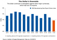
With quantitative easing finished and the Fed poised to raise rates, we are already starting to see stocks exhibit more volatility. We expect that to continue, and that stocks will rise or fall based on their fundamentals. In this environment, we believe active management is likely to become increasingly important to achieving sufficient returns. Capital markets offered some surprises for investors last week. Stocks rose globally with the Dow Jones Global Index rising 0.72%, while US stocks rallied with the S&P 500 hitting another record high. In addition, Treasury bonds sold off and oil continued its multi-week rebound. Clearly, asset classes are rotating and moving in different directions. A good example of this rotation can be found in the energy sector. Energy stocks have disappointed since last summer, falling in lockstep with the price of oil. However, in the past few weeks the price of oil has rapidly reversed course, helping energy stocks to rebound. The average energy-sector equity mutual fund returned almost 12% in the past month (as of February 13, 2015), well above every other sector fund average, according to Morningstar. Home and Away We’re also seeing divergent paths among fourth-quarter earnings reports. So far, earnings season has been positive, beating expectations. But there’s a substantial difference between companies that derive their earnings domestically from companies that derive their earnings largely from outside the United States. Why? Because the rising dollar has dragged down their fourth-quarter earnings results. A look at factory activity over the past few months drives home this point. The ISM manufacturing index has dropped to 53.5 in January from 57.6 in November. Weakness in foreign demand pushed new export orders down to their lowest level since November 2012. The caveat is that, like the price of oil, the dollar could reverse course relative to other currencies and the above scenario could change. Divergence can also be found in economic growth in the euro zone. For the fourth quarter, the euro zone skirted a recession and actually delivered modest growth. However, growth varied widely across member countries. Germany and Spain both saw their economies grow 0.7% in the quarter, beating expectations. Not surprisingly, some European countries didn’t fare as well, with both France and Italy falling short of expectations and Greece experiencing a -0.2% growth rate. Despite the disparity in growth, sovereign bond yields may not be dramatically different between these countries (except Greece) thanks to investors’ belief that the European Central Bank will stand behind this debt. Still, the performance of their stock markets could be where we see that growth gap reflected. The Perils of Indexing At Allianz Global Investors, we have long argued that once quantitative easing ended, we would see a change in the market environment. In other words, a move away from QE – which served as a rising tide lifting all boats – to an environment where stocks rise and fall on their individual fundamentals. We worry that the large number of investors who have enthusiastically embraced indexing in the past decade will be negatively impacted in this market environment, where we’re likely to see far more volatility, asset-class rotation and overall differentiation among individual securities. Unfortunately, indexing generally does not allow investors to avoid those companies that can be hurt by a rising dollar or the falling price of oil. And indexing does not allow investors to pivot when the dollar begins falling or the price of oil again changes course. In addition, as we look out on 2015, we expect relatively low stock returns. This again makes the case for active investing as investors will need to make active bets in an effort to surpass low market returns. In short, there are periods when markets are more conducive to index investing, as we saw over the past few years, but this environment isn’t one of them. We hope investors recognize the importance of active management in this unique and ever-changing market environment. We believe, a “buy the index and go home” strategy in times of uncertainty could come back to haunt investors.

NYSE Margin Debt Dips A Mite In December: Risk Rank At No. 43

Summary New York Stock Exchange margin debt slipped slightly to $456.28 billion in December from $457.11 billion in November. On the same basis, the SPDR S&P 500 Trust ETF’s adjusted closing monthly share price also slipped slightly to $205.54 from $206.06. The risk of speculation appeared lower in December than it did in November, but higher than it did in 69.93 percent of all months ranked by my methodology. New York Stock Exchange margin debt and the SPDR S&P 500 Trust ETF (NYSEARCA: SPY ) moved in the same direction in December for the second straight month, as each was down a wee bit. The level of NYSE margin debt relinquished -$823 million, or -0.18 percent, and the share price of SPY surrendered -$0.52, or -0.25 percent. Many equity market participants consider margin debt a long-term indicator of speculation in the stock market because of their tendency to move either higher or lower together. The NYSE has reported monthly data on securities market credit in three discrete series since 2003 and on margin debt itself since 1959. My primary analyses of these three data series focus on two proprietary metrics, the Margin Debt Directional Indicator, or MDDI, and the Securities Market Credit Risk Rank , or SMC Risk Rank, as described in “NYSE Margin Debt As An Indicator Of Long-Term Movements In S&P 500.” Figure 1: MDDI, January 2014-December 2014 (click to enlarge) Source: This chart is based on a proprietary analysis of monthly margin-debt data at NYSE’s online site. NYSE margin debt in December was -$9.44 billion, or -2.03 percent, lower than it was at its all-time high level in February (Figure 1). The anomalous behavior of margin debt in neither falling a great deal nor rising a great deal during the rest of 2014 appears unsustainable, factoring in the U.S. Federal Reserve’s actual announcement of the end of its latest quantitative easing program Oct. 29 and projected announcement of the beginning of its newest interest rate cycle April 29. This anomalous behavior is reflected by the MDDI, which basically is a comparative assessment of NYSE margin debt in the two most recent months of the data series. If the latest value of the MDDI ( MDDI in the above figure) is higher than its six-month simple moving average ( MDDI 6M SMA in the same figure), then I consider the market to be in bullish mode. If the most recent value of the MDDI is lower than its six-month SMA, then I consider the market to be in bearish mode. The MDDI’s December level is 171, which is lower than its November value of 172 and its six-month SMA of 171.17. As a result, I consider the equity market to have switched modes as of Dec. 31, to bearish from bullish. Based on the January performances of the stock market in general and SPY in particular, I anticipate a continuation of this mode for another month (at least). Figure 2: Highest And Lowest Risk Months, Per SMC Risk Rank (click to enlarge) Source: This table is based on proprietary analyses of monthly securities-market-credit data at NYSE’s online site. December is No. 43 among all 143 months evaluated since the January 2003 baseline by my SMC Risk Rank methodology, which carries out a comparative assessment of the data NYSE has reported in three discrete series: Margin Debt , Free Credit Cash Accounts and Credit Balances in Margin Accounts . The dynamic SMC Risk Rank is designed as a measure of equity market risk associated with speculation, ranking each month in the data set on an ongoing basis. At present, June 2014 is No. 1 , February 2014 is No. 2 and December 2013 is No. 3 among all months ranked (Figure 2). November’s SMC Risk Rank of No. 43 means I consider the stock market risk associated with speculation last month was higher than 69.93 percent and lower than 29.73 percent of all other months evaluated by the methodology. A high SMC Risk Rank for a given month indicates the market may be close to a significant peak, and a low SMC Risk Rank for a given month suggests the market may be close to a significant trough. In my interpretation, the term close in this context typically has meant within three to six months . Figure 3: NYSE Margin Debt And SPY, January 1993-December 2014 (click to enlarge) Source: This chart is based on monthly margin debt data at NYSE’s online site and adjusted closing monthly share prices of SPY at Yahoo Finance . Historically, NYSE margin debt and SPY have tended to move together, with an almost perfect positive correlation coefficient of 0.97 between them since the exchange-traded fund began trading in 1993 (Figure 3). I anticipate this close relationship will become increasingly important in the absence of Federal Reserve asset purchases under a QE program. If I were a party to either side of a margin debt transaction, then this is the time when I would start wondering whether more speculation is the wisest way to go. Disclaimer: The opinions expressed herein by the author do not constitute an investment recommendation, and they are unsuitable for employment in the making of investment decisions. The opinions expressed herein address only certain aspects of potential investment in any securities and cannot substitute for comprehensive investment analysis. The opinions expressed herein are based on an incomplete set of information, illustrative in nature, and limited in scope. In addition, the opinions expressed herein reflect the author’s best judgment as of the date of publication, and they are subject to change without notice. Disclosure: The author has no positions in any stocks mentioned, and no plans to initiate any positions within the next 72 hours. (More…) The author wrote this article themselves, and it expresses their own opinions. The author is not receiving compensation for it (other than from Seeking Alpha). The author has no business relationship with any company whose stock is mentioned in this article.

Why The S&P 500 Is A Bad Benchmark

Summary The S&P 500 represents only a portion of the world’s total stock market, whereas a diversified portfolio represents all of the world’s stocks—and can better manage risk over time. Individual parts of a diversified portfolio will always beat the overall portfolio. You just don’t know which part. Are you tall? Your answer to that will likely depend on your own personal context. For example, if you’re a 5’9” American male, and you’re comparing yourself to your American male peers, then you might say no. Why? Many of your friends are likely taller than you are, given that you’re a half-inch shorter than the average American male. ¹ But what happens when you compare your height to all other men in the world? The global average height of men is 5’8 1/2″. So let’s ask again: Are you tall? The lesson here is that we can’t let where we live play an overly important role when we’re trying to provide an objective, evidence-based answer. Applying this concept to investing, let’s examine the importance so many investors attach to the S&P 500 or the Dow Jones Industrial Average. U.S investors tend to heavily measure their portfolio performance against American indices, even though they have been proven not to be the best benchmarks. The S&P 500 is an index of the largest 500 publicly traded U.S. companies, such as Apple, Microsoft, and Ford, weighted by their market capitalization. As such, it’s often used by casual investors as a gauge of stock market performance. In 2014, it did very well—up almost 14%—significantly better than non-U.S. equity markets. Performance Relative to Global Stock Portfolio (click to enlarge) In other years, however, the opposite was true. From 2002 to 2007, the S&P 500 underperformed not only the U.S. stock market as a whole, but also a diversified portfolio and international markets. As American investors, we look to the S&P 500 because it’s familiar and it’s what’s in the headlines. We can’t resist using it as a benchmark for a diversified portfolio. This phenomenon is called home bias. Betterment’s portfolio avoids home bias by reflecting global stock market weights. U.S. stock markets make up roughly half of the world’s investable stock market—the remainder is international developed (43%) and emerging markets (9%). ² It’s important to keep in mind that the S&P 500 represents just over one-third of all the world’s stocks. That means comparing your performance to it is a bit like to comparing your height against only 37% of the world’s people who all come from the same place—say, comparing your height only to the average height of the American male, which is 5’ 9 1/2.” While you might be able to fudge a little with your height, your money is a different story. Using the right evidence—rather than the most convenient context—is the smarter way to invest. Diversification Is a Smarter Investment By using the world’s markets as its baseline, the Betterment portfolio diversifies risk on a number of levels, including currency, interest rates, credit risk, monetary policy, and economic growth country by country. Even as economic circumstances may drag down one nation, global diversification decreases the risk that no one geographic area alone will drag down your portfolio. In short, diversification is a fundamental way to manage risk—it keeps your investment performance more consistent. That’s why we pay so much attention to asset class correlation. ( You can read more about that here .) The result for you, the investor, is that you get the average performance of all the asset classes in which you are invested. If you had only selected one of these asset classes for your portfolio—say, the S&P 500—then you would be at the mercy of that sole index’s performance. By diversifying, you avoid extremes in both gains and losses, and you achieve the same average returns with less uncertainty. Diversification does not guarantee higher returns as compared to each constituent of the portfolio. Rather, diversification is about ensuring average returns—never the best, and never the worst. So, what can you use to compare your performance? The concept of a benchmark basically does not apply to an all-index portfolio. When you’re an index-fund investor—which is what you are when you have a Betterment portfolio—there is no under- or over-performance. You are the average performance. However, it can be useful to have some external yardstick to get a general sense of how you are doing. To do that, you’d need a fund that is similar to your Betterment portfolio with respect to allocation, costs, and diversification. While imperfect, Vanguard’s LifeStrategy Funds could be a point of comparison. If you choose to compare the two, make sure it’s apples-to-apples: Be careful to not equate a 90% stock fund with an 80% stock Betterment account, for instance. But keep in mind that the additional benefits of a Betterment account—general tax efficiency, including tax loss harvesting, free trading, goal-based advice, and more—are likely not included in the performance metrics of a similar non-Betterment diversified portfolio. And next time someone asks you if you are tall, remember that, to be accurate, you need to use the global average before you can say yes or no. Disclosure : Information in this article represents the opinion of the author. No statement in this article should be construed as advice to buy or sell a security. The author does not know your particular objectives for returns or constraints upon investing. All investors are encouraged to do their own research before making any investment decision.