Tag Archives: nysearcaivv

SPDR S&P 500 ETF (SPY) Analysis: Using CapFlow And FROIC

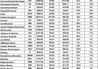
Summary Analysis of the components of the SPDR S&P 500 ETF (SPY) using my CapFlow and FROIC ratios. Specifically written to assist those Seeking Alpha readers who are using my free cash flow system. Part II will concentrate on “Main Street” while Part I in the series concentrated on “Wall Street”. Back in late December I introduced my free cash flow system here on Seeking Alpha, through a series of articles that you can view by going to my SA profile . My purpose in doing so was to try and teach as many investors as I could on how to do this simple analysis on their own as I believe in the following: “Give a person a fish and you feed them for a day, Teach a person to fish and you feed them for life” I have been very pleased with the positive feedback that I have received so far, but included in that feedback were many requests by those using my system, to see if they did their analysis correctly or not. Since the rate of these requests have been increasing with every new article I write, I have decided to start a new series of articles here on Seeking Alpha analyzing the SPDR S&P 500 ETF (NYSEARCA: SPY ), where I will analyze each of its components individually. That way those of you using my system will have something like a “teacher’s edition” that will give you all the correct calculations for each component. Obviously I can’t include the results for all my ratios in one article, so I will thus be doing a series of articles, where each ratio’s results for the SPDR S&P 500 ETF will have its own article devoted to it. Hopefully these articles can be used as reference guides that everyone can use over and over again, whenever the need arises. Having said that, I would suggest that everyone first read Part I by going HERE . There you will find the data on my “Free Cash Flow Yield” ratio which is one of three parts that I use it tabulating my final “Scorecard”. While free cash flow yield is a Wall Street ratio (Valuation Ratio), this article with concentrate on my “CapFlow” and “FROIC” Ratios, which are Main Street ratios. The final Scorecard results will be available in Part III of this series and basically combines all three ratio results to generate one final result. Once completed, my scorecard should give everyone a clearer understanding on how accurate the valuation is that Wall Street has assigned each company relative to its actual Main Street performance. Before we show you the final results of our two Main Street ratios, here is brief introduction to what each of the two ratios, which make up my system as well as what the final “Scorecard” score mean. CapFlow CapFlow is the name I have given to the ratio (Capital Expenditures/Cash Flow). CapFlow allows us to see how much capital spending (or capital expenditures, CAPEX) a company must employ in relation to its cash flow to maintain itself and more importantly grow the company. This ratio is extremely useful as it is both a qualitative and quantitative ratio in that it acts as a laser beam into the inner workings of a company. Quite simply if a company is increasing its profits and doing so by spending less money relative to its growth in cash flow, it should, in theory, outperform on Main Street. When you can have such an occurrence for more than a few years in a row, it clearly shows you have wonderful management in place that knows what it is doing. The ideal again is to consistently have a CapFlow of less than 33% and avoid any company, like the plague, that has a CapFlow of over 100%, as in such a case management is spending more in capital expenditures than it is bringing in from cash flow from operations. That is a recipe for disaster in my opinion. Just using this ratio alone will narrow your list of potential candidates for investment substantially and will give you an easy-to-use tool for judging management effectiveness. FROIC FROIC = Free Cash Flow Return on Invested Capital FROIC= Free cash flow/ (long-term debt + shareholders equity) FROIC basically tells us how much return in free cash flow a company generates for every one dollar of “Total Capital” it employs. I consider FROIC the primary determining factor in identifying growth companies as one can compare every company on an equal basis using this ratio. The question I ask every company I analyze is: “How much return (in percent) in free cash flow are you going to give us for every dollar of total capital you invest?” A FROIC of 20% or more is considered excellent and the higher the result the better. Since long-term debt is included in the invested capital part of the equation, one can see quite clearly by using this ratio, on just how well or how poorly management is managing its debt. So without further ado here are my results for the CapFlow and FROIC ratios for the components that make up the SPDR S&P 500 ETF : Always remember that the results shown above are just for two ratios and that this is not investment advice, but just the results of the ratios. The system outlined in this article and all that will follow, as part of this series, are just meant to be used as reference material to be included as just “one” part of everyone’s own due diligence. So in other words, don’t make investment decisions based on just these two results, but incorporate them as part of your own due diligence.
Stock Market Reversal In January: The Potential Effect Of Capital Gain Taxes

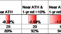
The S&P 500 index was up 11% in 2014 and up 64% over the past 3 calendar years before dividends. When the stock market is at or near all-time highs at the end of December the following January has on average posted a negative return. This reversal effect, likely due to delayed selling because of capital gains taxes, is stronger when the recent 1-year and 3-year returns are high. The past three calendar years have been quite good for the US stock market. Using S&P 500 index data from Yahoo Finance we have only seen better returns for three consecutive calendar years in the late 1990s and the mid-1950s. The S&P 500 data we use begins with full calendar year data in 1951, so we have 63 calendar years of data in our sample through 2013. What can we expect going forward for the stock market or more specifically the S&P 500 index ETFs, (NYSEARCA: SPY ), (NYSEARCA: IVV ), and (NYSEARCA: VOO ), after such a great run? It’s hard to come to any significant conclusions with just five data points, so we want to expand the sample size a bit before analyzing the data. One distinction we can make for this year versus the average year is that we are at all-time highs for the S&P 500. On a monthly closing basis the all-time high was in November with the S&P 500 closing at 2067. December’s close of 2058 is basically right there. There are 25 calendar years in our data set where the December closing level is within 2% of the all-time high. That is enough data to start to draw some conclusions. If we filter this some more by removing years where the last calendar year price change (return before dividends) was less than +10% we have 20 data points. Filtering with a +15% price change gives us 16 data points. We use price change rather than total return because returns from dividends don’t affect decisions about whether to take capital gains or not. The results of various filters are shown in the table below. In the filter criteria, “Near ATH” means December close is within 2% of the monthly closing all-time high, “1-yr ret” means the price change over the prior calendar year, and “3-yr ret” means the price change over the prior three calendar years. (click to enlarge) The confidence level in the last row of the table is a statistical measure that tells us the likelihood that the average January return of each subset of years is actually lower than the typical January return and the difference is not just due to statistical noise. In other words looking at the “Near ATH” column in the table we see there is an 89% chance that Januaries that begin near the all-time high for the S&P 500 can be expected to be worse than the typical January. While this doesn’t pass common statistical tests than require 95% or 99% confidence, it is still worth keeping in mind as investors consider what to do with their portfolios in the New Year. The filter that most closely matches the current environment is the far right column. There have been 11 years since 1951 that end near all-time highs, had greater than +10% price change and finish a three-year period with price change greater than 40%. The subsequent Januaries average price return was negative at -1.11%. The standard error on this sample mean estimate is 1.45%, so while the -1.11% seems significantly different from +0.89% (the average of all years), the difference between the two numbers isn’t that much more than the standard error. The eleven years that match this criteria are shown in the following table. Six out of 11 years are down in January and five are up. The best January in the table follows 1998 with a +4.0% return and the worst follows 1989 with a -7.1% return. Clearly the one year variation is fairly wide, so we can’t expect this January to have exactly a -1.11% decline. How should an investor use this information? Here are a few possibilities. If she wants to add to her equity position, waiting until February might be wise. If rebalancing is in order for a portfolio, and that involves reducing equity exposure, do it sooner rather than later. If it involves adding to equity exposure, wait a month. If there are capital gains in a taxable account and there is any need for the cash this year, sell sooner in January rather than later. If this potential January reversal takes place before an investor can act, it’s probably not a good idea to sell equities out of fear of further declines. For the months of February and March following the eleven Januaries in the table above the combined average returns were +4.1%. We can’t expect this January reversal phenomenon to persist into February and March. We attribute this reversal of returns in January to the impact of capital gains taxes, and delayed selling over the recent past to delay the capital gains tax until April 2016. There could always be some other reason for further selling, or for buying that overwhelms the tax impact to give us a positive return in January. There are a lot of possibilities for what happens to markets in January and in all of 2015. This is just another piece of data to consider that we view as important in the next month. Now that you’ve read this, are you Bullish or Bearish on ? Bullish Bearish Sentiment on ( ) Thanks for sharing your thoughts. Why are you ? Submit & View Results Skip to results » Share this article with a colleague