Tag Archives: nysearcahyg

ETFReplay.com Portfolio Update

The ETFReplay.com Portfolio holdings have been updated for February 2015. I previously detailed here and here how an investor can use ETFReplay.com to screen for best performing ETFs based on momentum and volatility. The portfolio begins with a static basket of 14 ETFs. These 14 ETFs are ranked by 6 month total returns (weighted 40%), 3 month total returns (weighted 30%), and 3 month price volatility (weighted 30%). The top 4 are purchased at the beginning of each month. When a holding drops out of the top 5 ETFs it will be sold and replaced with the next highest ranked ETF. The 14 ETFs are listed below: Symbol Name RWX SPDR DJ International Real Estate PCY PowerShares Emerging Mkts Bond WIP SPDR Int’l Govt Infl-Protect Bond EFA iShares MSCI EAFE HYG iShares iBoxx High-Yield Corp Bond EEM iShares MSCI Emerging Markets LQD iShares iBoxx Invest Grade Bond VNQ Vanguard MSCI U.S. REIT TIP iShares Barclays TIPS VTI Vanguard MSCI Total U.S. Stock Market DBC PowerShares DB Commodity Index GLD SPDR Gold Shares TLT iShares Barclays Long-Term Trsry SHY iShares Barclays 1-3 Year Treasry Bnd Fd In addition, ETFs must be ranked above the cash-like ETF SHY in order to be included in the portfolio, similar to the absolute momentum strategy I profiled here . This modification could help reduce drawdowns during periods of high volatility and/or negative market conditions (see 2008-2009), but it could also reduce total returns by allocating to cash in lieu of an asset class. The top 5 ranked ETFs based on the 6/3/3 system as of 1/31/15 are below: 6mo/3mo/3mo LQD iShares iBoxx Invest Grade Bond VNQ Vanguard MSCI U.S. REIT TLT iShares Barclays Long-Term Trsry TIP iShares Barclays TIPS SHY Barclays Low Duration Treasury Since all of the current holdings are still ranked in the top 5 there is no turnover this month. In 2014 I introduced a pure momentum system, which ranks the same basket of 14 ETFs based solely on 6 month price momentum. There is no cash filter in the pure momentum system, volatility ranking, or requirement to limit turnover – the top 4 ETFs based on price momentum will be purchased each month. The portfolio and rankings will be posted on the same spreadsheet as the 6/3/3 strategy. The top 4 six month momentum ETFs are below: 6 month Momentum TLT iShares Barclays Long-Term Trsry VNQ Vanguard MSCI U.S. REIT LQD iShares iBoxx Invest Grade Bond VTI Vanguard Total U.S. Stock Market The top 4 ETFs are the same as last months, so there is no turnover for February. Disclosures: None How did this change your view of ? More Bullish More Bearish It Didn’t This impact ( ) More Bullish More Bearish Unchanged Thanks for sharing your thoughts. Submit & View Results Skip to results » Share this article with a colleague

Which Junk Bond ETF Is Best For 2015? Part 1

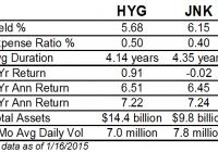
Summary JNK has a higher yield and lower expenses. HYG has higher credit quality and lower volatility. JNK and HYG have near identical returns over the past 5 years. Both have seen their payouts decline along with interest rates. The two largest high yield bond funds are the iShares iBoxx $ High Yield Corporate Bond (NYSEARCA: HYG ) and the SPDR Barclays Capital High Yield Bond ETF (NYSEARCA: JNK ). These funds use very similar strategies that result in largely similar portfolios and performance, with a few small variations. Index & Strategy HYG tracks the Markit iBoxx USD Liquid High Yield Index , while JNK tracks the Barclays High Yield Very Liquid Index. These two funds are highly correlated, to the tune of 0.9985 since 2006. Since 2010, the correlation rises to 0.9995. This comparison of some key data points reveals the main differences between the funds. Through January 16, these ETFs had near identical 3-year and 5-year annualized returns. Investors can pocket a little more income with JNK, but total returns are very similar. Along with that slightly higher yield comes a slightly higher duration, making JNK a little more sensitive to changes in interest rates. HYG has more assets and higher average dollar trading volume. The number of shares traded is very similar, but HYG’s price is more than double that of JNK. JNK is cheaper than HYG, to the tune of 0.10 percent a year. Given the similarities between the funds, the difference in cost is a big advantage for JNK. Even though HYG is at disadvantage on cost and yield, it has managed to outperform JNK. In terms of credit quality, JNK has 40 percent in BB rates bonds; 43 percent in B; and 16 percent in CCC or lower. HYG has 48 percent in BB rated bonds; 39 percent in B; and 11 percent in CCC. Performance This price ratio chart of HYG versus JNK shows the funds move in tandem, except during the financial crisis. Over the past 5 years, the two funds have fluctuated within a range of 3 percent of each other. A rising line indicates HYG is outperforming. (click to enlarge) This price ratio chart compares the price performance of HYG and JNK over the past 5 years without adjusting for dividends. It shows that HYG has benefited more from price appreciation than from income, as would be expected given HYG yields less, yet returns the same in the long-run. (click to enlarge) This chart shows their returns since 2010. (click to enlarge) Income JNK has a higher yield than HYG, but both funds have seen their payout decline amid low interest rates (data from the provider websites). (click to enlarge) The chart below shows the trailing 12-month yields based on actual payouts. JNK was paying more at the start in part because shares did under perform during the financial crisis. The main takeaway is that yields were falling due to falling interest rates (rising bond prices) and if that trend continues, investors will continue to see shrinking payouts. (click to enlarge) Risk & Reward JNK has a 3-year beta of 1.17 versus HYG’s beta of 1.09., both versus the BofAML HY Master II Index. JNK has a 3-year standard deviation of 5.33 compared to HYG’s standard deviation of 5.01. This means JNK is slightly more volatile than HYG. Both funds have exposure to the energy sector, with HYG’s provider listing its exposure at 13.82 percent. JNK does not break out its exposure by sector, but given the volatility in that sector, if it had a meaningful difference in exposure, there would be a considerable difference in returns. JNK is down 1.15 percent in the past three months versus a 0.26 percent drop in HYG. High yield bonds are less sensitive to changes in interest rates due to their lower duration, but they are very sensitive to the economy. In 2008, JNK fell 25.67 percent and HYG lost 17.37 percent. The late 2014 plunge in oil prices weighed heavily on junk bond funds. Including dividends, HYG is down about 3 percent over the past seven months, versus the 4 percent decline in JNK. The most recent turnover data from Morningstar shows JNK had turnover of 30 percent as of June 30, 2014, while HYG had turnover of 11 percent as of February 28, 2014. If HYG has historically maintained this lower turnover, this makes the cost gap smaller than the expense ratio indicates, since HYG would face fewer transaction costs. Conclusion JNK and HYG are very similar funds, but they do have their differences. JNK charges less and has a higher yield, but that comes with higher volatility and lower credit quality. HYG manages to consistently deliver nearly the same total return as JNK though. Overall, this makes HYG the more attractive ETF, especially given our position in the economic cycle. A recession isn’t brewing yet, but it has been seven years since the last one began. With better credit quality, HYG is likely to hold up better again in the next recession. Investors will receive a smaller yield from HYG, but this extra bit of income isn’t worth the risk of under performing the next time the high yield bond market suffers a major sell-off. Short-Term High Yield While HYG is a better choice than JNK in 2015, there are more funds to consider. In part 2, we’ll look at the SPDR Barclays Capital Short Term High Yield Bond ETF (NYSEARCA: SJNK ) and the PIMCO 0-5 Year High Yield Corporate Bond Index ETF (NYSEARCA: HYS ).

A Market Needing To Resolve Divergences In 2015

As 2014 has come to a close, investors have turned their attention to 2015 and looking for clues as to what the market and economy have in store for the new year. Below are divergences that unfolded in 2014 which raises the question of how they will be resolved this year. The resolution of these divergences will likely have implications on the performance of an investor portfolios this year. Oil Prices Knowing the stock market is not the economy and vice versa , determining factors contributing to the significant decline in oil prices is important. Certainly, increased supply is influencing the decline in crude prices. Equally though, as we have noted in several earlier articles, we believe lack of demand is also a contributing factor. The importance of the reduced demand leads strategists to raise the question of whether the global economy is entering a slowdown. To date, the U.S. seems to have shaken off the potentially negative impact of slowing economies outside its borders. Given the interconnectedness of the economic world today though, can the U.S. continue on its growth path while many other economies in the developed and emerging world struggle with growth? As the below chart indicates, historically, falling oil prices have been associated with slowing global GDP. Aubrey Basdeo, Managing Director at Blackrock, noted the potential negative impact of an extended run of low oil prices in an article late last year titled, Free Fallin’ . The article’s conclusion, Wherever the price ends up, it’s likely it’ll stay there for a while. We don’t see demand increasing, especially with China cooling off. In the short-term that could be good news for our economy – lower gas prices mean people have more money to spend – but it remains to be seen just how our country will be impacted by a sub-$60 oil price. The longer it stays low, though, the more difficult things could get. Highlighted in the Felder reference below was a comment by Howard Marks’ in a recent investor letter , “It’s historically unprecedented for the energy sector to witness this type of market downturn while the rest of the economy is operating normally. Like in 2002, we could see a scenario where the effects of this sector dislocation spread wider in a general ‘contagion.'” High Yield Bonds: Reduced Investor Risk Appetite The performance of high yield bonds has an above average positive correlation to the performance of equities. In short, as the economy grows, companies tend to experience better earnings growth. This improved earnings outlook generally leads to improved equity returns. Broadly, as companies generate better earnings growth, highly leveraged ones tend to experience an improved outlook as well. This in turn reduces the risk of default with highly leveraged companies. Consequently, high yield bond prices are bid up as investors are attracted to the higher yields provided by high yield debt in an environment where default risk seems lessened. A recent article by Jesse Felder of The Felder Report took an in depth look at the long term and short term price movements of high yield (NYSEARCA: HYG ) relative to a riskless 3-7 year Treasury ETF (NYSEARCA: IEI ) and the S&P 500 Index . As the first chart below shows, the high yield relative to treasury bond investment tracks closely with the S&P 500 Index. Felder notes in his article, Clearly, the chart above demonstrates that the strength in junk risk appetites led stocks off the lows back in 2009. Over the past summer, however, junk bonds started to lag stocks for the first time since the bull began (or lead lower, depending on your perspective). Since then the divergence has only gotten wider with each subsequent new high in the stock market [as seen in the below chart]: Large Caps Versus Small Caps And The Dollar The one asset allocation decision investors and advisers needed to get right in 2014 was to overweight U.S. equities, large caps more specifically, versus broad international. As can be seen in the two charts below, U.S. large cap stocks had a decisive performance edge versus developed international (NYSEARCA: EFA ), emerging markets (NYSEARCA: EEM ) and small cap equities (NYSEARCA: IWM ). With economies currently weaker outside the U.S. and interest rates lower in many European countries, foreign investors have allocated investment dollars to the U.S. This flow of funds into the U.S. has contributed to downward pressure on U.S. interest rates as well as continued upward pressure on the U.S. Dollar. The top chart above shows a longer view of the trade weighted US Dollar and its recent strength, although strong shorter term, the strength does not look exhausted when viewing the longer term chart. The implication of a stronger dollar has to do with the potential earnings headwind for large multinational companies. In a slow growing economy, the currency headwind can take a bite out of corporate profit growth. If this occurs, small and mid size companies are less exposed to exchange rates as business for these companies is mostly generated domestically. Lastly, the U.S. equity markets opened higher on the first trading day of the new year, but quickly turned lower near the time the ISM Manufacturing Index was reported. The manufacturing index was reported at 55.5 which was below consensus expectations of 57.5. This was the slowest rate of monthly growth in six months. Econoday noted, “growth in new orders slowed substantially, to 57.3 from November’s exceptionally strong 66.0, while backlog accumulation also slowed, to 52.5 from 55.0. Production slowed to 58.8 vs. 64.4….The abundant run of manufacturing reports point to year-end slowing in a sector which is oscillating going into the New Year.” The above highlights are just a few divergent factors that have developed recently. From a positive perspective, the equity markets have a tendency to climb the proverbial ” wall of worry .” We will cover more of our thoughts on these topics in our upcoming year end Investor Letter.