Tag Archives: nreum

An Alternative Way To View Diversification

We’re living in a post 2008-2009 financial crisis world. Investors and advisors alike know that having your eggs all in one basket could land you in some hot water (especially if it’s the arguably broken 60/40 portfolio). The reason being, one single person or group isn’t able to call what’s going to be the “best” asset class (by performance only) in any given year. Enter the ever so popular diversification quilt , which essentially ranks each asset class top to bottom over the past 15 years. The issue, of course, is that although they include 10 asset classes, they really don’t include alternative investments, specifically Managed Futures. The latest to release a chart like this is Business Insider. As you might remember, we took the liberty of changing around the “quilts” published by Bloomberg back in September by adding Managed Futures to the mix. The second issue with the quilt table is that these “quilts” are all on the same axis level. For example, if an investment was the worst performer of the year and still up 2 or 3 percent, it would look the same as an investment that came in last at a -10% on a different year. Which got us thinking how different would the table look if we spread out the investments so that the performance range would be visible? This is what we got. P.S – Looking at each asset class on its own fluctuates year to year, is just one way to look at volatility. So, so we connected the dots of the largest performance range (Emerging Markets), Managed Futures, and the smallest performance range (Cash). (click to enlarge) (Past performance is not necessarily indicative of future results) Source: Large Cap = S&P 500 Small Cap = Russell 2000 Intl Stocks = MSCI EAFE Emerging Markets = MSCI Emerging Markets REIT = FTSE NAREIT All Equity Index HG Bond = Barclay’s U.S. Aggregate Bond Index HY Bond =BoAML US High Yield Master II Cash= 3 Month T Bill Rate AA = Asset Allocation Portfolio (15% Large Cap, 15% Intl Stocks, 10% Small Cap, 10% Emerging Markets, 10% REIT, 40% HG Bond Share this article with a colleague

Dog-Day Summer: Scratch The VIX Fleas

Summary On a go-nowhere market day in mid-summer, the institutional investment management “B” teams are in charge under the remote watchful eyes of the vacationing “A” managers. An SA contributor perfectly times a clearly-written explanation of how several VIX-index derivatives do their thing, presenting numerous onlookers intellectual advancement opportunities for money-making insights. Eager observer participation comments encourage a demonstration of crowd-source strength that makes Seeking Alpha a stand-apart site of internet information exchange. Adding to the present contributions, this article provides a behavioral analysis dimension to the discussion, digging deeper into what makes the securities markets game challenging. Market-makers [MMs] use the VIX in ways that provide expanding opportunities for individual investors to gain market outlook perspective. New ones are about to arrive. The Market-makers’ Game Playbook It’s a game because everyone’s outcomes depend on someone else’s actions. Both initially (opening a position) and ultimately (closing the position) require an other side of the trade. It’s a great game, because we can’t be sure what that guy (or guys, and gals) are going to do next. Lots of game strategies can work, and are continually in play. Plenty of action in a trillion-dollar-a day market. But which way is the emphasis heading, enthusiasm or caution, greed or fear? Who knows what evil lurks in the hearts of men? Heh-heh-heh. The VIX knows! And because its calculation is rigidly defined and regularly measured, it is constantly watched. It is an objective appraisal of the most subjective element in the game. Starting 7/23/2015 additional coloration will enrich the speculative confusion. The VIX index is calculated from premiums paid for options on near expiration contracts on the S&P 500 index. Caution! Objects in this mirror are closer than they may appear! Those contracts have expirations with monthly granulations. But on 7/23 futures and options start trading in the VIX with weekly expirations. Why? Market professionals are consummate hedgers, hate risk, unless they get paid (extravagantly?) for bearing it. In the process, time has profound value. Hedging markets for equity securities have all-along had an inverted “yield curve.” Back in the old days of economically honest (non-governmental interference) markets for “risk-free” U.S. Government Treasury Debt securities, short duration obligations – bills – would carry small interest costs. Obligations with longer periods of time before the investor has his principal returned, paid larger yields. Logically, the more time before you got your bait back, the more likely something might go wrong. You need to be paid for that risk. It still works that way, but now the curve between 30 days and 30 years is a lot flatter. Not so in street equity financing. Market capital typically has huge return potentials in the immediate time frame. Every last scrap of capital that can be declared and committed earns something at the measurement hour. Street capital is required by means of “haircuts” to be reserved, unproductive, against potential disaster. The crisis of 2008 made the dangers clear. The cost of raising capital to meet regulatory requirements makes immediate capital availability dear, while long-term (days, weeks) capital is far less demanding, cheaper. If a hedger can arb a position with a one-week security instead of a one-month one, it is like found money. So the game rules are being eased, and weekly VIX expirations are coming. All very rational. But it may also be very informative. Or not; we really can’t be sure. Here is the CBOE’s official statement : VIX Weeklys futures began trading at CBOE Futures Exchange (CFE®) on July 23. VIX Weeklys options are expected to begin trading at Chicago Board Options Exchange, Incorporated (CBOE®) shortly thereafter. What do we know now? The VIX index tells the amount of uncertainty present in the prices of options on the S&P 500 Index (SPX). But it cannot distinguish any directional balance between upside and downside in that uncertainty. In fact, changes in the size of the VIX calculation are a resultant of the behavior of investors, not in themselves a forecaster of behavior. Observers have learned that fearful investor actions cause the VIX to rise, and reflections of comfort and reassurance cause it to diminish. When the VIX is high, it is because investor concerns are already high, usually because stock prices have already dropped some. How much worse it might get is hard to tell, since that bound has been erratic. The comfort side of the proposition is much more clearly defined and more frequently visited at 10 to 12. The introduction of options trading in the VIX Index in February of 2006 gave us the ability to apply to the VIX the insight we have in appraising the investor expectations we have for individual stocks and ETFs. The balance of expectations between upside and downside prospects measured by the Range Index became available to the VIX in 2006. We achieved the ability to forecast the directional inclination of what many observers took to be a forecasting device itself. A forecast of the forecast. But it hasn’t been the magic many have hoped for. Here are recent measures of the price range implications for the VIX, daily for 6 months in Figure 1, and once a week samples of that weekly for the past 2 years in Figure 2. Figure 1 (used with permission) Figure 2 (used with permission) It should be apparent that market professionals have a good sense of when investor confidence is high, because then the VIX is low in its expectations range, seen as green in these pictures. Prior experience since 2006 has been similar to these at the low extreme, and only more aggravated, but still irregular, on the high side. The small thumbnail picture at the bottom of Figure 2 shows what the distribution of VIX RIs has been daily over the past 5 years. The shape of its distribution is heavily skewed to the low end of a normal stock’s typical, fairly symmetrical, bell-shaped curve experience. The scarcity of VIX pricings at or above a mid-RI level (where prospects for market decline are as great as for price increase) should be a reassurance that markets still remember having grabbed the hot end of the match in 2008. But the RI distribution before the past 5 years is just as healthy, because there had been bad market experiences previously, and they too were remembered. In all, the evidences of U.S. equity market functionality over the past few decades are quite reassuring, largely because of its demonstrated recovery capacity. At the heart of that capacity is the market-making community’s self-protective instincts and its arbitrage skills in making risk-reward tradeoffs. Risks usually can not be eliminated, but can be transferred to those with the capacity to bear them, if appropriate price tags are attached. This is the heart of the insurance concept. This only breaks down when widespread fraud permeates the system, as was the case with mortgage-backed securities in 2007-2008. That was on a scale large enough to threaten the entire financial system and damaged important parts of it badly. Forecasting the “forecaster” We have the ability to infer when the VIX is at comfortable levels and to know when it has jumped to altitudes unlikely to be sustained. Can we make money with that knowledge? Let’s take a closer look at the VIX’s own price behavior following the presence of various levels of Range Indexes. Figure 3 shows what that has been over the past 4-5 years: Figure 3 (click to enlarge) The VIX Range Indexes currently indicated in Figures 1 and 2 are right at the bottom of a normal expectations range, with all upside “reward” and no downside “risk.” In Figure 3 that is indicated by the magenta color of the count of past RIs with similar RWD:RSK balances of 100:1. The blue 1 : 1 row is an average of all 1130 observations from 1/19/11 to 7/22/2015, cumulated from progressive rows above and below. But keep in mind that with the VIX, price direction of the market is inverted. Vix goes up whem markets go down. Given that, in terms of market outlook, there may be room for some concern. And that concern is what causes technical analysts to claim “bull markets climb a wall of worry.” We’re not ever in the technician camp, but let’s take a look at what is being implied by the numbers. If the VIX is to behave (exactly) as it has in the average of 208 prior experiences, that index might rise by +4% during the next week. A quick reference back to Figure 1, tells that the behavioral analysis implies that the Index could rise in the foreseeable future (weeks to months) from its present $12.12 to 16.74 or some 38+%. So maybe 1/10th of that +4.62 rise or $0.46 might happen right away. After 7-8 weeks it might be double that, +8%. Are we scared yet? Seems like sort of noise-level variations. Odds of it happening in the past have been little better than a coin-flip, about 5 out of 8. If the VIX went from $12.12 to $13 and its expectations stood still, then the Range Index would be 20-25 with not much change in prospect from where we are now. And maybe 7-8 weeks have passed. For a MM, 7-8 weeks are an eternity. They don’t husband their time, they pimp it. Conclusion No, to make what we know more valuable, we need a much more aggressive and productive strategy than simple asset-class allocation guesses. From what several commenters and some SA contributors have suggested there are effective strategies in place and being acted upon. Discussions to date have been light on the use of the ProShares Short VIX Short-term Futures ETF (NYSEARCA: SVXY ). It has a significant place in this ongoing discussion but has a tale of its own to tell and should be the subject of a separate article, to follow shortly. The enrichment of weekly data availability may make the discussion even more interesting. Disclosure: I/we have no positions in any stocks mentioned, and no plans to initiate any positions within the next 72 hours. (More…) I wrote this article myself, and it expresses my own opinions. I am not receiving compensation for it (other than from Seeking Alpha). I have no business relationship with any company whose stock is mentioned in this article.

Duplicating The All-Weather Fund Using Low-Cost ETFs

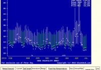
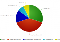
Summary Tony Robbins’ newest book reveals the asset allocation of Ray Dalio’s All-Weather Fund. The allocation is designed to balance the percentage of risk rather than the percentage of money to each asset. This strategy can be replicated using low-cost ETFs, but the biggest challenge is in sticking with the allocation as the years go by and each asset performs differently. Everyone in the business knows Ray Dalio is the manager of the world’s largest hedge fund, but his portfolio strategy has not always been very accessible by the public. Dalio has not added any clients in ten years, and even then, the only way to get access to the fund was with a net worth of at least four billion dollars and a minimum investment of 100 million dollars. Luckily, when Tony Robbins sat down with Dalio to interview him for his latest book , Ray shared the specifics of how he allocates the All-Weather fund. So this article will look at how to replicate that portfolio using a series of low-cost ETFs. Keep in mind that the fund does use leverage to increase the returns, and this allocation does not include any of the hedging activities. The large percentage allocated to bonds is a surprise to most, but the reasoning behind it is based on balancing the percentage of risk rather than the percentage of money put into each asset. Stocks are three times more volatile than bonds, so putting a higher percentage into bonds balances the risk in a way that putting 50/50 stocks and bonds wouldn’t. So the 15% in gold and commodities works the same way, as these are more volatile than both stocks and bonds. This approach is not all that different from Harry Browne’s permanent portfolio concept, which is a little more simple with 25% stocks, 25% bonds, 25% cash, and 25% gold. Swiss investor Marc Faber also recommends a similar allocation , 25% stocks, 25% bonds/fixed income, 25% real estate, and 25% gold. Dr. Faber’s portfolio is more suited towards very wealthy individuals, and it is closer to the “one third, one third, one third” concept that Jim Rickards talks about in regards to how wealthy families keep their wealth intact over many generations. The allocation is one third in land, one third in gold, and one third in fine art. This particular strategy takes a VERY long-term point of view and looks to protect and preserve wealth against any and all crises from depressions, wars, to hyperinflation. Dalio’s All-Weather fund is not centered around hedging against inflation/hyperinflation as much as the portfolios mentioned above, but the 15% in gold and commodities shows that he does have some concerns about inflation even though he might not think severe inflation is inevitable and imminent. In fact, it was the historic event in 1971 of President Nixon taking the US off the gold standard for good that greatly shaped Ray’s “all weather” strategy and realization that no one can really predict which investments will do best in the future. So here are the best choices of ETFs for replicating the All-Weather portfolio: 40% Long-Term Bonds Vanguard Long-Term Bond ETF (NYSEARCA: BLV ) With assets totaling 1.2 billion dollars, this fund invests in both government and investment-grade corporate long-term bonds. The mix of corporate bonds helps to give the yield a boost that one would not get by going only with government bonds. Of course, when you go with any Vanguard ETF, you are usually getting the lowest expense ratio in the industry, and with this particular ETF, the ER is only .10%. The yield is 4.05%. 15% Intermediate-Term Bonds Vanguard Intermediate-Term Bond ETF (NYSEARCA: BIV ) This popular fund is even bigger with total assets of 5.95 billion dollars. There are not too many differences between this fund and BLV, except that this fund of course holds only shorter-term bonds. The yield is 2.73%, and the expense ratio is also a very low .10%. For this 15% portion, you could also split it into two, with BIV on one side and a TIPS ETF on the other. 30% Stocks Vanguard S&P 500 ETF (NYSEARCA: VOO ) Only 30% in stocks seems very low compared to conventional wisdom. Again though, Dalio’s strategy puts the assets with the most volatility as a lower percentage of the portfolio. VOO is a large fund with 34.41 billion in assets . The expense ratio is .05%, which is very important for the long-term investor and the highlight of this ETF. The yield for VOO is 2.01%. In some of my recent articles, I have been highlighting ETFs that can provide income that would be cushioned from a major crash in the US, which I anticipate, although I won’t put a time on it. So, in that vein, I would add to this by splitting the equities portion of this strategy into two parts; one, domestic equities, and the other, international equities. For the international exposure, I think the Vanguard FTSE All-World Ex-US ETF (NYSEARCA: VEU ) is the best choice within this strategy. This ETF has 14.82 billion in assets , an expense ratio of .14%, and the yield is 2.81%. 7.5% Gold and 7.5% Commodities iShares Gold Trust ETF (NYSEARCA: IAU ) and PowerShares DB Commodity Index Tracking ETF (NYSEARCA: DBC ) This allocation to gold and commodities again goes against conventional wisdom. Considering the most recent downturn in gold, it would be even more difficult for most people to consider gold and commodities in their portfolio. It is easily the most hated commodity in world today, or at least it is the most hated in the financial mainstream media. Gold and the whole natural resource sector have been in a deflation since 2011, but that does not change the fact that since the late 90s, gold has outperformed the Dow, the S&P 500, as well as Berkshire Hathaway (NYSE: BRK.A ) (NYSE: BRK.B ). (click to enlarge) So, for this portion of the portfolio, IAU works best for the gold portion, because it has the lowest expense ratio of any gold ETF at .25%, as well as plenty of liquidity. For the commodities, DBC is a good choice. It tracks the DBIQ Optimum Yield Diversified Commodity Index Excess Return™ which has exposure to 14 of the most heavily traded commodities. While the expense ratio is higher than I would like at .85%, the fund offers exposure to the futures market without going through the actual trading process yourself. SA contributor Dan Bortolotti points out that this allocation did not provide mind-blowing returns over the past three decades (9.7% annualized returns) and that most people could not stomach any one asset going through turmoil while another asset is rising. The problem lies in the emotions of individual investors though, not in the actual portfolio. However you slice it up, it is going to be very difficult for most people to sit by while any part of their portfolio is not performing very well. The natural instinct is to sell the portion that is underperforming and be overweight the portion that is doing good. How many of the people who were 90% stocks and 10% bonds stuck with that strategy in 2008 when the crisis was going on? What about putting all your eggs in one basket, would that not cause tremendous pain when that one asset inevitably goes through a bear market? All that most people will need is basic asset allocation of their assets and the ability to stick with the allocation over a period of decades. Even for the person who is not a financial expert, the better option is to keep a core portfolio of low-cost and commission-free ETFs instead of letting a mutual fund do the same thing but with extra fees attached. Disclosure: I/we have no positions in any stocks mentioned, and no plans to initiate any positions within the next 72 hours. (More…) I wrote this article myself, and it expresses my own opinions. I am not receiving compensation for it (other than from Seeking Alpha). I have no business relationship with any company whose stock is mentioned in this article.