Water Utilities: American Water Works, Aqua America Are The Best Fundamental Selections
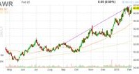
American Water Works and Aqua America rank highest on the average positioning of five fundamental criteria. American States Water is not far behind. A few water utility stocks have rewarded investors with total returns in excess of the S&P. There are a plethora of firms that play in the water sector from an infrastructure viewpoint. Regulated water utilities have been a sub-sector that attracts investors looking for the stable income attributes of a utility with exposure to both small-caps and a consolidation trend. Some utilities are pure water-focused and some firms have a diversified asset approach where water is a portion of their business portfolio. In addition, there are other industries that are water-related, such as desalination and water treatment along with pumps, pipes, and meters. A good recap of the investment thesis is provided by S Network, developer of the S Network Water Technology Index and S Network Water Works Index. These indexes were previously branded as Janney Indexes. Hundreds of articles have been published on the investment opportunities in the water sector. The underlying thesis is the same: water is one of the most crucial inputs to the global economy, not only supporting residential populations with safe, reliable drinking water, but as a necessary “feedstock” for industrial processes, including electrical power generation, semiconductor manufacturing, pharmaceutical production, and food and beverage processing. Water is also vital to agricultural production, and increasingly rainwater and groundwater supplies are not meeting local agricultural needs in many places around the globe. Within the US, there are regional water issues and many of these cross state regulatory boundaries. For example, according to a report published by calvert.com: ● California – According to the University of California, Davis, climate models show California’s water supply could fall up to 30% over the course of this century. The state’s plan to reduce per capita urban water usage 20% by 2020 is one of many efforts to address this. ● Great Lakes Region – Concerned about proposals to divert its water to other areas, an eight-state agreement now bans water exports from the Great Lakes-home to 90% of the nation’s freshwater and drinking water for 30 million people. ● Northeast – Aging infrastructure causes as much as 50% of clean water here to leak into the ground between treatment centers and the tap. ● The South – Drought has crippled the region in recent years, particularly Texas, where a record-level drought has decimated farms and ranches and caused billions of dollars in damage to the state’s economy. ● Gulf Coast – States such as Florida, Louisiana, and Texas need improvements in storm water management infrastructure due to increased risks from stronger hurricanes. Ten of the more popular stocks for many investors are the following firms, in order of market capitalization: American Water Works (NYSE: AWK ); Aqua America (NYSE: WTR ); American States Water (NYSE: AWR ); California Water (NYSE: CWT ); SJW Corp (NYSE: SJW ); Connecticut Water Service (NASDAQ: CTWS ); Middlesex Water (NASDAQ: MSEX ); York Water (NASDAQ: YORW ); Artesian A (NASDAQ: ARTNA ); Consolidated Water (NASDAQ: CWCO ) As Roberto Clemente once said, “Water stocks have been very, very good to me.” Below are 12-month charts of eight water companies as offered on finviz.com. (click to enlarge) (click to enlarge) (click to enlarge) However, not all water investments have been barnburners over the recent past. Below is a table of average annual 3-year and 5-year total returns, which includes share price appreciation plus dividend income, sorted by highest to lowest 5-yr return (S&P 500 average annual total returns are 17.8% and 16.5%, respectively): Source: Morningstar There is quite a difference between the best and the worst performers. However, this is yesterday’s news and investors should be looking towards tomorrow’s news. One management attribute worth analyzing is their ability to generate return on invested capital ROIC. The advantage of ROIC is it evaluates returns across the capital structure and is not limited to just equity or assets. One would think the highest returns would correlate with the highest share price appreciation, but it does not. Below is the same ten companies’ average ROIC for the previous 3-years and their respective 5-yr total stock returns: Source: Fastgraph, Morningstar, My Investment Navigator Overall, the regulated utility sector has an average ROIC in the 5% range, and most of these companies meet or exceed this level. Nevertheless, ROIC is only half the equation as it only evaluates the return of capital deployed and not the cost of capital. The best companies generate ROIC in excess of their weighted average cost of capital or WACC. Below is the Net ROIC, or ROIC less WACC, for these ten companies: Source: My Investment Navigator, Morningstar, ThatsWACC.com It seems only two management teams have generated returns on their total capital structure in excess of the cost of the same capital. It is intriguing the stocks with the best 5-yr total stock returns are not those generating the highest investor returns based on capital deployed and the cost of that capital. Dividend growth investors would be please by the majority of water utilities, and most have outpaced the meager inflation numbers of the past three years. In 2012, inflation as measured by the monthly CPI averaged 2.1%, in 2013 it was 1.5% and last year 1.6%, for a 3-yr average of 1.7%. Source: Reuters S&P offers an Equity Quality Ranking system evaluating a company’s 10-yr history of consistently generating earnings and dividend growth. The rankings range from A+ as the Highest, B+ as Average and NR as Not Rated. The Quality Ranking for these 10 companies are: A+: None; A: AWR, WTR, YORW; A-: CWT, MSEX, ARTNA. CWTS is ranked B+, SJW as B, and AWK, CWCO as Not Rated. Some investors prefer the diversity and ease of water ETFs: PowerShares Water Resources (NYSEARCA: PHO ), Guggenheim S&P Global Water Index (NYSEARCA: CGW ), PowerShares Global Water Resources (NYSEARCA: PIO ), and First Trust ISE Water Index (NYSEARCA: FIW ) Fund. In addition to these popular water utility firms and ETFs, several others play in the water sector. Of interest is the list offered by S Network Water Technology Index found here . These are global companies in the infrastructure, pump, and metering business with exposure to the water industry. Scanning these names may provide further opportunities worth researching. S Network also offers a variety of water information resources linked to its site here . I prefer to pick specific stocks over ETFs, unless there is disruptive technology involved that can upset the apple cart, and I do not see this happening in the water sector. As one who believes in ROIC, if I had to chose one water utility, it would be either American Water Works or Aqua America. Below is that ranking of each company in the tables above. AWK and WTR ranked the highest on average of these five criteria. American States Water is very close as well and should not be forgotten. Ranking By Order For Each Category Source: My Investment Navigator I have been writing about water stocks since 1997 and the trends in water investing are called out in my two books. This is one area every investor should have in their utility portfolio. Author’s Note: Please review disclosure in Author’s profile. Disclosure: The author is long WTR, AWK. (More…) The author wrote this article themselves, and it expresses their own opinions. The author is not receiving compensation for it (other than from Seeking Alpha). The author has no business relationship with any company whose stock is mentioned in this article.

