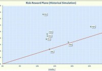
Summary PIMCO multi-sector CEFs outperformed DoubleLine over a 3-year period, but DoubleLine was best over the past year. PIMCO and DoubleLine multi-sector CEFs were not very correlated with one another. High premium funds, like PGP and PHK, have had relatively poor performance. As a retiree seeking income at a reasonable risk, I have allocated a significant portion of my portfolio to bond funds. I do not have the time or requisite knowledge to select suitable individual bonds, so I purchase professionally-managed Exchange Traded Funds (ETFs) or Closed-End Funds (CEFs). The ETFs are typically passive funds that track an index while the CEFs are actively managed. In the current environment of potentially risking rates, my preference is to invest in CEFs where the manager has the flexibility to reduce interest rate sensitivity by revamping their bond portfolio and diversifying away from indexes. Two of the most popular firms offering bond CEFs are Pacific Investment Management Company, better known as PIMCO, and DoubleLine. PIMCO had some rough times last year when “bond king” Bill Gross quit to take a position at Janus Capital. Allianz, PIMCO’s parent company, bled over 5 billion in market cap in a panic sell-off shortly after Gross left. However, it is still generally recognized that PIMCO has an excellent staff with deep experience in the bond market. Jeff Gundlach launched DoubleLine Capital in December 2009. With the departure of Gross from PIMCO, Gundlach has been crowned by many as the new “bond king.” Both PIMCO and DoubleLine have great reputations, so I decided to compare the multi-sector CEFs offered by these two companies to assess which company has had the “best” performance. There are many ways to define “best.” Some investors may use total return as a metric, but as a retiree, risk is as important to me as return. Therefore, I define “best” as the fund that provides the most reward for a given level of risk and I measure risk by the volatility. Please note that I am not advocating that this is the way everyone should define “best;” I am just saying that this is the definition that works for me. PIMCO Multi-Sector CEFS These funds are actively managed and their holding may change without prior notice. The funds typically use a combination of leverage and derivatives to enhance distributions. This strategy can generate above average income but can also run into trouble, like the 2008 bear market, where many of the PIMCO CEFs had substantial losses. The multi-sector bond CEFs are summarized below. PIMCO High Income Fund (NYSE: PHK ). On Wednesday, September 24, 2014 (the day before Gross announced his decision to leave PIMCO), this CEF was selling for a whopping 47% premium. This was not unusual since this fund typically sold at premiums of 50% or more. The premium has now dropped to about 42%; still large but well off the highs. The portfolio consists of 298 bonds, partitioned among corporate (39%), asset backed (28%), municipal (13%), loans (12%), and Government (5%). The effective leverage-adjusted duration is 4.2 years. The fund utilizes 26% leverage and has an expense ratio of 1.2%. The fund has an extremely high distribution of 13.7%, with no return of capital (ROC) over the past year. Note that in 2008, the price dropped 45% and in 2012, the fund hit another rough patch as the price only increased by 4.8% even though the Net Asset Value (NAV) soared over 40%. This divergence in 2012 was because the premium sharply declined from 70% to “only” 35%. PIMCO Income Strategy Fund (NYSE: PFL ). This CEF sells at a discount of 6%, which is unusual since the fund typically sells at a premium. Over the past 3 years, the fund has sold at an average premium of 2.4%. The fund holds 231 bonds allocated among corporate (43%), asset backed (24%), Government (12%), and loans (9%). The effective leverage-adjusted duration is 3.1 years. The fund utilizes 27% leverage and has an expense ratio of 1.2%. It has a distribution of 10%, with no return of capital. In 2008, the fund lost about 50% in both price and NAV. PIMCO Income Strategy Fund II (NYSE: PFN ). This CEF currently sells at a discount of 3.4%. In 2010, the fund strategy was revamped to decrease the focus on floating rate loans and enable the managers to invest in a wider range of fixed income assets. This is a sister fund to PFL and invests in securities with durations in the low-to-intermediate range. The effective leverage-adjusted duration is 3.2 years. The portfolio holds 260 securities partitioned among corporate (40%), asset backed (29%), Government (9%), and loans (9%). The fund utilizes 23% leverage and has an expense ratio of 1.2%. The distribution is 9.6%, with no return of capital. PFN was hit hard in 2008, losing over 50% in both NAV and price. This fund also struggled in 2013, with the price declining by 1%. PIMCO Global StockPLUS & Income Fund (NYSE: PGP ) . This CEF currently sells for a huge premium of 48% but this is a large drop from 52 week average premium of 67%. Over the past 5 years, the average premium has been 63% but on occasion, the premium has dropped to 30%. This fund utilizes an innovative approach by investing in S&P 500 and MSCI EAFE futures as well as bonds. The fund may also employ an equity index option strategy to increase income. The bond portion of the portfolio is focused on asset backed (46%) and corporate bonds (26%). The fund utilizes 38% leverage and has an expense ratio of 2.3%. The effective leverage-adjusted duration is only 1.2 years. The distribution is a high 11.6%, with no ROC over the past year. In 2008, the fund lost almost 50% in NAV and the price declined by 37%. The price of the fund also had losses in 2011 and 2014. PIMCO Income Opportunity Fund (NYSE: PKO ). This CEF currently sells at a discount of 2.5%, but over a 5-year period, this fund had an average premium of 2.6%. The portfolio has 421 holdings, allocated primarily among asset-backed bonds (43%) and corporate bonds (35%). Only about 70% of the bonds are from the USA. The fund utilizes 44% leverage and has an expense ratio of 2%. The effective leverage-adjusted duration is 3.4 years. The distribution is 9%, with no ROC over the past year. During 2008, this fund lost a little over 20% in both price and NAV but has not had a losing year since. PIMCO Dynamic Credit Income Fund (NYSE: PCI ). This CEF sells at a discount of 11.8%, which is a larger discount than the 52-week average of 8.9%. The fund was launched in January 2013, so it does not have a long history. It holds 625 securities, spread across corporate (32%), asset-backed bonds (44%) and cash equivalent (9.3%). The fund utilizes 43% leverage and has a 2.4% expense ratio. The effective leverage-adjusted duration is 3.2 years. The distribution is 9.2%, with no return of capital. PIMCO Dynamic Income Fund (NYSE: PDI ). This CEF sells for a discount of 6.7%, which is a larger discount than the 52-week average of 3.3%. This fund was launched in May 2012, so does not have a long history. It holds 397 securities, invested primarily in asset-backed bonds (68%) and corporate bonds (17%). The fund utilizes 46% leverage and has a high 3.1% expense ratio. The effective leverage-adjusted duration is 3.4 years. The distribution is 8.6%, with no return of capital. DoubleLine Multi-Sector CEFs DoubleLine funds have over $63 billion of assets under management and the founder, Jeffery Gundlach, has received many accolades from the investment community. The first DoubleLine multi-sector fund was not launched until 2013, so there was no way to assess the performance during the 2008 bear market. DoubleLine Opportunistic Credit Fund (NYSE: DBL ). This CEF sells at a discount of 1.9%, which is unusual since the fund usually sells at a premium (average premium over past 3 years was 3.7%). The portfolio has 213 holdings, most (96%) are invested in asset-backed bonds. The effective duration is 8.23 years. The fund employs 17% leverage and has an expense ratio of 1.7%. The fund has an inception date of January 2012, so it only has 3.5 years’ performance history. The fund has a distribution of 8.7% without any return of capital. DoubleLine Income Solutions Fund (NYSE: DSL ). This CEF sells at a discount of 10%, which is a larger discount than the 1-year average of 8%. The fund was launched in April 2013, so it does not have a long history. The fund utilizes 32% leverage and has an expense ratio of 2.2%. The effective duration is 6.3 years. The distribution is 9% with no return of capital. Risk versus Reward To assess the risk versus reward of these multi-sector funds over the past 3 years, I plotted the annualized rate of return in excess of the risk-free rate (called Excess Mu in the charts) versus the volatility of each of the funds. I used 1% as an estimate of the risk-free rate. The Smartfolio 3 program was used to generate the plot that is shown in Figure 1. Note that DSL and PCI were not included because they did not have a 3-year history. (click to enlarge) Figure 1. Risk versus reward over past 3 years As is evident from the figure, multi-sector bond funds have had a wide range of returns and volatilities. To better assess the relative performance of these funds, I calculated the Sharpe Ratio. The Sharpe Ratio is a metric developed by Nobel laureate William Sharpe that measures risk-adjusted performance. It is calculated as the ratio of the excess return over the volatility. This reward-to-risk ratio (assuming that risk is measured by volatility) is a good way to compare peers to assess if higher returns are due to superior investment performance or from taking additional risk. In Figure 1, I plotted a red line that represents the Sharpe Ratio associated with DBL. If an asset is above the line, it has a higher Sharpe Ratio than DBL. Conversely, if an asset is below the line, the reward to risk is worse than DBL. Some interesting observations are apparent from Figure 1. The PIMCO CEFs outperformed the DoubleLine CEFs in terms of overall returns and risk-adjusted returns. DBL had about the same risk-adjusted return as PHK. Most of the ETFs had similar volatilities except for PHK and PGP, which were substantially more volatile. This illustrates that CEFs with large premiums tend to be more volatile since the fluctuations in premium add to the overall risk. Even though PHK and PGP had large distributions, this did not translate into the best risk-adjusted return. In fact, PHK and PGP lagged the other PIMCO funds in risk-adjusted return. PDI was easily the best performer on a risk-adjusted basis. I next wanted to assess if the relative outperformance of PIMCO continued during a more recent past. I reduced the look-back period to 2 years, which allowed me to include DSL and PCI. The results are shown in Figure 2 and are similar to the 3-year data. Again, PIMCO outperformed DoubleLine. PDI continued to be the best performer. The new kid on the block, DSL, lagged. PHK and PGP still had the largest volatility. (click to enlarge) Figure 2. Risk versus reward over past 2 years As a last analysis, I reduced the look-back to the last 12 months, and the results are shown in Figure 3. What a difference a year made! Generally, the multi-sector bond funds have had a rough time over the past 12 months, with interest rate fears dragging down performance. During this period, only 4 of the ETFs (DBL, PDI, PFN, and PKO) managed to stay in positive territory. Over the past 12 months, DBL was the best performer on both an absolute and risk-adjusted basis. PGP was by far the worst performer, due primarily to the reduction in premium, which resulted in both increased volatility and decreased price performance. This illustrates the risks inherent in buying a CEF with a huge premium. DSL was in the middle of the pack. (click to enlarge) Figure 3. Risk versus reward over past 12 months Diversification To round out the analysis, I assessed the diversification associated with these CEFs. To be “diversified,” you want to choose assets such that when some assets are down, others are up. In mathematical terms, you want to select assets that are uncorrelated (or at least not highly correlated) with each other. I calculated the pair-wise correlations associated with the funds over the past two years and the results are shown in Figure 4. (click to enlarge) Figure 4. Correlation matrix over the past 2 years The figure presents what is called a correlation matrix. The symbols for the funds are listed in the first column on the left side of the figure. The symbols are also listed along the first row at the top. The number in the intersection of the row and column is the correlation between the two assets. For example, if you follow PKO to the right for three columns, you will see that the intersection with PFL is 0.550. This indicates that, over the past 3 years, PKO and PFL were only 55% correlated. Note that all assets are 100% correlated with themselves, so the values along the diagonal of the matrix are all ones. It was somewhat surprising to see the small pair-wise correlations among these funds. The only exceptions were the sister funds PFN and PFL, which were 80% correlated with each other. This means that you can gain diversification if you purchase more than one of the funds. In particular, DoubleLine ETFs have a low correlation with PIMCO ETFs. So if you cannot decide which is best, you can diversify by buying one from each investment house. Bottom Line Unfortunately, the analysis was not definitive. PIMCO outperformed over the longer term, but DoubleLine was best over the past year. I believe the PIMCO problems stemmed mainly from the selling after Gross quit, which resulted in an erosion of premiums that translated into reduced prices. Of the PIMCO CEFs, PDI was the best performer. For DoubleLine, the prize went to DBL. In today’s volatile environment, I would definitely avoid funds with huge premiums such as PGP and PHK. Disclosure: I/we have no positions in any stocks mentioned, and no plans to initiate any positions within the next 72 hours. (More…) I wrote this article myself, and it expresses my own opinions. I am not receiving compensation for it (other than from Seeking Alpha). I have no business relationship with any company whose stock is mentioned in this article.