No Miracles Needed To Make Substantial Profits Off GLD
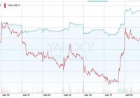
Summary From the beginning of this bear market in GLD, the gold stocks have been leading the way lower, and we are seeing many big names breaking below their November lows. If the sector finally breaks, I don’t envision GLD staying down at those levels for any long period of time. I don’t believe that the gold bull market that began in 2000 ended in August of 2011. Rather I believe this is a cyclical bear inside a secular bull. There are other variables that need to be considered when looking at the correlation between the price of gold and M2. Two weeks ago, I talked about how I was Anxiously Anticipating The Coming Bull Market in the SPDR Gold Trust ETF (NYSEARCA: GLD ). As I stated in the article, I’m hoping that there isn’t another save attempt in the works. GLD was at the bottom of its multi-year trading range. I didn’t want to see it move back and stay in this range for the foreseeable future. We need finality in this bear market. Since that time, GLD has risen to the 115 level, as it rocketed higher after the Fed meeting this past Wednesday. So just more of the same indecisiveness; however, the gold stocks aren’t really following GLD’s move to the upside. From the beginning of this bear market, it’s the gold stocks that have been leading the way lower. GLD’s strength might just be temporary due to a knee jerk reaction to the Fed statement. In the past, these initial moves turn out to be incorrect in terms of which way GLD is ultimately going to go. Below is a look at the performance of the Gold Bugs Index (^HUI) compared to GLD since my last article. The stocks have actually been very weak as of late. The last few trading days, they gave up a good portion of gains from Wednesday, while GLD continues to hold steady. (click to enlarge) (Source: Yahoo Finance) We are also seeing many stocks break down and fall below their November 2014 lows. Goldcorp (NYSE: GG ) was the latest victim, which is not a good sign for the sector. Many other big names like Eldorado (NYSE: EGO ), Gold Fields (NYSE: GFI ), etc. are doing the same. If the ^HUI continues to move to the downside, I expect GLD to soon follow. A Reversal Has Taken Place From April 8 to early May, the ^HUI was showing big gains while GLD was actually down slightly. I wrote an article on May 3 called GLD: Something’s Gotta Give . I said at the time: GLD has been incredibly weak over the last month while gold stocks have been strong. Something’s gotta give here though. Either the ^HUI starts to decline significantly or GLD makes a rebound and gold stocks take off like a rocket. This divergence can’t continue for too many more trading days. Since that time, the ^HUI is down 13.2% while GLD has been basically flat. So it was the gold stocks that finally gave in, as you can see in the chart below. GLD data by YCharts If we extend this chart out to April 8, notice how it’s the gold stocks that are now underperforming since that time. If they continue to decline and GLD remains steady, it’s going to be the same situation but in reverse. Either they quickly rebound, or GLD starts to plunge. Hopefully, it’s the latter. GLD data by YCharts A Miracle Is Not Needed I have been talking for the last 9-10 months about my expectations for GLD should it break below key levels, and how that last leg down could reach as low as 90. Please see my last article (link at the top) for the reason I pick that target. Should the ETF in fact take a final plunge, in a massive shaking of the golden tree, there is going to be a killing made off of it. No miracles are needed here, just a simple 10%-20% decline from current levels and the stage will be set. Should things unfold as described, the gold stocks in the sector will be crushed over the short term as panic begins and ridiculous talk of $500 gold (or a 48 handle for GLD) becomes more prominent. But GLD will not hit 48, or even 72 ($750 gold). Only some whiff of a deflation could bring about that kind of event, and there is absolutely zero signs of deflation showing up in the money supply. I don’t expect that to change in the next few months either. Below is my outlook for GLD should it break below support in the near term. It’s self-explanatory. I’m leaning more towards 90 being touched, and then I would expect a v-shaped recovery with GLD moving back into that 115 range (or $1,200 gold) within short order. By that point, it will be clear that the bottom is in and we will see more follow through action to the upside as new bulls jump on board. The initial move off of the bottom will generate tremendous returns across the entire gold stock landscape. (Source: StockCharts.com) The timing of this move isn’t important, and the above chart isn’t a prediction of the time frame either. Whether it starts next week or months from now, all that matters is it does happen eventually. In 2008, when the financial crisis was in full swing, we had gold stocks imploding as GLD collapsed. Below is a look at some of the larger companies in the sector and their roughly 1 year return after the bottom was hit. AUY data by YCharts Some of the smaller names had even bigger percentage moves off of their lows, as the mass hysteria in late 2008 was just a distant memory by that time. A short-term blip. That’s what I feel this will be for GLD, should it take a final plunge. The key word being “should.” I’m not making a call that it’s going to happen. We have seen GLD pull off many comebacks, I’m just hoping this isn’t another one and this continues to drag on. Again, I want to see finality in sight for this GLD bear. The gold stocks declining and GLD breaking lower would be all of the proof we need that the end is nigh. If the sector finally breaks, I don’t envision GLD staying down at those levels for any long period of time. A Continuation Of the 2000 Bull Market, Or A Brand Spanking New One? I don’t believe that the gold bull market that began in 2000 ended in August of 2011. Rather, I believe this is a cyclical bear inside a secular bull. Sometimes I label it a new bull market just for simplicity sake, so I don’t have to go into the detail, which I’m about to. There is a lot of confusion amongst gold investors when it comes to where we are now. We don’t have a long history of gold in comparison to the stock market and other asset classes. Gold’s price was always fixed until 1971, as the U.S. Dollar was backed by the precious metal. That’s a very small window of data to have available. Investors look at the 1980 peak for gold, and the subsequent 20-year bear market, and just assume that history is going to repeat. Given we are only about 4 years into this bear market, that means we have 16 more years to go. But I don’t see this as a 20-year bear market. I simply look at the money supply as well as annual worldwide gold production data, and I see the reemergence of the bull market very soon. Many disagree that gold follows the money supply, but this is basic economics and it’s a little surprising how few grasp this. However, I can see where the confusion comes from. People are looking at M2 and then they look at the gold price and say: “Gold’s value was in decline from 1980-2000, while M2 was increasing, so why didn’t gold also increase?” Because of this 20-year period of history between gold and M2, investors (and scary enough, some economists) just automatically assume that there can’t be any correlation. But there are more variables that need to be included. We are talking starting points, annual gold supply, total above ground stock, rate of change for M2, etc. The 1980 top in gold was much different than the one that occurred in 2011. During the former bull, the price of the yellow metal went up to $850 (the chart below is the monthly fix, which is why the $850 peak isn’t shown as that price only lasted for a few days). Aggressive gold bidders took things much further than they should have, and gold needed to cool for the next several years as the money supply caught up, which it did. (Source: FRED ) You are always going to have assets revert back to the mean when they get extremely overvalued compared to the fundamentals. That was a major gold bubble back in 1980, those kind of prices (inflation adjusted) weren’t hit in 2011. So you can’t just look at the trajectory of gold and M2 over the proceeding 20 years, and say there is no correlation because one was in decline and one was in advance. You must look at the starting point as well. If gold was currently at $10,000 an ounce, and we assume M2 remains on this same trajectory and all other variables remain constant, we could see gold decline steadily for the next 20 years as well. But it wasn’t just that reversion back to the mean that was impacting the gold price. Just when M2 was back in line with gold in the mid-late 1980s, the money supply drastically slowed down. You can see in the graph above that from about 1991-1995, the rate of increase of M2 declined significantly. If we just focus on that time period, M2 grew by just 4% from July 1991-April 1995. July 1991 $3,355 billion April 1995 $3,496 billion Total M2 Growth Over 4 Years 4% To put that in perspective, in the last 8 months, we have had a 4% increase in M2. If the money supply keeps up the same growth rate from the last 6 months, we would be on pace for an annual increase of 6.4%. A sharp slowdown in the rate of change of M2 is going to impact the price of gold. This is one reason why gold struggled so much in the early 1990s. (Source: Federal Reserve) While all of this was taking place, we also had a huge increase in the annual gold supply, basically doubling from 1,200 tons per year in 1980, to 2,300 tons by 1990. New mining methods to extract ore, along with major new multi-million ounce gold discoveries being found worldwide, contributed to a substantial jump in global gold production. If we just look at discoveries in Australia, you went from basically 0 per year in the 1970s, to 10+ per year by the mid-1980s, and a good portion of these were 1-6 million ounce deposits. (Source: Minerals Council of Australia ) Australia saw a reemergence of their gold industry during that time, after having dwindled to almost nothing in the previous several decades. The country’s gold output was 15% of the total worldwide production by the 1980s. You can see this colored in yellow in the graph below. It wasn’t just Australia though, it was SE Asia, North America, Latin America, etc. (click to enlarge) (Source: I-Graph, World Gold Council, GFMS, BHP Billiton, Macquarie Research) The total above ground stock of gold in 1980 was around 90,000 tons. If the supply kept increasing at 1,200 tons annually, by 2000, the above ground stock would have only been 114,000 tons. But because of the increase in supply hitting the market over those 20 years, the above ground stock was actually 135,000 tons by the end of the 90s. That massive increase in annual supply from 1980-1990 was offsetting some of the growth in M2. Simple supply/demand. Simple economics. 1980 2000 Above Ground Gold Stock Had Annual Supply Remained at 1,200 tons 90,000 114,000 Above Ground Stock As A Result Of Annual Gold Supply Doubling to 2,300 tons 90,000 135,000 So there are other variables that need to be taken into consideration. It’s those variables that people are overlooking when they compare what gold and M2 did from 1980-2000. If we look at those same variables today, we just don’t see the same things occurring. Gold/M2 – The price of gold did get above M2 in 2011, but not even close to the same degree as it did in the previous bull market. Gold was a massive bubble back in 1980, gold in 2011 was just overheated. M2 Growth Rate – Since 2000, we haven’t experienced a long slowdown in M2 growth like we did in the early 1990s. During the 2008 financial crisis, and a few years after as well, M2 was struggling to gain momentum. But we had the Fed doing rounds of QE during that time, so the money supply did keep expanding aggressively. Annual Gold Supply – As for annual gold supply, we have seen a 20% increase since 2000, from around 2,600 tons per year then to 3,100 tons now. Not a substantial jump over the last 15 years considering how high the gold price has risen. It also looks like 2015 is going to be the peak production year, as most of the major producers are expecting flat to declining gold output over the next several years. According to forecast, we will actually see the annual gold supply return to 2000 levels by 2020. If gold remains in this price range, I can almost guarantee that’s going to occur. As a side note, if the annual supply stays around this level for the next several decades, we are looking at some serious gold supply imbalances relative to the money supply. But that is for a future article, as we are getting into more complex thinking/discussions that would need an entire article devoted just to it. So given all of those factors, I don’t see how it is at all possible that we are in the midst of a 20-year bear market in gold like the one from 1980-2000. That’s why I say there will be a resumption of the bull that started in 2000. In other words, whether you like it or not, whether you believe it or not, get ready for a return of the bull market in GLD. In Summary The conclusion of a Federal Reserve meeting is always going to bring increased volatility to GLD. This past week, GLD shot up after the Fed meeting was over with and the statement was read, but gold stocks have been severely lagging for the last few weeks. We are now seeing more gold stocks break below their November 2014 lows, with Goldcorp being the latest to join the party. The stocks have always led the metal lower since the bear market began. I want to see finality to this bear market, not another save attempt. Hopefully, the stocks in the sector are signaling a final move lower is in the works. If GLD should break down from here, and my target of 90-100 is hit, I expect a v-shaped recovery with the ETF moving back up to the 115 region in short order. There are no miracles that need to happen to make a lot of money in this sector, we don’t need to see GLD reach those 2011 highs again to make a substantial profit. Just a quick blast down 10-20% will suffice. The rebound off of the 2008 lows produced 200-300% gains in gold stocks over the course of a year, I expect similar gains this time around should GLD take a tumble. Whatever happens, I do believe that the bull market in gold that began in 2000 is still alive and well. This is more than likely just a cyclical bear inside a very long secular bull market. This isn’t like 1980-2000, I don’t expect a 20-year bear market in gold. Disclosure: I/we have no positions in any stocks mentioned, and no plans to initiate any positions within the next 72 hours. (More…) I wrote this article myself, and it expresses my own opinions. I am not receiving compensation for it (other than from Seeking Alpha). I have no business relationship with any company whose stock is mentioned in this article.