Tag Archives: most-popular

Capitalizing On The Low Volatility Anomaly: An Introduction

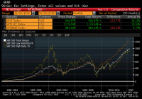
Summary Introduces readers to a series on the Low Volatility Anomaly, or why lower risk investments have outperformed higher risk investments over time. Sets the stage for a more academic approach to detailing Low Volatility strategies. Breaking this thesis down into fundamental pieces could provide for a more consumable narrative for readers and provide an opportunity for real-time feedback as the study is completed. The alpha we are collectively seeking in this community is investment outperformance on a risk-adjusted basis. As a contributor, describing to readers a readily implementable strategy that has consistently and meaningfully outperformed the broader market over the history of modern finance should be a chief goal. I have referenced such a strategy, the Low Volatility Anomaly, in a litany of articles over the years, including in my well received recent series on 5 Ways to Beat the Market . Given the long-run structural alpha generated by low volatility strategies, I want to dedicate a more detailed discussion of the efficacy of this style of investing. Providing a detailed theoretical underpinning of the strategy or detailing multiple examples of its outperformance can prove challenging in a single blog post. In a series of articles, I am going to describe the theoretical underpinning for the Low Volatility Anomaly and empirical evidence of its existence across markets, geographies, and long-time intervals. For most readers, this will not be a summer blockbuster. I am going to attack this series of articles in a more academic approach, linking to scholarly articles by authors who are wiser than me for support of my thesis. By breaking this series into themed segments, I hope it is more consumable for readers wishing to explore the merits of this strategy. I previously had good success with a more long-form academic undertaking through the post, A Lecture on Yield , and I hope readers enjoy this series even more. Before we delve into an introduction on the Low Volatility Anomaly, I want to pictorially demonstrate the strategy. Since pictures are worth a thousand words (and I am preparing to write several thousand of them in this effort), a couple of pictures should be a good place to start. Below is the cumulative total return profile (including reinvested dividends) of the S&P 500 (NYSEARCA: SPY ), the S&P 500 Low Volatility Index (NYSEARCA: SPLV ), and the S&P 500 High Beta Index (NYSEARCA: SPHB ) over the past twenty-five years. The volatility-tilted indices are comprised of the one-hundred lowest (highest) volatility constituents of the S&P 500 based on daily price variability over the trailing one year, rebalanced quarterly, and weighted by inverse (direct) volatility. Pictorial Depiction of the Low Volatility Anomaly (click to enlarge) Below I capture annual total returns of the Low Volatility, High Beta, and broad market indices, and provide summary return and risk statistics, illustrating the risk-adjusted outperformance of Low Volatility stocks. Note: Index data is available back to November 1990. Index data is back-tested based on this methodology, which is hypothetical and not actual performance. While this is not the only example of Low Volatility strategies outperforming their higher beta cohorts or the market in general, it provides a good jumping off point for this discussion based on the broad domestic equity market benchmark. In the graph and chart, one can see that the Low Volatility Index produced higher absolute returns with only three-quarters of the market risk and less than half of the risk of the High Beta Index as measured by variability of returns. We will examine both longer-time interval samples of outperformance and greater alpha in other examples throughout this series, but I hope these historical returns frame the Low Volatility Anomaly at the outset. Why has this anomaly persisted for so long? The next article in this series will begin to discuss the theoretical underpinning for the Low Volatility Anomaly, combining elements of market structure and a touch of behavioral economics. The next section will also feature expansive market studies of the persistence of the Low Volatility Anomaly. Disclaimer My articles may contain statements and projections that are forward-looking in nature, and therefore inherently subject to numerous risks, uncertainties and assumptions. While my articles focus on generating long-term risk-adjusted returns, investment decisions necessarily involve the risk of loss of principal. Individual investor circumstances vary significantly, and information gleaned from my articles should be applied to your own unique investment situation, objectives, risk tolerance, and investment horizon. Disclosure: I am/we are long SPLV, SPY. (More…) I wrote this article myself, and it expresses my own opinions. I am not receiving compensation for it (other than from Seeking Alpha). I have no business relationship with any company whose stock is mentioned in this article.

4 ETFs In Focus As Iran Reaches Nuclear Deal

The tension in the Middle East has eased following the historic nuclear deal between Iran and world powers. After decade-long negotiations, the Islamic Republic is ready to back down the development of nuclear weapons for over a decade in exchange for relief in oil sanctions imposed in the late 2000s. This seems to be a major development for Iran, the U.S. and the six world powers. The deal would open the doors for international oil and gas giants like Royal Dutch Shell (NYSE: RDS.A ), Total S.A. (NYSE: TOT ) and Eni SpA (NYSE: E ), previously barred under sanctions, to invest in the Iranian oil and energy sector thanks to Iran’s huge oil reserve. This is especially true as Iran is the world’s fourth-largest reserve holder of oil with 158 billion barrels of crude oil, according to the Oil & Gas Journal . Notably, it accounts for almost 10% of the world’s crude oil reserves and 13% of reserves held by the Organization of the Petroleum Exporting Countries (OPEC). On the other hand, any relaxation in sanctions would boost Iranian oil exports and production, adding to the global supply glut. However, it will take at least six months for the sanctions to be lifted due to vast legislative procedure involved in the historic deal. Additionally, the relief to oil sanctions will be gradual when it starts and thus could take years or more for Iran to increase oil production significantly or fully ramp up its export capacity. As per Fitch Ratings, Iranian oil production will increase in 2016 but will take a number of years to reach its previous peak. Iran currently exports about 1.1 million barrels per day, which more than halved from 2.6 million barrels per day exported in 2011. The development has put the spotlight on many corners of the investing world with investors keeping a close eye on them for the coming days. In particular, crude oil price has seen huge volatility following the historic nuclear deal. Crude price slumped as much 2.3% on the day but bounced back later to settle 1.6% higher at the close. As a result, we have highlighted four ETFs, which are especially in focus in the wake of nuclear deal: United States Brent Oil Fund (NYSEARCA: BNO ) Oil ETFs which directly deal in the futures market will be on the top of investors’ list. While there are many, the focus would be on Brent crude oil that serves as a major benchmark of oil worldwide instead of WTI, which is more of a benchmark for American prices. The fund provides direct exposure to the spot price of Brent crude oil on a daily basis through future contracts. It has amassed $95.4 million in its asset base and trades in good volume of roughly 215,000 shares a day. The ETF charges 75 bps in annual fees and expenses. BNO gained 0.5% on Tuesday trading session and is down about 9% in the year-to-date period. SPDR S&P Oil & Gas Exploration & Production ETF (NYSEARCA: XOP ) As Iran is expected to increase oil production after sanctions are lifted, a closer look at the exploration and production sector is warranted. XOP is one of the largest and popular funds in the energy space with AUM of $1.7 billion and expense ratio of 0.35%. It trades in heavy volume of more than 9.7 million shares a day on average. This fund provides an equal-weight exposure to 75 firms by tracking the S&P Oil & Gas Exploration & Production Select Industry Index. None of the firms accounts for more than 1.84% of the total assets. The product is skewed toward small cap securities, as these account for 56% share in the basket, while the rest is almost evenly split between large and mid caps. The ETF surged 3% on the Iran deal but is down 4.8% so far in the year. iShares U.S. Aerospace & Defense ETF (NYSEARCA: ITA ) A nuclear agreement could be a boon for the U.S. defense sector, as it will prompt the Mideast partners to seek improved defense systems from American contractors. While there are other two quality options in the defense space – PPA and XAR – ITA will garner huge investors’ interest for its liquidity and AUM. The fund follows the Dow Jones U.S. Select Aerospace & Defense Index and holds 36 stocks in its basket. It allocates higher weights to the top two firms – Boeing (NYSE: BA ) and United Technologies (NYSE: UTX ) – at over 8% share each. Other securities hold no more than 6.70% of total assets. The fund has accumulated $533.6 million in AUM while charges 44 bps in fees a year. The product is up 0.6% on Tuesday trading session and 6.4% so far this year. Market Vectors Gulf States Index ETF (NYSEARCA: MES ) The deal could be the game changer for the Middle East, as it would make the relationship with the Western countries smoother with increased investments, new business, and a pickup in other economic activities. Given this, MES having AUM of just $15.3 could be potential winner in the coming years. The fund provides exposure to the 63 largest and most liquid stocks in the Gulf region by tracking the Market Vectors GDP GCC Index. Emaar Properties, Qatar National Bank and National Bank of Kuwait occupy the top three spots with at least 6% share each. Other firms hold no more than 4.3% of total assets. From a sector look, financials dominates the portfolio with 66.7% share while industrials and telecom round off the next two spots with double-digit exposure each. The ETF charges 99 bps in annual feeds and trades in a paltry volume of about 6,000 shares. The fund added 1.3% on the day and over 4% in the year-to-date time frame. Original Post

Risk Is The Dark Matter Of Portfolio Management

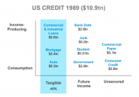
By Ron Rimkus, CFA In 1932, a Dutch astronomer measuring the motion of the stars in the Milky Way noticed something odd in his calculations: The orbital velocities didn’t match up with the visible amount of mass in the galaxy. In response to this observation, he theorized that dark matter – invisible, undetectable matter – must be present in massive quantities to explain the observed movement of heavenly bodies. This is a lot like risk management in the field of investing. Many investors today use a broad array of mathematical tools to track the movements of security prices, sectors, factors, benchmarks, portfolio characteristics, alpha, beta, smart beta… you name it. Yet these tools failed to predict the last crisis in 2008. In fact, historically, they have failed to predict every crisis. And they will fail to predict any crisis in the future. There is much more to risk than the observed movement of security prices. Quite simply, measuring risk is not what such tools do – at least not in any absolute sense. Tools like factor exposures, tracking error, value-at-risk (VaR), growth, value, momentum, and smart beta only measure the relationship of one group of securities relative to another group of securities. But they do serve a purpose. Many investors use them to better understand how their portfolio behaves relative to another portfolio, or to compare relative exposures to interest rates, oil prices, etc., which of course are perfectly valid uses. But they also tell you something about historical relationships that can and frequently do change – often implying that the observed relationship will continue. In statistical parlance, when it comes to the future, these tools are often applied “out of sample.” Typically, these tools work just fine… until they don’t. They’re great when comparing a client’s portfolio with the S&P 500 Index, for example. But what happens if the S&P 500 goes over a cliff? Is it sufficient to say, “Yeah, but our portfolio model went over the cliff with less volatility and a lower tracking error, too!” The real risk, of course, is that clients fail to meet their goals. Don’t get me wrong; these tools have their place. But many investors believe they can adequately measure and describe risk with them. Unfortunately, the tools of risk management are inadequate to describe risk in any absolute sense. What these tools really measure is relative risk, not absolute risk. Consequently, absolute risk is like dark matter. It governs the behavior and performance of securities markets but is not easily measured. So, we often ignore it. But we do so at our own peril. Of course, understanding relative risk can be both interesting and useful. But success is judged against the goals one is trying to achieve. If an investment manager uses these tools to understand his intended and unintended bets against the market, they can be quite helpful. If the manager uses them to create closet index funds, however, then it is simply self-serving. What happens is that the portfolio might closely mirror – or even beat – the performance of the index for many periods, but the two are in essence the same. All too often portfolios using these tools disguise a sad reality: They deliver market-like performance at active management prices. So, where today can we find examples of rising absolute risk that is likely undetected by today’s tools of relative risk? I’m glad you asked. Consider for a moment the broad stretch of financial history. It used to be that currency was backed by gold and loans were backed by tangible assets (e.g., mortgages are typically backed by homes). Both instruments gave their owners legal claims to real assets in the event of default. This approach helps establish trust between two parties in a transaction. During much of the 19th century, the world operated on what is known as the classical gold standard, in which currencies were backed more or less one-for-one with gold. Why did this come about? Why did any country ever have a gold standard? Because people can trust gold – in an absolute sense. Governments can’t print gold. But the world has long since abandoned the classical gold standard, so the fundamental trust and stability conveyed by gold is almost always out of sample in the context of today’s data and mathematical tools. Likewise, back in the 19th century, loans were fully backed by tangible assets. Lenders would let other people borrow only if they had the right to recover money if a borrower defaulted. And government debt typically traded with a risk premium over corporate bonds. By backing loans with collateral, borrowers don’t need income to fulfill their obligations to lenders. Collateral creates trust in the financial system. Over time, however, the use of real assets to back these claims, whether currency or loans, has been whittled away by numerous small changes. Today, currency is no longer backed by anything, and loans are increasingly backed by nothing but the earning power of the borrower. So, the fundamental reason for people to trust currency and credit has slowly shifted from a sound claim on tangible assets to a speculative claim on future income. Now, so long as future income is healthy, there isn’t necessarily a problem. Trust is intact. But what happens when the future income fails to materialize? That’s right: default. So, the transition from relying on tangible assets to future income increases the risk to the entire system. This is systemic risk. Where exactly does this systemic risk show up? Is it in time series data of security prices or spreads from the past 10, 20, or 30 years? No. Is it in your factor exposures relative to the benchmark? How could it be? Is it even showing up in interest rates or spreads? Hardly. Curiously, over the last 25 years, the United States has seen a marked increase in credit without collateral in the form of credit cards, student loans, bank financing, junk bonds, government bonds, etc. With these instruments, borrowers repay by using their future income to meet obligations. By charging high rates of interest, lenders anticipate a percentage of borrowers won’t have adequate future income and will default. Therefore, lenders charge interest rates in excess of the expected default rate to earn a spread (among other things). But this comes with a cost. Borrowers must have income in order to repay. At the macro level, personal income must grow and jobs must be abundant in order to have healthy credit markets. In the absence of a healthy economy, it all comes racing back to trust. And without income or collateral, trust becomes scarce. Consider now the debt profile of the United States over the last 25 years. The first chart shows that about 40% of debt in the United States was backed by tangible assets in 1989. The second graph shows that only about 29% of debt in the United States was backed by tangible assets in 2014. Moreover, collateral requirements in the system have been weakened as loan-to-value (LTV) ratios have risen substantially in mortgages, for instance. According to the Federal Reserve Bank of Dallas, LTV ratios increased from roughly 83% in 1989 (meaning the average borrower put 17% down and borrowed the rest) to about 93% as of 2010 (the latest date for which these data were published). An LTV of 93% means that the home price need only fall by more than 7% in order for the loan to be underwater and the bank to be at risk of losses of principal (equity). Because LTV ratio data capture home values at date of purchase and do not capture current values of homes (which fluctuate in the market), the picture could be much worse than the data suggest. For instance, in a down market like the one the United States had from 2007-2011, the LTV ratios are much higher and the buffers in the financial system are consequently much lower. And this is for the one-quarter of U.S. debt that is backed by tangible assets. So, what about the rest of the debt? About three-quarters of U.S. debt is now supported solely by future income. This means a massive increase in systemic risk over time. These changes have occurred incrementally over many decades, so much of the increases in systemic risk are out of sample. Few people recognize the totality of the change from beginning to end. Small, incremental changes that add up to big changes over time are typically missed by the market. And this is due, at least in part, to the investment profession relying statistical tools like standard deviation, factor exposures, VaR models, etc. But make no mistake: The safety and soundness of the system has fundamentally changed. How is this possibly reflected in the day-to-day volatility of benchmarks? Or how about the covariance of a portfolio with oil prices over the last 10 years? Ten years is, after all, a small fraction of the time it took for today’s financial system to evolve. We now have an economy and money supply that grows with credit expansion. But credit is expanding rapidly while economic growth is faltering. A premise of modern central banking is that lower interest rates drive credit growth, which in turn drives economic growth. But what happens if credit expansion reaches a tipping point and lower rates fail to grow the economy? Isn’t that risk? Are we there now? Over the last 100-plus years, the United States has shifted the security of its currency and credit from fully backed collateral to promises based on the future income of borrowers. And in doing so, it has largely abandoned the idea that obligations can be made whole with tangible assets. At the very bottom of it all, the reason to trust U.S. currency and credit has declined. So, the risk in the system has markedly increased, but where is that risk captured and calculated? How exactly does that manifest itself in market prices? What about a portfolio manager whose strategy is based on investing in illiquid assets in a liquid world? What happens if liquidity changes should stop economic growth? Perhaps when the economy stops growing, we will all find out how much absolute risk has grown over the years regardless of what your relative risk tools are telling you. In the end there is but one question to consider: Is there some dark, mysterious force holding the financial universe together? Or will it all come flying apart?