Tag Archives: market

A Race Against Volatility And Bearish Sentiment For The United States Oil ETF

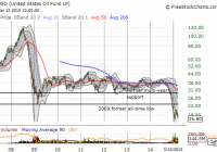
Summary Option-implied volatility on oil is at levels seen during the financial crisis, and short-term volatility on the United States Oil ETF has soared. While current momentum and fundamentals strongly favor the bears, it seems a recent large long-term bet against volatility is the best risk/reward trade on the United States Oil ETF. An analysis of the timing of various United States Oil ETF trades shows a strong bearish short-term opinion that is very reactive and a telling dispersion of longer-term opinion. On March 5, 2015, Barron’s Blogs published a short article on a large bet against volatility on the United States Oil ETF (NYSEARCA: USO ) called ” Big Options Bet Sees Oil ETF Rangebound into 2017.” The possibilities intrigued me because USO enjoyed a remarkable 5-year period of range-bound trading before the current plunge. After the bounce from 2009 lows, USO hit a high of around $46 in 2011 and a low of $29 once in 2011 and again in 2012. An extended period of relative tranquility has been rudely interrupted Directionless, long-term bets seem very reasonable especially given the runway allowed to close-out the trade at a profit well ahead of expiration. The key quote from the blog post: Energy-sector analysts continue debate the supply and demand picture, but one trader in the options market stepped up to the plate with a notably large, long-term wager oil stability. Andrew Wilkinson at Interactive Brokers noted the so-called ‘straddle’ position, which involved the simultaneous sale of ‘put’ options and ‘call’ options that expire way out in January 2017. Options are contracts that allow investors to buy or sell shares at a set price at a specific period of time. Selling options requires a bet against the underlying equity trading “in the money” by expiration. For call options, it is a bet that the underlying will close below the strike price plus the option premium. For put options, it is a bet that the underlying will close above the strike price minus the option premium. Selling BOTH call and put options on the same underlying is a bet that the underlying will stay within a range over time AND that volatility will generally decline over this time. If the underlying falls too far or gains too much too soon, losses could be great enough to force the trader to abandon the bet at a large loss. The Barron’s blog indicated that the big trade will work as long as USO remains within the range of $12.30/share to $25.70/share. It did not provide the specific strikes, so I directly reviewed the Jan 2017 strikes for large increases in open interest. After this process, I concluded that the swell of negative short-term bets combined with the dispersion of opinion on longer-term bets makes a directionless bet more intriguing. I used the options information in Etrade.com to look at the open interest on individual options as of the close Friday, March 13, 2015. The January 2017 calls with the largest open interest have strikes of $19 and $20 at 21,199 and 23,626 options, respectively. The January 2017 put options with the largest open interest have strikes of $19 and $20 as well at 20,178 and 17,975 options, respectively. There are no other strikes that even come close to these. Looking at the history of open interest, I found that the Jan $20 calls and Jan $20 puts have experienced steady increases in open interest since mid-January and early February, respectively. On the other hand, the Jan $19 calls and Jan $19 puts have both experienced large leaps in open interest. The open interest on the call options more than doubled to about 12,500 options on March 5th. The open interest on the put options went from a mere 2,500 or so to about 12,500 on March 5th. In both cases, traders have clearly piled into calls and puts on top of the initial surge – perhaps in imitation of the short straddle, perhaps as a result of differing interpretations on the implications for the large options trades. For reference, I looked at the other long-term options available for trading: the January 2016 expiration. Open interest in the January 2016 options is quite diverse. For call options, the top open interest sits at $25 with no other strike anywhere close to the 44,445 options. This is of course, right at the top of the range that the January 2017 trader is betting on. There are a cluster of call options ranging from 34,667 to 20,988 open interest scattered across $18, $20, $21, $28, $35 and $30 strikes in descending order. For put options, the $16 strike has an open interest of 52,625 with the $18 strike at a close second with 41,748 open interest. In the case of the call options, clearly some of the bets are very speculative. The calls at the $35 strike have been bought mainly in three separate chunks once in each of the months of November, December, and January at prices around $1.10, $0.45, and $0.17, respectively. So from the lens of individual options on a longer-term basis, the bets for or against USO represent a spread of market opinions. On a short-term basis, the opinion on USO is definitively negative although sentiment has hit even more negative levels before the big sell-off started. This sentiment has created substantial premiums on puts options. Schaeffer’s Investment Research calculates an open interest put/call ratio based on the options expiring within three months. It represents immediate market sentiment. The chart below shows three large spikes in the ratio; only the third turned out to be significant. Yet, traders still rapidly got more (relatively) bullish as the sell-off got underway. After hitting a major low, the ratio only tentatively stair-stepped its way higher until it finally soared in the past month AFTER USO made its last all-time low. The overall open interest put/call ratio stair-stepped tentatively until AFTER USO made its last major low In other words, the market only recently started to accept the bearish nature of the trading in USO as a result of the bearish fundamentals of on-going inventory builds and STILL rising production in oil (not to mention the contango conditions which promise to drag USO further down as the fund rolls over futures positions). Last week, Kuwait suggested that OPEC will continue its production policy in its upcoming June meeting. Also last week, the International Energy Agency (IEA) said …U.S. supply so far shows precious little sign of slowing down. Quite to the contrary, it continues to defy expectations. The organization does not expect production growth to slow until the second half of 2015. U.S. crude inventories are now at a record 468M barrels. (See Reuters ” IEA sees renewed pressure on oil prices as glut worsens” for more details on these developments). I suspect the issue of supply cuts will finally get forced when the marginal buyers of oil have to exit the market for lack of storage. At THAT point, perhaps some kind of sustainable bottom in oil will begin. In the meantime, the pressure on oil prices has created a surge in related measured volatility. The Bank of England recently published this spider chart showing option-implied volatility for oil is at levels seen during the financial crisis. Volatility across financial markets has expanded rapidly from last year’s levels – oil stands out as having reached levels of volatility equal to those of the financial crisis Schaeffer’s Investment Research calculates its own volatility index, the SVI, on individual equities. I believe it uses the front and second month options for its calculation . The SVI for USO has surged to tremendous highs but it has actually come off in recent weeks, likely a reflection of the relief from USO’s jump from recent lows. It took a while for the market to accept the tremendous downside potential on USO. The volatility index did not even reach a new high until the sell-off was about 3 months old. The volatility index on USO peaked just after its recent low. Source: Schaeffer’s Investment Research The behavior of the SVI suggests that the market in USO is very reactive rather than predictive. The extreme in the option-implied volatility on oil suggests that we are closer to the end than the beginning of the volatility spike in oil. If volatility measures on USO, like SVI, manage to make fresh highs, such a move could represent a final washout of negative sentiment. Time seems to be on the side of the big seller of the straddle on January 2017 options. Like the open interest put/call ratio, it took the failure of OPEC’s November meeting to prop up prices for USO shorts to get really serious. In other words, there was a lot of latent expectation (hope?) that OPEC would succeed in efforts to manipulate the market. Shares short on USO are now back to levels last seen in the summer of 2013. Note how that ramp evaporated quickly after USO declined mildly for a few months. Shares short on USO were sitting at a major low one month into the sell-off… Here is a close-up showing how fast shorts piled up after the OPEC late November meeting. For example, shares short soared over 50% from December 1 to December 15. …and shares short did not take-off in earnest until December (after OPEC could not decide to cut production to try to prop up prices) As of the time of completing this piece, USO cracked a new all-time low as WTI crude hit lows not seen since March, 2009. The mild optimism that built from the earnings reports of various oil companies has faded in the wake of the market realities that continue to pressure oil lower. United States Oil ETF makes a new (intraday) all-time low shortly after opening for trading on March 16, 2015 Source: FreeStockCharts.com As I mentioned earlier, I think a major market event like an actual decline in U.S. inventories or the complete filling of storage capacity might be required to signal a more sustainable bottom in oil prices. Ahead of that, selling long-term volatility while premiums are high could be the best risk/reward trade available on USO. Until a major market event, the shorter-term momentum looks firmly in favor of the bears. Be careful out there! Disclosure: The author has no positions in any stocks mentioned, but may initiate a short position in USO over the next 72 hours. (More…) The author wrote this article themselves, and it expresses their own opinions. The author is not receiving compensation for it (other than from Seeking Alpha). The author has no business relationship with any company whose stock is mentioned in this article. Additional disclosure: Note that I may open a short and/or long position on USO in the next 72 hours. See article for more details.

Schwab Intelligent Portfolios: Intelligent Investing Or Marketing Hype?

Summary Schwab has joined the rapidly growing robo-adviser market with its “Schwab Intelligent Portfolios.” Cash drag can dramatically diminish investor returns. Smart beta does not live up to its hype of superior returns. “No adviser fee” is just a marketing hype that can cost an investor millions of dollars when cash drag and ETF expenses are taken into account. Schwab Intelligent Portfolios won’t be a game changer for many reasons. Due to the increasing popularity of robo adviser investing, Charles Schwab (NYSE: SCHW ) has entered this market with its introduction of Schwab Intelligent Portfolios . For a minimum of $5,000 initial investment, Schwab sets an asset allocation using ETFs and rebalances the portfolio periodically. For a minimum of $50,000, a client may elect tax loss harvesting by the program. No adviser fees are charged on top of the fees charged by the ETFs. Is this a game changer? Should you enroll? How much will it cost? One major implicit cost is cash drag. Schwab Intelligent Portfolios hold 6-30% of assets in cash, allowing Schwab to earn the spread between the interest it pays on the cash deposits (currently around 0.12%) and investment income from such deposits. Assuming average stock market return of around 10%, a 6-30% cash allocation costs 0.6-3% annually ! That is at least twice as much as the 0.3% annual adviser fees charged by other similar robo adviser programs, as stated in Schwab’s disclosure . For comparison, neither Wealthfront nor Betterment mandate cash allocations. After all, if I want to hold cash, why do I need to give it to a robo adviser? While Schwab pays only 0.12% on cash deposits, you can earn over 8 times as much with a high yield savings account , which also allows you to withdraw money anytime. This implicit 0.6-3% annual fee from cash drag belies Schwab’s claim as a no-fee robo adviser. But that is not all. The ETFs selected have fees of their own. The asset allocation recommended is based on risk tolerance and investment horizon. The lowest cost asset allocation possible, recommended with the highest risk and return potential, and minimum 6% cash allocation, is shown below: Stocks 94% Probable ETF Expense U.S. Large Company Stocks 11% SCHX 0.04% U.S. Large Company Stocks – Fundamental 17% FNDX 0.32% U.S. Small Company Stocks 7% SCHA 0.08% U.S. Small Company Stocks – Fundamental 11% FNDA 0.32% International Developed Large Company Stocks 9% SCHF 0.08% International Developed Large Company Stocks – Fundamental 13% FNDF 0.32% International Developed Small Company Stocks 4% SCHC 0.18% International Developed Small Company Stocks – Fundamental 6% FNDC 0.48% International Emerging Market Stocks 4% SCHE 0.14% International Emerging Market Stocks – Fundamental 6% FNDE 0.47% U.S. Exchange-Traded REITs 4% SCHH 0.07% International Exchange-Traded REITs 2% VNQI 0.24% Cash 6% 0.00% Total 100% 0.23% Schwab will likely use its own funds whenever possible, but may switch to other funds under its program as part of tax loss harvesting. While the fees of traditional Schwab cap-weighted index funds are among the lowest in the mutual fund industry, the fees of fundamental index ETFs are much higher, as seen above. The net result is an additional 0.23% annual fee for the overall portfolio. In sum, Schwab Intelligent Portfolios cost at least 0.83% of assets annually . That does not account for costs associated with capital gains tax and bid-ask spread for periodic rebalancing. What is the effect of a 0.83% annual expense? Due to the effect of compounding, an investor will lose 14% of their assets in 20 years, 20% in 30 years, 26% in 40 years, and 32%, or almost a third of their potential wealth, in 50 years. As shown by the following graph, $100,000 invested over 50 years earning 10% return will grow to $11.7 million, but the investor paying 0.83% fee would end up with only $8.0 million, losing $3.7 million to fees over the years. (click to enlarge) Do fundamental index funds offer higher returns, thereby justifying their higher fees? The research suggests no. The table below shows that such so-called smart beta funds actually underperform the market: Smart beta funds vs. S&P 500 Name 3-year annualized total return 5-year annualized total return 10-year annualized total return Net expense ratio Strategic beta ETFs* 13.33% 12.5% 7.9% 0.48% Strategic beta mutual funds** 18.17% 13.69% 6.98% 1.17% S&P 500 index 20.42% 15.45% 7.67% Source: Morningstar. Returns are through Dec. 31, 2014. *Results from 394 strategic beta exchange-traded funds covered by Morningstar. **Results from 43 strategic beta open-end mutual funds covered by Morningstar. Fundamentally weighted indices have outperformed traditional capitalization-weighted indices by greater allocation to value stocks and small size stocks. ETFs and mutual funds constructed from fundamental indices, however, fail to live up to their promise of superior returns, mainly due to higher expense ratios and turnover costs. As John Bogle famously said about investing: You get what you don’t pay for. Impact on the Robo Advisor Industry Adam Nash, CEO of Wealthfront, wasted no time to attack Schwab’s new robo advisor program as a marketing gimmick by presenting something as no fee that was in fact high cost. Schwab was equally quick to issue a response , arguing that cash is actually an investment and the interest rate will eventually rise, that fundamentally weighted indices have historically delivered excess returns, and that the 0.25% advisor fee charged by Wealthfront is a real sunk cost. Betterment also wrote an article to attack Schwab’s program as costly due to cash drag . It is revealing that both Wealthfront and Betterment, the two leaders in the robo advisor industry, each with over one billion dollars in assets under management (AUM), felt compelled to respond with such rapidity. They clearly felt threatened. And rightly so. Most investors too lazy to manage their own investment portfolio and willing to pay 0.15-0.25% advisor fee that Betterment and Wealthfront charge will probably not look too closely at the real cost of cash drag, but rather be attracted by the superficial charm of Schwab posing as a “no fee” advisor. Robo advisor services, which are new technologies, mainly appeal to younger investors, who tend to like free things and new, fashionable things, such as smart beta, one of the latest financial innovations. It is probably inevitable that Schwab will take away some market share in the robo advisor industry. Nonetheless, the products offered by the three robo advisors are differentiated enough to have their own moats. Below are the highest risk and return portfolios from Wealthfront and Betterment: Wealthfront: Asset ETF Allocation Expense ratio U.S. Stocks VTI 35% 0.05% Foreign Stocks VEA 22% 0.09% Emerging Markets VWO 28% 0.15% Dividend Stocks VIG 5% 0.10% Natural Resources DJP 5% 0.75% Municipal Bonds MUB 5% 0.25% Total 100% 0.13% Betterment: Asset ETF Allocation Expense ratio U.S. Total Stock Market VTI 16.2% 0.05% U.S. Large-Cap Value VTV 16.2% 0.09% U.S. Mid-Cap Value VOE 5.2% 0.09% U.S. Small-Cap Value VBR 4.5% 0.09% Developed Markets VEA 37.5% 0.09% Emerging Markets VWO 10.5% 0.15% Municipal Bonds MUB 5.5% 0.25% U.S. Corporate Bonds LQD 0.6% 0.15% International Bonds BNDX 2.4% 0.19% Emerging Market Bonds VWOB 1.6% 0.34% Total 100.2% 0.11% For some reason, probably due to rounding error, the Betterment allocations don’t exactly add up to 100%. The table below summarizes the differences between the three portfolios. Schwab Wealthfront Betterment Stocks 92% 89% 89% Bonds 0% 5% 10% Cash 6% 1% 1% Alternatives 2% 5% 0% U.S. Stocks 52% 40% 41% Foreign Developed Market 33% 26% 38% Emerging Market 7% 23% 10% Value 58% 59% 58% Growth 42% 41% 42% Large Cap 59% 81% 76% Mid/Small Cap 41% 19% 24% Price/earnings 17.5 16.14 16.26 Price/book 1.81 1.94 1.79 Return on equity 14.61 18.21 16.61 Average Market Cap 16.0B 29.3B 29.0B Expense ratio 0.24% 0.13% 0.11% Number of Holdings 13 6 10 Overall stock allocation is similar, with Wealthfront and Betterment both at 89%, while Schwab is slightly higher at 93%. The rest is mostly in cash for Schwab, partly in bonds and partly in alternatives for Wealthfront, and mostly in bonds for Betterment. In terms of allocation to world regions, Schwab is U.S. centric. Wealthfront has a significantly higher allocation to emerging markets at 23%. All three are similar in value versus growth allocation. Schwab has significantly higher allocation to small cap stocks. The price ratios are similar for all three. Schwab has a significantly higher expense ratio, twice as much as its competitors; it also has the higher number of holdings in its portfolio. Wealthfront would appeal to investors who prefer simplicity (the portfolio has only 6 holdings), emerging markets, and alternative investments. Betterment would appeal to cost conscious investors. Schwab would appeal to investors who prefer complexity, small cap, smart beta, and tax loss harvesting (more holdings create more opportunities for tax loss harvesting). But the $64,000 question is, will this be a game changer? I doubt it, for several reasons. First, the robo advisor market is relatively small within the entire asset management business. Even if Schwab could reach $1 billion AUM, at 0.83% fee, that would still generate only a tenth of one percent of Schwab’s 2014 revenue of $6.157 billion, too small to move the needle. Second, Schwab Intelligent Porfolios might even eat into Schwab’s high margin core business, as it could cause Schwab clients using traditional advisor services and expensive actively managed mutual funds to switch over to Schwab’s robo advisor service, causing loss of revenue. Third, robo advisor service may not be a sustainable business model, as it has never been tested under bear market conditions. Young investors confident in a bull market may not feel so confident when the next bear market comes, especially without the hand-holding and long-term relationship of a personal investment advisor, causing funds to go out as fast as they had come into the robo advisor industry. Fourth, investors will probably come to the realization that cash drag is a significant hidden cost, and Schwab Intelligent Portfolios may end up being a total flop. Finally, even if Schwab does succeed in gaining market share and the industry continues to grow, the success itself will attract fierce competition from yet bigger firms, such as Merrill Lynch, ultimately driving profits down. Even though Schwab’s new robo advisor service would not alter Schwab’s fundamentals, robo advisor service is a Wall Street fad worth paying attention to for the enterprising investor. If Schwab succeeds in penetrating the market, it could generate undue optimism, creating good selling opportunities. Watch for its growth in AUM relative to the competitors, new market entrants, and how it handles a bear market. If the new robo advisor service fails, on the other hand, it could generate undue pessimism, leading to a selloff in Schwab’s stock, creating good buying opportunities. Conclusion Don’t fall prey for the marketing hype of Schwab’s “no fee” robo investing. One should hold enough cash as an emergency fund for 6 months worth of living expenses, but not in an investment portfolio meant to last 20 years or more. Put the cash in a high yield savings account, where you can earn over 8 times as much interest, and be able to withdraw anytime you want, rather than be forced to hold at least 6% cash at all times. Forget about smart beta. For higher returns, allocate more to value and small cap, and minimize costs. Schwab Intelligent Porfolios is good marketing, but it won’t be a game changer. Whether or not it succeeds, the potential market is too small to move the needle for Schwab; nonetheless, its success or failure may create price discrepancies for the enterprising investor to exploit. Disclosure: The author has no positions in any stocks mentioned, and no plans to initiate any positions within the next 72 hours. (More…) The author wrote this article themselves, and it expresses their own opinions. The author is not receiving compensation for it (other than from Seeking Alpha). The author has no business relationship with any company whose stock is mentioned in this article.

Essential To Understand This If You Are A 60/40 Investor

Summary We show exactly why the 60/40 allocation has provided better risk adjusted returns by evaluating 60/40 from the perspective of the enterprise. Buying stocks is buying a business, which invariably includes assumption of debt, i.e. being short bonds. Viewed in this light, actual 60/40 “net” bond exposure is significantly less than 40%. Portfolio risk is 90% from stocks and 10% from bonds, not because stocks are 9x riskier than bonds, but because your average true net dollar exposure is close to 90/10. We show historical returns for a variety of strategy combinations based on the insights of this approach, including combinations that target an “actual” net bond exposure. Targeting a true 40% bond exposure has slightly lower returns than traditional 60/40, but better risk adjusted returns with much lower drawdowns; beneficial for retirees who are making annual withdrawals. The 60/40 portfolio (60% equities, 40% bonds) has been the stalwart of the investment management industry. It has delivered better risk adjusted returns than either stocks or bonds individually since 1973. The basic idea is that some balanced combination of two non-correlated assets will provide a consistent and less volatile return stream. It has developed an aura of its own and is the go-to benchmark for other portfolio strategies to compare to. The founder of one of the large investment management firms likened it to Adam Smith’s ‘Invisible Hand,’ saying “We don’t know exactly why it works, it just always seems to work. In the end, when you look back over a 15-year period of time, it works.” Clearly, it would provide much comfort if we did understand why it worked, and this article will shed some light on how 60/40 works in a way you have probably not seen before. Going back to Basics First To understand the concept in its simplest sense, we need to cover some basics of investing across the capital structure. The graphic below shows the enterprise triangle, with the various levels of participation that an investor can choose from. Bonds are the least risky form of investment in the enterprise because they have the highest priority claim against the assets of the business. Equity carries the highest risk because it is the last to get paid after all other stakeholders have been paid. By definition, you should expect a higher return from equity than debt because it carries more risk. Except for government debt, all other debt and equity are dependent on the performance of the enterprise. (click to enlarge) Key concept When investing in stocks, you are buying an ownership interest in the whole enterprise. This means that you also assume (not personally) the debts of the enterprise. Assuming debt or borrowing is the opposite of lending, investing or being long. Borrowing is therefore the same as being short debt. Investing in equities of companies that have debt therefore creates two risk exposures, 1) long equities and 2) short debt. The following box shows an example of creating a 60/40 portfolio at the simplest level. Assume company SPX, representing the entire investment universe, has a market cap of $600,000 and has debt outstanding of $400,000. Assume further that your portfolio of $1,000,000 is currently in cash and ready to be invested in a 60/40 portfolio. (click to enlarge) There are two transactions necessary, 1) allocating 60% of your capital to stock, and 2) 40% to bonds. In Transaction #1, when you buy the equity in a company you automatically assume (not personally) the debt of that company. The debt as a percent of the market cap is 66.7% ($400,000/$600,000). Assuming the debt, as explained above is the same as being short the debt, so your exposure from Transaction #1 is to be long $600,000 in equities and short $400,000 in debt. In Transaction #2, you allocate 40% of your $1,000,000 to bonds. By investing $400,000 in the bonds of the company, you have effectively neutralized your bond exposure. Your net bond exposure is now zero . Obviously, the investment universe is a lot more diverse than just our company SPX, including government debt, but hopefully you get the concept of your “net debt” exposure. We will use the terms net debt, net bond and net leverage exposure interchangeably. Extrapolating the concept to the real world Most 60/40 portfolios will invest the equity portion into a diversified fund or ETF that tracks the entire market such as the SPDR S&P 500 Trust ETF (NYSEARCA: SPY ) or the Vanguard S&P 500 ETF (NYSEARCA: VOO ). When you purchase the SPY, you are by definition assuming the total debt of all those companies in the same proportion to your equity ownership. How do you know how much debt you are assuming? The Federal Reserve Z1 makes this data available on a quarterly basis. It shows the total credit market liabilities as a percentage of the market value of equities outstanding (debt/market cap ratio). Here is the chart since 1953. (click to enlarge) You will notice that the amount of debt that companies hold relative to the market value of their equity is not constant. For every dollar you have invested in equities, you are effectively short bonds in the amount of $1 x debt/market cap ratio percentage, shown on the vertical axis of the graph. This would be offset by your 40% long investment in bonds. Based on this, we can show the net debt exposure for a 60/40 portfolio, rebalanced annually, going back 40 years to 1973. Key Takeaways Net debt exposure is not constant with 40% in bonds. Net exposure will differ depending on the debt/market cap ratio, and it changes continuously. Over 40 years, the 60/40 portfolio, rebalanced annually, had only 3.01% net exposure to bonds . From 1974-1993, net exposure averaged -7.73% and from 1994-2014 was a positive 13.25%. This exposure worked out well for 60/40 investors because it was generally short debt in the rising interest rate environment and long debt in the declining interest rate environment. The often cited fact that stocks in a 60/40 represent 90% of the risk is true, but not because stocks are 8-9 times riskier than bonds, but because the true net dollar exposure of bonds has been less than 10%. Dollar allocation does approximate risk allocation when you think about it in this framework. 60/40 has worked by essentially maintaining a relatively unlevered exposure to the enterprise. Note that while we have assumed all debt is corporate debt, in reality a large portion of the 40% gets allocated to government debt. While the risk profiles are somewhat different, the net bond exposure is the same, and the performance over 40 years is very similar. The Mechanics of Rebalancing The mechanics of rebalancing, which we show below, are a bit complicated, but in a nutshell, when equities go down relative to bonds you increase your risk profile at rebalance time, and when equities go up relative to bonds you reduce your risk profile at rebalance time. The transactions that occur at rebalance time are shown below for two scenarios, 1) equities go down relative to bonds, and 2) equities go up relative to bonds. The dynamics change slightly depending on how you treat the book value of debt. Does it go to market or stay at book? We show it both ways. In Scenario #1, when equity values decline, the debt/market cap ratio increases, increasing your short debt exposure at the enterprise level, making your portfolio more volatile; rebalancing increases your equity exposure, and your implied short debt exposure (both of which contribute to increasing your risk profile), which is then offset by the increased allocation to your long debt exposure. Like I said, it’s a bit complicated. The bottom line of each table shows the new net debt exposure. If you are interested in the workings, then review the tables below else skip ahead to the next section. Questions and Possibilities There are literally dozens of possibilities that arise in thinking around this idea, but I want to give you some actionable insights, so I will highlight a few possibilities and show a range of performance comparisons to finish. Can we replicate the 60/40 risk profile by just investing 100% of the portfolio in equities of a basket of unlevered, or low levered companies? There is no index that we know of that tracks exclusively low leverage; some include leverage as a factor in their quality index. Berkshire Hathaway (NYSE: BRK.A ) (NYSE: BRK.B ) almost fits the bill, and we show the performance, but Buffett is an anomaly, so we cannot assume similar performance. Risk is not only a function of leverage, but also industry and size, so expecting low leverage alone to match the risk profile of 60/40 is not realistic. The S&P Low Volatility Index (implement with SPLV) does have about 25% less leverage than the S&P 500, so we show those returns both individually and in combination with 20% government bonds. As an investor, you have the choice of deciding how much net leverage you are comfortable with. You can adjust your bond exposure to achieve this. We show the performance of a portfolio that targets 0% net bond exposure, and one that targets 40% net bond exposure. It turns out that 60/40 outperforms any positive target debt level we could find, but on a risk adjusted basis, the true 40% bond target does much better. While there is some benefit to government bonds, over 40 years the difference between using corporate and government is very small – corporate has a slightly higher return, but government has slightly better risk adjusted returns. Corporate bonds are exposed to the enterprise risk, so for diversification you may prefer more exposure to government bonds. Government bonds provide that flight to safety when the future of the economic enterprise looks risky, even though corporate bonds seem to have performed better individually. We show the traditional 60/40 with both government and corporate bonds. Performance Comparisons The following table shows returns for stocks, government bonds, corporate bonds, low volatility, and Berkshire, individually, and then in a series of different combinations, including 60/40 conventional with T-bonds, 60/40 with corporate bonds, 0% net bond target, 40% net bond target, and 80% low vol/20% government bonds. Years in which stocks had negative returns are highlighted in red to easily see how each strategy performs under those conditions. While I will leave you to peruse these without comment, I just want to highlight the performance of the “true” 40% net bond exposure versus the traditional 60/40 (both circled); it has slightly lower returns but much better risk adjusted returns and the drawdowns are much smaller. This can be especially beneficial for retirees who are withdrawing assets from their portfolio every year to live on. Conclusion This article just scratches the surface, and there are many portfolio construction possibilities to explore around this idea. Viewing 60/40 from an enterprise value perspective offers a better insight into your risk profile characteristics. Targeting a true 40% long bond exposure gives a lower absolute return than traditional 60/40, but much better risk adjusted returns, with much lower drawdowns. Disclosure: The author has no positions in any stocks mentioned, but may initiate a long position in SPY, VOO, TLT, AGG, LQD, SPLV over the next 72 hours. (More…) The author wrote this article themselves, and it expresses their own opinions. The author is not receiving compensation for it (other than from Seeking Alpha). The author has no business relationship with any company whose stock is mentioned in this article.