Tag Archives: loader

Best High-Yield Bond Funds For 2015 – Part 3

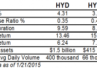
Summary HYD has a higher yield and lower credit quality. HYMB has higher credit quality and better total return history. HYMB has large exposure to California. In part one , we compared the two largest high-yield bond funds: iShares iBoxx $ High Yield Corporate Bond (NYSEARCA: HYG ) and SPDR Barclays Capital High Yield Bond (NYSEARCA: JNK ). In part two , we compared two short-term high-yield bond funds: PIMCO 0-5 Year High Yield Corporate Bond (NYSEARCA: HYS ) and SPDR Barclays Short Term High Yield Bond (NYSEARCA: SJNK ). In part three, we will look at the offerings in the high-yield municipal bond space: SPDR Nuveen S&P High Yield Municipal Bond (NYSEARCA: HYMB ), Market Vectors High-Yield Municipal Index (NYSEARCA: HYD ) and the much newer Market Vectors Short High-Yield Municipal Index (NYSEARCA: SHYD ). Index & Strategy HYD tracks the Barclays Municipal Custom High Yield Composite Index while HYMB tracks the S&P Municipal Yield Index. HYD was created in February 2009, HYMB in April 2011. These two funds have a correlation of 0.9836. On the expense ratio, HYMB has an asterisk because it is currently subsidized through October 31, 2015. Without the subsidy, the expense ratio would be 0.50 percent (the yield would also dip 0.05 percent). On volume, HYD’s price is half that of HYMB, so dollar volume is about three times higher for HYD. HYD has a higher yield, lower expenses and longer average duration. As we’ve seen when comparing other high-yield ETFs, total returns have favored the funds with shorter durations, lower yields and higher credit quality. As for the latter, HYD has 30 percent of assets in BBB rated debt; 22 percent in BB; and 17 percent in B. HYMB has superior credit quality, with 21 percent of assets in A rated debt; 22 percent in Baa; and 33 percent below Baa. Both portfolios have about one-quarter of assets in unrated debt. Both funds give a geographic breakdown of their assets as well. HYMB has 14.2 percent of assets in California, while HYD has only 8.9 percent in the state. HYMB’s next largest state is Texas, with 7.5 percent of assets, while HYD’s second largest holding is NY with 8.5 percent of assets. One other option out there is Market Vectors Short High-Yield Municipal Index. The fund tracks the Barclays Municipal High Yield Short Duration Index. It has an expense ratio of 0.35 percent and a yield of 3.10 percent. It has a duration of 4.17 years. The fund is overweight Texas, at 10.5 percent of assets. Credit quality is 48 percent in BBB rated debt; 16 percent in BB; 10 percent in B; and 2 percent in CCC. It has higher credit quality than HYD. The fund has only $80 million in assets and trades about 20,000 shares per day. SHYD had only one year of history, with an inception date in January 2014. Performance The price ratio chart of HYD and HYMB shows HYD in a persistent downtrend, signifying under performance. However, there are two clear periods when HYD outperformed: summer 2011 and summer 2013, while under performing in July 2014. (click to enlarge) Summer 2011 was a period when investors worried about sovereign debt in the U.S. and Europe, getting to the point where people were discussing a U.S. Treasury default. In summer 2013, Detroit declared bankruptcy , while in summer 2014, Puerto Rican bonds sold off sharply. This shows that the portfolios have deviated substantially when volatility increases. A performance chart shows that only the Detroit bankruptcy led to significant price declines. (click to enlarge) Income HYMB has a 30-day SEC yield of 3.83 percent versus HYD’s 4.31 percent yield. As has been the case with other high-yield funds, falling interest rates have weighed on the fund’s payouts. (click to enlarge) Risk & Reward Compared to the Barclays Municipal Index, HYD has a beta of 1.50 and HYMB has a beta of 1.61. Investors are taking on more market risk with these funds as compared to aggregate muni bond funds and the beta reflects this. The Barclays Municipal Index has a standard deviation of 3.72. HYD has a standard deviation of 6.24 and HYMB a standard deviation of 6.42. These standard deviations are higher than any of the junk bonds previously covered in parts one and two. This is due to the volatility surrounding Detroit’s bankruptcy in 2013. High-yield corporate bonds have enjoyed a smoother ride over the past three years and this is reflected in their lower standard deviation. Bloomberg’s ranking of states by their underfunded pensions shows a wide gap between the states when it comes to financial management. Between HYD and HYMB, the one state that sticks out is California. While most state exposure is similar, California accounts for 5 percentage points more of HYMB’s assets. Investors with a strong opinion on California’s long-term finances can opt for one fund over the other, but for other states, single state exposure is not as large a concern. Conclusion Municipal debt is not out of the woods because unfunded liabilities will eventually become a public debt if the municipality doesn’t go bust first. In the long-run, that favors HYMB’s superior credit quality-assuming California isn’t one of the problem states in the future. As for 2015, municipal bonds appear to be in good shape. Investor interest in municipal bonds recovered in 2014 after a drop in 2013. The Federal Reserve Z1 report shows municipal debt was $2.999 trillion in 2009, and as of Q3 2014, that number fell to $2.908 trillion. State and local governments have been slowly repaying their debt, leaving many states in a stronger financial position than they were six years ago. Liabilities such as unfunded pensions are a concern in states that haven’t addressed the problem, but overall the supply of muni debt has stayed constant as the economy has grown. While the municipal bond market looks attractive next to corporate junk bonds in terms of risk/reward, PIMCO 0-5 Year High Yield Corporate Bond (covered in part two) appears more attractive for 2015 given it has declined since the summer along with high-yield corporate bonds. If the economy stays strong in 2015, HYS is likely to recover and deliver some capital appreciation. It lacks energy exposure, which could struggle if the U.S. dollar continues its rally in 2015, and that could help it beat other high-yield bonds funds this year.
Why Indexing And ‘Smart Beta’ Are So Popular

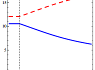
By Jack Vogel, Ph.D. Asset Manager Contracts and Equilibrium Prices Abstract: We study the joint determination of fund managers’ contracts and equilibrium asset prices. Because of agency frictions, investors make managers’ fees more sensitive to performance and benchmark performance against a market index. This makes managers unwilling to deviate from the index and exacerbates price distortions. Because trading against overvaluation exposes managers to greater risk of deviating from the index than trading against undervaluation, agency frictions bias the aggregate market upwards. They can also generate a negative relationship between risk and return because they raise the volatility of overvalued assets. Socially optimal contracts provide steeper performance incentives and cause larger pricing distortions than privately optimal contracts. Core Idea: This is a theoretical paper, so proceed with caution! However, the paper does a good job discussing the Principal/Agent Problem . Briefly stated, the “principal/agent problem” relates to how the interests of agents, who act on behalf of principals, can conflict with those of the principals. In investing, when an asset manager’s performance (or fees) is measured or benchmarked relative to an index, the potential friction (of losing fees and possibly their job) causes the manager to track closer to the index. Here is a quote from the paper: Benchmarking, however, only incentivizes the manager to take risk that correlates closely with the index, and discourages deviations from that benchmark. Thus, the manager becomes less willing to overweight assets in low demand by buy-and-hold investors, and to underweight assets in high demand. The former assets become more undervalued in equilibrium, and the latter assets become more overvalued. Within this theoretical framework, how are asset prices affected? In the graphs below, the blue solid line represents assets in large supply, and the red dashed line assets in small supply. Notice in the graph, that the more expensive asset has lower supply, while the less expensive asset has higher supply! Not surprisingly, the expected return is inverted, where the asset with less supply and is more expensive has lower expected returns, while the asset with high supply and lower price has higher expected returns. Additionally, these assets with higher (lower) supply have lower (higher) volatility. See the paper for details on why this may be so. Note, however, that if an expensive (overvalued) asset with higher volatility has a positive shock to expected cash flows, it would account for a larger portion of market movement. For this reason, managers are reluctant not to hold it, and instead will buy it, since they fear that failing to buy it may cause them to deviate from the benchmark. The main conclusion is that in this theoretical world, asset managers tend to hug the index, as their fees are tied to the index, and thus they are loath to do things that might cause them to depart from it. In the real world, this makes sense as well. Imagine the following two investment strategies that an institutional money manger must pick from: With 98% certainty, you are going to beat the index by 5% over the next 10 years. The other 2% of the time, you will lose to the index by 1%. However, you know that 3 of the years you may lose by as much as 8%! So while the long run expected returns are quite high, the return path to get there is very noisy and volatile. With 50% certainty, you are going to beat the index by 1% over the next 10 years. The other 50% of the time, you will lose to the index by 0.50%. In any given year, you will be +/- 0.25% relative to the index. Here, the long run expected returns are comparatively lower, but the return path is stable. Now, from a mathematical and economist perspective, there is an easy solution — calculate the expected value. Expected Value = beat index by (0.98%)(5%) + (2%)(-1%) = beat index by 4.88% Expected Value = beat index by (0.50%)(1%) + (50%)(-0.5%) = beat index by 0.50 % Any economist would pick option 1! It’s a slam dunk. However, the asset manager knows that picking option 1 is risky to him as an agent, as he might lose his job if the principal (owner of money) loses faith in his strategy. Ever wonder why smart beta products run rampant in the marketplace? It’s because smart beta has low tracking error versus the index. Although expected returns are modest, the manager will remain withing hailing distance of the benchmark, and a principal can’t complain too much about that, right? Unfortunately, this may not necessarily be in the principal’s best interests. Original Post

A Weak Start To 2015 For MLP ETFs: Buy On The Dip?

Despite hailing from the energy space, MLPs put up a great fight last year against the oil price slump thanks to their low correlation with the underlying commodity and the U.S. shale oil boom. However, the winning streak reached the verge of a reversal as MLPs entered the New Year. The largest MLP ETF Alerian MLP ETF (NYSEARCA: AMLP ) , which added about 0.3% in the last one year against a 50% decline in oil prices, has lost about 3.2% so far this year (as of January 16, 2015). All energy MLP ETFs/ETNs are deep in the red this year with some products hitting an acute 12.5% loss in such a short span of time. Now, with the no signs of end to the oil price slouch and analysts turning more bearish on this liquid commodity, MLPs might find it tough to stay afloat. Going by a recent article by Bernstein , MLPs had a free cash flow yield of 5% in 2009 while at present these have a free cash flow yield of negative 5%. As you may know, MLPs often operate pipelines or similar energy infrastructures that make it an interest-rate sensitive sector. This group catches an investor’s eye as these do not pay taxes at the entity level and hence must pay out most of their income (more than 90%) in the form of dividends. Investors looking for higher income levels outside the traditional bond sources generally bet on these products. Investors should note that the rate scenario has been subdued since last year with yields on 30-year Treasury notes touching the all-time low in January. While this should brighten the appeal for MLP investing, a six-year low oil price comes in the way of outperformance. Strength & Weakness in the MLP Space Speculations are rife that the U.S. stockpiles will remain high in the coming days. So no matter how bad the oil price situation is, the need for mid-stream MLPs involved in the processing and transportation of energy commodities such as natural gas, crude oil and refined products, under long-term contracts, will always remain due to the energy production boom in the U.S. This is because MLP revenues depend on the volumes flowing through the pipes and not on the commodity price. On the other hand, upstream exploration MLP companies earn from every barrel of oil and are being thrashed by the endless weakness in oil prices. Still, investors’ fears pertaining to oil have hurt the MLP sector as a whole to start the year despite its allure for dividend income. Buy on the Dip Given the fundamentals discussed above, investors might consider the recent dip as an entry point to the mid-stream or energy infrastructure ETFs. Below are three such MLP ETFs for investors. AMLP in Focus It is the most popular product with an asset base of $8.62 billion and average trading volume of more than $6 million shares. The fund’s expense ratio is high at 8.56%. The product tracks the Alerian MLP Infrastructure Index and has exposure to the mid-stream securities like Williams Partners L.P. (NYSE: WPZ ), Energy Transfer Partners, L.P. (NYSE: ETP ), MarkWest Energy Partners, L.P. (NYSE: MWE ) and Magellan Midstream Partners LP (NYSE: MMP ). The fund has lost only 0.5% in the last five trading sessions and 3.2% in the year-to-date frame. AMLP pays out 6.9% in annual yields (as of January 16, 2015). Global X MLP ETF (NYSEARCA: MLPA ) The fund looks to track the Solactive MLP Composite Index. The Index is comprised of MLPs engaged in the transportation, storage, processing, refining, marketing, exploration, production, and mining of natural resources. The fund charges 45 bps in fees. The fund has garnered about $150 million in assets. This ETF too has considerable exposure to Energy Transfer Partners (6.72%), Magellan Midstream (6%) and Buckeye Partners, L.P. (NYSE: BPL ) (5.98%). The fund was off 0.6% last week and has shed about 2.6% so far this year. MLPA has a dividend yield of 6.13% (as of January 16, 2015). Credit Suisse Equal Weight MLP Index ETN (NYSEARCA: MLPN ) The ETN is equally weighted in nature. It is designed for investors seeking exposure to the Cushing 30 MLP Index. The Index tracks the performance of 30 firms which hold mid-stream energy infrastructure assets in North America. MLPN has amassed about $735 million in assets. The fund charges 85 bps in fees. MLPN lost about 0.7% last week and 4% so far this year (as of January 16, 2015). Bottom Line With oil prices falling fast on the 24 -year low Chinese GDP data in 2014 and rocketing volatility in the Euro zone, MLPs seem to be the best bet. Though the space succumbed to a slowdown to start 2015, it pared losses considerably in the middle of the month. Moreover, global growth worries kept the yields at substantial low levels and spurred the appeal for dividends. Apart from the strong return, these MLPs are acting as strong income engines reinforcing its scope for outperformance in the days ahead.