Tag Archives: iyh

The Market Map Portfolio: Holding Healthcare ETFs During Underperforming Months

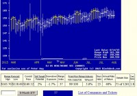
Summary Seeking Alpha contributor mentioned that my previous biotech seasonal portfolio could be improved with some tweaks. I backtested this strategy against mine, finding it to be a low-risk, low-reward strategy. I then tweaked Market Map’s strategy to find a high-risk, high-reward version of the same strategy. In my previous article, I introduced a biotech-heavy seasonal portfolio that resulted in a 4.57 cumulative return. To recap, the strategy not only outperforms a buy-and-hold strategy with the SPDR S&P Trust ETF (NYSEARCA: SPY ) 2 to 1 but also had nearly half the max drawdown. The strategy is summarized as follows. November to January: Hold the iShares Nasdaq Biotechnology ETF (NASDAQ: IBB ) February to May: Hold the Energy Select Sector SPDR ETF (NYSEARCA: XLE ) June to August: Stay out of the market September: Hold the SPDR Gold Trust ETF (NYSEARCA: GLD ) October: Stay out of the market Seeking Alpha contributor Market Map had this to say regarding the strategy: (click to enlarge) In other words, he proposed some changes that would lead to a better performance. Let’s review Market Map’s strategy and then run a backtest on it. Market Map’s Strategy As I understand it, Market Map’s strategy has three main differences from the one I presented. It has different allocations. It is in the market year-round. It cuts down on exposure during “high risk years.” Let’s deal with each in turn. First, the allocation issue. The major difference is that it forgoes gold in favor of healthcare. I will be using the iShares U.S. Healthcare ETF (NYSEARCA: IYH ) here. Second, Market Map’s strategy is in the market year-round, whereas mine avoided June to August and October. This gives the strategy more market exposure – likely increasing both risk and reward. I expect a higher cumulative return but at higher drawdowns. Finally is the “high risk” year issue. Market Map did not mention how to define high risk years. Thus we must define high risk years before running this strategy. Because we are backtesting, we cannot pretend to know that 2008 was to be a bad year, for example. Luckily, in my monthly “The Trader’s Book Summary” newsletter, I once reviewed a book called “The Stock Traders Almanac.” In this book, data from 1949 was analyzed, producing annual patterns, which I will briefly summarize below. Pre-presidential years outperformed. Presidential years outperformed. Mid-term years underperformed. Post-presidential years underperformed. Years ending with 5 outperformed. I will define “high risk years” as per the above. For a backtest over the past ten years, high-risk years are the following: In the backtest, during the above years, I will cut down portfolio allocation to 50%, putting the other 50% in bonds via the SPDR Barclays 1-3 Month T-Bill ETF (NYSEARCA: BIL ). And hence we have our strategy, all ready for backtesting. So here we go… The Results The results of the backtest follows. I am comparing this strategy to the following strategies: BIL_HOLD: Bonds – 100% invested in BIL SPY_HOLD: Stocks – 100% invested in SPY SPY_Cash: Sell in May – SPY in October and switch to Treasury bills in May Sector: Biotech seasonal strategy – The strategy I outlined in my last article Mm: Market Map’s strategy – The strategy as outlined above As you can see, the strategy did not perform as advertised. While both the max and average drawdowns were the lowest of all strategies (barring bonds), the cumulative return was also the worst (again, barring bonds). This strategy seems more like a low-risk version of SPY_Cash, as it did even better than SPY_Cash during the 2008 bear market, despite it being a strategy that was fully invested in the market during 2008. So my hypothesis was also wrong in expecting MM’s strategy to be a high-risk, high reward strategy. In fact, it is the opposite. Nevertheless, I wanted to give MM the benefit of the doubt in that his strategy could outperform mine, so I removed the constraints of trying to time market years. That is, I reran the backtest without the annual market timing aspect. The strategy then becomes being fully invested in the market year-round every year. In other words, we are making a much more simple modification to my previous strategy: Forget gold and avoiding the market during underperforming months; during these times, invest in healthcare instead. The strategy summarized: November to January: Hold the iShares Nasdaq Biotechnology ETF ( IBB ) February to May: Hold the Energy Select Sector SPDR ETF ( XLE ) June to October: Hold the iShares U.S. Healthcare ETF Let’s see how this strategy measures up: This is essentially a confirmation of my original hypothesis. MM’s strategy provides higher rewards in the long run but at a higher risk. Notice that MM’s strategy goes head-to-head with Sector until the 2008 market crash. Conclusion for Investors MM does not beat the sector strategy until 2014 due to having to recoup from its 2008 losses. However, in the long-term MM does prevail as the more profitable strategy. As to which is better, it’s a question of risk versus reward. Both strategies only require three trades per year. But MM stays in the market during underperforming months. But it is that extra exposure to the healthcare industry during those times – especially from 2014 to 2015 – that brings this strategy ahead of Sector in the long-run. Overall, it is up to you whether the extra cumulative performance is worth the extra risk exposure that comes as a result of being in the market year-round. Personally, I would be a bit worried about holding onto both biotech and healthcare year-round, as it seems a bit underdiversified compared to holding bonds and gold during underperforming months. If you’re interested in seeing some tweaks to this strategy, ask me in the comments section or via mail. I’ll be rolling out my premium Seeking Alpha backtesting newsletter soon, in which I backtest your strategies. For example, if you want to see the above Sector strategy tested with full market exposure or with different ETFs as the forerunners, just leave your ideas below.

Today’s Strong Competitive Wealth-Builder ETF Investment

Summary From a population of some 350 actively-traded, substantial, and growing ETFs this is a currently attractive addition to a portfolio whose principal objective is wealth accumulation by active investing. We daily evaluate future near-term price gain prospects for quality, market-seasoned ETFs, based on the expectations of market-makers [MMs], drawing on their insights from client order-flows. The analysis of our subject ETF’s price prospects is reinforced by parallel MM forecasts for each of the ETF’s ten largest holdings. Qualitative appraisals of the forecasts are derived from how well the MMs have foreseen subsequent price behaviors following prior forecasts similar to today’s. Size of prospective gains, odds of winning transactions, worst-case price drawdowns, and marketability measures are all taken into account. Today’s most attractive ETF Is the iShares U.S. Healthcare ETF (NYSEARCA: IYH ) . The investment seeks to track the investment results of an index composed of U.S. equities in the healthcare sector. The fund generally invests at least 90% of its assets in securities of the underlying index and in depositary receipts representing securities of the underlying index. It seeks to track the investment results of the Dow Jones U.S. Health Care Index (the “underlying index”), which measures the performance of the healthcare sector of the U.S. equity market. The fund is non-diversified. (Description from Yahoo Finance.) The fund currently holds assets of $2.68 billion and has had a YTD price return of +13.73%. Its average daily trading volume of 261,855 produces a complete asset turnover calculation in 64 days at its current price of $161.94. Behavioral analysis of market-maker hedging actions while providing market liquidity for volume block trades in the ETF by interested major investment funds has produced the recent past (6 month) daily history of implied price range forecasts pictured in Figure 1. Figure 1 (used with permission) The vertical lines of Figure 1 are a visual history of forward-looking expectations of coming prices for the subject ETF. They are NOT a backward-in-time look at actual daily price ranges, but the heavy dot in each range is the ending market quote of the day the forecast was made. What is important in the picture is the balance of upside prospects in comparison to downside concerns. That ratio is expressed in the Forecast Range Index [RI], whose number tells what percentage of the whole range lies below the then current price. Today’s Range Index is used to evaluate how well prior forecasts of similar RIs for this ETF have previously worked out. The size of that historic sample is given near the right-hand end of the data line below the picture. The current RI’s size in relation to all available RIs of the past 5 years is indicated in the small blue thumbnail distribution at the bottom of Figure 1. The first items in the data line are current information: The current high and low of the forecast range, and the percent change from the market quote to the top of the range, as a sell target. The Range Index is of the current forecast. Other items of data are all derived from the history of prior forecasts. They stem from applying a T ime- E fficient R isk M anagement D iscipline to hypothetical holdings initiated by the MM forecasts. That discipline requires a next-day closing price cost position be held no longer than 63 market days (3 months) unless first encountered by a market close equal to or above the sell target. The net payoffs are the cumulative average simple percent gains of all such forecast positions, including losses. Days held are average market rather than calendar days held in the sample positions. Drawdown exposure indicates the typical worst-case price experience during those holding periods. Win odds tells what percentage proportion of the sample recovered from the drawdowns to produce a gain. The cred(ibility) ratio compares the sell target prospect with the historic net payoff experiences. Figure 2 provides a longer-time perspective by drawing a once-a week look from the Figure 1 source forecasts, back over two years. Figure 2 (used with permission) What does this ETF hold, causing such price expectations? Figure 3 is a table of securities held by the subject ETF, indicating its concentration in the top ten largest holdings, and their percentage of the ETF’s total value. Figure 3 source: Yahoo Finance IYH has over half its investments in ten major, mainstream corporations serving the broad healthcare industry, from pharmaceuticals producers to healthcare insurers, medical equipment makers, and service providers. Investments in developmental research in biotechnology are restricted to the in-house activities of the big-pharma companies held. There the emphasis is more likely to be on capitalizing on known technology and existing markets rather than on breakthrough developmental activities. The expectations for these companies, derived from Market-Maker hedging to protect its own capital while facilitating volume transactions for big-$ fund clients, is shown below. Figure 4 is a table of data lines similar to that contained in Figure 1, for each of the top ten holdings of IYH. Figure 4 (click to enlarge) In an industry as unpredictably dynamic as this, wide variations in market experience can be the rule. The averages of IYH’s 10 largest holdings compete quite favorably with the 20 best equity wealth-building candidates from our population of 2475 issues. Column (5) contains the upside price change forecasts between current market prices and the upper limit of prices regarded by MMs as being worth paying for price change protection. The average of +9.0% of the top ten IYH holdings is close to the +10.2% of the population’s best. Its investments in Gilead Sciences, Inc. ( GILD) and AbbVie Inc. ( ABBV) exploit the hep-c extensive market, which has produced impressive stock price gains (11). BMY at its present price and coming price expectations offers further support for IYH gains. The other side of the coin is column (6), which shows what actual worst-case price drawdowns have been typical in the 3 months following each time there has been a forecast like those of the present day. Those risk exposures have been only -4.0% in the holdings top ten, less than half the -8.6% by equities at large. The IYH 10’s reward-to-risk ratio (14) of 2.3 outranks all of the other aggregate set measures. Conclusion IYH provides only modestly attractive forecast price gains, supported by equally appealing largest holdings. Both the ETF and many of its major holdings offer very attractive prospects in near-term price behaviors, demonstrated by previous experiences following prior similar forecasts by market makers. The principal attraction of IYF at this point in time is its strength of resistance to price drawdowns and excellent recovery from temporary bad times by the strong underlying trend of its economic sector. In any period of concern over market weakness this is a prime defensive commitment here. Disclosure: I/we have no positions in any stocks mentioned, and no plans to initiate any positions within the next 72 hours. (More…) I wrote this article myself, and it expresses my own opinions. I am not receiving compensation for it (other than from Seeking Alpha). I have no business relationship with any company whose stock is mentioned in this article.