Tag Archives: highest

Essential To Understand This If You Are A 60/40 Investor

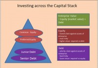
Summary We show exactly why the 60/40 allocation has provided better risk adjusted returns by evaluating 60/40 from the perspective of the enterprise. Buying stocks is buying a business, which invariably includes assumption of debt, i.e. being short bonds. Viewed in this light, actual 60/40 “net” bond exposure is significantly less than 40%. Portfolio risk is 90% from stocks and 10% from bonds, not because stocks are 9x riskier than bonds, but because your average true net dollar exposure is close to 90/10. We show historical returns for a variety of strategy combinations based on the insights of this approach, including combinations that target an “actual” net bond exposure. Targeting a true 40% bond exposure has slightly lower returns than traditional 60/40, but better risk adjusted returns with much lower drawdowns; beneficial for retirees who are making annual withdrawals. The 60/40 portfolio (60% equities, 40% bonds) has been the stalwart of the investment management industry. It has delivered better risk adjusted returns than either stocks or bonds individually since 1973. The basic idea is that some balanced combination of two non-correlated assets will provide a consistent and less volatile return stream. It has developed an aura of its own and is the go-to benchmark for other portfolio strategies to compare to. The founder of one of the large investment management firms likened it to Adam Smith’s ‘Invisible Hand,’ saying “We don’t know exactly why it works, it just always seems to work. In the end, when you look back over a 15-year period of time, it works.” Clearly, it would provide much comfort if we did understand why it worked, and this article will shed some light on how 60/40 works in a way you have probably not seen before. Going back to Basics First To understand the concept in its simplest sense, we need to cover some basics of investing across the capital structure. The graphic below shows the enterprise triangle, with the various levels of participation that an investor can choose from. Bonds are the least risky form of investment in the enterprise because they have the highest priority claim against the assets of the business. Equity carries the highest risk because it is the last to get paid after all other stakeholders have been paid. By definition, you should expect a higher return from equity than debt because it carries more risk. Except for government debt, all other debt and equity are dependent on the performance of the enterprise. (click to enlarge) Key concept When investing in stocks, you are buying an ownership interest in the whole enterprise. This means that you also assume (not personally) the debts of the enterprise. Assuming debt or borrowing is the opposite of lending, investing or being long. Borrowing is therefore the same as being short debt. Investing in equities of companies that have debt therefore creates two risk exposures, 1) long equities and 2) short debt. The following box shows an example of creating a 60/40 portfolio at the simplest level. Assume company SPX, representing the entire investment universe, has a market cap of $600,000 and has debt outstanding of $400,000. Assume further that your portfolio of $1,000,000 is currently in cash and ready to be invested in a 60/40 portfolio. (click to enlarge) There are two transactions necessary, 1) allocating 60% of your capital to stock, and 2) 40% to bonds. In Transaction #1, when you buy the equity in a company you automatically assume (not personally) the debt of that company. The debt as a percent of the market cap is 66.7% ($400,000/$600,000). Assuming the debt, as explained above is the same as being short the debt, so your exposure from Transaction #1 is to be long $600,000 in equities and short $400,000 in debt. In Transaction #2, you allocate 40% of your $1,000,000 to bonds. By investing $400,000 in the bonds of the company, you have effectively neutralized your bond exposure. Your net bond exposure is now zero . Obviously, the investment universe is a lot more diverse than just our company SPX, including government debt, but hopefully you get the concept of your “net debt” exposure. We will use the terms net debt, net bond and net leverage exposure interchangeably. Extrapolating the concept to the real world Most 60/40 portfolios will invest the equity portion into a diversified fund or ETF that tracks the entire market such as the SPDR S&P 500 Trust ETF (NYSEARCA: SPY ) or the Vanguard S&P 500 ETF (NYSEARCA: VOO ). When you purchase the SPY, you are by definition assuming the total debt of all those companies in the same proportion to your equity ownership. How do you know how much debt you are assuming? The Federal Reserve Z1 makes this data available on a quarterly basis. It shows the total credit market liabilities as a percentage of the market value of equities outstanding (debt/market cap ratio). Here is the chart since 1953. (click to enlarge) You will notice that the amount of debt that companies hold relative to the market value of their equity is not constant. For every dollar you have invested in equities, you are effectively short bonds in the amount of $1 x debt/market cap ratio percentage, shown on the vertical axis of the graph. This would be offset by your 40% long investment in bonds. Based on this, we can show the net debt exposure for a 60/40 portfolio, rebalanced annually, going back 40 years to 1973. Key Takeaways Net debt exposure is not constant with 40% in bonds. Net exposure will differ depending on the debt/market cap ratio, and it changes continuously. Over 40 years, the 60/40 portfolio, rebalanced annually, had only 3.01% net exposure to bonds . From 1974-1993, net exposure averaged -7.73% and from 1994-2014 was a positive 13.25%. This exposure worked out well for 60/40 investors because it was generally short debt in the rising interest rate environment and long debt in the declining interest rate environment. The often cited fact that stocks in a 60/40 represent 90% of the risk is true, but not because stocks are 8-9 times riskier than bonds, but because the true net dollar exposure of bonds has been less than 10%. Dollar allocation does approximate risk allocation when you think about it in this framework. 60/40 has worked by essentially maintaining a relatively unlevered exposure to the enterprise. Note that while we have assumed all debt is corporate debt, in reality a large portion of the 40% gets allocated to government debt. While the risk profiles are somewhat different, the net bond exposure is the same, and the performance over 40 years is very similar. The Mechanics of Rebalancing The mechanics of rebalancing, which we show below, are a bit complicated, but in a nutshell, when equities go down relative to bonds you increase your risk profile at rebalance time, and when equities go up relative to bonds you reduce your risk profile at rebalance time. The transactions that occur at rebalance time are shown below for two scenarios, 1) equities go down relative to bonds, and 2) equities go up relative to bonds. The dynamics change slightly depending on how you treat the book value of debt. Does it go to market or stay at book? We show it both ways. In Scenario #1, when equity values decline, the debt/market cap ratio increases, increasing your short debt exposure at the enterprise level, making your portfolio more volatile; rebalancing increases your equity exposure, and your implied short debt exposure (both of which contribute to increasing your risk profile), which is then offset by the increased allocation to your long debt exposure. Like I said, it’s a bit complicated. The bottom line of each table shows the new net debt exposure. If you are interested in the workings, then review the tables below else skip ahead to the next section. Questions and Possibilities There are literally dozens of possibilities that arise in thinking around this idea, but I want to give you some actionable insights, so I will highlight a few possibilities and show a range of performance comparisons to finish. Can we replicate the 60/40 risk profile by just investing 100% of the portfolio in equities of a basket of unlevered, or low levered companies? There is no index that we know of that tracks exclusively low leverage; some include leverage as a factor in their quality index. Berkshire Hathaway (NYSE: BRK.A ) (NYSE: BRK.B ) almost fits the bill, and we show the performance, but Buffett is an anomaly, so we cannot assume similar performance. Risk is not only a function of leverage, but also industry and size, so expecting low leverage alone to match the risk profile of 60/40 is not realistic. The S&P Low Volatility Index (implement with SPLV) does have about 25% less leverage than the S&P 500, so we show those returns both individually and in combination with 20% government bonds. As an investor, you have the choice of deciding how much net leverage you are comfortable with. You can adjust your bond exposure to achieve this. We show the performance of a portfolio that targets 0% net bond exposure, and one that targets 40% net bond exposure. It turns out that 60/40 outperforms any positive target debt level we could find, but on a risk adjusted basis, the true 40% bond target does much better. While there is some benefit to government bonds, over 40 years the difference between using corporate and government is very small – corporate has a slightly higher return, but government has slightly better risk adjusted returns. Corporate bonds are exposed to the enterprise risk, so for diversification you may prefer more exposure to government bonds. Government bonds provide that flight to safety when the future of the economic enterprise looks risky, even though corporate bonds seem to have performed better individually. We show the traditional 60/40 with both government and corporate bonds. Performance Comparisons The following table shows returns for stocks, government bonds, corporate bonds, low volatility, and Berkshire, individually, and then in a series of different combinations, including 60/40 conventional with T-bonds, 60/40 with corporate bonds, 0% net bond target, 40% net bond target, and 80% low vol/20% government bonds. Years in which stocks had negative returns are highlighted in red to easily see how each strategy performs under those conditions. While I will leave you to peruse these without comment, I just want to highlight the performance of the “true” 40% net bond exposure versus the traditional 60/40 (both circled); it has slightly lower returns but much better risk adjusted returns and the drawdowns are much smaller. This can be especially beneficial for retirees who are withdrawing assets from their portfolio every year to live on. Conclusion This article just scratches the surface, and there are many portfolio construction possibilities to explore around this idea. Viewing 60/40 from an enterprise value perspective offers a better insight into your risk profile characteristics. Targeting a true 40% long bond exposure gives a lower absolute return than traditional 60/40, but much better risk adjusted returns, with much lower drawdowns. Disclosure: The author has no positions in any stocks mentioned, but may initiate a long position in SPY, VOO, TLT, AGG, LQD, SPLV over the next 72 hours. (More…) The author wrote this article themselves, and it expresses their own opinions. The author is not receiving compensation for it (other than from Seeking Alpha). The author has no business relationship with any company whose stock is mentioned in this article.

Bottom-Digging During Market Tops

Summary Finding investing opportunities when the market reaches all-time highs. What industries currently offer value in the market. Managing your portfolio. The S&P 500 has nearly tripled from a 2009 low of 735 to 2113 currently. Just as a rising tide lifts all ships, so too does a rising stock market lift all stocks. At greedy times like these, investors should be fearful and reexamine their portfolios. …if [investors] insist on trying to time their participation in equities, they should try to be fearful when others are greedy and greedy only when others are fearful. -Warren Buffett Now, I’m not saying the market has reached its peak (though some do make compelling arguments ). I am not a market timer. I’ve written about the folly of forecasting in the past. I’m merely saying a prudent investor should not let greed get the better of him. The following strategy is one that is more likely to be applicable during market highs as investors are more likely to have a preponderance of stocks trading at prices much higher than their actual values (aka, the rising tide theory mentioned above). So what to do? Well, I believe the prudent investor should lock in gains on stocks pushing well beyond their valuations (close to 52-week or all-time highs) and replace them with stocks trading at reasonable valuations. Mr. Market is offering attractive prices for your stocks, let him have them. But then we’re left with the problem of finding alternative investments. As markets keep pushing higher and higher, investors are often left scratching their heads wondering where to find value. Admittedly, this can be challenging, however, opportunities do still exist. One place to look as stocks reach all-time highs are stocks reaching new 52-week lows. Some noteworthy examples include PriceSmart (NASDAQ: PSMT ), SodaStream (NASDAQ: SODA ), Turtle Beach Corp. (NASDAQ: HEAR ), and Fossil (NASDAQ: FOSL ). PriceSmart is the Sam’s Club of Central America and the Caribbean. It’s trading at a small discount to its sales, has high insider ownership, and has consistently grown sales, 15% on average, over the past ten years. At its current price of $17.07 after-market, SodaStream trades at a large discount to sales (72% of sales) and is nearly trading at its book value of $16.59. Turtle Beach has near-total domination in the gaming headphone market with 50% of both the UK and US markets. It trades at 60% of sales (which it looks to nearly double sales this year) and is led by smart management with a solid near-term plan, and patents, to enter industries such as health, automotive, TV and mobile. I’ve already written my take on Fossil, you can read it here . The next place to look is at overlooked stocks (often smaller capitalization, less than $100m) in industries where there is a low supply of investment opportunities. One such industry is the coffee industry. Now, before going into individual companies, let me preface this discussion by first noting some interesting dynamics at place in this market. For one, coffee consumption is not nearly what it used to be. In fact, in 1946 consumers drank 46.4 gallons of coffee per person ( Figure 1 ). Today, even with a coffee shop on every corner, consumers drink less than half as much at only 20-25 gallons of coffee per year as coffee was replaced predominantly by soda. As consumers become more health-conscious, pop consumption should decrease and coffee, as a viable, healthy alternative, should have an increased level of consumption. Secondly, there is a shift taking place where high-quality shade-grown coffee (high cost to grow) is being overtaken by the rise of poorer quality shade-free coffee (cheaper to grow). This makes coffee plants much more susceptible to climate change and topsoil erosion. As climate change concerns begin to grow, the downfall we’ve seen in coffee prices from $300 in 2011 to a current 52-week low of $140 is not likely to last. Figure 1 Now, opportunities in this market surely exist in the form of large companies. There is, of course, Green Mountain Coffee Roasters (NASDAQ: GMCR ) and Starbucks (NASDAQ: SBUX ), but investors in those companies will soon bail when they see these companies for what they are-overvalued. Starbucks trades at an all-time high ($94.30) and the highest price-to-sales ratio it has ever seen in the last ten years of 4.12. Starbucks also trades inversely to coffee prices. Green Mountain Coffee Roasters ($124.10) shares trade even higher at a price-to-sales of 4.31 and, like Starbucks, it is also inversely correlated to coffee prices. As coffee prices rise investors will bail on these two companies (and valuations will come back down to earth). So when investors bail, where will they look? On the conservative end is Coffee Holding Co. (NASDAQ: JVA ), trading at 28% of its total sales. This company is well-managed by its owners, experienced coffee industry veterans who have a 10% stake in the company’s shares. They also support and believe in sustainable practices. These beliefs lead to production of higher quality coffee (shade grown) that is not as susceptible to soil erosion and climate change. Furthermore, as experienced coffee experts, they are well-hedged against fluctuating prices. On the risky end is Jammin Java ( OTCQB:JAMN ), better known by its Marley Coffee, which is trying to force itself to turn things around before it does a complete nose-dive. If company-estimated year-end sales are to be believed, the company trades at a 10% discount to expected year-end sales. However, this company is only for high-risk-oriented individuals who don’t mind getting cleaned out if things turn south. Then, there’s the oil industry. I don’t think I need to go into this as many have already witnessed the price collapse at the pumps, so suffice it to say that there are many opportunities to be had in this sector, both large cap and small, and everything in between. (Check out Cale Smith’s recent notes about the oil price phenomenon). I’m pretty sure you could throw 10 darts at oil stocks right now and make at least 8 solid investments. Another interesting idea is James O’Shaughnessy’s strategy of looking for stocks that he calls Reasonable Runaways . These are stocks that have a high relative strength, greater than $150m in market cap and trade at a price-to-sales ratio less than 1. I’ve modified this strategy a little bit by including companies that have large amounts of cash in excess of debt. Some notable examples include FreightCar America Inc. (NASDAQ: RAIL ), BeBe Stores (NASDAQ: BEBE ), Men’s Wearhouse (NYSE: MW ), LSI Industries (NASDAQ: LYTS ) and FujiFilm Holdings ( OTCPK:FUJIY ). While I have not had time to look into each of these companies it doesn’t matter- the theory of the Reasonable Runaways strategy is one of investor agnosticism. The theory says that you are buying $1 worth of sales for less than a dollar (low P/S) just as investors are realizing the company is undervalued (high relative strength). You simply run the screen, buy agnostically, and diversify your portfolio by giving equal weight to the top 20 or so companies with the highest price appreciations. Sell after a year then repeat the process. Since 1951 this strategy had a compound annual growth rate of over 18%. While the S&P 500 may have reached its top, your portfolio doesn’t have to top out. You can simply shift your current best performers to companies that offer greater opportunity and more attractive valuations. Employing several different search techniques, such as those mentioned above, can get you on the right track to optimizing your portfolio towards value and thus reducing your overall risk by increasing your margin of safety. But don’t forget to hold on to a fair amount of just in case cash for when the market does plummet. You’ll want to have that cash in your back pocket to snatch up undervalued companies when the falling tide lowers all the ships again and more opportunities abound. Editor’s Note: This article covers one or more stocks trading at less than $1 per share and/or with less than a $100 million market cap. Please be aware of the risks associated with these stocks. Disclosure: The author is long FOSL, JVA. (More…) The author wrote this article themselves, and it expresses their own opinions. The author is not receiving compensation for it. The author has no business relationship with any company whose stock is mentioned in this article.

Dual Momentum Portfolio Update

Scott’s Investments provides a free “Dual ETF Momentum” spreadsheet which was originally created in February 2013. The strategy was inspired by a paper written by Gary Antonacci and available on Optimal Momentum. Antonacci has a new book out, Dual Momentum Investing: An Innovative Strategy for Higher Returns with Lower Risk . If you want to see how he applies Dual Momentum to a portfolio strategy I encourage you to read the book. My Dual ETF Momentum spreadsheet is available here and the objective is to track four pairs of ETFs and provide an “Invested” signal for the ETF in each pair with the highest relative momentum. Invested signals also require positive absolute momentum, hence the term “Dual Momentum.” Relative momentum is gauged by the 12 month total returns of each ETF. The 12 month total returns of each ETF is also compared to a short-term Treasury ETF (a “cash” filter) in the form of iShares Barclays 1-3 Year Treasury Bond ETF (NYSEARCA: SHY ). In order to have an “Invested” signal the ETF with the highest relative strength must also have 12-month total returns greater than the 12-month total returns of SHY. This is the absolute momentum filter which is detailed in depth by Antonacci, and has historically helped increase risk-adjusted returns. An “average” return signal for each ETF is also available on the spreadsheet. The concept is the same as the 12-month relative momentum. However, the “average” return signal uses the average of the past 3, 6, and 12 (“3/6/12″) month total returns for each ETF. The “invested” signal is based on the ETF with the highest relative momentum for the past 3, 6 and 12 months. The ETF with the highest average relative strength must also have an average 3/6/12 total returns greater than the 3/6/12 total returns of the cash ETF. Portfolio123 was used to test a similar strategy using the same portfolios and combined momentum score (“3/6/12″). The test results were posted in the 2013 Year in Review and the January 2015 Update. Below are the four portfolios along with current signals: Return data courtesy of Finviz Equity Representative ETF Signal based on 1 year returns Signal based on average returns U.S. Equities VTI Invested Invested International Equities VEU Cash SHY Credit Risk Representative ETF Signal based on 1 year returns Signal based on average returns High Yield Bond HYG Invested Interm Credit Bond CIU Invested Cash SHY Real-Estate Risk Representative ETF Signal based on 1 year returns Signal based on average returns Equity REIT VNQ Invested Invested Mortgage REIT REM Cash SHY Economic Stress Representative ETF Signal based on 1 year returns Signal based on average returns Gold GLD Long-term Treasuries TLT Invested Invested Cash SHY As an added bonus, the spreadsheet also has four additional sheets using a dual momentum strategy with broker specific commission-free ETFs for TD Ameritrade, Charles Schwab, Fidelity, and Vanguard. It is important to note that each broker may have additional trade restrictions and the terms of their commission-free ETFs could change in the future. Disclosures: None Are you Bullish or Bearish on ? Bullish Bearish Neutral Results for ( ) Thanks for sharing your thoughts. Submit & View Results Skip to results » Share this article with a colleague