Tag Archives: handle

The ‘Efficiency’ Of The Market Doesn’t Matter To Smart Investors

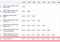
The huge growth in index funds has caused some investors to debate the merits of the market’s “efficiency” and whether index funds would make the markets less efficient. The basic thinking is that if everyone starts buying index funds then that could create more opportunities for stock pickers who are able to go against the grain and pick the stocks that have been unjustifiably correlated to the actions of the overall index. This whole debate confuses why correlations are rising in the first place. Correlations aren’t rising because index funds are becoming more prevalent. Index funds are becoming more prevalent because the performance of the economy is becoming increasingly correlated. If you look at any sector of the S&P 500, you’ll find rising correlations over the course of the last 50 years. The average 10-year correlation of all the sectors of the S&P 500 is about 83.5%: (10-Year Correlation of various sectors) This isn’t happening because index funds are becoming more popular. It’s happening because US corporations are becoming increasingly interconnected. Public companies are becoming multi-national and multi-industry companies whose performance depends increasingly on the way the macroeconomy works. If we look at the underlying Earnings Per Share of these same industries, we find equally strong correlations in their profit growth over time. Of course, high correlations doesn’t mean there won’t be uncorrelated entities whose prices get irrationally whipsawed by the aggregate market performance. But it does mean that it is becoming increasingly difficult to find entities who aren’t dependent on the performance of the broader economy. Finding truly uncorrelated companies is not as easy today as it might have been back in the early 1900s when the broader economy was much more fragmented. Paul Samuelson always argued that the markets were micro efficient, but not macro efficient. Indeed, the whole concept of market “efficiency” is becoming increasingly irrelevant in a world where entire economies are becoming so highly correlated. But this doesn’t change the importance of understanding the discussion and its impact. At the aggregate level, we have all become “asset pickers.” The distinction between “active” and “passive” investors is largely irrelevant in a world where we all now pick baskets of assets inside the global aggregate. And when one deviates from global cap weighting (roughly the Global Financial Asset Portfolio) you are engaging in a form of asset picking that makes you no different than a stock picker. You are declaring that you can generate a better risk adjusted return than the global aggregate. Indexing has become the new stock picking. Instead of picking 25 stocks in an index, we now pick baskets of index funds inside a global aggregate. The idea of “market efficiency” was never very useful to begin with however because it is constructed around a gigantic political strawman. The EMH is essentially a political construct that argues that discretionary intervention is useless because “the market” is smarter than everyone else. It is a political argument against discretionary intervention that was constructed to create a theory of finance that was consistent with an anti government economic theory (Monetarism primarily). In essence, you can’t “beat the market” because the market is so smart. This is silly though. The market will generate the aggregate market return and your real, real return will be the market return minus the rate of inflation, taxes and fees. Taxes and fees alone will reduce the aggregate return by over 35% (if we assume a 10% aggregate return, 1% fees and 25% tax rate). No one will consistently beat “the market” aside from a few lucky outliers. The math just doesn’t work. And the index we are comparing ourselves to is a completely fictitious benchmark because the average real, real return is lower than the pre-tax and pre-fee benchmark to begin with. But the EMH defenders have misconstrued this entire debate to promote a political position constructed by anti government economists at the Chicago School of Economics. Imagine, for instance, that, for the purpose of record keeping, at the end of each NBA basketball game, the NBA reduced the average score of 100 points by 25%, and then imagine that the coaches reduced the score by another 10%. What the EMH defenders have done is argued that the score of 100 means that the teams are all terrible because they cannot, on average beat this “benchmark.” There will be outlier teams who sometimes score more than 100 points, but on average these “professional” teams will underperform. EMH defenders have used this strawman to argue that “active” investors are all terrible. It’s a completely useless construct that does nothing more than misconstrue the entire premise of the discussion. Of course, none of this means that high fees and overly active trading are good. After all, when one engages in such activities they only increase the size of the friction, which reduces returns in the first place. But the debate about EMH and “active” vs. “passive” has been blurred by a useless discussion about how “efficient” the market is. The reality is that we are all active investors to some degree. All indexers have to pick their asset allocations and the funds they will use. All indexers time their entry/exit points, their rebalancing points, their “tilts,” etc. The smarter indexer tries to capture much of the broad market gain while reducing their tax and fee burden. But that has nothing to do with whether the market has become “efficient” or whether some degree of “active” management is “smart” or “stupid.” Samuelson was right – the market is micro efficient and macro inefficient. And as the market has become increasingly macro oriented the discussion about the “efficiency” of the market has become increasingly useless.

For Passive Funds, A Stronger Link Between Fees And Performance

By Michael Rawson When shopping for products of unknown quality, price forms a cue that shoppers can use to differentiate products. It is often a safe assumption that a higher priced product offers better performance than a lower priced product. For instance, the Porsche 911 lists for $93,000 while the Chevy Malibu will set you back $20,000. But this is not always the case, particularly with fund investing. Unlike the Porsche, there is no cachet from buying a high-priced fund. Still, price can be useful when predicting results – though not in the way fund companies would like. Morningstar’s Analyst Rating for funds is based on five pillars: People, Parent, Process, Performance, and Price. The first three of these pillars are somewhat qualitative, while Performance and Price are much more quantitative. Price is the most tangible, both in terms of the impact of price on fund performance and comparability across funds. On average, we find that the higher the price of a fund, the worse its performance tends to be, and the link between fees and performance is stronger for passive funds. The chart below illustrates the relationship between price and performance among U.S. equity funds. It shows the average alpha (excess returns after adjusting for risk relative to the category benchmark) for all funds grouped into five quintiles by expense ratio. The y-axis shows the average alpha and the position on the x-axis indicates the average expense ratio for the group. We included all U.S. equity funds that existed five years ago and survived through today. Because some funds have performance-based fees, we used the 2009 annual report expense ratio rather than the expense ratio during the sample period. This also simulates the results of picking funds based on currently available information and examining future performance. As the chart illustrates, there appears to be an inverse relationship between fees and performance. The lowest-fee quintile has an average expense ratio of 0.64% and an average alpha of negative 0.71%, while the highest-fee quintile has an average expense ratio of 2.02% and an average excess return of negative 1.94%. However, grouping the funds into quintiles masks the tremendous variability in the relationship between fees and performance, which is better illustrated in the following graph. Here, the relationship appears much less precise. In fact, a regression of alpha on expense ratio has an R-squared of just 6%, suggesting that fees explain a small portion of the overall variability in fund performance. However, there are a few issues that may obfuscate this relationship. The chart above includes all U.S. equity funds, even though small-cap funds have higher expense ratios than large-cap funds. It also includes all available share classes despite the fact that low-cost institutional share classes must outperform high-cost retail share classes of the same fund. Also, the relationship between fees and performance might be different for active and passive funds. Because passive funds seek to match an index less fees, the relationship between fees and performance might be stronger among them. In contrast to passive funds, well-run active funds have a better chance of earning back their fees. In order to address these issues, we narrowed our focus to large-cap U.S. equity funds and removed multiple share classes of the same fund to get a cleaner read on the link between fees and strategy performance. We also grouped active and traditional broad passive funds separately and removed most niche index and strategic beta funds (index funds that make active bets in an attempt to outperform traditional indexes). The results are shown in the following chart. In this chart, the relationship between fees and performance is a bit clearer. For active funds, there is still a tremendous amount of variability, but there appear to be more dots in negative territory as we move from lower- to higher-cost funds (from left to right on the chart). Passive funds seem to hew closer to a straight line. Quantifying this relationship with a regression that expresses the expected alpha as a function of the expense ratio highlights the negative slope. For active large-cap funds, the expected alpha is approximately negative 1.21 times the expense ratio. In other words, a fund with an expense ratio 10 basis points above the average would be expected to deliver an alpha 12 basis points lower than average. While the relationship is significant, the R-squared is only 6%. Despite the poor fit of the model linking fees to performance for active large-cap funds, lower-fee funds still had a better chance of outperforming on average. This simply indicates that, while fees are predictive of performance, there are many other factors that matter. For passive large-cap funds, the R-squared is 38%. This means that there is a cleaner relationship between fees and performance for passive funds than active funds. In the sample studied, active funds in the lowest expense ratio quintile had a 28% chance of earning a positive alpha compared with just a 15% chance for those in the highest-cost quintile. But the relationship is even stronger for passive funds. About 52% of passive large-cap funds in the lowest-cost quintile earned a positive alpha (however small), while none of the funds in the highest-cost quintile did. This suggests that investors can increase their probability of success by selecting low-cost funds. Fortunately, there are a lot of low-cost passive and active funds to choose from. Vanguard Total Stock Market ETF (NYSEARCA: VTI ) holds more than 3,000 U.S. stocks and offers similar exposure to iShares Russell 3000 (NYSEARCA: IWV ) . The funds have had similar returns and risks over the past decade. However, the Vanguard fund charges 0.05% compared with 0.20% for the iShares fund. Assuming both funds return 5% annually gross of fees over 10 years, a $100,000 investment in VTI would be worth about $2,300 more at the end of the period than an investment in IWV. Among active funds, Price is one of five pillars taken into consideration in the Morningstar Analyst Rating for funds. When there are multiple funds that offer similar exposure, the lowest-cost option may be the prudent choice. Disclosure: Morningstar, Inc. licenses its indexes to institutions for a variety of reasons, including the creation of investment products and the benchmarking of existing products. When licensing indexes for the creation or benchmarking of investment products, Morningstar receives fees that are mainly based on fund assets under management. As of Sept. 30, 2012, AlphaPro Management, BlackRock Asset Management, First Asset, First Trust, Invesco, Merrill Lynch, Northern Trust, Nuveen, and Van Eck license one or more Morningstar indexes for this purpose. These investment products are not sponsored, issued, marketed, or sold by Morningstar. Morningstar does not make any representation regarding the advisability of investing in any investment product based on or benchmarked against a Morningstar index.

The SPDR S&P 600 Small Cap ETF: Let’s Analyze It Using Our Scorecard System

Summary Analysis of the components of the SPDR S&P 600 Small Cap ETF (SLY) using my Scorecard System. Specifically written to assist those Seeking Alpha readers who are using my free cash flow system. Compares the results of the SPDR S&P 600 Small Cap ETF to the SPDR S&P 500 ETF. Back in late December I introduced my free cash flow “Scorecard” system here on Seeking Alpha, through a series of articles that you can view by going to my SA profile . My purpose in doing so was to try and teach as many investors as I could, how to do this simple analysis on their own as I believe in the following: “Give a person a fish and you feed them for a day, Teach a person to fish and you feed them for life” I have been very pleased with the positive feedback that I have received so far, but included in that feedback were many requests by those using my system, to see if they did their analysis correctly or not. Since the rate of these requests have been increasing with every new article I write, I decided to concentrate my attention on articles analyzing indices and industry ETF’s covering a broad range of sectors. That way those of you using my system will have something like a “teacher’s edition” that will give you all the correct calculations for each component. Obviously I couldn’t include the financials used to create the results for all my ratios (as I would need to write you a book instead), so instead I will provide just my Scorecard results for each index or ETF and then let everyone go back and analyze each company and see if you get the same answers that I did. My data source will always be Y-Charts . I designed this system for the newbie investor, whom may have limited knowledge of investing, and assure them that with just a little effort, anyone can master the system I have presented here. As I write more articles, my hope in doing so is that everyone will be able to follow my work and then go investigate the stocks that seem interesting to them. Think of this project as sort of like the game show “JEOPARDY”, where I give you the final answers and then you go figure out the questions. Hopefully these articles can be used as reference guides that everyone can use over and over again, whenever the need arises. Again this analysis will just be my final Scorecard for the SPDR S&P 600 Small Cap ETF (NYSEARCA: SLY ) and for those new to this analysis, I suggest that you read my introductory Scorecard article on the SPDR S&P 500 ETF (NYSEARCA: SPY ) by going HERE . That article will send you HERE . There you will find the data on my “Free Cash Flow Yield” ratio which is one of three parts that I use it tabulating my final “Scorecard”. While free cash flow yield is a Wall Street ratio (Valuation Ratio), I also wrote an article that concentrated on my “CapFlow” and “FROIC” Ratios, which are Main Street ratios, which you can read about by going HERE . In this article I will generate my Scorecard results for each component and basically combine all three ratio results to generate one final result. Once completed, my Scorecard should give everyone a clearer understanding on how accurate the valuation is that Wall Street has assigned each company relative to its actual Main Street performance. Before we show you the final results of my Scorecard, here is brief introduction to how it works: Scorecard The Scorecard is the final score for any company under analysis and this is done by combining the three ratio (listed below) final results into one analysis, we grade each company with either a passing score of 1 or a failing score of 0 per ratio where a perfect final score per stock would be a 3. The ideal CapFlow results are anything less than 33%. The ideal FROIC score is any result above 20%. The ideal Free Cash Flow Yield is anything over 10%. So in analyzing Apple (NASDAQ: AAPL ) for example, we get for TTM (trailing twelve months). For the conservative investor: CAPFLOW = 16% PASSED FROIC = 34% PASSED FREE CASH FLOW YIELD = 7.6% FAILED SCORECARD SCORE = 2 (Out of possible 3) For the aggressive or “Buy & Hold” investor, we get a Scorecard score of 3 as Apple’s 7.6% free cash flow yield would be classified as a buy. These are the parameters for the Free Cash Flow Yield. It is important before preceding to determine what kind of investor you are as determined by the amount of risk you are willing to take. Then once you have done that, then pick the parameter list below that fits your risk tolerance. So without further ado here are the final Scorecard results for the components that make up the SPDR S&P 600 Small Cap ETF . What my Scorecard also achieves, besides telling you which individual stocks are attractive and which are not, is that it also allows you in “one shot” to see how overvalued or attractively valued the stock market is as a whole. For example, for the conservative investor now is the time to be extremely cautious as only these fifteen stocks came in with a perfect score of “3” As you can see I only found 15 bargains out of 600 for the conservative low risk investor and that comes out to just 2.5% of the total universe being bargains! As for the aggressive investor, who is willing to take on more risk, we have only 28 stocks that are considered higher risk bargains. That comes out to only 4.6% being attractive and 95.4% being holds or sells. So as you can see as a portfolio manager I have to work extremely hard just to find one needle in the haystack, while in March 2009 there were probably 300 bargains for the conservative investor at that time. Thus this data clearly shows that we are at the opposite extreme of where we were in 2009 and are in my opinion, at an extremely overvalued level. Here is the same analysis using the Dow Jones Index where I actually analyzed that index for 2001, 2009 and 2015. You can view those results by going HERE . In getting back to the main table above, the “TOTALS” you see at the end are the sum of each ratio divided by 600. The totals for both Scorecards are out of 1800 (1 point for each ratio result) as a perfect score were every stock would be a bargain. Therefore the conservative scorecard result is 374/1800 or 20.77% out of 100% and the more aggressive/buy & hold scorecard came in at 476/1800 or 26.44% out of 100%. The beauty of this system is that you can now compare this index result to any other index or ETF in juxtaposition. For example the S&P 500 Index for the conservative scorecard result is 384/1500 or 25.6% out of 100% and the more aggressive/buy & hold scorecard came in at 488/1500 or 32.5% out of 100%. Both clearly are not inspiring and could be a clear sign that the markets are ready for serious correction going forward. Always remember that the results shown above should not be considered investment advice, but just the results of the ratios. The system outlined in this article is just meant to be used as reference material to be included as just “one” part of everyone’s own due diligence. So in other words, don’t make investment decisions based on just my Scorecard results, but incorporate them as part of your own due diligence.