Tag Archives: fn-start

4 Outperforming Country ETFs Of 2014

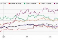
Amid a myriad of economic and political woes, the stock markets across the globe have given mixed performances. While 2014 is turning out as another banner year for the U.S. stock market with multiple record highs on several occasions, international investing has not been so encouraging. This is especially true as Vanguard FTSE All-World ex-US ETF (NYSEARCA: VEU ) targeting the international equity market has lost about 4% this year compared to a gain of 5.3% for iShares MSCI ACWI ETF (NASDAQ: ACWI ) , which targets the global stock market including the U.S. A strong dollar, Russia turmoil, slump in key emerging markets, sliding oil prices, speculation of interest rates hike faster than expected, and concerns over the global slowdown continued to weigh on the international stocks. Though developed markets started the year on a solid note, these lost momentum with Europe struggling to boost growth and inflation, and Japan suffering from the biggest setback following a sales tax increase in April that has pushed the world’s third-largest economy into a deep recession. Among developing nations, Russia has been hit hard owing to Western sanctions and a massive drop in oil prices while Greece saw another political chaos. On the other hand, India and Indonesia have shown strong resilience to the global slowdown driven by positive developments, election euphoria, new reforms and monetary easing policies. In particular, Chinese stocks have no doubt given impressive performances with the Shanghai Composite Index touching the major threshold of 3,000 for the first time in three years. The massive gains came on the back of speculation that the loose monetary policy measures will revive the dwindling economy and pump billions of dollars into the country. Additionally, growing investor confidence following prospects of a rebound in the Chinese economy, a stabilizing real estate market as well as the launch of the Shanghai-Hong Kong Stock Connect program propelled the Chinese stocks higher in recent months. There are several country ETFs that not only delivered handsome returns this year but also crushed the broad U.S. market fund. Below, we have highlighted a few of these strong momentum plays, which could be interesting picks for investors heading into the New Year. iShares MSCI India Small Cap Index Fund (BATS: SMIN ) – Up 48.3% This product provides exposure to the small cap segment of the broad Indian stock market by tracking the MSCI India Small Cap Index. Holding 180 securities in its basket, it is widely spread out across number of securities with none holding more than 2.67% of assets. Financials takes the top spot with one-fourth share followed by consumer discretionary (19.8%), industrial (18.4%) and materials (10.2%). The fund has been able to manage assets worth $24.1 million while sees light volume of about 16,000 shares per day. Expense ratio came in at 0.74%. SMIN is up over 48% this year and has a Zacks ETF Rank of 2 or ‘Buy’ rating with a High risk outlook. PowerShares China A-Share Portfolio (NYSEARCA: CHNA ) – Up 43.18% This is an actively managed ETF providing exposure to the China A-Share market using Singapore exchange FTSE China A50 Index futures contracts. The product is unpopular and illiquid with AUM of $5.3 million and average daily volume of around 8,000 shares. It charges 51 bps in fees per year from investors and has surged about 43% this year. iShares MSCI Philippines Investable Market Index (NYSEARCA: EPHE ) – Up 22.4% This product targets the Philippines stocks in the emerging Asia Pacific space and tracks the MSCI Philippines Investable Market Index. The fund has amassed $365.3 million in its asset base while trades a good volume of 236,000 shares a day. It charges 61 bps in annual fees. The fund holds a small basket of 43 firms with 61.5% of assets invested in the top 10 holdings, suggesting a high concentration risk. More than one-third of the portfolio is dominated by financials while industrials occupy the second position with 22.4% share. The fund has added over 22% this year and has a Zacks ETF Rank of 3 or ‘Hold rating with a Medium risk outlook. iShares MSCI Indonesia Investable Market Index Fund (NYSEARCA: EIDO ) – Up 20.76% This fund provides exposure to the Indonesian equity market by tracking the MSCI Indonesia Investable Market Index. Holding 102 securities in its basket, it is concentrated on both sectors and securities. The product puts about 44% in the top five holdings while financials dominates the fund’s return at 37.1%. EIDO is the most popular ETF with AUM of $578.4 million and average daily volume of nearly 665,000 shares. Expense ratio came in at 0.61%. The fund is up 20.8% so far in the year and has a Zacks ETF Rank of 2 with a High risk outlook. Bottom Line Investors should note that some specific emerging market ETFs have outperformed this year and will likely continue this trend in 2015. This is especially true, as a slump in oil price has created a major headwind for many key emerging nations or oil producing nations. Also, some developed economies are facing problems in reinvigorating growth.

Low Inflation And Higher Growth Keep GLD Down

Summary The recent higher-than-expected GDP report may also suggest the rise in U.S. economy will steer investors away from gold and into other assets. The recent PCE report showed a core inflation of only 1.4%. The ongoing lower inflation is likely to keep dragging down the price of GLD. The gold market continued to show a high level of volatility in the past several weeks. Nonetheless, the SPDR Gold Trust (NYSEARCA: GLD ) is nearly flat for December and only 1.2% during 2014. But the ongoing low inflation and signs of recovery in the U.S. economy are likely to further drive down GLD over the coming months. This week didn’t offer a whole lot of news items but there were two reports that came out from the Bureau of Economic Analysis: the final update on the U.S. GDP for the third quarter and the PCE monthly update. On the one hand, the GDP growth rate was revised up again to 5%. The revision was from 3.9% back in the second estimate. Even after subtracting the change in private inventories, the growth rate remains at 5% – so the growth mostly came from private and public sectors. Part of this revision came from higher real nonresidential fixed investments that grew by 8.9%. The recovery of the U.S. economy is a step in the direction towards the FOMC raising rates next year, which is likely to bring down the price of GLD further. Another issue to consider is the progress in the U.S. inflation: The recent PCE report showed that the core PCE annual rate slipped to 1.4%. The relation between GLD and inflation concerns is a close one and may have played a major role in the progress of GLD. (click to enlarge) Source of chart is from FRED’s web site Albeit the U.S. inflation remained low in the recent year, the progress in other measures, most notably the U.S. money base, drove bullion bugs towards GLD. Even M1 showed a sharp rise. If we were to examine the change in M1 and the progress of the gold during the past few years, we can see that following the economic recession, as the growth rate in M1 picked up, so did gold rally. (click to enlarge) Source of chart is from FRED’s web site But after the end of QE2 and then QE3, the growth in M1 has tapered down, which also coincided with the drop in GLD. This doesn’t mean we are in a situation where inflation actually substantially increased. Only that the steps the FOMC implemented, including low rates and QE programs, led to higher concerns over a potential rise in inflation – all the rise in M1 and U.S. money base had some people think prices are about to pick up anytime soon (some still think so) and may reach double digits. The last time U.S. inflation reached double digits was back in the early 80’s – back then gold prices reached their highest level, for that time. This high inflation led the Fed to raise rates, which soon brought down inflation expectations – and then gold soon followed. This time around, however, the circumstances are a bit different. Some were concerned about higher inflation that led to higher GLD prices. Nevertheless, the U.S. inflation remained low. (click to enlarge) Source of chart is from FRED’s web site But the current depressed prices, which are likely to come further down considering oil is at its current low level and the FOMC’s decision to end QE3 and perhaps even raise rates by mid-2015 have only reduced the fear factor of the U.S. inflation rearing its head. Some still think that the FOMC’s cash injections to the U.S. economy may eventually result in a spike in inflation down the line – like a time-release bomb. But this scenario seems, for now, less likely. As times passes, the price of GLD is likely to further suffer from U.S. inflation remaining well below 2%. The potential rise in the Federal Reserve’s cash rate is also likely to raise the yields of U.S. treasuries, which could diminish the appeal of GLD as an investment. I have referred to this point in the past . It’s a competing theory but it too plays the same role the inflation based theory plays. So where does it leave GLD? The recovery of U.S. economy and a little growth in inflation don’t vote well for GLD. The FOMC’s policy is still likely to play the main role in the progress of GLD. This year, the tapering of QE3 didn’t have a strong adverse impact on GLD as it slipped by only 1.2% (year to date). Most of the impact was already priced in when Bernanke announced this decision back in June 2013. The main change will be the rate hike and subsequent raises. For now, the FOMC keeps dropping hints of a rate raise soon but keeps us guessing because, well, perhaps some FOMC members aren’t so sure about making this rate hike next year. Until we get a clear guidance, the price of GLD isn’t likely to do much and only slowly come down. For more see: What are the advantages of GLD?

Country CAPE Ratios: Wizard In 2013, Dunce In 2014?

Summary The CAPE ratio was a fantastic predictor of country returns in 2013. In March 2014, Mebane Faber and Cambria Investments launched GVAL, which uses CAPE-like methodologies to buy the cheapest global markets. How did CAPE and GVAL do in 2014? Introduction As followers of my Buy-the-Dip High-Yield portfolio would know, I am a value investor at heart. The fact that value stocks outperform growth stocks has been proven by ample academic research, and is also attested to by the legendary value investor Warren Buffett’s remarkable track record over the years. One commonly used measure to determine market valuation is the cyclically-adjusted price-earnings [CAPE] ratio, also known as the Shiller P/E ratio. This metric was developed by U.S. economist and Nobel laureate Robert Shiller, and is defined as price over 10-year average earnings adjusted for inflation. By using 10-year average earnings rather than one-year trailing (or forward) earnings, fluctuations in net income caused by variations in profit margins over a typical business cycle can be reduced. The use of CAPE as a valuation indicator does have its limitations. While high CAPE values have been associated with lower future long-term returns, and lower CAPE values with higher future long-term returns, the CAPE ratio does not reliably predict near-term tops and bottoms. In a chart from a December 2013 article by Hussman Funds entitled ” Does the CAPE still work? “, the projected 10-year returns predicted by CAPE was found to correlate nicely (> 90%) with actual 10-year returns, except when markets became very overvalued or very undervalued . (click to enlarge) (Image from Hussman Funds) The current CAPE ratio of the U.S. market (27.33) is significantly higher than both its historical average (16.58) and median (15.95), suggesting moderate overvaluation of the market, and thus, low future returns. However, the above commentary from Hussman Funds states that actual returns can exceed CAPE forecasts when stocks become overvalued (“Actual 10-yr. returns overshoot in 1990 and 2003 because market overvalued in 2000 and 2013”). My own interpretation of this is that if the U.S. market were to remain overvalued for the next couple of years, then the subsequent returns could be greater than what is currently predicted by CAPE. However, Hussman Funds is seemingly confident that would not be the case: The CAPE Ratio is doing exactly what it has always done, which is to help investors anticipate the investment returns they should expect over the next decade. Those returns will very likely be in the low, single digits. Country CAPE Does value investing work for countries? According to Mebane Faber, co-founder and Chief Investment Officer at Cambria Investments, the answer is a resounding “yes”. In a January 2, 2014 posting on his “Meb Faber Research” website, Faber points out that the countries with the cheapest CAPE ratios massively outperformed those with the highest CAPE ratios in 2013. The bottom-5 and bottom-10 CAPE countries averaged 20.74% and 21.11% returns, respectively, in 2013, while the top-5 and top-10 CAPE countries averaged -17.81% and -5.39%, respectively. This represents a differential of 38.59% for the top-5 versus bottom-5, and 26.5% for the top-10 versus bottom-10, a remarkable outperformance. (Image from Meb Faber Research ) I compiled the total return performances into a bar chart. Blue bars represent the cheapest countries, red bars represent expensive countries. Countries are sorted from left to right, in order of increasing CAPE values. I have also compiled the data into a scatterplot, to show the relationship between CAPE on the December 31, 2012 and 2013 returns. On the face of it, the divergence between the most expensive and the cheapest stocks in 2013 was pretty dramatic. Even with the outliers (Russia and USA) present, a statistical test conducted on this data revealed that the negative correlation was highly significant (p-value = 0.00018). In other words, countries with high CAPE values showed lower 2013 returns, while countries with low CAPE values showed higher 2013 returns. These results, therefore, suggested that CAPE was an excellent metric for identifying cheap markets to obtain outsized returns. Three months later, Cambria debuted the Cambria Global Value ETF (NYSEARCA: GVAL ), an ETF fund (with a relatively high 0.69% expense ratio for a passive fund) that uses CAPE-like methodologies to invest in the cheapest markets globally. Coincidence? Maybe. How good was CAPE as a valuation measure in 2014? Last year, Faber had actually pre-empted his new year’s article with a December 5, 2013 posting that showed the impressive performance of the CAPE indicator through the first 11 months of 2013. Unfortunately, he had chosen not to do so again this year. Therefore, I took it upon myself to obtain data for CAPE ratios for countries from the start of the year and compare those with their YTD performances. 2014 Country CAPE Evaluation Meb Faber updated his CAPE ratios at the start of the year. As reported by Seeking Alpha : Mebane Faber updates countries’ cyclically-adjusted price-earnings ratios for the start of the year, and Greece, Russia, Ireland, Argentina, Hungary, Jordan, Austria, and Lebanon make the list of the cheapest – all under 10. How did the CAPE do in 2013? If you bought the 5 highest-priced countries – Peru, Colombia, Indonesia, Mexico, and Chile – you would have lost 17.8%. If you bought the 5 cheapest – Greece, Ireland, Argentina, Russia, and Italy – you would have gained 20.7%. Unfortunately, I do not have a subscription to The Idea Farm, Faber’s subscription service, and so could not access Faber’s updated list of CAPE ratios. Therefore, bits and pieces of data were instead obtained from StreetAuthority and from StarCapital . In the table below, CAPE ratios for countries marked with (^) are from StreetAuthority, and are from 12/11/2013. CAPE ratios for the remaining countries are from StarCapital, and are from 1/31/2014. Although the two sets of CAPE data originate from time points nearly two months apart, I reasoned that it should not have a large effect on the analysis, because CAPE is a long-term measure of valuation. 2014 YTD return data are from Morningstar . Country ETF CAPE 2014 YTD % Greece (NYSEARCA: GREK ) 4.03 -36.35 Argentina^ (NYSEARCA: ARGT ) 6.91 -3.12 Ireland^ (NYSEARCA: EIRL ) 6.94 0.67 Russia^ (NYSEARCA: RSX ) 7.11 -42.54 Jordan^ 8.64 Italy (NYSEARCA: EWI ) 8.8 -7.98 Austria^ (NYSEARCA: EWO ) 9.16 -19.47 Hungary^ 9.46 Croatia^ 9.81 Lebanon^ 9.97 Israel^ (NYSEARCA: EIS ) 9.98 -1.39 Spain (NYSEARCA: EWP ) 10.3 -2.22 Belgium (NYSEARCA: EWK ) 12.2 4.81 Norway (NYSEARCA: NORW ) 12.3 -21.68 United Kingdom (NYSEARCA: EWU ) 12.6 -5.77 Singapore (NYSEARCA: EWS ) 12.9 2.6 France (NYSEARCA: EWQ ) 13.8 -7.97 Netherlands (NYSEARCA: EWN ) 14.5 -3.53 Australia (NYSEARCA: EWA ) 16.2 -4.73 Germany (NYSEARCA: EWG ) 17.3 -9.51 Hong Kong (NYSEARCA: EWH ) 18.2 3.15 Canada (NYSEARCA: EWC ) 18.6 1.57 Switzerland (NYSEARCA: EWL ) 21.6 0.28 Japan (NYSEARCA: EWJ ) 23.9 -4.22 USA (NYSEARCA: SPY ) 24.6 14.68 The 2014 YTD total return performances have also been compiled into a bar chart. Blue bars represent the cheapest countries (CAPE