Tag Archives: fn-start

I Like The Risk Level On SPLV, But I’m Not Entirely Sold

Summary I’m taking a look at SPLV as a candidate for inclusion in my ETF portfolio. I’m not huge on the expense ratio, but I like the other aspects of the ETF. The ETF is incredibly well-diversified which favorably impacts the standard deviation of returns. In the context of Modern Portfolio, the correlation and standard deviation of returns are very important. The ETF looks favorable in those regards. I’m not assessing any tax impacts. Investors should check their own situation for tax exposure. Investors should be seeking to improve their risk adjusted returns. I’m a big fan of using ETFs to achieve the risk adjusted returns relative to the portfolios that a normal investor can generate for themselves after trading costs. I’m working on building a new portfolio, and I’m going to be analyzing several of the ETFs that I am considering for my personal portfolio. One of the funds that I’m considering is the PowerShares S&P 500 Low Volatility Portfolio (NYSEARCA: SPLV ). I’ll be performing a substantial portion of my analysis along the lines of modern portfolio theory, so my goal is to find ways to minimize costs while achieving diversification to reduce my risk level. What does SPLV do? SPLV attempts to track the total return of the S&P 500® Low Volatility Index. At least 90% of funds are invested in companies that are part of the index. SPLV falls under the category of “Large Value.” Does SPLV provide diversification benefits to a portfolio? Each investor may hold a different portfolio, but I use (NYSEARCA: SPY ) as the basis for my analysis. I believe SPY, or another large cap U.S. fund with similar properties, represents the reasonable first step for many investors designing an ETF portfolio. Therefore, I start my diversification analysis by seeing how it works with SPY. I start with an ANOVA table: (click to enlarge) The correlation is about 86%. This is pretty great for making the ETF fit under modern portfolio theory. The low correlation means it should be possible to use the ETF without raising the standard deviation of returns unless the risk ETF has a very high standard of deviation of returns. Standard deviation of daily returns (dividend adjusted, measured since January 2012) The standard deviation is phenomenal. For SPLV it is .5978%. For SPY, it is 0.7300% for the same period. SPY usually beats other ETFs in this regard, so the combination of reasonable correlation and lower standard deviation than SPY is giving this ETF a real chance at being selected for my portfolio. Mixing it with SPY I also run comparisons on the standard deviation of daily returns for the portfolio assuming that the portfolio is combined with the S&P 500. For research, I assume daily rebalancing because it dramatically simplifies the math. With a 50/50 weighting in a portfolio holding only SPY and SPLV, the standard deviation of daily returns across the entire portfolio is 0.6410%. If we drop the position to 20% the standard deviation goes to .6899%. Once we drop it down to a 5% position the standard deviation is .7195%. I haven’t decided what exposure level I would use yet, but probably 5% to 10%. I really like the combination of low volatility and moderate to low correlation. If it wasn’t for the higher expense ratio, I’d consider making this a core holding. Why I use standard deviation of daily returns I don’t believe historical returns have predictive power for future returns, but I do believe historical values for standard deviations of returns relative to other ETFs have some predictive power on future risks and correlations. Yield & Taxes The distribution yield is 2.21%. The yield seems strong enough that it could be included in a retirees portfolio to bring some diversification benefits and a moderate dividend yield. I’m not a CPA or CFP, so I’m not assessing any tax impacts. If I were using SPLV, I would want it to be in a tax exempt account to remove any headaches associated with frequent rebalancing. Expense Ratio The ETF is posting .25% for an expense ratio. I want diversification, I want stability, and I don’t want to pay for them. In my opinion, a .25% expense ratio is higher than I want to pay for equity investments. It’s still low relative to many other methods of investing, but I’m looking for long term holdings and I don’t want to give my investments away. I haven’t decided if it’s worth paying the higher expense ratio to include SPLV. If the expense ratio was under .10%, this ETF would have a very strong case for being included. Market to NAV The ETF is at a .05% premium to NAV currently. In my opinion, that’s not worth worrying about. It is practically trading right on top of NAV. However, premiums or discounts to NAV can change very quickly so investors should check prior to putting in an order. Largest Holdings The portfolio is extremely well diversified. The largest position is around 1.25% of the portfolio. That is solid diversification. The intense diversification is part of the reason the volatility of the ETF is so low. Check out the chart below: (click to enlarge) Conclusion I’m currently screening a large volume of ETFs for my own portfolio. The portfolio I’m building is through Schwab, so I’m able to trade SPLV with no commissions. I have a strong preference for researching ETFs that are free to trade in my account, so most of my research will be on ETFs that fall under the “ETF OneSource” program. SPLV is a difficult ETF to make a decision on. For equity investments, the expense ratio is a bit high, but the relatively low correlation and standard deviation of returns make a pretty good argument for using at least a small position such as 5% in a long term portfolio. I could go either way on this one. I won’t consider it as a core holding (20%+) because of the higher expense ratio. Disclaimer: Information in this article represents the opinion of the analyst. All statements are represented as opinions, rather than facts, and should not be construed as advice to buy or sell a security. Ratings of “outperform” and “underperform” reflect the analyst’s estimation of a divergence between the market value for a security and the price that would be appropriate given the potential for risks and returns relative to other securities. The analyst does not know your particular objectives for returns or constraints upon investing. All investors are encouraged to do their own research before making any investment decision. Information is regularly obtained from Yahoo Finance, Google Finance, and SEC Database. If Yahoo, Google, or the SEC database contained faulty or old information it could be incorporated into my analysis. The analyst holds a diversified portfolio including mutual funds or index funds which may include a small long exposure to the stock.

Yellen’s Inflation Compensation And GLD

Summary The Fed is an important influencer of inflation, and for 2015, the Fed is ready to accept inflation as low as 1% and this will push down gold prices. The Fed is ready to fight possible long-term inflation as the economy grows by raising Fed Rates and gradually reducing its $4.55 trillion balance sheet if necessary. Yellen is signaling that the Fed is going to ignore market based weak inflation expectations as seen by the new term ‘inflation compensation’ on the Treasury market. Slim possibility that inflation will overshoot the 2% target, it is more likely to undershoot as energy prices are not transitory. A significant portion of gold holders still see high inflation as the economy strengthens. This is not applicable now and it is time to sell GLD before the crowd does. Fed, Inflation and Gold Frequent readers of my articles on gold will realize that I have been bearish on gold for quite some time now. Gold has many purposes and one of which is for its usage as storage of value. There will always be someone who is willing to buy and store gold if they do not believe in today’s monetary order or simply to form part of a diversified portfolio, and there are those who buy gold as an inflation hedge. This article is targeted for those who view gold as an inflation hedge. There will be a significant portion of investors who will buy gold as an inflation hedge, and it is the changes in inflation or inflation expectations which will have a big impact on the price of gold. There is no other institution that has more influence on inflation than the Federal Reserve, and this is why I believe that by following the Fed closely, we can better inform ourselves on inflation and that is why most of my gold article involves the Fed in one way or the other. The latest Fed document comes in the form of Chair Janet Yellen’s press conference on 17 December 2014. As always, the mainstream media is obsessed with when the Fed will raise interest rates, and there are a number of questions on it with the word ‘patient’ being the new buzz word. If you read the press articles elsewhere, you will probably be informed that the Fed will not raise rates for ‘a couple’ of meetings. Indeed, during the question and answer session, one reporter even wanted to confirm with the Chair if ‘a couple’ means 2 meetings which was subsequently confirmed. However, this is actually quite meaningless for the serious investors because Yellen has qualified her response as data dependent so who is to stop her from raising rates in the next meeting or 5 meetings down the road? She has certainly kept that possibility open, and remember that the US grew by 5% in the third quarter of 2014. My article may have come after all the buzz has subsided, but as you read about it in the new year of 2015, I hope to bring about new perspective based on some points that are largely ignored by the media. Let me bring your attention to the idea of inflation compensation, the existing size of the Fed’s balance sheet, and the Fed’s own inflation expectation for 2015, together with their view of a transitory low energy prices. Rate Hikes and Balance Sheet – Tools ready to Cap Growth Related Inflation Let us first begin with the concept that monetary policy works with a lag time. So the appropriate response to do is to predict as best as possible what will happen in the future and set policy that will ensure that the Fed’s dual mandate of stable prices and maximum employment is achieved as much as possible when the monetary policy takes effect. The Fed views that stable price means a 2% inflation target and predicts that this will be reached in 2017. Stable prices can only be achieved together with an appropriate Federal Funds Rate, which stands at 3.75% in the long run. However, the Fed set a target of 2.5% by 2017 to accommodate for the economic recovery and deal with the residual effect of the Great Recession. This will fit into the narrative where they would start to raise rates in 2015 and gradually guide rates towards their target as they expect the economy to grow in strength. For the shorter term, the Fed’s own forecast, which they would have factored in their own rate hikes, expects inflation to stay between 1% to 1.6% in 2015. This range is within the current Personal Consumption Expenditure inflation reading of 1.4% . So at least in the short term, the Fed is willing to accept lower inflation reading and this is going to be bearish on gold. However, gold might still catch a bid if there is a reasonable expectation for inflation to increase significantly in the future. This is where the size of the Fed balance sheet comes into the picture and where the uncertainty over the inflation compensation comes into play. The Fed is holding $4.55 trillion of assets as of 24 December 2014 and $4.47 trillion comes in the form of Federal Reserve credit. While this may have been accommodative in the past, it can also be used to keep a lid on inflation as seen in the quote by Yellen below. “Rather than actively planning to sell the assets that we’ve put onto our balance sheet, sometime after we begin raising our targets for short-term interest rates, depending on economic and financial conditions, we’re likely to reduce or cease reinvestment and gradually run down the stock of our assets. But our active tool for adjusting monetary – the stance of monetary policy so that it is appropriate for the economic needs for the country, that will be done through adjusting our short-term target range for the federal funds rate.” Yellen’s quote above shows that the Fed is ready to tighten monetary policy not only through the federal rate hike that is in the spotlight recently, but also through a gradual reduction of its balance sheet assets. Hence, we can conclude that the Fed is poised to reign in any runaway inflation that they expect when the economy recovers. This is an old economic theory that is about to be revisited by the investment community at large. Also, consider the argument that low energy prices may be here to stay in this excellent article by Kyle Spencer. The Fed has a bullish outlook for the US economy, and this is the majority view of the FOMC and they are prepared to reign in long-term inflation. The biggest cheerleader of them all has to be the Dallas Fed President, and you can read all about it in this article, Dallas Fed Fisher’s Prescience And GLD . In that article, I gave you the reason that the USD will rise, as the strong 5% GDP growth reinforces the possibility of an earlier rate hike and this will bring down the price of gold that is denominated in USD. In this article, I am now giving you another reason to sell which is to say that the Fed has capped all possibilities of inflation going higher than 2%. In all possibilities, inflation is more included to remain lower than what the Fed expects. My view is that the economy may grow, but inflation might not move towards the 2% target that is expected by the Fed. The tightening of monetary conditions by way of rate hikes will act as an inflation dampener in 2017. I have written about it in this article, Growflation And The 1% Fed Inflation Target In 2015 so I am not going to repeat myself. I am going to bring a new perspective of the declining yield of the 5-year treasury yields and how the Fed is responding to it. Instead of seeing it as a sign of a decline in inflation expectations, they see that it is possible that this could be due to an influx of funds due to the USD safe haven status. Inflation Compensation “Well, what I would say, we refer to this in the statement as “inflation compensation” rather than “inflation expectations.” The gap between the nominal yields on 10-year Treasuries, for example, and TIPS have declined-that’s inflation compensation. And five-year, five-year-forwards,as you’ve said, have also declined. That could reflect a change in inflation expectations, but it could also reflect changes in assessment of inflation risks. The risk premium that’s necessary to compensate for inflation, that might especially have fallen if the probabilities attached to very high inflation have come down. And it can also reflect liquidity effects in markets. And, for example, it’s sometimes the case that-when there is a flight to safety, that flight tends to be concentrated in nominal Treasuries and could also serve to compress that spread. So I think the jury is out about exactly how to interpret that downward move in inflation compensation. And we indicated that we are monitoring inflation developments carefully.” I have quoted Yellen on her answer above as this is a new concept. This would imply that the Fed would not take reference from market signals as credible inflation measurement for a while. This is evident in Yellen’s renaming of inflation expectation to inflation compensation instead. In other words, investors may expect 2% inflation in 5 years time, but increased demand for Treasury bills pushed down their actual yield to 1.538% (Current Yield of 1.66%-0.125% TIPS, see chart below). Hence, this 1.538% inflation market expectation is not a good gauge of actual inflation 5 years later. Source: Bloomberg This safe haven argument is not an unreasonable one, as Europe and Japan are still mired in economic troubles. Europe, Japan and Switzerland have all instituted negative interest rates, and it is only logical that international capital would flee these financial centers and enter into secure Treasury holdings, especially when the market has reasonable expectations that rates are going to rise soon. So to summarize it even further, Yellen is telling the world that the Treasury inflation pricing mechanism is malfunctioning now so don’t take it seriously. Since the Fed is going to raise rates soon, the danger is not that it would overshoot its inflation target, but rather that it will undershoot the inflation target. This is why I am bearish on gold as there is little upside to inflation to support gold prices. As long as the market continues its expectation that inflation is coming as the economy recovers, they will continue to overprice gold as there will be investors who will hold gold with a longer time horizon. Profiting with GLD In other words, there is a very slim possibility of high inflation in the days ahead, and the greater possibility is that inflation will undershoot the 2% target in the medium term. Hence, there is no reason to hold gold as an inflation hedge. As the new consensus builds around this, gold prices will continue its secular decline. The way for investors to profit from this is to sell the SPDR Gold Trust ETF (NYSEARCA: GLD ). There are other gold ETFs, but GLD is the most liquid at $27.45 billion market capitalization and 7.9 million of last known daily transaction. (click to enlarge) As you can see on the chart above, GLD has been on the bearish decline, but periodically there will be strength for which investors can sell on. This is indicative of a healthy market for which to sell GLD. The pullback indicates the profit taking of the bears. Of course, this bearishness of GLD will end one day as it approaches its true value. However, this will only happen after we see the significant portion of gold holders who hold in expectation of higher inflation as the economy grows give up their position. For most, this will only occur when they continue to see low inflation amid high growth. Then they will question themselves why they are willing to lose out on the economic growth by tying up their funds on their gold holding when there is very low inflation. So for readers who hold gold as an inflation hedge and are persuaded by my arguments, the time to sell gold is now before a flood of sell orders enter the market.

High Quality Stocks In Developed Markets

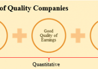
This article is based on the working paper we published on ssrn. The working paper can be accessed by clicking here . The risk of paying too high a price for good quality stocks – while a real one – is not the chief hazard confronting the average buyer of securities. Observation over many years has taught us that the chief losses to investors come from the purchase of low quality securities at times of favourable business conditions. – Benjamin Graham It’s far better to buy a wonderful company at a fair price than a fair company at a wonderful price. – Warren E. Buffett As the above two quotes reflect, the idea of buying high quality stocks has been around for quite some time. However, it has gained renewed momentum over the past few years driven by spectacular crashes experienced subsequent to the technology boom and during the global financial crisis. This is also reflected in academic research. Over the last few years, several academics have weighed in on the quality factor and many papers have been written trying to identify criteria for defining high quality stocks. Further, as it is becoming widely accepted as an anomaly, quality is now being designated by many researchers as a fifth factor explaining investment returns in addition to the four widely accepted factors, namely beta, size, momentum, and value. This development is in sync with our long held belief that quality is a distinct investment style. This paper is related to a large literature as a number of studies have explored returns to factors such as profitability, relationship between accounting and economic profits, and leverage. Robert Novy-Marx (2013) showed that stocks with high gross profitability as measured by gross profits to assets, outperform. Chan, et. al. (2006) shows that difference between accounting earnings and cash flows is negatively associated with future returns. George and Hwang (2010) shows that stocks with low leverage have high alpha. In this paper, we discuss the investment returns of a simple quantitative process from selecting high quality stocks. We believe that in valuing high quality stocks, market participants systematically underestimate the duration of competitive advantage such that the valuation premium assigned isn’t sufficient to account for the difference between the business value creation potential of a high quality business as compared to the average business. Indeed, a basket of high quality stocks generates significantly superior investment returns compared to publicly traded benchmarks and does so with significantly lower risk. Section 1. High Quality Stocks – The Multi-Act Way At Multi-Act, we have spent in excess of fifteen years developing and perfecting our process of identifying high quality stocks. Our internal research process assigns every company followed by us a quality rating, referred to as ‘Grade’. There are several components of our process some of which lend themselves to quantitative modelling while others don’t. A crucial component of our classification of a business as high quality is the existence of “sustainable” competitive advantage, a component that does not lend itself to quantitative modelling. It is important to note that the existence of competitive advantage and sustainability of this competitive advantage are the most important criteria in our classification of a business as quality. This is driven by our assertion that much of the investment returns that accrue to investors from quality factor depend on the ability of the business to persist with its supernormal returns on capital which in turn depends on its ability to keep competition at bay. Given our inability to model this component, we believe that our manually selected list of quality businesses will likely generate superior risk-adjusted performance as compared to the quantitatively selected basket that is discussed here. Section 2. Quality Factors There are some key characteristics of a high quality business. A high quality business generates superior returns on capital – stronger the competitive advantage, lesser the impact of competition, higher the returns on capital. Returns on capital of such businesses tend to be persistently fat. Further, such businesses have a very healthy relationship between their accounting profits and their economic profits. Finally, we like our high quality businesses to possess good balance sheets such that financial risk isn’t a significant factor driving our investment returns or risk. Source: MAEG As shown in Exhibit 1, Multi-Act’s process of classification of a business as a high quality business includes three characteristics that lend them to quantitative analysis. Note that our research process utilizes a multiplicity of measures within each characteristic. However, for the sake of simplicity, we have chosen one measure to represent each quality characteristic. For the purposes of this paper, we measure returns on capital by return on equity (RoE). Fat return on equity indicates existence of competitive advantage and the persistence of this variable suggests sustainability of the competitive advantage. It is important to keep in mind that it is possible for the management of a company to manage its return on equity. To the extent that earnings are manipulated, they will impact return on equity as well. Further, return on equity is also affected by corporate transactions including buybacks, acquisitions, restructuring, etc. To ensure that the earnings component of the return on equity is not a result of financial creativity, we use a quality of earnings factor namely free cash flow over earnings (FCF/EPS). Over the years, we have found that this measure helps us filter out companies with suspect accounting numbers. Finally, we measure financial safety by net debt over free cash flow (ND/FCF). This measure indicates the number of years of free cash flow that is needed to repay the debt. Table 1 provides summary statistics on each of the quality factors by country. Section 3. Data and Quality Factors Data Sources Our data sample consists of 5,262 companies covering 23[1] countries between 1997 and 2013. The 23 markets correspond to countries contained in the MSCI World Developed Index as of December 31, 2013. All data including fundamentals and price data are from Factset Global data feed with returns calculated in USD with currency risk hedged away. We utilize fundamental data reported anywhere in calendar year t-1 in April of calendar year t such that there is a minimum of three month lag from the end of the fiscal year of the company. Table 2 provides summary statistics on number of companies and market capitalization by country. Since the cash flow data is available from 1989 and some of our fundamental variables require minimum five-year data availability, our sample could start at the earliest from 1994. However, given the limited number of companies which satisfied our data requirements, our model starts from 1997. Section 4. Methodology Before proceeding with our calculations, we perform two exclusions, firstly for size and secondly for suitability and data applicability. We exclude all companies with market capitalization less than USD 1 billion. This number is deflated at 6% p.a. for years prior to 2013. The objective of this exclusion is to minimize size factor’s contribution to our investment returns. Further, we exclude some industries that in our assessment do not lend themselves to existence of sustainable competitive advantages[2]. This is not to say that there cannot be a business with sustainable competitive advantage in these industries. However, it is our assessment that the probability of finding a business with sustainable competitive advantage in these industries is significantly lower. Further, calculating cash flow data presents a practical problem with some of these industries, especially in the case of banking and insurance businesses where cash flow is affected by changes to loans, investments, and deposits and thus loses its sanctity. Accordingly, we have excluded these industries from our samples. We calculate quality factors discussed earlier for all the remaining stocks in our data sample. We then apply absolute cutoffs, levels that a business must meet in order to qualify as a high quality business. Businesses that meet these cutoffs are then sorted by their market capitalization in a descending order. Finally, we select fifty of the largest businesses from all qualifying businesses as our quality basket. Using the characteristics above, we create a basket of fifty high quality stocks every year and test the performance of the basket so created over a period of seventeen years, from 1997 to 2013. Section 5. Risk and Returns of the Quality Basket We now turn our attention to risk and returns of high quality stocks. Figure 1 shows the performance of the high quality stocks basket on a net basis[3] as compared to that of MSCI World Developed market index. Given that we selected our high quality stocks basket from a universe of all companies from developed markets, we consider this index to be the appropriate benchmark. The high quality stocks basket generated compounded annual return of 7.4% as compared to 4.3% for MSCI World Developed index. What is more, annualized standard deviations of monthly returns were lower for the high quality stocks basket at 12.6% as compared to 16.1% for the benchmark index. Over the same time frame, S&P 500 generated returns of 5.3% p.a. with annualized standard deviation of 15.8%. (click to enlarge) High Quality Stocks – Investment Returns to Quality, Net Figure 2 shows performance of the high quality stocks basket on a gross basis[4] as compared to that of the benchmark index. The high quality stocks basket generated compounded annual return of 9.4% as compared to 6.6% for the benchmark index. The annualized standard deviations of returns were lower for the high quality stocks basket at 12.7% as compared to 16.1% for the benchmark index. Over the same time frame, S&P 500 generated returns of 7.3% p.a. with annualized standard deviation of 16.0%. (click to enlarge) High Quality Stocks – Investment Returns to Quality, Gross Figure 3 shows drawdown[5] profiles of the high quality stocks basket and of the benchmark index. Clearly, the high quality stocks basket is significantly less risky when compared to MSCI World Developed index as drawdowns aren’t only shallower; recovery to peak is quicker as well. We estimate the high quality stocks basket’s relative risk to be 55%[6] of that of the benchmark index. (click to enlarge) High Quality Stocks – Drawdowns for High Quality Stocks Section 6. Risk and Returns of MAEG’s “Manual” Quality Basket As stated earlier, a key component of our high quality stocks selection process does not lend itself to modelling. In this section, we analyze performance of our actual quality basket, a basket that has to pass through our human analytical rigor as well as our systematic process. We refer to this basket as the 100% list. Figure 4 shows performance of the 100% list of high quality stocks on a net basis[7] as compared to that of the benchmark index. The 100% list of high quality stocks generated compounded annual return of 13.5% as compared to 4.3% for benchmark index. The annualized standard deviations of returns were lower for the 100% index of high quality stocks at 14.8% as compared to 16.1% for the benchmark index. Over the same time frame, S&P 500 generated returns of 5.3% p.a. with annualized standard deviation of 15.8%. $100 invested in April of 1997 in MAEG’s 100% index of high quality stocks would have grown to almost $883 by June 2014 as compared to $206 in MSCI World Developed Index and $245 in S&P 500 Index. (click to enlarge) High Quality Stocks – Investment Returns to MAEG’s High Quality Index, Net Figure 5 shows drawdown profiles of the 100% index of high quality stocks and of the benchmark index. Clearly, the 100% Index of high quality stocks is significantly less risky when compared to MSCI World Developed index as drawdowns aren’t only shallower; recovery to peak is quicker as well. We estimate the quality basket’s relative risk to be 57% of that of the benchmark index. (click to enlarge) High Quality Stocks – Drawdowns for MAEG’s High Quality Index Summary Multi-Act’s definition of high quality stocks includes quantitative as well as qualitative variables with sustainability of competitive advantage being a key factor. A simple three factor quantitative process for selecting high quality stocks outperforms the publicly traded benchmarks and does so with lower risk. MAEG’s manually selected list of high quality stocks – 100% Index – generated substantially superior performance even when compared to the performance of quantitatively selected high quality stocks. Table 1. Comparison of Quality Measures This table shows average quality measures by country for the investment universe as well as for the quality basket. Each year, we calculate averages for the three quality measures for the investment universe selected after making size-based and industry-based exclusions and for the quality basket comprised of fifty stocks. We utilize fundamental data reported anywhere in calendar year t-1 in April of calendar year t such that there is a minimum of three month lag from the end of the fiscal year of the company. This table reports the average of each year’s equal-weighted average of quality measures between 1997 and 2014. High Quality Stocks – Countrywise Quality Factors Table 2. Number of Companies and Market Capitalization This table shows yearly average of total number of companies and yearly average of market capitalization for the investment universe as well as for the quality basket, by country. High Quality Stocks – Descriptive Statistics References Novy-Marx, Robert (2013), “The Other Side of Value: The Gross Profitability Premium,” Journal of Financial Economics Chan, K., Chan, L.K.C., Jegadeesh, N., Lakonishok, J. , (2006), “Earnings quality and stock returns,” Journal of Business George, Thomas J., and C.Y. Hwang (2010), “A Resolution of the Distress Risk and Leverage Puzzles in the Cross Section of Stock Returns,” Journal of Financial Economics [1] The countries included are Australia, Austria, Belgium, Canada, Denmark, Finland, France, Germany, Hong Kong, Ireland, Israel, Italy, Japan, Netherlands, New Zealand, Norway, Portugal, Singapore, Spain, Sweden, Switzerland, United Kingdom, and United States. [2] Following industries were excluded for the purposes of this paper: Aluminum, Steel, Pharmaceuticals: Generic, Pharmaceuticals: Major, Pharmaceuticals: Other, Financial Conglomerates, Investment Banks/Brokers, Life/Health Insurance, Major Banks, Multi-Line Insurance, Property/Casualty Insurance, Real Estate Investment Trusts, Regional Banks, Specialty Insurance, Biotechnology, Apparel/Footwear Retail, Major Telecommunications, Electronics/Appliance Stores, and Specialty Stores. [3] Excluding dividends. [4] Inclusive of dividends. [5] The peak-to-trough decline during a specific record period of an investment, fund or commodity. A drawdown is usually quoted as the percentage between the peak and the trough. (Source: Investopedia) [6] Worst drawdown of the quality basket is 35% while that of the benchmark index is 54%. The relative risk is estimated as log(1-35%)/log(1-54%) = 55%. At 55% of the benchmark’s risk, relative risk of the quality basket is about half that of the benchmark index. What this means is that it takes about two back-to-back losses of 35% to produce one 55% loss. For more on this, refer http://www.hussmanfunds.com/wmc/wmc141013.htm [7] Excluding dividends.