Tag Archives: fn-start

Materials ETF: XLB No. 8 Select Sector SPDR In 2014

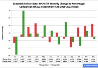
Summary The Materials exchange-traded fund finished eighth by return among the nine Select Sector SPDRs in 2014. The ETF was a winner in the first and second quarters, flattish in the third and a loser in the fourth. Seasonality analysis indicates its downward trajectory could continue in the first quarter. The Materials Select Sector SPDR ETF (NYSEARCA: XLB ) in 2014 ranked No. 8 by return among the Select Sector SPDRs that section the S&P 500 into nine subdivisions. On an adjusted closing daily share-price basis, XLB progressed to $48.58 from $45.33, a yield of $3.25, or 7.17 percent. Accordingly, it lagged its sibling, the Utilities Select Sector SPDR ETF (NYSEARCA: XLU ) and parent proxy, the SPDR S&P 500 Trust ETF (NYSEARCA: SPY ) by -21.57 and -6.29 percentage points, in that order. (XLB closed at $47.19 Wednesday.) XLB also ranked No. 8 among the sector SPDRs in the fourth quarter, when it behaved worse than XLU and SPY by -14.60 and -6.32 percentage points, respectively. And XLB ranked No. 6 among the sector SPDRs in December, when it performed worse than XLU and SPY by -4.13 and -0.30 percentage points, in that order. Figure 1: XLB Monthly Change, 2014 Vs. 1999-2013 Mean (click to enlarge) Source: This J.J.’s Risky Business chart is based on analyses of adjusted closing monthly share prices at Yahoo Finance . XLB behaved worse in 2014 as it did during its initial 15 full years of existence based on the monthly means calculated by employing data associated with that historical time frame (Figure 1). The same data set shows the average year’s weakest quarter was the third, with an absolutely large negative return, and its strongest quarter was the fourth, with an absolutely larger positive return. Inconsistent with this pattern last year, the ETF actually had a loss in Q4. Figure 2: XLB Monthly Change, 2014 Versus 1999-2013 Median (click to enlarge) Source: This J.J.’s Risky Business chart is based on analyses of adjusted closing monthly share prices at Yahoo Finance. XLB performed a little worse in 2014 than it did during its initial 15 full years of existence based on the monthly medians calculated by using data associated with that historical time frame (Figure 2). The same data set shows the average year’s weakest quarter was the third, with an absolutely large negative return, and its strongest quarter was the fourth, with an absolutely larger positive return. It also shows there is no historical statistical tendency for the ETF to explode in Q1. Figure 3: XLB’s Top 10 Holdings and P/E-G Ratios, Jan. 14 (click to enlarge) Note: The XLB holding-weight-by-percentage scale is on the left (green), and the company price/earnings-to-growth ratio scale is on the right (red). Source: This J.J.’s Risky Business chart is based on data at the XLB microsite and Yahoo Finance (both current as of Jan. 14). LyondellBasell Industries NV (NYSE: LYB ) aside, XLB’s top 10 holdings appear to range between fairly valued and overvalued (Figure 3). And these kinds of valuations seem unlikely to function as tailwinds for the ETF this quarter, even though the numbers on the S&P 500 materials sector reported by S&P Senior Index Analyst Howard Silverblatt Dec. 31 indicated the sector’s valuation is not superstretched, with its P/E-G ratio at 1.26. However, I suspect XLB will continue to be a laggard among the Select Sector SPDRs in Q1, mostly because of the bias divergence in monetary policy at major central banks around the world. On the one hand, the U.S. Federal Reserve is oriented toward tightening; on the other hand, the Bank of Japan, European Central Bank and People’s Bank of China are oriented toward loosening. This bias divergence has had important effects on currency-exchange rates, such as the one centered on the euro and U.S. dollar pair: The EUR/USD cross dipped from as high as $1.3992 May 8 to as low as $1.1753 Jan. 8, a drop of -$0.2239, or -16.00 percent. This change in EUR/USD and similar moves in other currency pairs could pressure earnings of U.S. companies in sectors with substantial international businesses. It is noteworthy the Fed announced the conclusion of asset purchases under its latest quantitative-easing program Oct. 29 and may announce the beginning of interest-rate hikes April 29. Its ending of purchases under its first two formal QE programs this century is associated with a correction and a bear market in large-capitalization equities, as evidenced by SPY’s falling -17.19 percent and -21.69 percent in 2010 and 2011, respectively. If one were to argue that this time is different, then I would have to wonder: Why? Disclaimer: The opinions expressed herein by the author do not constitute an investment recommendation, and they are unsuitable for employment in the making of investment decisions. The opinions expressed herein address only certain aspects of potential investment in any securities and cannot substitute for comprehensive investment analysis. The opinions expressed herein are based on an incomplete set of information, illustrative in nature, and limited in scope. In addition, the opinions expressed herein reflect the author’s best judgment as of the date of publication, and they are subject to change without notice.
Get Out Of Swiss Stocks Now: Barclays

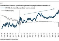
By Michael Ide Swiss stocks took a beating yesterday (and are falling again today) after the Swiss National Bank ’s decision to end the 1.20 cap on the EUR/CHF exchange rate. But if you are a non-CHF investor the exchange rate shift more than made up for falling stock prices, pushing the Swiss Index up in USD even as it fell in CHF. Barclays PLC analysts Dennis Jose and Ian Scott think this is the perfect opportunity for those non-CHF investors to get out (although many would have argued that before the big drop would have been a better time). “The sudden appreciation of the Swiss franc has provided a windfall to non-Swiss denominated investors despite the decline in the stock market in domestic currency terms,” they write. “We advocate switching out of Swiss stocks into Euro Area stocks now… if as per our FX view, the CHF weakens hereon, the benefit to non-CHF returns should no longer be there.” Non-CHF investors should take advantage of temporary exchange rate effects: Barclays The obvious reason to take yesterday’s gains and get out of the Swiss market is that Swiss companies are expected to face earnings pressure now that their currency has gotten stronger. The SNB has said that the strength of the Swiss franc is still a concern, part of the reason Jose and Scott expect it to depreciate by other means, but it probably won’t return to the 1.20 EUR/CHF exchange rate naturally any time soon. Non-Swiss investors who stay invested risk watching the beneficial exchange rate effects wear off while stock prices continue to struggle and dividends probably get reduced. (click to enlarge) European QE could undermine the Swiss stock market The other reason to worry about Swiss stocks is the effect that European QE would have on Switzerland. Swiss stock market gains have been inversely correlated with German Bund yields for more than a decade. If that relationship continues, then when ECB QE pushes yields higher it would also pull Swiss stock prices down. We won’t know officially whether the ECB is going to start buying sovereign bonds until January 22, but all signs point to yes – the SNB decision being the most recent signal. Investors who wait until the end of the month to make their decision by may not be able to exit quite as easily. Jose and Scott removed Credit Suisse Group AG (ADR) (NYSE: CS ) and Adecco ( OTCPK:AHEXY ) from their recommended European portfolio and replaced them with Airbus ( OTCPK:EADSY ) and Publicis ( OTCQX:PUBGY ). (click to enlarge) Disclosure: None Editor’s Note: This article discusses one or more securities that do not trade on a major exchange. Please be aware of the risks associated with these stocks. Now that you’ve read this, are you Bullish or Bearish on ? Bullish Bearish Sentiment on ( ) Thanks for sharing your thoughts. Why are you ? Submit & View Results Skip to results » Share this article with a colleague

A Value Approach To Rebalancing Out Of U.S. Stocks

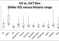
Summary I will present an approach to use Shiller P/E to value-adjust portfolio weights when rebalancing for 2015. Interestingly, of 13 developed and 12 emerging market countries evaluated, the U.S. is the only country currently in the top quartile of its historic P/E range. With the exceptions of the U.S., Switzerland, South Africa and Thailand, every developed and emerging market country’s P/E ratio is currently below its historic median. 2014 was unexpectedly a solid year for U.S. equities. Many predicted that the multi-year bull market would not continue, but yet the Vanguard Total Stock Market ETF (NYSEARCA: VTI ) managed a 12.6% total return. The same fortune could not be said about the Vanguard FTSE Developed Markets ETF (NYSEARCA: VEA ) (-5.7%) or the Vanguard FTSE Emerging Markets ETF (NYSEARCA: VWO ) (+0.6%). In rebalancing, I have in years past kept things simple and diligently rebalanced my stock portfolio to the same target weights (note this is not my entire portfolio – I also hold bonds, REITs, and individual value stocks): Index Stocks Wt. Total U.S. 50% International Developed 25% Emerging Market 25% The S&P 500, as mentioned in my previous article on market valuation, is ridiculously high. Using a few valuation metrics, history would suggest the U.S. market is due for a correction. I will certainly reduce my exposure to U.S. stocks, as I would normally in rebalancing. However, based on the current relative level of the U.S. market, I consider the traditional rebalancing approach of reducing my U.S. total stock position down to 50% insufficient if not foolish. I have done enough comparisons over time and cross-sectionally to sit idle. Instead I want to reduce my U.S. allocation further, while maintaining the same stock exposure. In this article, I will present an approach to use Shiller P/E to adjust rebalancing weights for value in 2015. My intent is NOT to actively manage my ETF portfolio, but instead to set periodic weights (once a year) based on market valuations and rebalance to them. I encourage your feedback on this disciplined simple mix of passive rebalancing with value investing. Country Price-Earnings ratio boxplots I credit Research Affiliates LLC for providing the historic ranges of Shiller Price-Earnings ratios for developed and emerging market countries (all countries have at least 19 years of data). The chart below shows the range of P/E ratios for U.S. versus International Developed countries in a boxplot with the current value in blue, the line representing the lower 25% and upper 25%, and the box representing the middle 50%. The countries shown represent 90.1% of the Vanguard FTSE Developed Markets ETF. Interestingly, only the U.S. is in the top quartile of its historic range. Also note in absolute level, it has the highest P/E ratio. The U.S., at 27.1 times earnings is 2.2 times higher than the next highest developed country, Japan. Since I do not have the entire distribution to calculate the current percentiles (and create an average percentile), I instead rate each country with a number 1 through 4 that represents which historic quartile its current P/E ratio stands in (from top to bottom). Thus, the U.S. scores a 1 and the portfolio weighted average score for the International Developed countries is 3.32. (click to enlarge) Next I will show the U.S. versus Emerging Market P/E ratio boxplots. Note, these countries represent 94% of the Vanguard Emerging Markets Stock Index ETF. Once again the U.S. is alone in the 4th quartile of its historic range and is has a higher P/E ratio greater than the emerging market country with the highest P/E ratio (Mexico) by 6 times earnings. Using the same quartile scoring approach as the U.S. and International Developed countries, the Emerging Market average score is 3.26. (click to enlarge) Country P/E deviations from median Next, I measure the percent deviation from the historic medians for each country. I omitted adding medians on the boxplots to avoid cluttering them. The U.S. P/E ratio is currently 70% above its historic median. With the exceptions of Switzerland, South Africa and Thailand, every other Developed and Emerging Market country is currently below its historic median. Also note, these three are only modestly above their medians (within 20%). Brazil, Russia, and Italy are all 35% below their median P/E ratios or lower. (click to enlarge) (click to enlarge) Conclusion: New Portfolio Weights Using the three quartile scores, I recalculate my new portfolio weights by ranking them with adjustments of (-10%, 0, and +10%). Since the International Developed and Emerging Market scores are so close, I give them both weight increases: Stock 2014 weights Avg. P/E Quartile Weight adjustment 2015 weights Total U.S. 50% 1.00 -10% 40% International Developed 25% 3.32 +5% 30% Emerging Market 25% 3.26 +5% 30% Total 100% 7.58 0% 100%