Tag Archives: fn-start

MDYG Looks Like A Great ETF, I Don’t See A Single Weakness

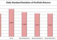
Summary I’m taking a look at MDYG as a candidate for inclusion in my ETF portfolio. MDYG offers investors enough liquidity to reduce risks of being stuck in an undesired position. The liquidity, in my opinion, is better than it appears from trading volume. The correlation is respectable and based off a strong enough level of liquidity that I have some confidence in the statistics. From the diversification to the expense ratio, I can’t find a single problem. I don’t intend to focus on “growth” companies, but I might make a small niche for MDYG. I’m not assessing any tax impacts. Investors should check their own situation for tax exposure. How to read this article : If you’re new to my ETF articles, just keep reading. If you have read this intro to my ETF articles before, skip down to the line of asterisks. This section introduces my methodology. By describing my method initially, investors can rapidly process each ETF analysis to gather the most relevant information in a matter of minutes. My goal is to provide investors with immediate access to the data that I feel is most useful in making an investment decision. Some of the information I provide is readily available elsewhere, and some requires running significant analysis that, to my knowledge, is not available for free anywhere else on the internet. My conclusions are also not available anywhere else. What I believe investors should know My analysis relies heavily on Modern Portfolio Theory. Therefore, I will be focused on the statistical implications of including a fund in a portfolio. Since the potential combinations within a portfolio are practically infinite, I begin by eliminating ETFs that appear to be weak relative to the other options. It would be ideal to be able to run simulations across literally billions of combinations, but it is completely impractical. To find ETFs that are worth further consideration I start with statistical analysis. Rather than put readers to sleep, I’ll present the data in charts that only take seconds to process. I include an ANOVA table for readers that want the deeper statistical analysis, but readers that are not able to read the ANOVA table will still be able to understand my entire analysis. I believe there are two methods for investing. Either you should know more than the other people performing analysis so you can make better decisions, or use extensive diversification and math to outperform most investors. Under CAPM (Capital Asset Pricing Model), it is assumed every investor would hold the same optimal portfolio and combine it with the risk free asset to reach their preferred spot on the risk and return curve. Do you know anyone that is holding the exact same portfolio you are? I don’t know of anyone else with exactly my exposure, though I do believe there are some investors that are holding nothing but SPY. In general, I believe most investors hold a portfolio that has dramatically more risk than required to reach their expected (under economics, disregarding their personal expectations) level of returns. In my opinion, every rational investor should be seeking the optimal combination of risk and reward. For any given level of expected reward, there is no economically justifiable reason to take on more risk than is required. However, risk and return can be difficult to explain. Defining “Risk” I believe the best ways to define risk come from statistics. I want to know the standard deviation of the returns on a portfolio. Those returns could be measured daily, weekly, monthly, or annually. Due to limited sample sizes because some of the ETFs are relatively new, I usually begin by using the daily standard deviation. If the ETF performs well enough to stay on my list, the next levels of analysis will become more complex. Ultimately, we probably shouldn’t be concerned about volatility in our portfolio value if the value always bounced back the following day. However, I believe that the vast majority of the time the movement today tells us nothing about the movement tomorrow. While returns don’t dictate future returns, volatility over the previous couple years is a good indicator of volatility in the future unless there is a fundamental change in the market. Defining “Returns” I see return as the increase over time in the value known as “dividend adjusted close”. This value is provided by Yahoo. I won’t focus much on historical returns because I think they are largely useless. I care about the volatility of the returns, but not the actual returns. Predicting returns for a future period by looking at the previous period is akin to placing a poker bet based on the cards you held in the previous round. Defining “Risk Adjusted Returns” Based on my definitions of risk and return, my goal is to maximize returns relative to the amount of risk I experienced. It is easiest to explain with an example: Assume the risk free rate is 2%. Assume SPY is the default portfolio. Then the risk level on SPY is equal to one “unit” of risk. If SPY returns 6%, then the return was 4% for one unit of risk. If a portfolio has 50% of the risk level on SPY and returns 4%, then the portfolios generated 2% in returns for half of one unit of risk. Those two portfolios would be equal in providing risk adjusted returns. Most investors are fueled by greed and focused very heavily on generating returns without sufficient respect for the level of risk. I don’t want to compete directly in that game, so I focus on reducing the risk. If I can eliminate a substantial portion of the risk, then my returns on a risk adjusted basis should be substantially better. Belief about yields I believe a portfolio with a stronger yield is superior to one with a weaker yield if the expected total return and risk is the same. I like strong yields on portfolios because it protects investors from human error. One of the greatest risks to an otherwise intelligent investor is being caught up in the mood of the market and selling low or buying high. When an investor has to manually manage their portfolio, they are putting themselves in the dangerous situation of responding to sensationalistic stories. I believe this is especially true for retiring investors that need money to live on. By having a strong yield on the portfolio it is possible for investors to live off the income as needed without selling any security. This makes it much easier to stick to an intelligently designed plan rather than allowing emotions to dictate poor choices. In the recent crash, investors that sold at the bottom suffered dramatic losses and missed out on substantial gains. Investors that were simply taking the yield on their portfolio were just fine. Investors with automatic rebalancing and an intelligent asset allocation plan were in place to make some attractive gains. Personal situation I have a few retirement accounts already, but I decided to open a new solo 401K so I could put more of my earnings into tax advantaged accounts. After some research, I selected Charles Schwab as my brokerage on the recommendation of another analyst. Under the Schwab plan “ETF OneSource” I am able to trade qualifying ETFs with no commissions. I want to rebalance my portfolio frequently, so I have a strong preference for ETFs that qualify for this plan. Schwab is not providing me with any compensation in any manner for my articles. I have absolutely no other relationship with the brokerage firm. Because this is a new retirement account, I will probably begin with a balance between $9,000 and $11,000. I intend to invest very heavily in ETFs. My other accounts are with different brokerages and invested in different funds. Views on expense ratios Some analysts are heavily opposed to focusing on expense ratios. I don’t think investors should make decisions simply on the expense ratio, but the economic research I have covered supports the premise that overall higher expense ratios within a given category do not result in higher returns and may correlate to lower returns. The required level of statistical proof is fairly significant to determine if the higher ratios are actually causing lower returns. I believe the underlying assets, and thus Net Asset Value, should drive the price of the ETF. However, attempting to predict the price movements of every stock within an ETF would be a very difficult and time consuming job. By the time we want to compare several ETFs, one full time analyst would be unable to adequately cover every company. On the other hand, the expense ratio is the only thing I believe investors can truly be certain of prior to buying the ETF. Taxes I am not a CPA or CFP. I will not be assessing tax impacts. Investors needing help with tax considerations should consult a qualified professional that can assist them with their individual situation. The rest of this article By disclosing my views and process at the top of the article, I will be able to rapidly present data, analysis, and my opinion without having to explain the rationale behind how I reached each decision. The rest of the report begins below: ******** (NYSEARCA: MDYG ): SPDR® S&P 400 Mid Cap Growth ETF Tracking Index: S&P MidCap 400 Growth Index Allocation of Assets: At least 80% to securities in the index Morningstar® Category: Mid-Cap growth Time period starts: April 2012 Time period ends: December 2014 Portfolio Std. Deviation Chart: (click to enlarge) (click to enlarge) Correlation: 85.22% Returns over the sample period: (click to enlarge) Liquidity (Average shares/day over last 10): About 17,000 Days with no change in dividend adjusted close: 10 Days with no change in dividend adjusted close for SPY: 5 Yield: .88% Distribution Yield Expense Ratio: .25% Discount or Premium to NAV: .16% premium Holdings: (click to enlarge) Further Consideration: Definitely Conclusion: MDYG comes out of this looking fairly reasonable. It isn’t my goal to put a growth weighting into my portfolio, but the correlation is respectable, the liquidity is solid, and the expense ratio is reasonable. While liquidity of 17,000 isn’t huge, the dividend adjusted close was regularly changing. Out of the 10 days in which the dividend adjusted close did not change, there were 5 in which the trading volume was actually 0 for the day. In my opinion, that’s enough liquidity to be worthy of consideration. The yield isn’t very high, but I can deal with that. If I wanted to orient my portfolio towards growth rather than value I think MDYG would be a very strong contender. Due to the orientation I want, if I use MDYG it will be a fairly small position and I will have to compare it directly with a few other ETFs that focus on growth. For my investing style, the ideal exposure is probably around 5%. The best thing for the ETF is probably the complete lack of red flags that I’ve seen. There is no single factor that I can point out as a problem. In my opinion, any ETF that comes out of this with 0 intrinsic weaknesses deserves some consideration. Additional disclosure: Information in this article represents the opinion of the analyst. All statements are represented as opinions, rather than facts, and should not be construed as advice to buy or sell a security. Ratings of “outperform” and “underperform” reflect the analyst’s estimation of a divergence between the market value for a security and the price that would be appropriate given the potential for risks and returns relative to other securities. The analyst does not know your particular objectives for returns or constraints upon investing. All investors are encouraged to do their own research before making any investment decision. Information is regularly obtained from Yahoo Finance, Google Finance, and SEC Database. If Yahoo, Google, or the SEC database contained faulty or old information it could be incorporated into my analysis. The analyst holds a diversified portfolio including mutual funds or index funds which may include a small long exposure to the stock.
Energy ETF: XLE No. 9 Select Sector SPDR In 2014

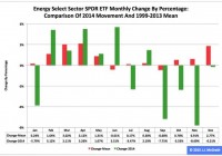
Summary The Energy exchange-traded fund finished ninth by return among the nine Select Sector SPDRs in 2014. The ETF was extraordinarily strong in the first half and even more extraordinarily weak in the second half. Seasonality analysis may be irrelevant until the commodity price of crude oil shows signs of stability. The Energy Select Sector SPDR ETF (NYSEARCA: XLE ) in 2014 ranked No. 9 by return among the Select Sector SPDRs that split the S&P 500 into nine segments. On an adjusted closing daily share-price basis, XLE dipped to $79.16 from $86.68, a drop of -$7.52, or -8.68 percent. As a result, it behaved worse than its sibling, the Utilities Select Sector SPDR ETF (NYSEARCA: XLU ) and parent proxy, the SPDR S&P 500 Trust ETF (NYSEARCA: SPY ) by -37.41 and -22.14 percentage points, in that order. (XLE closed at $72.86 Thursday.) XLE also ranked No. 9 among the sector SPDRs in the fourth quarter, when it performed worse than XLU and SPY by -25.29 and -17.00 percentage points, respectively. And XLE ranked No. 5 among the sector SPDRs in December, when it led SPY by 0.04 percentage point and lagged XLU by -3.79 points. Figure 1: XLE Monthly Change, 2014 Vs. 1999-2013 Mean (click to enlarge) Source: This J.J.’s Risky Business chart is based on analyses of adjusted closing monthly share prices at Yahoo Finance . XLE behaved a lot worse in 2014 than it did during its initial 15 full years of existence based on the monthly means calculated by employing data associated with that historical time frame (Figure 1). The same data set shows the average year’s weakest quarter was the third, with a relatively small negative return, and its strongest quarter was the first, with an absolutely large positive return. Inconsistent with its pattern last year, the ETF had a little gain in Q1, a big gain in Q2 and big losses in Q3 and Q4. Figure 2: XLE Monthly Change, 2014 Versus 1999-2013 Median (click to enlarge) Source: This J.J.’s Risky Business chart is based on analyses of adjusted closing monthly share prices at Yahoo Finance. XLE also performed a lot worse in 2014 than it did during its initial 15 full years of existence based on the monthly medians calculated by using data associated with that historical time frame (Figure 2). The same data set shows the average year’s weakest quarter was the second, with a relatively small positive return, and its strongest quarter was the third, with an absolutely large positive return. Meanwhile, I suspect seasonality analysis may be irrelevant until the commodity price of crude oil displays signs of stability. Figure 3: XLE’s Top 10 Holdings and P/E-G Ratios, Jan. 15 (click to enlarge) Notes: 1. “NA” means “Not Available.” 2. The XLE holding-weight-by-percentage scale is on the left (green), and the company price/earnings-to-growth ratio scale is on the right (red). Source: This J.J.’s Risky Business chart is based on data at the XLE microsite and Yahoo Finance (both current as of Jan. 15). With the possible exception of Schlumberger Ltd. (NYSE: SLB ), XLE’s top 10 holdings appear to range from fairly valued to overvalued (Figure 3). However, the numbers on the S&P 500 energy sector reported by S&P Senior Index Analyst Howard Silverblatt Dec. 31 indicated its valuation seems comparatively reasonable, with its P/E-G ratio at 1.16. Speaking of Schlumberger, the 2014 financial report it released Thursday was replete with evidence of the effects that the cratering in the commodity price of crude oil has had on the company in particular and, by extension, on the energy sector in general. Here are three of the highlights, or lowlights, of the report: [1] Although the functional currency of Schlumberger’s operations in Venezuela is the U.S. dollar, a portion of the transactions are denominated in local currency. Schlumberger has historically applied the official exchange rate of 6.3 Venezuelan Bolivares fuertes per U.S. dollar to remeasure local currency transactions and balances into U.S. dollars. Effective December 31, 2014, Schlumberger concluded that it was appropriate to apply the … exchange rate of 50 Venezuelan Bolivares fuertes per U.S. dollar as it believes that this rate best represents the economics of Schlumberger’s business activity in Venezuela. As a result, Schlumberger recorded a $472 million devaluation charge. [2] In response to lower commodity pricing and anticipated lower exploration and production spending in 2015, Schlumberger decided to reduce its overall headcount to better align with anticipated activity levels for 2015. Schlumberger recorded a $296 million charge associated with a headcount reduction of approximately 9,000. [3] Schlumberger determined that, primarily as a result of the recent decline in commodity prices, the carrying value of its investment in [a Schlumberger Production Management] development project in the Eagle Ford Shale was in excess of its fair value. Accordingly, Schlumberger recorded a $199 million impairment charge. I suspect many other energy-sector firms will be making similar announcements in the weeks, months and quarters to come. Figure 4: EUR/USD, Crude Oil And XLE, 2014 Daily Prices (click to enlarge) Note: The crude-oil and XLE scale is on the left, and the EUR/USD scale is on the right. Source: This J.J.’s Risky Business chart is based on analyses of adjusted closing daily share prices of XLE reported by Yahoo Finance ; closing daily prices of the New York Mercantile Exchange’s Cushing, OK Crude Oil Future Contract 1 reported by the U.S. Energy Information Administration ; and daily foreign-exchange rates of the euro/U.S. dollar, or EUR/USD, currency pair reported by the Federal Reserve Economic Data site of the Federal Reserve Bank of St. Louis. As indicated previously , I believe XLE’s upward movement in the first half of last year was primarily driven by market participants’ concern about the battle over control of Middle Eastern crude-oil assets between Islamic State of Iraq and the Levant, or ISIL, fighters on the one side and Iraqi government, Kurdish and aligned forces on the other side. I think the ETF’s downward movement since then has been primarily driven by market participants’ concern about the battle over monetary policy between major central banks: The U.S. Federal Reserve is oriented toward tightening, while the Bank of Japan, European Central Bank and People’s Bank of China all are oriented toward loosening. This bias divergence at the biggest central banks in the world already has had major effects on multiple markets, ranging from currencies (e.g., the euro/U.S. dollar cross, or EUR/USD) to commodities (e.g., crude oil) to the energy sector of the equity market (e.g., XLE), as suggested by Figure 4. Along this line, the amazing disappearance of about 18.79 percent in the euro/Swiss franc cross, or EUR/CHF, Thursday was but the latest manifestation of the wobbles in financial markets around the world. Measured by the daily prices of the components of the above chart, the EUR/USD currency pair peaked at $1.3927 March 13 (revisiting the area May 6), crude oil per barrel peaked at $107.26 June 20 and XLE per share peaked at $100.77 June 23. Their respective declines since then are clearly related, statistically speaking. Their lockstep movements appear likely to continue unless the Federal Open Market Committee makes clear it will delay the anticipated announcement of its interest-rate hikes April 29 and that it is preparing to carry out asset purchases under its fourth formal quantitative-easing program of the 21st century, aka QE4. The FOMC may be hard-pressed to present a convincing rationale for those actions, given the conditions described in “SPY Slips And U.S. Economic Index Slides In December.” But, without them, XLE may continue to be the equivalent of a canary in coal mine where things are looking darker by the day. Disclaimer: The opinions expressed herein by the author do not constitute an investment recommendation, and they are unsuitable for employment in the making of investment decisions. The opinions expressed herein address only certain aspects of potential investment in any securities and cannot substitute for comprehensive investment analysis. The opinions expressed herein are based on an incomplete set of information, illustrative in nature, and limited in scope. In addition, the opinions expressed herein reflect the author’s best judgment as of the date of publication, and they are subject to change without notice.

The SNB Catalyst For GLD

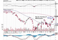
Summary SNB surprised the market by its sudden decision to abandon the EURCHF floor and reduce its deposit rate further to -0.75%. Existing push factor of GLD such as current deflation, strong USD and holding cost is being pushed aside by negative interest rates and market concern about market stability. Global negative interest interest rates is attracting bids for GLD especially when conservative investors cannot hold their funds in safe deposit and bonds without attracting a penalty. Deeper market concerns over the ability to grow the economies of Europe and Japan without destabilizing the economic system. SNB Surprise served as a catalyst to bring these concerns to the front of investors mind and is responsible for the gap up of GLD. The Swiss National Bank (SNB) surprised the market on 15 January 2015 by announcing the abandonment of the floor of the Swiss Franc (CHF) 1.20 to the euro. In addition, the SNB announced that it has reduced its sight deposit rate from -0.25% to -0.75%, effective 22 January 2015. The rationale that the SNB imposed this floor in 2012 is to prevent importing deflation from Europe but it has done it at the cost of a ballooning balance sheet to GDP from at least 60% to 85%. The SNB has finally accepted that deflation of -0.1% for this year and have made it clear that even if they do prevent deflation from Europe, they can’t prevent deflation from the U.S. through a strengthening USD. In this article, we will look at how the conflicting pull and push factors which affect the attractiveness of gold. In my previous articles, I have been bearish on gold as I consider opportunity cost of holding gold when the U.S. economy is rising and the fact that the strengthening USD will weaken gold. In addition, I have considered the fact that there is very little inflation worldwide given the low energy price. Hence gold would lose its allure as an inflation hedge, especially when it is increasingly clear that major economies like Japan and Europe is nearer to deflation than inflation. Negative Interest Rates Even as I consider these factors to be relevant, it would appear that other factors are now raising to the forefront to challenge these push factors of gold. The most prominent factor would have to be the negative interest rates. We are seeing a number of major countries imposing negative interest rates. The latest and deepest negative interest rates come from the SNB at -0.75% of deposit rates. The European Central Bank (ECB) has set its deposit rate to -0.1% and there are Japanese Treasury Bills that are having negative interest rates . This is because investors prefer these treasury bills even when key interest rates are zero and they are willing to pay a premium for it. Negative interest rate means that investors have to pay the banks to keep their money and this has offset the cost of gold purchase. For investors who are conservative, they are not likely to invest into equities which they perceive to be of high risk. Given that they can’t deposit their money safely in banks or bonds without attracting a penalty, they are more likely to be attracted to gold as a store of value. Market Concern about Economic Stability Then there is the risk of unintended consequences. With the ECB and Bank of Japan (BoJ) determined to ease monetary conditions further, they are increasing the risk that these actions will cause a bubble in the future. The issue is that inflation might surface in other form with all these QE efforts. These QE measures are described as emergency measures by the Fed and this is why they are being rolled back by the Fed right now. The question remains unanswered in the market as to whether a prolonged dosage of QE will actually help or harm the economy. We have to remember that the Fed used QE to purchase banks asset to restore confidence in the system and this is done with a bank stress test. The banks subsequently healed as investor confidence were restored and were able to lend as they have a clean balance sheet. They also have incentive to lend as the economy recovers amid a low interest rates environment. As the economy recovers, people consumes and we naturally see inflation which stands at 1.3% in December 2014. This will have been higher if not for low energy prices. There might be a question as to whether the banks started to lend first or the economy recovered and people consumed first before the banks were willing to lend. My opinion is that QE and the bank stress test cause the recovery in confidence first and the bank lending and consumption happened in tandem. The big question for Europe and Japan is that despite all these efforts in QE, we do not see a recovery in their economy. Europe is still having sub 1% growth and Japan has slipped into recession again with the second and third quarter of contraction in 2014. This might point to a bigger problem to their economies than what QE can solve. SNB Catalyst on GLD The SNB move to abandon the peg and lessen the deposit rate serves as a catalyst which brought the issue of negative interest rates to the forefront of investor’s mind. This is a signal to investors that there might be a paradigm shift in how major economies will operate from now on. The fact that the SNB has to surprise the market instead of following the usual central bank communications strategy which has been the norm for the past 10 years also hints at future uncertainty. In this environment, we are likely to see more demand from gold. We can see this from the SPDR Gold Trust ETF (NYSEARCA: GLD ) chart below. GLD tracks the performance of gold bullion after expenses and it is listed on the New York Stock Exchange. It is liquid with $27.54 billion of market capitalization and 17 million of last known daily transactions. (click to enlarge) Despite this liquidity, we see that GLD gap up on the SNB surprise. This is a clear sign that there are issues in the Europe and Japan which the market is concerned about. The market’s concern seems to be that despite the QEs, Japan and Europe would not be able to solve their issues. The side effect of these QE besides the massive purchase of securities, is to resort to negative interest rates which is forcing conservative investors out of safe deposit. These issues have always come along with QE and the market assumption has been that the recovery prospect will outweigh the risk involved as mentioned above. However the SNB surprise suggest otherwise and this is serving as a catalyst for these issues to surface and for GLD to gap up. Of course, the market has been wrong before and GLD was up from 2009 when the Fed started its first QE to 2011 when it was clear that the U.S. economy has recovered before GLD became bearish again. There is a possibility that this will be the start of a new bullish trend for the medium term if Europe and Japan is not able to get their act together. It would appear that even the strong USD cannot hold down GLD and this shows the depth of the market concerns.