Tag Archives: fn-start

Cold Weather Isn’t Enough To Turn UNG Around

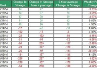
Colder-than-normal weather in parts of the U.S. wasn’t enough to bring back up UNG. This week’s extraction from storage was lower than the 5-year average. EIA still estimates this year’s natural gas demand in the residential and commercial sectors will decline. Next week’s EIA report is expected to show another lower-than-normal extraction from storage. The lower-than-normal extraction from storage and ongoing weakness in the oil market have contributed to the decline of The United States Natural Gas ETF (NYSEARCA: UNG ) to fall below $14 – its lowest price this year. Let’s examine the latest from the natural gas market. The cold weather, mainly in the Northeast, wasn’t enough to keep the price of UNG up as it fell by over 8% during the past week. In the past two months, UNG shed nearly 35% off of its value. This week’s withdrawal from storage was only 94 Bcf – this is below the 5-year average withdrawal, which was 168 Bcf. This comes after two consecutive weeks of above-normal withdrawals from storages. Source of data taken from EIA In next week’s EIA storage update, the extraction from storage could be again lower than the 5-year average – which is 165 Bcf for the last week of January. This is because last week’s deviation from normal temperatures was, on average, 5.93. The correlation between the deviation from normal temperatures and extractions from storage is high at 0.61. Thus, the higher-than-normal temperatures, on a national level, could tilt the scales towards a lower-than-normal withdrawal. Source of data taken from EIA If we were to assume the extraction from storage to remain, on average, 15% higher than the 5-year average, then the storage is likely to be slightly above the 5-year average by the time the extraction season ends in April. Source of data taken from EIA Despite the lower-than-normal extraction from storage, the weather is still expected to be colder than normal throughout the east coast, including in the Northeast over the next two weeks. Conversely, throughout the west coast, temperatures are still projected to remain above normal temperatures. Nonetheless, the uncertainty in the weather is still expected to be high during February, according to latest National Oceanic and Atmospheric Administration monthly report. So we could still see big swings in the price of UNG in the coming weeks. For now, the EIA still predicts that this year’s natural gas consumption in the residential/commercial sectors will decline in 2015. This could be due, in part, to lower demand for heating purposes during this year’s winter. Nonetheless, total consumption is projected to reach 73.8 Bcf per day this year – this is a 0.3% gain compared to the average consumption in 2014. The rise in demand is expected to come from industrial and electric power sectors. In the power sector, coal is being pushed out for natural gas. But it’s still used by major utility companies. Bear in mind, that if coal prices were to keep coming down, as they did in recent weeks, this could also play a secondary role in driving down prices of natural gas. Finally, the weakness in the oil market may have also contributed to the weakness of natural gas. In recent weeks, the linear correlation between oil and natural gas strengthened and reached 0.54 (this is for the past month) – this is a strong and positive correlation albeit this relation doesn’t hold up over extended periods of the time. This is yet another issue to keep in mind. After all, Goldman Sachs lowered its outlook for its U.S. natural gas for this year. This was due to deflationary pressure on prices – the pressure comes from low oil prices that are likely to cut down drilling and services costs, and thus reduce the cost per barrel for shale gas. In other words, Goldman Sachs thinks that drilling companies will drill where it makes fiscal sense to do so considering the current low oil prices; this will also result in lower cost of drilling for natural gas. The recent fall in UNG may have stemmed from the weaker-than-expected demand for natural gas, ongoing strong production and low oil prices. The uncertainty in the weather could still bring back up UNG for a short term. But for now, UNG is still expected to remain low for the season. For more see: A Couple of Notes on Oil
Vanguard FTSE Pacific ETF Is Mostly Japanese Stocks, But It Looks Compelling

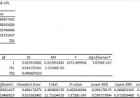
Summary VPL has a respectably low correlation to SPY and isn’t too volatile in its own right. The expense ratios are low and the liquidity is strong, but the ETF is currently trading at a premium to NAV. Despite the name, China is almost completely excluded while Japan and Australia dominate most of the portfolio. Investors should be seeking to improve their risk-adjusted returns. I’m a big fan of using ETFs to achieve the risk-adjusted returns relative to the portfolios that a normal investor can generate for themselves after trading costs. I’m working on building a new portfolio and I’m going to be analyzing several of the ETFs that I am considering for my personal portfolio. A substantial portion of my analysis will use modern portfolio theory, so my goal is to find ways to minimize costs while achieving diversification to reduce my risk level. In this article, I’m reviewing the Vanguard FTSE Pacific ETF (NYSEARCA: VPL ). What does VPL do? VPL attempts to track the investment results of the FTSE Developed Asia Pacific Index. The ETF falls under the category of “Diversified Pacific/Asia”. Does VPL provide diversification benefits to a portfolio? Each investor may hold a different portfolio, but I use the SPDR S&P 500 Trust ETF (NYSEARCA: SPY ) as the basis for my analysis. I believe SPY, or another large-cap U.S. fund with similar properties, represents the reasonable first step for many investors designing an ETF portfolio. Therefore, I start my diversification analysis by seeing how it works with SPY. I start with an ANOVA table: (click to enlarge) The correlation is about 77%, which is low enough that I’m expecting to see significant diversification benefits. Standard deviation of daily returns (dividend adjusted, measured since January 2012) The standard deviation isn’t too bad. For the period I’ve chosen, the standard deviation of daily returns was .889%. For SPY, it was 0.736% over the same period. While VPL is more volatile than SPY, the difference isn’t huge enough to prevent the low correlation from reducing portfolio risk if the level of exposure is right. Mixing it with SPY I also run comparison on the standard deviation of daily returns for the portfolio assuming that the portfolio is combined with the S&P 500. For research, I assume daily rebalancing because it dramatically simplifies the math. With a 50/50 weighting in a portfolio holding only SPY and VPL, the standard deviation of daily returns across the entire portfolio is 0.764%. If the position in SPY is raised to 80% while VPL is used at 20%, the standard deviation of daily returns drops down to 0.734%. This is slightly below the standard deviation of a portfolio that only holds SPY. In practice, I would want to limit a position in VPL to no more than 20% of the portfolio, but I’d prefer to use an amount that was still lower. The low correlation makes a very strong case for using VPL in a small position to enhance diversification. At 5%, the standard deviation of the portfolio would have been 0.733%. If an investor was only measuring risk based off the standard deviation of returns, it would appear that the 20% to 5% range was very reasonable. I’d lean towards being a little more conservative with the exposure. I think 10% to 5% is a fairly reasonable range. Why I use standard deviation of daily returns I don’t believe historical returns have predictive power for future returns, but I do believe historical values for standard deviations of returns relative to other ETFs have some predictive power on future risks and correlations. Yield & Taxes The distribution yield is 2.7%. It’s high enough that the portfolio could be included as part of an ETF portfolio designed for a retiring investor. If an investor wants to ensure they aren’t tempted to get into the portfolio, the strong yields are nice. Expense Ratio The ETF is posting .12% for an expense ratio, which is a very reasonable cost for the diversification. Unfortunately, most ETFs have expense ratios higher than I’d like to see. Clearly, VPL isn’t one of those ETFs. Vanguard funds usually have low expense ratios, which is one of the more appealing things about using their ETFs. Market to NAV The ETF is trading at a .22% premium to NAV currently. I think any ETF is significantly less attractive when it trades above NAV. I wouldn’t have expected such a significant premium on an ETF with over a million shares per day trading hands. I may need to dig deeper into the ETF to look for a reason for that premium and determine if it is normal for the ETF to trade at a premium. Aside from that premium, this is one of the better foreign ETFs I’ve seen. Largest Holdings The diversification within the ETF is pretty good. Despite the largest position being over 3%, the allocations drop off rapidly before we are even out of the top 10. I find that attractive because it ensures investors are getting some diversification benefits within the individual holdings as a benefit for paying the expense ratio. (click to enlarge) Investing in the ETF is largely relying on modern portfolio theory. The argument for the investment is the respectably low correlation of the portfolio to the major U.S. index funds. Making an investment requires a belief that markets are at least somewhat efficient so that the companies within the portfolio will be reasonably priced. Conclusion The ETF looks less volatile than many of the foreign ETFs I have been considering. I’m finding that to be an attractive factor even though there is significant correlation between VPL and the other international market ETFs. So far, VPL is easily one of the stronger contenders for the foreign exposure area in my IRA. The ETF simply does very well on several metrics. Toyota (NYSE: TM ) is a very solid company to have as the top holding. The most interesting thing I found while researching the ETF is that the exposure isn’t quite what I would have expected when broken down by individual countries. I figured Japan would be a significant part of the portfolio, but being over 50% of the portfolio is enough to concern me a little bit. Despite the strong focus on a single foreign country, the volatility has been much lower than competing ETFs with much broader focuses. Australia is the second largest representation at nearly 20%. That’s okay with me. BHP Billiton (NYSE: BHP ) is a quality company that I’d have no issue with having in my portfolio despite the terrible performance lately of mining stocks. Hong Kong is represented with 7% of the portfolio, but China is less than 1%. When I’m looking at something labeled “Asia Pacific”, I generally expect substantially more Chinese companies to be included. If I had commission-free trading on VPL so I could keep rebalancing the position for free, it would be a pretty much automatic pick for my foreign exposure. In that hypothetical scenario, I’d lean towards a 5% exposure. Additional disclosure: Information in this article represents the opinion of the analyst. All statements are represented as opinions, rather than facts, and should not be construed as advice to buy or sell a security. Ratings of “outperform” and “underperform” reflect the analyst’s estimation of a divergence between the market value for a security and the price that would be appropriate given the potential for risks and returns relative to other securities. The analyst does not know your particular objectives for returns or constraints upon investing. All investors are encouraged to do their own research before making any investment decision. Information is regularly obtained from Yahoo Finance, Google Finance, and SEC Database. If Yahoo, Google, or the SEC database contained faulty or old information it could be incorporated into my analysis. The analyst holds a diversified portfolio including mutual funds or index funds which may include a small long exposure to the stock.

The SPDR S&P MidCap 400 ETF: Let’s Analyze It Using Our Scorecard System

Summary Analysis of the components of the SPDR S&P MidCap 400 ETF using my Scorecard System. Specifically written to assist those Seeking Alpha readers who are using my free cash flow system. Compares the results of the SPDR S&P MidCap 400 ETF to the SPDR S&P 600 Small Cap ETF and the SPDR S&P 500 ETF. Back in late December I introduced my free cash flow “Scorecard” system here on Seeking Alpha, through a series of articles that you can view by going to my SA profile . My purpose in doing so was to try and teach as many investors as I could, how to do this simple analysis on their own as I believe in the following: “Give a person a fish and you feed them for a day, Teach a person to fish and you feed them for life” I have been very pleased with the positive feedback that I have received so far, but included in that feedback were many requests by those using my system, to see if they did their analysis correctly or not. Since the rate of these requests have been increasing with every new article I write, I decided to concentrate my attention on articles analyzing indices and industry ETFs covering a broad range of sectors. That way those of you using my system will have something like a “teacher’s edition” that will give you all the correct calculations for each component. Obviously I couldn’t include the financials used to create the results for all my ratios (as I would need to write you a book instead), so instead I will provide just my Scorecard results for each index or ETF and then let everyone go back and analyze each company and see if you get the same answers that I did. My data source will always be Y-Charts . I designed this system for the newbie investor, whom may have limited knowledge of investing, and assure them that with just a little effort, anyone can master the system I have presented here. As I write more articles, my hope in doing so is that everyone will be able to follow my work and then go investigate the stocks that seem interesting to them. Think of this project as sort of like the game show “JEOPARDY”, where I give you the final answers and then you go figure out the questions. Hopefully these articles can be used as reference guides that everyone can use over and over again, whenever the need arises. Again this analysis will just be my final Scorecard for the SPDR S&P MidCap 400 ETF (NYSEARCA: MDY ) and for those new to this analysis, I suggest that you read my introductory Scorecard article on the SPDR S&P 500 ETF (NYSEARCA: SPY ) by going HERE . That article will send you HERE . There you will find the data on my “Free Cash Flow Yield” ratio which is one of three parts that I use it tabulating my final “Scorecard”. While free cash flow yield is a Wall Street ratio (Valuation Ratio), I also wrote an article that concentrated on my “CapFlow” and “FROIC” Ratios, which are Main Street ratios, which you can read about by going HERE . In this article I will generate my Scorecard results for each component and basically combine all three ratio results to generate one final result. Once completed, my Scorecard should give everyone a clearer understanding on how accurate the valuation is that Wall Street has assigned each company relative to its actual Main Street performance. Before we show you the final results of my Scorecard, here is brief introduction to how it works: Scorecard The Scorecard is the final score for any company under analysis and this is done by combining the three ratio (listed below) final results into one analysis, we grade each company with either a passing score of 1 or a failing score of 0 per ratio where a perfect final score per stock would be a 3. The ideal CapFlow results are anything less than 33%. The ideal FROIC score is any result above 20%. The ideal Free Cash Flow Yield is anything over 10%. So in analyzing Apple (NASDAQ: AAPL ) for example, we get for TTM (trailing twelve months). For the conservative investor: CAPFLOW = 16% PASSED FROIC = 34% PASSED FREE CASH FLOW YIELD = 7.6% FAILED SCORECARD SCORE = 2 (Out of possible 3) For the aggressive or “Buy & Hold” investor, we get a Scorecard score of 3 as Apple’s 7.6% free cash flow yield would be classified as a buy. These are the parameters for the Free Cash Flow Yield. It is important before preceding to determine what kind of investor you are as determined by the amount of risk you are willing to take. Then once you have done that, then pick the parameter list below that fits your risk tolerance. So without further ado here are the final Scorecard results for the components that make up the SPDR S&P MidCap 400 ETF. What my Scorecard also achieves, besides telling you which individual stocks are attractive and which are not, is that it also allows you in “one shot” to see how overvalued or attractively valued the stock market is as a whole. For example, for the conservative investor now is the time to be extremely cautious as only these thirteen stocks came in with a perfect score of “3” As you can see I only found 13 bargains out of 400 for the conservative low risk investor and that comes out to just 3.3% of the total universe being bargains! As for the aggressive investor, who is willing to take on more risk, we have only 33 stocks that are considered higher risk bargains. That comes out to only 8.3% being attractive and 91.7% being holds or sells. So as you can see as a portfolio manager I have to work extremely hard just to find one needle in the haystack, while in March 2009 there were probably 200 bargains for the conservative investor at that time. Thus this data clearly shows that we are at the opposite extreme of where we were in 2009 and are in my opinion, at an extremely overvalued level. Here is the same analysis using the Dow Jones Index where I actually analyzed that index for 2001, 2009 and 2015. You can view those results by going HERE . In getting back to the main table above, the “TOTALS” you see at the end are the sum of each ratio divided by 400. The totals for both Scorecards are out of 1200 (1 point for each ratio result) as a perfect score were every stock would be a bargain. Therefore the conservative scorecard result is 482/1200 or 40.16% out of 100% and the more aggressive/buy & hold scorecard came in at 614/1200 or 51.16% out of 100%. The beauty of this system is that you can now compare this index result to any other index or ETF in juxtaposition. For example the S&P 500 Index for the conservative scorecard result is 384/1500 or 25.6% out of 100% and the more aggressive/buy & hold scorecard came in at 488/1500 or 32.5% out of 100%. The SPDR S&P 600 Small Cap ETF (NYSEARCA: SLY ) came in for the conservative scorecard at 374/1800 or 20.77% out of 100% and the more aggressive/buy & hold scorecard came in at 476/1800 or 26.44% out of 100%. All three are clearly not inspiring and could be a clear sign that the markets are ready for serious correction going forward, while the MidCap is far more attractive than the S&P 500 and 600 and that is where I am concentrating most of my attention. Always remember that the results shown above should not be considered investment advice, but just the results of the ratios. The system outlined in this article is just meant to be used as reference material to be included as just “one” part of everyone’s own due diligence. So in other words, don’t make investment decisions based on just my Scorecard results, but incorporate them as part of your own due diligence.