Tag Archives: fn-start

The Gone Fishin’ Portfolio: 14 Years Of Market-Beating Returns

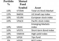
I’ve always been fascinated by ‘Couch Potato’ portfolios, those where you invest in index mutual funds and rebalance only once per year. In the early 2000’s I read about the ‘Gone Fishin’ Portfolio. ‘Gone Fishin’ was intriguing because it is based on the work of Harry Markowitz, who won a Nobel Prize in 1990 for Modern Portfolio Theory – now known as asset allocation. Asset allocation is the process of developing the most effective – optimal – mix of investments. In this case, optimal means that there is not another combination of asset classes that is expected to generate a higher ratio of return to risk. Quite simply, it’s breaking down your portfolio into different baskets, or classes of investments, to maximize returns and minimize risk. Asset allocation is based upon the principal that non-correlated investments of varying risk, when astutely mixed together, will smooth out the volatility (or variability) of your returns. And the best part about it is that it also increases your returns. Alexander Green of The Oxford Club took the work of Markowitz and gave it a name – ‘The Gone Fishin’ Portfolio.’ The allocations are: So we have 30% U.S. Stocks, 30% International Stocks, 30% Bonds, then 5% REITs and 5% Gold/Precious metals. A nice well-balanced portfolio. Advantages of the ‘Gone Fishin’ Portfolio, and other Lazy portfolios, are that they help address four major investment risks: Being too conservative. Being too aggressive. Trying and failing to time the market. Using expensive fund managers (Recommend Vanguard funds) Back 14 years ago when I first heard of the Gone Fishin’ Portfolio, I thought that replacing the index funds with active managers (while keeping the same % allocation) might even be better than this passive index approach. I knew lots of great fund managers whom I thought would beat their index in the long term, so why not utilize their expertise within the Gone Fishin’ framework? I called this creation the ‘Masters Select’ Gone Fishin’ Portfolio. I then created an Excel spreadsheet to track both styles, and have updated it each January for the last 14 years. Here’s the ‘Masters Select’ Gone Fishin’ Portfolio I set up 14 years ago: So you can see in most cases I replaced the passive index fund with a favorite active manager. Fairholme Fund for the Total U.S. market, and Third Avenue Value for small caps. Matthews Asian Growth & Income for the Pacific stock index. And Third Avenue Real Estate replaced the REIT index. Back 14 years ago I could not identify a worthy active manager for the European or Emerging Markets indices, so I left these as the passive index. For Bonds, I took the combined 30% allocation and divvied it between two excellent bond managers – Bill Gross of Managers Fremont Bond, and John Hussman of Hussman Strategic Total Return. And I replaced the normal Gone Fishin’ precious metals fund with a broad commodity fund. I’ve been tracking the results of both the official Gone Fishin’ portfolio and my ‘Masters Select’ version. Here are the results. The standard Gone Fishin’ portfolio has performed as advertised, soundly beating both the S&P 500 and a 60/40 Stock/Bond portfolio. On a risk-adjusted basis the Gone Fishin’ portfolio does extremely well (the whole idea behind Markowitz theory), with the drawdowns in bad years less than the stock market. My ‘Masters Select’ Gone Fishin portfolio did even better than the Markowitz model. Half the time (7 of 14 years) it beat the other three portfolios, and had a total return better than the standard model. I should emphasize I did not replace an active manager during the entire 14 year period, so there’s no bias there. Of course perhaps I was lucky (or good) with the picks. Further, by using active managers, I realize I was introducing ‘tracking risk’ to the portfolio, where a manager strays away from the intended index. Nevertheless it paid off to combine these pros with a Nobel prize-winning framework. Of some concern – the Gone Fishin’ portfolios started off with a blast, beating the S&P 500 for 10 straight years (2001 – 2010). But since then they have underperformed. This also happened in the late 1990’s when the S&P 500 was in its strongest bull phase and international stocks were out of favor. We seem to be in a similar era right now and I expect the underperformance to be temporary. One other concern I have with the ‘Masters Select’ Gone Fishin’ concept is the fund size. Fairholme Fund and Third Avenue Value have grown incredibly in the past 14 years. Size is an anchor to performance, particular with small-cap funds. If I started this today I may choose a few different funds, or a combination of active funds.
Explaining Why The Portfolio-Barbell Works

One classic (liability-driven) portfolio strategy, known for obvious reasons as the “barbell,” entails a lot of very defensive low-beta assets on the one side, and a lot of aggressive high-beta assets on the other. Practitioners follow the advice of Mr. Bing Crosby: they don’t “mess with Mr. In-between.” For the most part, this is a practitioners’ strategy, not a theorists’ strategy. There’s been little reason in theory to think that it should work. After all. if you want diversification, why not include some assets in between those extremes? And if you don’t care for diversification, why not go whole hog with a “bullet” strategy? Despite its lack of conceptual foundations, practitioners continue to use it. Theory in Pursuit of Practice Donald Geman, a Fellow at the Institute of Mathematical Statistics and a professor of Applied Mathematics at Johns Hopkins, with expertise in machine learning, joins with two other scholars in writing a paper, now a preprint at arXiv, which seeks to put a foundation under this practice. The other authors are: Hélyette Geman of the University of London and… Nassim Nicholas Taleb, of black swans and anti-fragility renown. The gist of the paper, expressed non-mathematically, is that managers work with the facts they know. What they know is that they have to constrain the tails of their portfolio-return bell curve to satisfy various regulatory or institutional demands, Value at Risk, Conditional Value at Risk, and stress testing. The “operators,” as the authors call the decision makers in portfolio management, aren’t “concerned with portfolio variations” except insofar as they have “a vague notion of association and hedges.” They set out on the one hand to limit the maximum drawdown with investments at the conservative side of the scale in response to the sort of pressures and mandates just listed, then they move to the other end of the scale to seek to get the upside benefits of the same market uncertainties against which they’ve just protected themselves. In the course of making these points, the authors get in the by-now customary jabs at Modern Portfolio Theory. One footnote for example explains that MPT’s aim of lowering variance, thus its habit of treating the left-hand tail and the right-hand tail as equally undesirable, is rational only if there is certainty about the future mean return, or if “the investor can only invest in variables having a symmetric probability distribution.” And the authors consider neither premise plausible. The latter they find especially “farfetched.” From MDH to Entropy To get a bit more technical, their discussion elaborates on an existing literature on the “mixture” of two or more normals, the “mixture of distributions hypothesis.” It has been part of the finance literature for at least twenty years, since Matthew Richardson and Thomas Smith wrote a paper of the “daily flow of information” for the Journal of Financial and Quantitative Analysis in 1994. The underlying idea of the MDH is that information is moving into markets at uneven rates, and that this unevenness renders asymmetric distribution curves inevitable. In 2002, Damiano Brigo and Fabio Mercurio used MDH to calibrate the skew in equity options. What Geman et al. add is a model that makes “estimates and predictions under the most unpredictable circumstances consistent with the constraints.” They also, somewhat confusingly, call this a “maximum entropy” model. Entropy of course is a concept taken from the physical sciences, and the maximum entropic state for any system is one in which all useful energy has been converted into heat. Not a good thing. The idea has long been adopted into information theory, re-conceiving useful energy as signal and heat as noise. Thus, unsurprisingly, early efforts to introduce entropy into finance have seen entropy as something to be minimized. The Question in Unanswered Indeed, Geman et al are aware that their invocation of “maximum entropy” will seem an odd innovation to many of their readers. Most papers that have invoked entropy “in the mathematical finance literature have used minimization … as an optimization criterion” they say. Their use of a “maximum entropy” model (not as a “utility criterion” of course but as a way of recognizing “the uncertainty of asset distributions”) is itself not entirely novel though. They seem to have imported it from the world of developmental economics. In 2002 Channing Arndt, of the UN’s World Institute for Development Economics Research, witrh two associates, published an article announcing a ” maximum entropy approach” to modeling general equilibrium in developing economies, illustrating it with specific reference to Mozambique. Geman at al deserve some credit for their syncretism, their willingness to look in a variety of different places for the solution to the puzzle they’ve set themselves. Still, it seems to this layperson expert-on-none-of-it that the resulting construction is a ramshackle hut rather than a model. The simple question of why barbells work remains (so far as I can tell) unanswered.

A Red Flag On The S&P 500 Index

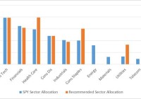
Summary The U.S. Economy is growing at an above trend pace over the last 2 quarters. Despite this there has been recent volatility in U.S. equity markets and there was a shift in sector performance. Nonetheless the trend in the S&P 500 remains intact with a 3 month outlook on the S&P 500 at 1170. A Red Flag On The S&P 500 I love the beach. Almost every weekend I would go on afternoons and take a swim. I would build sand castles and often times swim in the water and if I were hungry I would go by the local kiosk and eat some delicacies such as “Bake & Shark” or “pholouri”. Those were fun times. Even now when I get an opportunity I would spend some of my vacation days by the beach relaxing on the sand. But every time by the beach wasn’t always pristine. On some days there would have been rough waters or areas of roughness by the bay. The lifeguards would put up these red flags by the areas that were not safe for swimming. The red flags were a warning for swimmers so that drowning would be prevented. On the Friday 16th January 2015 close of the U.S. equity market, I observed a red flag on the S&P 500 Index. While the U.S. economy has been moving at an above trend pace over the past couple of quarters and the risk premium for investing in U.S. stocks are at 1-year lows, there has been a shift in sector performance, showing that the S&P 500 Index is becoming defensive. As such a new asset allocation is recommended. While still being overweight in U.S. equities by having a position in the SPDR S&P 500 Trust ETF (NYSEARCA: SPY ), a heavy overweight position in the health care sector is recommended, through the Health Care Select Sector SPDR Fund (NYSEARCA: XLV ). Slightly overweight positions are proposed in the Consumer Staples Select Sector SPDR ETF (NYSEARCA: XLP ) and the Utilities Select Sector SPDR ETF (NYSEARCA: XLU ) . Neutral positions should be observed in info tech through the Technology Select Sector SPDR ETF (NYSEARCA: XLK ) and the Consumer Discretionary Select Sector SPDR ETF (NYSEARCA: XLY ). Finally underweight positions in the energy sector through the Energy Select Sector SPDR ETF (NYSEARCA: XLE ), the materials sector through the Materials Select Sector SPDR Fund (NYSEARCA: XLB ) and telecoms through the SPDR S&P Telecom ETF (NYSEARCA: XTL ) are also recommended. The table below illustrates the recommendations. Chart 1 – Recommended Portfolio Allocation Versus S&P 500 Index as at Jan 9 th 2015 (click to enlarge) Source: Cerebro Recommendation using Microsoft Excel By looking at the allocation the portfolio is prepped for rough waters. On a weekly basis the portfolio metrics utilized to derive the portfolio allocation will be analyzed to determine whether another shift in asset allocation is required. Economic Activity Over the past couple of quarters the U.S. economy has been operating at an above trend pace. Latest figures show that U.S. GDP grew 2.7% year over year in the 3rd quarter of 2014, 0.4% higher when compared to the previous comparable quarter. U.S. GDP growth is also moving above its 4 quarter moving average of 2.6%. Chart 2 – U.S. GDP Growth (Y-o-Y %) as at Sept 2014 (click to enlarge) Source: Bloomberg The U.S. has been one of the leaders of growth from the developed economies and this trend is expected to continue, with its consumers obtaining a stronger purchasing power due to a strengthening U.S. Dollar. One of the more visible aspects of an appreciating U.S. Dollar was the decline in WTI Crude Oil. The over 50% decline in oil should bode well for the U.S. consumer. The uptrend in growth is also expected to continue as the slack in the U.S. labor market recedes. Chart 3 – U.S. Unemployment Rate (%) as at Dec 2014 (click to enlarge) Source: Bloomberg The U.S. unemployment rate stood at 5.6% at the end of the year, below the 12 month average of 6.2% and it is the lowest rate over the past 5 years. The “weather” in the U.S. appears to be just fine. Things appear to be going so well in the U.S. that the Fed ended its Q.E. program in October 2014. Also analysts expect the Fed to be raising its benchmark rate by the 3rd quarter of 2015. The Fed has continuously reiterated that it is data dependent and it will not make a move in rates unless the data corroborates the move. This is why the rate increase is expected 6 months ahead because the inflation data does not reflect a hike in rates. Over the month of November, U.S. CPI had the largest decline since December 2008. The retreat was attributed to the precipitous fall in fuel. U.S. CPI fell to 1.3% year-over-year in November 2014. The less volatile core CPI fell 0.1% year-over-year to 1.7%. Energy costs fell 3.8% versus a month earlier, led by a 6.6% decline in gasoline. While rent, medical care and airline fares rose, it was negated by the largest drop in clothing costs in 16 years and the largest fall in prices in used cars & trucks in September 2012. The declining energy & transportation costs will help both companies and consumers, improving the expectations for an increase in the S&P 500 Index in the short to medium term. Chart 4: 5-Year Chart of U.S. CPI (Y-o-Y %) as at Nov 2014 (click to enlarge) Source: Bloomberg Relative Asset Allocation & Sector Rotation Metrics By looking at the performance of bonds, stocks and commodities, a next move in the asset class performance of stocks can be forecasted as all these assets are related. Table 1: Total Returns of SPY, the iShares 7-10 Year Treasury Bond ETF (NYSEARCA: IEF ) & the PowerShares DB Commodity Index Tracking ETF (NYSEARCA: DBC ) ETFs Over Various Time Periods as at Jan 16 th 2015 Source: Bloomberg Chart 5: 6-Stage Business Cycle Source: StockCharts Based on the total returns of the ETFs above, the commodities are in a bear market while stocks and bonds are performing positively. Based on the above data it can be said that we are in stage 2 of the business cycle, with stocks and bond prices expected to continue to increase. Given that U.S. yields are expected to decline, stocks remain favored over bonds with the earnings yield of the S&P 500 at 5.58% as at January 16th 2015 while the U.S. 10-Year yield is at 1.84%. The difference between the 2 asset classes is 3.74%. On average, over the past year, the S&P 500 made a daily low when the difference or spread was 3.49%. Another point to note is that on average, over the past 12 months, the spread when the S&P 500 made a daily high was 3.09%. Thus one can deduce that the S&P 500 is closer to making a new low than a new high and that this low would be made soon (and perhaps around the 2040 to 2015 price zone). A daily price high can be deduced when the spread between the S&P 500 earnings yield and the U.S. 10 Year yield nears or is less than 3.09%. It can be construed that investors are not prepared to invest in U.S. equities as the risk premium (the value attained for buying such a risky asset as U.S. equities) for investing in U.S. equities heads below 3.09%. While the “weather” appears good, the waters are rough and it triggered a red flag. This red flag was derived from the shift in sector performance over the last couple of weeks. The tables below denote the shift. Table 2: S&P 500 Sector Total Returns Over Various Time Periods as at January 9 th 2015 Source: Bloomberg Table 3: S&P 500 Sector Total Returns Over Various Time Periods as at January 16 th 2015 Source: Bloomberg The health care, consumer staples and utilities all became leaders, indicating that the market is defensive, despite the S&P 500 Index having a larger than average risk premium. This move in sector performance complemented the move in the VIX, a measure of volatility for the S&P 500, which made a daily high of 23.34, which is below the 1 year October 2014 high of 31.06. Chart 6: Daily VIX Candlestick Chart as at 16 th Jan 2015 (click to enlarge) Source: Bloomberg Despite the shift in total returns of the sectors, when the returns are weighed versus the S&P 500, which smoothens the data, the shift is not so drastic. Chart 6: S&P 500 Sector Relative Rotation Graph as at January 16 th 2015 (click to enlarge) Source: Bloomberg From the relative rotation graph above we can see that info tech and health care are the leaders while telecom, materials & telecom are the laggards. Utilities & consumer staples are neutral with positive momentum while financials and consumer discretionary are also neutral, with negative momentum. By marrying the two concepts, total return sector performance & sector relative rotation, the recommended sector allocation in chart 1 was derived. Technical Analysis Based on the chart analysis as well as the risk premium in the S&P 500, support is seen around the 2040 to 2015 price region, with the S&P 500 expected to reach 1170 over the next 3 months. Chart 7: S&P Index 500 Candlestick Chart as at Jan 16 th 2015 (click to enlarge) Source: Bloomberg