Tag Archives: fn-end

Inside The 2 New Innovative Biotech ETFs From BioShares

The biotechnology corner of the broader health care industry has been one of the best performing U.S. sectors this year despite some temporary glitches and rough trading in between. Encouraging industry trends, increasing merger and acquisition (M&A) activities, expansion into emerging markets and ever-increasing health care spending led the sector to easily outperform the broader U.S. equity markets. Encouraged by the high growth potential offered by this sector, issuers are launching innovative products to attract investors to this space. In fact, the new issuer – BioShares – has gone a step further to launch two new funds that look to provide exposure to two distinct groups of stocks – one focusing on earlier clinical trial stage companies and the second looking to provide exposure to advanced products stage companies with FDA approved drugs. The two passively managed funds – BioShares Biotechnology Clinical Trials Fund (NASDAQ: BBC ) and BioShares Biotechnology Products Fund (NASDAQ: BBP ) – follow an equal-weighted strategy which diminishes single-stock risk and results in a well-diversified portfolio. Also, both the funds charge 85 basis points as fees. BBC and BBP in Focus BBC tracks the LifeSci Biotechnology Clinical Trials Index to measure the performance of biotechnology companies with a primary product offering that is in a Phase 1, Phase 2 or Phase 3 clinical trial stage of development. These biotechnology clinical trial companies conduct clinical human trials with the ultimate aim of gaining FDA approval. With this focus, the fund presently holds a basket of 68 stocks focusing mainly on small caps. Auspex Pharmaceuticals Inc. (NASDAQ: ASPX ) occupies the top spot with 2.85% allocation, followed by 1.65% to Retrophin Inc. ( OTC:RTRX ) and 1.59% to Sage Therapeutics Inc. (NASDAQ: SAGE ). BBP, on the other hand, tracks the LifeSci Biotechnology Products Index to measure the performance of biotechnology companies with a primary product offering that has received U.S. Food and Drug Administration approval. The companies within the index have developed at least one drug that has been approved by the FDA and has gone into commercial production. Moreover, these companies primarily focus on sales and marketing to raise awareness of their new product launches. BBP currently holds a basket of 36 stocks with NPS Pharmaceuticals Inc (NASDAQ: NPSP ), ImmunoGen Inc. (NASDAQ: IMGN ) and Halozyme Therapeutics Inc (NASDAQ: HALO ) being the top three holdings, each with a little over 3% exposure. Companies forming part of BBP and BBC’s index should have a minimum of $250 million in market capitalization and a minimum average daily volume of $1 million. How Might it Fit in a Portfolio? The above two funds are an interesting choice for investors seeking to gain exposure to the high potential biotech space. The funds give investors a choice to select the group of biotech companies they want to invest in – as in earlier clinical trial stage companies or advanced products stage companies. These two groups of companies are typically found together in most of the Biotech ETFs currently trading in the market. Moreover, biotech companies are expected to continue benefiting from increased M&As in the space, boom in health care activities and an aging global population, reigniting higher health care utilization. Can it Succeed? The biotech space is moderately populated though there are a few competitors to these funds. There are presently six regular Biotech ETFs in the market. Among them, iShares Nasdaq Biotechnology Index Fund (NASDAQ: IBB ) is the largest and most popular fund in the space with an asset base of $6.5 billion and average trading volume of 1.4 million shares. The fund has returned 33.8% this year. First Trust Amex Biotechnology Index Fund (NYSEARCA: FBT ) and SPDR S&P Biotech ETF (NYSEARCA: XBI ) are two other funds which have garnered $1.9 billion and $1.4 billion in assets, respectively. Investors should note that all the above-mentioned ETFs charge less than the two new funds from BioShares. The expense ratios of IBB, FBT and XBI stand at 0.48%, 0.60% and 0.35%, respectively. Consequently, BBP and BBC might have a difficult time attracting investors from a price perspective. However, if the funds manage to deliver better returns than the veterans in the space, they might eventually gain popularity.
History Shows That Silver Prices Should Start To Grow

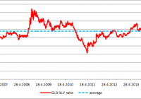
Summary The historical analysis of the gold-silver ratio shows that silver price should start to grow. The value of the gold-silver ratio is almost 75 which is significantly above the long term average. The last two tops (2003 and 2008) were just shy of the 80 level and they were followed by significant increases of the silver price (180% and 315%). There is a significant potential of another huge gains for the iShares Silver Trust ETF shareholders. Historical analysis shows that the iShares Silver Trust ETF (NYSEARCA: SLV ) shareholders may see some interesting gains in the coming years. There are two generally recognized wisdoms that contradict each other. The first one says that the historic results are no guarantee of future performance; the second one says that only a fool repeats the same thing and expects different results. Both of them are applicable to financial markets. Although you can be never sure what the markets will do, there are some patterns that tend to repeat themselves. When you follow such a pattern there is a high probability that the performance of the asset will be similar to the previous cases. There is approximately 19 times more silver than gold in nature. This number was somehow reflected in the historical fixed gold-silver ratios. The ratio was set at 12 in the Roman Empire and at 15 during the era of bimetallism in the 19th century. Today the ratio is not fixed, but moves according to the actual gold and silver prices. The average gold-silver ratio was approximately 55 during the last 44 years. But this is only the average value, the actual values ranged from 17 in January 1980 to 97 in February 1991. The current high valuations don’t reflect the difference in the abundance of gold and silver in the nature and moreover they, don’t reflect even the difference in the abundance of the disposable mined silver and gold. Almost all of the mined gold is being hoarded and most of the mined silver is being consumed by various industrial applications. As a result there is less disposable silver than gold in the world. The GLD-SLV ratio The gold-silver ratio can be tracked also using the SPDR Gold Trust ETF (NYSEARCA: GLD ) and the iShares Silver Trust ETF. During the lifetime of both (chart below), the average GLD-SLV ratio has been 5.77. The highest value was recorded on October 10th, 2008. The GLD price of $83.22 and SLV price of $9.8 resulted in the GLD-SLV ratio of 8.49. The lowest value (3.20) was recorded on April 25th, 2011 at the GLD price of $146.87 and SLV price of $45.83. As we can see, the way from the top to the bottom took 639 trading days. During this time period GLD gained 76.5% and SLV increased by whopping 440%. On the other hand, from April 2011 to present SLV lost 67% of its value while GLD declined only by 22%. (click to enlarge) Source: own calculations The outperformance of SLV during precious metals bull markets and its underperformance during precious metals bear markets is caused by its volatility, which is significantly higher compared to gold. The chart below shows the 20-day moving coefficients of variation for GLD and SLV. The volatility of SLV is significantly higher compared to GLD, regardless of the actual market trend. Source: own calculations But the changing GLD-SLV ratio itself doesn’t tell us anything about the market direction without a further analysis. It is a ratio which means that it is impacted by the price moves of both of the assets. When the GLD-SLV ratio grows it doesn’t mean that the GLD price must grow. The ratio can grow when GLD price declines, but the SLV price must decline even stronger and vice versa. The behavior of both of the assets during particular phases of the GLD-SLV ratio development are shown by the chart below. The chart shows that the declines of the GLD-SLV ratio are related to the growth phases of the gold and silver price cycle and the increases of the ratio usually happen during the decline phases of the gold and silver price cycle. (click to enlarge) Source: own calculations The Long term picture The chart below shows the long term development of the gold-silver ratio calculated from the average monthly gold and silver prices. The chart shows the major tops and bottoms of the gold-silver ratio as well as the metal prices related to the particular local extremes (gold price : silver price). The color of the number shows whether the price of the metal increased or decreased compared to the preceding extreme. (click to enlarge) Source: own calculations Thanks to this chart we can come to three important conclusions: The most important tops of the ratio are almost always associated with a decline of the silver price. The most important bottoms of the ratio are always related with an increase of the silver price. While the direction of the silver price is quite reliably predictable (as shown by points 1. and 2.), predictions of the gold price direction based on the gold-silver ratio development are much less reliable. We can also see that the ratio is approaching 80 right now. The last two approaches to this border were followed by strong declines of the gold-silver ratio and huge silver bull runs, when the silver price increased by 180% and 315% respectively. Conclusions The historical records show that the gold-silver price ratio as well as the GLD-SLV ratio should start to decline in the coming months and years. The major declines of this ratio are always accompanied by a strong silver bull market. The current value of the ratio is approximately 75. The last two times when the ratio attacked the level of 80, the value of the ratio collapsed and silver achieved triple digit gains. If the history should repeat itself once again, the holders of physical silver, SLV or another ETF that tracks the price of the physical silver, should record significant profits. Additional disclosure: The author is long physical silver.

Short GLD And Central Gold-Trust Into The Secular Decline Of Gold

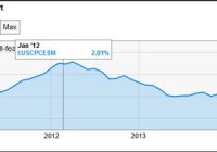
Recovering US economy together with the Fed pushing off inflationary concerns results in a hawkish Fed. This is bullish on the USD and bearish on Gold. Inflation is likely to remain subdued as low energy prices can persist. GLD would be an ideal instrument to short gold efficiently into its secular decline. Gold is priced in United States Dollars (USD) and it is affected by the actions of the Federal Reserve, inflationary pressure and issues of financial stability. In this article, we shall start with recent action by the Federal Reserve as seen in the December 2014 FOMC statement . We are currently in the interim period after the Fed has formally ended QE3 and before the first rate hike since the Great Recession of 2009. In general, a bullish Fed is bearish on the price of gold as it would push the USD higher and reduce inflation. This is exactly what we got as we go through the latest FOMC statement. The FOMC has a upbeat outlook on the US economy as we see in the quote below: “Information received since the Federal Open Market Committee met in October suggests that economic activity is expanding at a moderate pace. Labor market conditions improved further, with solid job gains and a lower unemployment rate. On balance, a range of labor market indicators suggests that underutilization of labor resources continues to diminish. Household spending is rising moderately and business fixed investment is advancing, while the recovery in the housing sector remains slow. Inflation has continued to run below the Committee’s longer-run objective, partly reflecting declines in energy prices.” In the above quote, we can see two drivers of weakness for gold. First, it is clear that the economy is recovering steadily. This is supported by labor market improvement and increasing consumption. Secondly, we are seeing the Fed’s acknowledgment that inflation is running low due to the decline of energy prices. The economy is expanding and the financial system has been cleaned up after the Credit Crunch of 2007, with strong regulatory action. With the benefit of hindsight, regulators have learned the cost of lax oversight and will be more stringent in their supervision. As the economy strengthen, the banks will strengthen accordingly. This has reduced the appeal of gold in the extreme event of a currency collapse when the banking and payment system ends as we know it. Next we see that inflation is low and below the 2% inflation target due to low oil prices. Inflation as measured by broad based measures such as the Consumer Price Index (CPI) is at 1.3% for November 2014, dropping from 1.7% from the prior 3 consecutive months. Even if we take into consideration the Fed’s preferred measure of inflation, the Personal Consumption Expenditure (PCE), it is also low at 1.55%. (click to enlarge) Source: Y-Charts Now I would like to point out that I am referring to broad based measures of inflation and not prices of individual items. A common rebuttal that I get from comments when I mention low inflation is that they would quote price increase of individual items from their grocery shopping increasing more than the mentioned inflation rates. Broad based inflationary measures such as CPI and PCE take into account a basket of goods and services which includes grocery shopping. These are what the Fed considers in its decision making process. What the Fed does have an impact on is the market and price of gold which is the main consideration of this article. Now the attitude of the Fed is crucial in linking the price of gold to inflation. In today’s fast paced world, gold would react first to expected inflation before actual inflation kicks in. One crucial source of expected inflation trend would come from the Fed. Today the Fed is giving more leeway to the below target inflation environment. Currently, the Fed sees this period of low inflation as ‘transitory’ as it expects low energy price to pass. They are not going to ease monetary conditions which would be supportive of gold prices. In this FOMC meeting, we also saw two hawkish dissents urging for an earlier rate hike on the grounds that the economy is strengthening faster than expected. The two hawkish dissents together with the overall bullish majority view outweighs the one dovish dissent urging for more accommodation to meet the Fed’s 2% inflation target. The majority view remains bullish on the US economy even as they urge patience to temper the bullishness of the FOMC Statement. In fact, credit conditions are likely to tighten as the banks pre-empt the Fed’s tightening. In this period of guessing when the Fed will start its first rate hike, the market tendency would be to assume an earlier rate hike rather than a later rate hike as the US economy recovers. As credit conditions tighten marginally and inflation risk remains subdued, gold investors are likely to exit their position and go into more productive assets. Moreover, there are grounds to believe that energy price can remain low for an extended period of time which would continue to keep a lid on inflation. A final piece of the argument acting against the price of gold is the strengthening USD. We can approach this from the theme of divergence of monetary policy in major currencies. Large economies like Japan and Europe are embarking on massive monetary easing programs of 80 Trillion yen per year and 3 Trillion euros respectively. The Fed and the Bank of England are expected to raise rates next year. This will encourage funds to flow into a higher yielding USD especially when the European Central Bank and Swiss National Bank are discouraging deposits with negative interest rates. This would include funds parked in gold, and gold being priced in USD will decline further as the USD appreciates. The chart below will show you the strength of the USD as measured against the Australian Dollar, Euro, Japanese Yen and Great Britain Pound in the spot market. This is the Dow Jones FXCM Dollar Index and these currencies against the USD make up 80% of the spot market and represents a diverse economic makeup. A pictorial view should give you a better sense of the USD strength on the bigger weekly picture. (click to enlarge) There are two ways to sell gold efficiently if you share my bearish view on gold. The first way would be to sell SPDR Gold Trust ETF (NYSEARCA: GLD ). The second way would be to sell the Central Gold-Trust (NYSEMKT: GTU ). Both are listed on the New York Stock Exchange and the prices are closely correlated to each other. GLD has a market capitalization of $27.71 billion and a volume of 7.4 million and it is more liquid than GTU with a market capitalization of $788.17 million and volume of 131 thousand. The reason for mentioning GTU is that it provides unencumbered gold holdings that are not being lent out. This will provide an alternative to investors who take issue with the ‘red flags’ that they see in the GLD prospectus and the gold audit process. (click to enlarge) (click to enlarge) Both the GLD and GTU charts above are almost identical in their trend. This would show that GLD reflects the price of gold as accurately as GTU despite the concerns over it by some investors. As GLD is more liquid than GTU, it would be the ideal instrument to profit from the slide of the gold. However I would note that GTU is a Closed End Fund, not an Exchange Traded Fund like GLD. There are some tax advantages by holding onto GTU compared to GLD. You can read more about GTU here and decide for yourself which is a better instrument for you based on your individual investment status. From both GLD and GTU, we can see that gold had a mini rally for two months from the start of November to mid December 2014 and it is now resuming its downtrend again. (click to enlarge) For a long term view of gold, I have added the monthly chart of XAU/USD. XAU is the currency term for gold and you can see for yourself the current and ongoing secular decline of gold. You can read about the history of the QE programs from the St. Louis Fed . Merry Christmas and a Happy New Year.