Tag Archives: fn-end

Residential REITs ETF Could Slow As Renters Turn Into Buyers

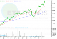
Summary The residential REIT ETF was this year’s best performing financial services fund. However, residential REITs could slow down next year. Rental costs are rising, which in turn could force more renters to buy homes. The residential real estate investment trust exchange traded fund may be this year’s best financial services fund, but things may slow down next year as younger Americans find cheaper financing for a new home. The iShares Residential Real Estate Capped ETF (NYSEArca: REZ ) has increased 37.7% year-to-date as Americans opted to rent instead of purchase a new home this year. REZ offers investors a liquid alternative to physically owning commercial real estate. To qualify as a REIT, a real estate firm has to pay out the majority of its taxable income to shareholders as dividends, and REZ generates its income through renters. Since REITs pay out income to investors, REZ also shows a decent 3.21% 12-month yield. In 2014, U.S. renters paid a collective $441 billion in rent, up $20.6 billion, or 4.9%, from 2013 as renters in San Francisco paid over 14% more in rent, renters in Denver paid 11% more and New Yorkers paid over 10% of all the rent paid in the country, reports Diana Olick for CNBC . Zillow Chief Economist Stan Humphries said in the CNBC article: Over the past 14 years, rents have grown at twice the pace of income due to weak income growth, burgeoning rental demand, and insufficient growth in the supply of rental housing. Next year, we expect rents to rise even faster than home values, meaning that another increase in total rent paid similar to that seen this year isn’t out of the question. In fact, it’s probable. Consequently, the sudden rise in rents could force renters to become new homeowners, especially with cheaper loans available. Specifically, Fannie Mae and Freddie Mac have announced low-down payment loans and mortgage rates are also still attractive. Currently, Fannie Mae and Freddie Mac implement a minimum 5% down payment on home loans. However, the lenders could change it to a 3% minimum, which would allow creditworthy but cash-strapped consumers to acquire a new home. Additionally, mortgage rates remain depressed after Treasury bond yields made a surprising turnaround this year, with benchmark 10-year yields down to 2.2% compared to about 3.0% at the start of 2014. Zillow’s Humphries added: As we prepare for New Year’s and the next home shopping season, we expect soaring rents to entice more people to the relative stability of home ownership, particularly younger potential buyers. iShares Residential Real Estate Capped ETF (click to enlarge) Max Chen contributed to this article .

Valuation Challenges When PEs Are Expanding: 2 Examples

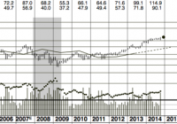
One hallmark of this secular bull market is expanding PE/cash flow multiples. Thus valuations based upon recent historical multiples can be deceiving. I give an example from one stock and one broad ETF. Everyone knows we have been in a cyclical bull market since the spring of 2009. I have argued elsewhere we are now in the early stages of a secular bull market that should continue well into the next decade. One argument supporting this view is to point out that the PE compression which characterized the earlier years of the 21st century has ceased. I shall illustrate this with a few charts shortly. Why is this important to investors? Many analysts judge the attractiveness of the market or a particular stock by comparing PE multiples (or cash flow multiples) with traditional and recent (say, the past decade) multiples. A stock selling at 45x earnings when historically it commanded a multiple closer to 18x is likely to be overvalued and less attractive as an investment or source of dividend income. If we are in a period of rising multiples, however, comparing current PEs to those of the past few years may make companies appear overvalued, when in fact they remain attractive investments going into a brighter future. We can use Teleflex (NYSE: TFX ) as an example. The Value Line chart below shows that TFX traditionally has commanded a cash flow multiple of 10.5x. Well above this (e.g. 2007) was an attractive time to sell, below it (e.g. 2003 and certainly 2009) were great entry points. What should we make of the current multiple, which is closer to 20x cash flow? (click to enlarge) source: Value Line The quick conclusion is that TFX is overvalued and buyers should not pull the trigger. But what if we are in a period of rising multiples, for reasons i made clear yesterday ( here )? This is even more likely given that medical technology is an emerging super field and has been a market leader for several years now. Combining fundamental analysis with charts and some technical snooping might shed more light, and useful trading information, on this challenge. The chart below shows that TFX has been in a bull market since 2009 and ascending in a broad channel as shown in white. If you look at the white channel, TFX touched the upper boundary (it was “overvalued”) in April of this year. But instead of selling off and churning like it did for almost two years back in 2010, the shares have worked their way higher. Maybe we should assume the price range is better defined by the red channel now. Oddly enough, that also suggests it is now fully valued. But the point where a prospective buyer might want to reacquire the shares is quite different. If the higher evaluation (red channel) mode is now in force, that price is approaching $100 as the new year unfolds. Using the old valuation channel, a buyer wouldn’t be interested until the price falls well into the $70s. This might be mere curve fitting but for the fact that broad indexes and ETFs such as the S&P500 Trust (NYSEARCA: SPY ) show almost exactly the same phenomenon. Compare the white and red channels in SPY below. (click to enlarge) source: freestockcharts.com Is this new channel reflective of higher valuations? Yes: (click to enlarge) source: etrade . While some expansion might have occurred in the early years of the bull market because earnings (the denominator in PE) are lagging indicators, it certainly is not the case now: corporate earnings growth is strong. And likely to get stronger! Already third quarter GDP growth came in at 5%, and second quarter GDP was revised higher. The full effect of lower oil prices still has to fully work into the economy, and the fiscal prudence of a Republican House (and now Senate) seems destined to continue. While it may be an ad hoc/seat of the pants process, investors would be well advised to revise their tolerable PE/cash flow multiples on stocks higher in the next few years. Get ready to buy Teleflex shares if a correction brings prices back to the high nineties.

Crude Oil Price Prospects As Seen By Market-Makers

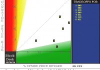
Summary Oil-price ETFs provide a quick look at expectations for change prospects in Crude Oil commodity prices. Market-maker hedging in these ETFs provide an overlay in terms of their impressions of likely big-money client influences on Oil-based ETF prices. But is there a broader story in price expectations for natural gas? And for ETFs in NatGas, following the same line of reasoning? Change is coming, so is Christmas But in what year? Expert oil industry analyst Richard Zeits in his recent article points out how long prior crude oil price recovery cycles have taken, with knowledgeable perspectives as to why. Still, there is also a suggestion that differences could exist in the present situation. Past cruise-ship price experiences of Crude Oil investors on their VLCC-type vessels have marveled at how long it takes to “change course and speed” in an industry so huge, complex, and geographically pervasive. To expect the navigating agility of an America’s Cup racer is wholly unrealistic. Yet some large part of the industry’s present supply-demand imbalance is being laid at the well-pad of new technology and aggressive new players in the game. In an effort to explore the daisy chain of anticipations that may ultimately be reflected by a persistent directional change in the obvious scorecard of COMEX/ICE market quotes, let’s step back a few paces from the supply~demand balance of commercial spot-market commodity transactions to the futures markets on which are based ETF securities whose prospects for price change attract investors in such volume that ETF markets require help from professional market-makers to commit firm capital to temporary at-risk positions that provide the buyer~seller balance permitting those transactions to take place. But that happens only after the market pros protect their risked capital with hedges in the derivative markets of futures and options, which doing so, quite likely provide some much lesser fine-tuning back into the price contemplations back up the ladder that brought us down to this level of minutia. So where to start? Mr. Zeits regularly asserts that his analyses are not investment recommendations, so securities prices are typically unmentioned, and left to the reader’s cogitation. We will start at the other end, where you can be assured that our thinking is in strong agreement with Mr.Z at his end. We convert (by unchanging, logical systemic means, established well over a decade ago) the market-makers [MMs] hedging actions into explicit price ranges that reflect their willingness to buy price protection than to have their perpetual adversaries in (and of) the marketplace take their capital (perhaps more brutally) from them. Using Richard Z’s list of Oil ETFs, here is a current picture of what the MM’s hedging actions now indicate are the upside price changes possible in the next few (3-4) months that could hurt them if their capital was in short positions. The complement to that, price change possibilities to the downside, could be a yin to the upside move’s yang, but we have found better guidance for the long-position investor’s concern in the actual worst-case price drawdowns during subsequent comparable holding periods to the upside prospects. So this map presents the upside gain potentials on the horizontal scale in the green area at the bottom, with the typical actual downside risk exposure experiences on the vertical red risk scale on the left. The intersection of the two locates the numbered ETFs listed in the blue field. (used with permission) Here’s the cast of characters: [1] is United States Brent Oil ETF (NYSEARCA: BNO ) and PowerShares DB Oil ETF (NYSEARCA: DBO ); [2] is ProShares Ultra Bloomberg Crude Oil ETF (NYSEARCA: UCO ); [3] is United States Short Oil ETF (NYSEARCA: DNO ); [4] is United States 12 month Oil ETF (NYSEARCA: USL ); [5] is ProShares Ultra Short Bloomberg Crude Oil ETF (NYSEARCA: SCO ); and [6] is the iPath S&P GSCI Crude Oil Price Index ETN (NYSEARCA: OIL ). Here is how they differ from one another: All are ETFs except for OIL, an ET Note with trivially higher credit risk and possible slight ultimate transaction problems. All except BNO are based on West Texas Intermediate [wti] crude oil availability and product specs, BNO is based on Brent (North Sea oil) quotes, directly influenced by ex-USA supply and demand balances. Most prices are at spot or most immediate futures price quotes, but USL is an average of the nearest-in-time 12 months futures quotes. All are long-posture investments except for SCO and DNO which are of inverse [short] structure. Both UCO and SCO are structured to have ETF movements daily of 2x the long or short equivalent unleveraged ETFs. What is the Reward~Risk map telling us? For conventional long-position investors, items down and to the right in the green area are attractive, to the extent that their 5 to 1 or better tradeoffs of upside potentials to bad experiences (after similar forecasts) are competitive to alternative choices. The closer any subject is to the lower-left home-plate of zero risk, zero return, the less attractive it is to those not traumatized by bunker mentality. SCO, the 2x leveraged short of WTI crude has a +20% upside with a -16% price drawdown average experience with similar forecasts in the past 5 years. It is a slightly better reward than a bet on a long position in Brent Crude and DNO, whose +18% upside is coupled with only -2% drawdowns. SCO’s minor return advantage over DNO comes largely from its leverage which is responsible for its large risk exposure. The same is true for UCO. USL’s trade-off risk advantage over OIL comes largely from smaller volatility in the 12-month average of futures prices that it tracks, rather than only the “front” or near expiration month. Here are the historical details and the current forecasts behind the map. The layout is in the format used daily in our topTen analysis of our 2,000+ ranked population of stocks and ETFs. For further explanation, check blockdesk.com . (click to enlarge) Conclusion In general, this map suggests that we still have ahead of us some further price declines as crude oil equity investors (via ETFs) see advantages in short structures. The spread between WTI crude price and Brent crude may be as narrow now as is likely in the next few months, given BNO’s relative attractiveness here. This analysis will be followed shortly by a parallel on those ETFs focused on Natural Gas and alternative energy fuels.