Tag Archives: etf-hub

Global Asset Allocation Update

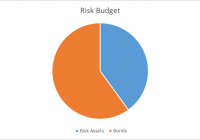
By Joseph Y. Calhoun I am lowering our risk budget this month, based on several factors. For the moderate risk investor, the allocation between risk assets and bonds moves to a defensive 40/60 versus the benchmark of 60/40 and last month’s 50/50. Credit spreads have resumed widening, as crude oil prices have resumed their downtrend. The downtrend in high-yield credit prices may be concentrated in energy issues, but it isn’t confined to that sector. Momentum has shifted notably over the last month to long-term bonds, as inflation expectations have fallen considerably. The yield curve flattened during the month. Although the curve has not fully flattened yet – indeed, it sits in the middle of its historical range – I am still uncertain as to the degree of flattening we’ll see before the next recession. I am choosing to be conservative in my approach to asset allocation. Valuations are still high by historical standards, and revenue and earnings growth is very weak. (click to enlarge) Of the four items we monitor for asset allocation, three are flashing warnings. The change in credit spreads last month approached 10%, well above the 7.5% level we use as a warning sign. Momentum, as I’ve noted numerous times the last few months, has rolled over for the S&P 500, and now, upward momentum can be observed in long-term bonds. It is not as concerning as it might be, though, since the rally in the long end has also included high-grade corporates. Lastly, reliable valuation methods continue to show a stock market near all-time high valuation levels. The only indicator not flashing a warning is the yield curve, which is still far from flat – the condition most commonly associated with pre-recession. (click to enlarge) With rates so low, though, an outright inversion seems highly unlikely, and even getting to flat would seem a heroic feat. If that happens, I cannot imagine that stocks will not have already succumbed to altitude sickness. Credit spreads moved wider on the month, enough to trigger a Sell signal for the stocks. High yield spreads are not yet at levels associated with past recessions, but the rate of change is concerning. Historically, rapidly widening spreads are a sign of stress, and are associated with stock market corrections. Furthermore, Baa spreads are already at recession-associated levels, and investment-grade spreads remain elevated across the credit spectrum. (click to enlarge) (click to enlarge) (click to enlarge) Momentum shifted during the month to bonds, a trend that is actually pretty well established, although it stumbled a bit earlier this year: (click to enlarge) Longer-term bonds continue to outperform shorter maturities, exactly what we would expect with inflation and nominal growth expectations falling: (click to enlarge) On the equity side, EAFE continues to outperform the US market this year, although not by a lot: (click to enlarge) Asia, which outperformed last year and into this one, has flagged badly recently, and I am closing out that position: (click to enlarge) Japan, however, continues to outperform. As I’ve stated numerous times, I think the country has entered a secular bull market: (click to enlarge) Emerging markets have not recovered, and now sit at the bottom of their several years-old range. As I’m moving to a more defensive posture, it does not make sense to maintain exposure to these markets. If the dollar starts to fall, I will reconsider the position: (click to enlarge) Europe outperformed on the month, and I would maintain that exposure: (click to enlarge) Small cap stocks underperformed badly versus large caps in July. In a defensive mode, small cap allocations should be minimized. (click to enlarge) Lastly, I am maintaining a small position in gold, as I believe the US dollar is peaking. The sentiment toward gold is extremely bearish right now, so a small position makes sense from a contrarian perspective. Moderate risk allocation : (click to enlarge) I also run two asset allocation models (one aggressive, one more moderate) based on momentum. These models ignore all fundamental and economic information in favor of just allocating to asset classes that are exhibiting momentum. Here’s where those models stand at the end of the week (rebalancing is monthly): Aggressive Version : 50% TLT 50% EWJ Moderate Version : 25% TLT 25% TLH 25% SCZ 25% IEF As you can see, both of these models are overweight bonds, especially of the long-term variety. More information on these momentum models can be found here .

HEDJ: Is There Any More Upside In This Euro-Hedged ETF?

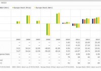
Summary The euro hit a 10-year low relative to the dollar and depreciated dramatically by 22% over a 12 month period leading into April of 2015. As the recent resistance and ostensible capitulation in the euro has taken hold investors may be better positioned in a long non-hedged European position. Since the sharp fall in the euro has subsided over the past four months, the two currencies appear to be normalizing against each other. Resistance has been seen at $1.05 (EU/USD) and the disparity between the two currencies has been retracing towards this level. Over the past 4 months a significant performance divergence exemplifies this phenomenon between hedged (HEDJ) and non-hedged (VGK) European ETFs. Introduction: In my previously published articles (on April 6th 2015: ” The Inevitable Capitulation Of The Euro Hedge ” and on May 20th 2015: ” The Inevitable Capitulation Of The Euro Hedge has begun “), I posited rotating money out of the WisdomTree Europe Hedged Equity (NYSEARCA: HEDJ ) ETF into a long non-hedged European equity position such as the Vanguard FTSE Europe ETF (NYSEARCA: VGK ). This thesis was rooted in three major pillars: 1) The Euro had depreciated relative to the dollar by more than 20% leading into April of 2015. 2) The currency disparity rendered a 10-year low for the euro relative to the dollar. 3) The Euro hedge within HEDJ had been largely attributable to this outperformance over an 18 month time period through April of 2015 relative its indices. Now four months later, two additional attributes may further support this thesis: 1) The Greece crisis is behind us and while this situation was not factored in to my previous articles as a potential event, this fiasco did not negatively impact the euro beyond the $1.05 resistance level. 2) As a looming interest rate increase by the Federal Reserve is on the horizon, this inevitable event may be priced in to some extent and thus the impact on the currency discrepancy may not be as dramatic as previously thought. This partial priced in event will mitigate the downside effect of the euro relative to the dollar when an interest rate increase takes place. Investors in the WisdomTree Europe Hedged Equity ETF have been rewarded handsomely over the past year leading into April of 2015 as the euro has depreciated relative to the dollar in spectacular fashion by more than 20% through March of 2015. HEDJ possess a hedge component exploiting this currency difference on the side of the US dollar, thus investors are rewarded as the euro weakens in relation to the dollar. I posited that this hedge may inevitably become a liability as the two currencies normalize against each other and thus back in April it was time to be in the sell camp of this hedged ETF prior to this hedge component working against investors in HEDJ. I suggested, as Europe continues to strengthen throughput 2015 and beyond, investors may be better positioned in a long European holding such as the Vanguard FTSE Europe ETF as opposed to the euro-hedged HEDJ. This article revisits this thesis four months removed to quantitatively assess the recent movement in the dollar and its impact on the performance of the hedged and non-hedged ETFs. The hedge: the depreciating euro relative to the US dollar HEDJ has outperformed its non-hedged index by a wide margin in 2014 and 2015 albeit through March. HEDJ outperformed the Morningstar non-hedged Europe Stock index on an annual basis by 11.3% and 11.9% in 2014 and 2015 (through March), respectively (Figure 1). However that outperformance of 11.9% through March has given up ground and has since fallen to an outperformance spread of 7.6% YTD (Figure 1). Per WisdomTree, HEDJ seeks to provide investors with exposure to European equities with a built-in hedge against the euro while focusing on companies that conduct a significant portion of their business overseas (non-euro exposure). “The Index and Fund are designed to have higher returns than an equivalent non-currency hedged investment when the value of the U.S. dollar is increasing relative to the value of the euro, and lower returns when the U.S. dollar declines against the euro.” This currency hedge has played out well for investors as the euro has slid against the dollar over the previous 12 months through March of 2015 (Figure 2). The euro sat at a 10-year low against the dollar with a sharp 22% depreciation seen over the previous 12 months heading into April of 2015 (Figures 2 and 3). A sharp divergence between the two currencies can be seen in figures 2 and 3, demonstrating this 20% slide. From these data, I stated that currency fluctuations are transient over the long-term, thus the euro hedge will likely capitulate in the near term. (click to enlarge) Figure 1 – Morningstar annual performance of HEDJ relative to a non-hedged Morningstar Europe Stock index (click to enlarge) Figure 2 – Google Finance graph showing the euro depreciation relative to the dollar over the previous 12 months leading into April of 2015 (click to enlarge) Figure 3 – Google Finance graph showing the euro depreciation relative to the dollar over the past 10 years heading into April of 2015. The capitulation of the euro hedge may be unfolding Recent data suggests that the perpetual falling of the euro may be coming to an end relative to the dollar (Figure 4). There also appears to be a firm resistance at ~$1.05. The euro touched down twice at or near $1.05 in Mach and April (Figure 4). Given the most bullish case for the dollar, some analysts are projecting the dollar to hit $0.95 by the end of the year. Assuming that the dollar hits that mark, this translates into another ~9% move after the already 22% move. Investors may be safe remaining in the hedge for now without much upside given the most bullish case. Given the most bullish estimates, I’d be content capturing over 70% of that spread and rotating money out of that position into a long European position such as VGK if investors would like to maintain exposure to European equities. (click to enlarge) Figure 4 – Google finance YTD performance of the euro relative to the dollar Hedge verses non-hedge performance: HEDJ and VGK Taking a close look at a long European ETF position via VGK (which I wrote about in detail here ) in comparison to the euro hedged HEDJ over the long-term exemplifies that currency fluctuations are transient over the long-term and this euro hedge will likely continue to capitulate in the near term. In 2012 and 2013 HEDJ underperformed VGK on an annual basis at times when the euro and dollar were mostly stable relative to each other (Figure 5). This hedge play has been highly favorable for investors over the most recent 12 month time period through March of 2015 however the currencies will inevitably start to trend to the inverse of this hedge as recent data suggests. At the point of initial reversion to the mean, this hedge will essentially be rendered useless and VGK will outperform as it did in 2012 and 2013. As the euro depreciation seems to have been arrested, HEDJ will likely continue its capitulation and underperform with any further uptick in the euro. This has been the case over the past four months, where VGK has outperformed HEDJ by 3.0% (Figure 6). These data suggest that VGK may be superior moving into the future and combined with the recovery in Europe, it may be time to abandon HEDJ and be long European equities without the euro hedge prior to the hedge working against the investor. (click to enlarge) Figure 5 – Morningstar annual return comparison between HEDJ and VGK through March of 2015 (click to enlarge) Figure 6 – Performance divergence between VGK and HEDJ over the previous four months since my initial article Conclusion: HEDJ has outperformed the non-hedged Morningstar Europe Stock index on an annual basis in 2014 by 11.3% and 11.9% through March in 2015. It is noteworthy to point out that this 11.9% outperformance has dwindled down to a 7.6% outperformance YTD. Specifically regarding HEDJ vs VGK, HEDJ maintains an outperformance of 11%, down from 14.3% since my last article in April. The hedge against the euro within HEDJ is largely attributable to this outperformance over the 12 month time period through March. Considering that the euro appears to have capitulated from its 10-year low preceded by a sharp depreciation by more than 20% indicates that this hedge may have played out. Continued exposure to this hedge may inevitably become more of a liability as the two currencies normalize against each other and thus it may be time to take profits. As Europe continues to strengthen throughput 2015 and beyond, investors may be better positioned in a long European ETF such as VGK. If the European economic strength is enough to mitigate the dollar rise after the Federal Reserve increases rates then there’s limited upside to remaining in this hedge. In terms of quality attributes, HEDJ lacks adequate diversification (by design) and provides a dividend yield inferior to that of VGK and the expense ratio is 6 times that of VGK (0.58%). Taken together, this euro hedge has provided investors with great returns however data suggest currency fluctuations are transient over the long-term and this euro hedge may not add any additional value to one’s portfolio moving into the future. Disclosure: The author currently holds shares of VGK and is long VGK. The author does not hold shares of HEDJ. The author has no business relationship with any companies mentioned in this article. I am not a professional financial advisor or tax professional. I am an individual investor who analyzes investment strategies and disseminates my analyses. I encourage all investors to conduct their own research and due diligence. Please feel free to comment and provide feedback. I value all responses. Disclosure: I am/we are long VGK. (More…) I wrote this article myself, and it expresses my own opinions. I am not receiving compensation for it (other than from Seeking Alpha). I have no business relationship with any company whose stock is mentioned in this article.
Is It Time To Buy Energy CEFs?

Summary Energy CEFs have been hit hard over the past year, resulting in potential bargains. Energy CEFs offer enticing income while you wait for the sector to recover. My picks are PEO and TTP for long term risk-adjusted performance when the bull returns. I am primarily an income investor but I have a contrarian streak and believe in the wisdom of Warren Buffet when he opined: “Be greedy when others are fearful.” This advice has never been truer than now when you consider the total collapse of the energy market. West Texas Intermediate (WTI) oil has plummeted from $104 per barrel in June of last year to less than $50 a barrel today. This has driven down energy stocks to what I consider bargain basement levels. The rapid fall of energy stocks is illustrated by plot of the price of the Energy Select Sector SPDR Exchange Traded Fund (NYSEARCA: XLE ) shown in Figure 1. This ETF is a passive cap-weighted fund that tracks the price of 41 of the largest energy companies. It has an expense ratio of only 0.15% and yields 2.9%. The plot shows that prices peaked in July of last year and has since fallen over 33%. (click to enlarge) Figure 1: Plot of XLE over past 3 years I am not clairvoyant and have no idea how long it will take the energy sector to recover. However, I am confident that over the long run, oil will again return to its glory days. This is based on past history coupled with the number of trouble spots around the world that could disrupt the supply of oil. So I have begun accumulating beaten-down energy stocks. To accomplish this, I am a fan of using Closed End Funds (CEFs) because they are actively managed and offer attractive distributions while you wait for the recovery. There are only four CEFs that focus on energy and have at least a 3 year history. I did not include CEFs that invest primarily in precious metals or master limited partnerships (NYSEARCA: MLPS ). If you are interested in MLPs, please see my article that I recently wrote on Seeking Alpha. The CEFs I included in the analysis are summarized below. Adams Natural Resources (NYSE: PEO ). This CEF was formerly known as Petroleum and Resources and is one of the oldest CEFs, having begun trading on the NYSE in 1929. The fund sells at a discount of 15.2%, which is a slightly larger discount than the 3 year average of 14%. The portfolio consists of 39 companies in the energy and natural resource sectors. It utilized less than 1% leverage and has an expense ratio of 0.6%. The distribution is $0.10 per quarter which is only 2% but it also typically distributes a large capital gain at the end of the year. Last year the capital gain was $1.59, which brought the yearly distribution to $1.99 or almost 10%. None of the distribution was return of capital (NYSE: ROC ). The fund has an exceptional track record and has paid capital gains for 63 consecutive years and dividends for 80 consecutive years. The fund has made a commitment to pay distributions equal to at least 6% of the fund trailing 12 month average price. BlackRock Energy and Resources (NYSE: BGR ). This CEF sells at a discount of 11.4%, which is a larger discount than the 3 year average discount of 7%. This fund is concentrated and has only 30 holdings, all from the energy sector. About 75% of the companies are domiciled in the United States with the rest primarily Canadian and European companies. The fund does not use leverage and has an expense ratio of 0.3%. However, the fund may use options to enhance dividend yield. The distribution has been $0.135 per month but was dropped to $0.11 for August. The fund distributed $1.14 in December of last year. Unfortunately the distributions this year have been mostly return of capital. It is difficult to assess if this is destructive ROC because of the option income plus the fact that the Undistributed Net Investment Income (UNII) is only slightly negative. If readers have more insight, please let me know. First Trust Energy Infrastructure (NYSE: FIF ). This CEF sells at a discount of 15.3%, which is a larger discount than the 3 year average of 7.7%. The portfolio has 70 holdings and focuses on energy infrastructure, with 26% in MLPs and the rest invested in energy companies. About half the holdings are in the pipeline industry and about 24% are associated with electric power. This fund utilizes 25% leverage and has an expense ratio of 1.8%. The distribution is 0.11 per month with capital gains of $1.43 paid last November. Most of the distributions do not rely on ROC and UNII is positive. Tortoise Pipeline and Energy (NYSE: TTP ). This CEF sells for a discount of 15.1%, which is a larger discount than the 3 year average of 8.5%. The portfolio has 60 holdings consisting of 24% MLPs, 65% pipeline corporations, and 10% integrated oil companies. About 30% of the holdings are domiciled in the U.S. The fund utilizes 22% leverage and has an expense ratio of 2.1%. The distribution is 5.3%, consisting of income, capital gains, and a relatively small amount of ROC. The UNII is large and positive, which is a good sign. Voya Natural Resources, Equity (NYSE: IRR ). This CEF sells at a discount of 13.2%, which is a larger discount than the 3-year average discount of 8.6%. The portfolio consists of 84 holdings with 20% from integrated oil companies, 26% from exploration and production companies, and 16% from oil services. About 89% of the holdings are domiciled in the U.S. This fund uses a covered call strategy to enhance returns and does not utilize leverage. The expense ratio is 1.2%. The distribution a huge 15.7%, consisting primarily of short term gains. The fund has not used ROC over the past year and the UNII is positive. To assess the performance of the selected CEFs, I plotted the annualized rate of return in excess of the risk free rate (called Excess Mu in the charts) versus the volatility of each of the component funds over the past 3 years. The risk free rate was set at 0% so that performance could be easily assessed. This plot is shown in Figure 2. Note that the rate of return is based on price, not Net Asset Value (NYSE: NAV ). (click to enlarge) Figure 2. Risk versus reward over the past 3 years. The plot illustrates that the CEFs have booked a wide range of returns and volatilities over the past 3 years. To better assess the relative performance of these funds, I calculated the Sharpe Ratio. The Sharpe Ratio is a metric, developed by Nobel laureate William Sharpe that measures risk-adjusted performance. It is calculated as the ratio of the excess return over the volatility. This reward-to-risk ratio (assuming that risk is measured by volatility) is a good way to compare peers to assess if higher returns are due to superior investment performance or from taking additional risk. In Figure 2, I plotted a red line that represents the Sharpe Ratio associated with XLE. If an asset is above the line, it has a higher Sharpe Ratio than XLE. Conversely, if an asset is below the line, the reward-to-risk is worse than XLE. Note also that Sharpe Ratios are not meaningful if a stock has a negative return. Some interesting observations are evident from the figure. The energy CEFs exhibited a relative tight range of volatilities that were similar to XLE. This was somewhat surprising since I expected CEFs to have higher risks than the passive XLE (because the CEFs are actively managed and some use leverage which could increase volatility). Overall, as expected, energy funds did have great performance over the period. The funds that focused on energy production and exploration fared the worst while the infrastructure funds (FIF and TTP) performed the best. The funds that utilized an option strategy (BGR and IRR) were the worst performers. On both an absolute basis and a risk-adjusted basis, TTP and FIF outperformed XLE. PEO had about the same risk-adjusted performance as XLE but both only managed to eke out a small positive total return. PEO was the least volatile of the group. Since all the funds were associated with natural resources, I wanted to assess how much diversification you might receive by buying multiple funds. To be “diversified,” you want to choose assets such that when some assets are down, others are up. In mathematical terms, you want to select assets that are uncorrelated (or at least not highly correlated) with each other. I calculated the pair-wise correlations associated with the funds. The results are presented in Figure 3. Figure 3. Correlation over the past 3 years The figure presents what is called a correlation matrix. The symbols for the funds are listed in the first column on the left side of the figure. The symbols are also listed along the first row at the top. The number in the intersection of the row and column is the correlation between the two assets. For example, if you follow TTP to the right for three columns you will see that the intersection with IRR is 0.413. This indicates that, over the past 3 years, TTP and IRR were only 41% correlated. Note that all assets are 100% correlated with themselves so the values along the diagonal of the matrix are all ones. As shown in the figure, BGR and PEO were highly correlated with XLE. Thus, you do not receive substantial diversification benefits by purchasing more than one of these funds. On the other hand, FIF, IRR, and TTP were not highly correlated with each other or XLE. Thus, the funds would provide good diversification if you already own PEO or XLE. The 3 year look-back data shows how these funds have performed in the past. However, the real question is how they will perform in the future when the bull market in energy returns. Of course, no one knows but we can obtain some insight by looking at the most recent bull market period from July, 2012 to July, 2014. As shown in Figure 1, this was a great period for energy firms. Figure 4 plots the risk versus reward for the funds over this bull market time frame. As expected, all the funds did well and most (with the exception of IRR and FIF) had about the same risk-adjusted performance. Both IRR and FIF lagged during the bull market but TTP was the best performer. (click to enlarge) Figure 4. Risk versus reward during a bull market Bottom Line Energy CEFs are selling at large discounts and if you believe the bull market in energy will return over the near term, you should consider investing in CEFs. I would recommend PEO and TTP. PEO has a great long term record and I like it better than XLE. I would also consider adding TTP, which is relatively uncorrelated with PEO and did exceedingly well during the last bull market. Both of these funds offer good diversification and income while you wait for the bull to return. Disclosure: I am/we are long PEO, TTP. (More…) I wrote this article myself, and it expresses my own opinions. I am not receiving compensation for it (other than from Seeking Alpha). I have no business relationship with any company whose stock is mentioned in this article.