Tag Archives: etf-hub

Dual Momentum August Update

Scott’s Investments provides a free “Dual ETF Momentum” spreadsheet, which was originally created in February 2013. The strategy was inspired by a paper written by Gary Antonacci and available on Optimal Momentum . Antonacci’s book, ” Dual Momentum Investing: An Innovative Strategy for Higher Returns with Lower Risk “, also details Dual Momentum as a total portfolio strategy. My Dual ETF Momentum spreadsheet is available here , and the objective is to track four pairs of ETFs and provide an “Invested” signal for the ETF in each pair with the highest relative momentum. Invested signals also require positive absolute momentum, hence the term “Dual Momentum”. Relative momentum is gauged by the 12-month total returns of each ETF. The 12-month total returns of each ETF is also compared to a short-term Treasury ETF (a “cash” filter) in the form of the iShares Barclays 1-3 Year Treasury Bond ETF (NYSEARCA: SHY ). In order to have an “Invested” signal, the ETF with the highest relative strength must also have 12-month total returns greater than the 12-month total returns of SHY. This is the absolute momentum filter, which is detailed in depth by Antonacci, and has historically helped increase risk-adjusted returns. An “average” return signal for each ETF is also available on the spreadsheet. The concept is the same as the 12-month relative momentum. However, the “average” return signal uses the average of the past 3-, 6-, and 12- (“3/6/12”) month total returns for each ETF. The “invested” signal is based on the ETF with the highest relative momentum for the past 3, 6 and 12 months. The ETF with the highest average relative strength must also have an average 3/6/12 total returns greater than the 3/6/12 total returns of the cash ETF. Portfolio123 was used to test a similar strategy using the same portfolios and combined momentum score (“3/6/12”). The test results were posted in the 2013 Year in Review and the January 2015 Update. Below are the four portfolios, along with current signals: (click to enlarge) As an added bonus, the spreadsheet also has four additional sheets using a dual momentum strategy with broker-specific, commission-free ETFs for TD Ameritrade, Charles Schwab, Fidelity, and Vanguard. It is important to note that each broker may have additional trade restrictions, and the terms of their commission-free ETFs could change in the future. Disclosures: None. Share this article with a colleague

Bring Data

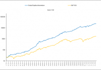
When doing financial modeling, one of the first things to look at is if your empirical work makes sense. In other words, are there valid economic reasons why a model should work? This can help you avoid drawing erroneous conclusions based on creative data mining. [1] Next, you should look for robustness. This can take several forms. One of the most common robustness tests is to see how well a model does when it is applied to somewhat different markets. Even though equities have historically offered the highest risk premium, it is desirable to see a model do well when it is also applied to other financial markets. Another robustness test is to see if a model is consistent over time. You do not want to see success based on spurious short periods of good fortune. Similarly, you would like to see a model hold up well over a range of parameter values. Getting lucky can be good in some things, but not in financial research. Relative and absolute momentum have held up well according to all of the above criteria. But now that momentum is attracting more attention, it is important to remain vigilant and to keep robustness in mind. What makes this especially true is the natural tendency to come up with modifications and “enhancements” that can add complexity to a once-simple model. An interesting new paper by Dietvorst, Simmons, and Massey (2015) called ” Overcoming Algorithm Aversion: People Will Use Algorithms if They Can (Even Slightly) Modify Them ,” shows that people are considerably more likely to adopt a model if they can modify it. Everyone likes to feel that they have some personal involvement with a model, and that they may have made it better. But simpler is often better in the long run. Data-mined “enhancements” may fit the existing data well, but may not hold up on new data or over longer periods of time. I have seen dozens of variations and “enhancements” to momentum, and I will undoubtedly see many more in the days ahead. One variation that attracted considerable attention a few years ago was by Novy-Marx (2012), who found that the first six months of the lookback period for individual stocks gave higher profits than the more recent six months. This became known as the “echo effect.” However, it never made much sense to me. So I tested the echo effect on stock indices, stock sectors, and assets other than stocks. I was not surprised when incorporating the echo effect gave worse results than the normal way of calculating momentum. A subsequent study by Goyal and Wahal (2013) showed that the echo effect was invalid in 37 markets outside the U.S. Goyal and Wahal also demonstrated that the echo effect was largely driven by short-term reversals stemming from the second to the last month. Overreaction to news leading to short-term mean reversion of individual stocks does make sense. Prior to that time, only the last month was routinely skipped when calculating momentum for stocks. [2] Based on this finding, the latest research papers skip the prior two months instead of just the last month when calculating individual stock momentum. [3] While robustness tests are very important, the best validation of a trading model is to see how it performs on additional out-of-sample data. The statistician W. Edwards Deming once said, “In God we trust; everyone else bring data.” When I first developed the dual momentum-based Global Equities Momentum (GEM) model, my backtest went to January 1974. This is because the Barclays Capital bond index data I was using began in January 1973. I am now able to access Ibbotson bond index data, which has a much longer history. My GEM constraint has now changed to the MSCI stock index data going back to January 1970. Having this additional bond data, I have another three years of out-of-sample performance for GEM. My new backtest includes the 1973-74 bear market, and shows dual momentum sidestepping the carnage of another severe bear market. (click to enlarge) GEM is more attractive than it was previously on both an absolute basis and relative to common benchmarks. Here is summary performance information from January 1971 through July 2015. 60/40 is 60% S&P 500 and 40% Barclays Capital U.S. Aggregate Bonds (prior to January 1976, Ibbotson U.S. Government Intermediate Bonds). Monthly returns (updated each month) can be found on the Performance page of our website. GEM S&P 500 60/40 Ann Rtn 18.2 11.9 10.2 Std Dev 12.5 15.2 9.8 Sharpe 0.91 0.38 0.44 Max DD -17.8 -50.9 -32.5 Results are hypothetical, are NOT an indicator of future results, and do NOT represent returns that any investor actually attained. Indexes are unmanaged, do not reflect management or trading fees, and one cannot invest directly in an index. Please see our GEM Performance and Disclaimer pages for more information. In our next article, we will look at longer out-of-sample performance using the world’s longest backtests. Fortunately for us, these were done to further validate simple relative and absolute momentum. [1] For example, between 1978 and 2008, U.S. stocks had an annual return of 13.9% when a U.S. model was on the cover of the annual Sports Illustrated swimsuit issue versus 7.2% when a non-U.S. model was on the cover. [2] Short-term mean reversion is not an issue with stock indices or other asset classes, so the last two months do not need to be excluded from their momentum lookback period. [3] See Geczy and Samonov (2015). The discovery of two-month mean reversion is an example of the Fleming effect in which different but related research can lead to serendipitous results.
Time To Buy Japanese Stocks? Why Not The Yen?

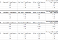
Some trades are obviously simple on the surface: if we think the S&P 500 is going up, we buy the S&P 500. Yes, there are questions to be answered: how much? How do we know we are wrong? Where are we getting out if we’re right? These are important questions, but the essence of the trade is simple – buy the thing we think is going up. Sometimes, though, even the question of what to buy (or sell) – what the appropriate instrument for the trade – can be complicated. A client and friend of mine sent me a note this morning asking about a trade I put on in Japanese stocks. I suggested buying the Nikkei 225 futures (which are not the most liquid market in the world, sometimes) on a breakout, and that US-based investors might want to consider ETF alternatives. His question was… well, rather than paraphrasing, here’s his question: the chart [of the Nikkei average] looks a lot like the USDJPY chart, i.e. strength in Japan seems to be caused by weakness in JPY. Wouldn’t it be less complex to simply use USDJPY? Conceptually the same question arises for set-ups in mining (NASDAQ: RGLD ) or oil stocks etc. Now, I have to basically agree with everything he says there (with the exception of one nitpicking, but critical point). The chart of the Nikkei (below) does, in fact, look a lot like the USDJPY. Here, though, is my point of contention: it’s not quite right to think that strength in Japan is “caused by” weakness in the Yen. One of the best pieces of advice is to be very careful of the phrase “caused by” whenever you are thinking about markets. Do not assume causative links, and check any assumptions carefully. A lot of money has been lost by traders (and made by writers) who oversimplify and assume causative connections that might not be real. A good setup for a long trade on the weekly chart This is not just an academic point; it goes straight to the heart of what we’re trying to do with this trade. I want long exposure to the global equity market that appears to be best set to break out. I want to buy the relative strength leader, ideally before everyone else sees that it’s the leader! That’s what I’m trying to accomplish with this trade, and the most direct way is simply to buy that index. Simple really is better. People tend to over-complicate, particularly in portfolio management, and this can result in complicated trades that don’t do what we expect. For instance, the trader thinking he is “getting gold” by buying something like GDX is getting a mix of gold and stock exposure; he might be disappointed to see GDX go down if gold goes up but stocks go down. These types of complicated trades also carry risks we don’t understand. I’ll write more on this topic of “factor exposure” in portfolio construction and long-term investing, but let me leave you with one last thought about the Japan trade: When we compare global stock indexes, we need to do so with them priced in a common base currency. Because I’m in the US, I look at all stock indexes priced in USD. (Otherwise, we’re looking a combination of currency and stock factors every time we look at a market.) When we execute the trade, we can make a choice to accept the currency risk or hedge it, but we must be aware of the issues and risks involved. This trade provides a good example of the idea of simplicity and the dangers of over complicating. No one would deny that currencies have an impact on stock prices (though we could debate about what, exactly, that impact is), but this is a simple trade. We want long exposure to Japanese stocks with an appropriate risk point. In most cases, we are better off if we don’t get sidetracked by charts that look similar or other potential influences – simply execute the trade in the simplest, most direct way possible.