Tag Archives: applicationtime

VNQ: Take The 3.85% Yield; Duplication Is Rarely Worth It

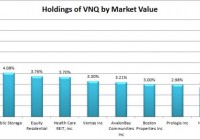
Summary I’ve been getting questions about why investors should choose VNQ over buying largest holdings within VNQ. VNQ offers substantially better diversification than investors can create by replicating the top holdings. The ETF yield is surprisingly similar to the yields across the top holdings. If an investor is committed to a plan of dollar cost averaging, VNQ offers a smart way to minimize trading costs. Vanguard REIT Index ETF (NYSEARCA: VNQ ) offers investors strong distribution yields at a rate of 3.89%. However, some investors are contemplating if they would be better off simply buying the top 5 or 10 holdings of VNQ to avoid the expense ratio and generate more income by concentrating their investments in the REITs with the highest yields. It’s a reasonable idea and it is worth some discussion. I wanted to offer a thorough response on some of the reasons that I believe investing in VNQ is superior to trying to replicate the portfolio through buying the top ten holdings. Holdings I put together a quick chart showing the recent holdings of VNQ based on their most recent market values. (click to enlarge) The top 10 holdings make up about 37% to 38% of the value of the ETF. That is a fairly substantial portion, but not substantial enough that it would make it easy to duplicate the fund by buying the top holdings. An investor that only buys the top 10 would still be missing out on a very substantial amount of diversification from the other 62% or so of the portfolio. Dividend Yields I put together a chart showing the dividend yields on each of the top 10 positions. For the convenience of readers, I kept the holdings in the same order rather than sort them by the highest dividend yields: (click to enlarge) There are certainly a few REITs in this ETF that are paying much higher yields than the main portfolio, but investors focusing on only the highest yield REITs will be putting themselves at risk for slower growth in the pay outs or more risk to the dividend itself. Higher yields are often related to higher levels of risk, so holding only the highest yielding REITs would result in a significantly higher concentration of risk. If you were to take the average yield (equally weighted) of the top 5 REITs, you would have 4.018%. If you take the average yield across the top 10, it is 3.764%. This suggests that all around VNQ is paying a fairly similar level of dividends to what an investor would expect if they focused on buying the top 5 or top 10 holdings by market value in an equally weighted portfolio. Expense ratios are fairly low The Vanguard REIT Index ETF has an expense ratio of only .12%. That does cost shareholders money compared to simply holding all of the underlying securities, but the cost is fairly low compared to the benefits. In exchange for the .12% ratio the investors are able to buy shares in a high liquid ETF with the spread is frequently one cent. On a share price that is floating around $77, that is a very attractive bid ask spread. For comparison, at the time of my checking Simon Property Group, Inc. ( SPG) had a 4 cent bid ask spread on a price around $176 (slightly better larger than VNQ), P ublic Storage (P SA) had a spread of 4 cents on a price around $187, Equity Residential ( EQR) had a spread of 1 cent on shares running around $70 (about equal to VNQ), and Health Care REIT, Inc. ( HCN) had a spread of 2 cents on a price slightly under $70. In short, the Bid-Ask spread on even the largest equity REITs is slightly worse than the spread on VNQ. Granted, if you have an indefinite holding time period the spread is only an issue when purchasing, but it does increase the cost of buying into the position. If an investor has free trading on VNQ (some brokerages do), then their trading cost to buy into positions is limited to crossing the spread. If an investor is simply doing a buy and hold with a 40 year time frame, this isn’t a huge consideration. For the investor with a 40 year time frame that is buying their REITs in one single purchase, it makes sense to replicate the fund. For an investor with a long time frame that intends to continue investing REITs by buying into their position every month or every quarter for dollar cost averaging, it would be better to take advantage of the low spreads and look for a brokerage that is offering no commissions on VNQ. Conclusion While it would be possible to generate higher yields than VNQ by picking the equity REITs with the highest yields, it would also leave an investor facing significantly more diversifiable risk. The extra income may be nice and replicating the portfolio through buying a very large volume of the securities (you’d need more than 10) would make sense for a long term investor that does not plan to be investing new money every month or every quarter. For the investor that is planning to dollar cost average into their investments and builds them up over a period of years, the purchases will be more frequent and the investor may save more on trading commissions and spreads than they lose on the expense ratio. Whether this works or not will depend on the individual investor. My dollar cost averaging strategy puts in place a minimum amount of purchasing activity for REITs, but I will occasionally add to the position when I see share prices fall. Disclosure: The author is long VNQ. (More…) The author wrote this article themselves, and it expresses their own opinions. The author is not receiving compensation for it (other than from Seeking Alpha). The author has no business relationship with any company whose stock is mentioned in this article. Additional disclosure: Information in this article represents the opinion of the analyst. All statements are represented as opinions, rather than facts, and should not be construed as advice to buy or sell a security. Ratings of “outperform” and “underperform” reflect the analyst’s estimation of a divergence between the market value for a security and the price that would be appropriate given the potential for risks and returns relative to other securities. The analyst does not know your particular objectives for returns or constraints upon investing. All investors are encouraged to do their own research before making any investment decision. Information is regularly obtained from Yahoo Finance, Google Finance, and SEC Database. If Yahoo, Google, or the SEC database contained faulty or old information it could be incorporated into my analysis.
Paring The Leaders, ETF Performance Review: Major Asset Classes

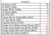
The U.S. equity market has regained front-runner status for the trailing one-year return (250 trading days) among the major asset classes, but the edge is looking considerably less impressive compared with the glory days of recent years. In fact, rolling one-year returns overall are a diminished lot lately, based on our standard set of ETF proxies that track broad measures of the global opportunity set. There are fewer positive returns for the trailing 250-day period while the performance histories that are still in the black reflect relatively modest gains vs. recent history. In short, earning a risk premium isn’t getting any easier. That’s another way of saying that there’s more red ink weighing on the one-year profiles. Ten of the 14 ETFs that track the major asset classes have lost ground over the past 250 trading days. One thing that hasn’t changed: the deeply bearish trend for commodities in broad terms. The iPath Dow Jones-UBS Commodity Index Total Return ETN (NYSEARCA: DJP ) is still the big loser, shedding nearly 28% over the past year. Here’s a graphical recap of the relative performance histories for each of the major asset classes for the past 250 trading days via the ETF proxies. The chart below shows the performance records through June 12, 2015, with all the ETFs rebased to a year-ago starting-value of 100. U.S. equities are again in the lead (blue line at top), but the edge is razor thin over U.S. real estate investment trusts (black line), which is the number-two performer at the moment. Meanwhile, let’s review an ETF-based version of an unmanaged, market-value-weighted mix of all the major asset classes – the Global Market Index Fund, or GMI.F, which holds all the ETFs in the table above. Here’s how GMI.F stacks up for the past 250 trading days through June 12, 2015. This investable strategy is ahead by just 1.7% over that span – well below the performance for U.S. stocks, via the Vanguard Total Stock Market ETF (NYSEARCA: VTI ) and slightly behind the 2.0% return for U.S. bonds via the Vanguard Total Bond Market ETF (NYSEARCA: BND ). Comparing the median dispersion for rolling 250-day returns for the major asset classes via ETFs suggests that the general rebalancing opportunity has fallen for GMI.F vs. recent history after surging in recent months. Analyzing the components of GMI.F with a rolling median absolute deviation via one-year returns for the ETFs implies a moderately diminished potential for adding value by reweighting this portfolio in comparison with recent history. Keep in mind that the implied opportunity for productive rebalancing will vary depending on the choice of holdings and historical time window. Also, any given pair of ETFs may present a significantly greater or lesser degree of rebalancing opportunity vs. analyzing GMI.F’s components collectively, which is the methodology that’s reflected in the chart below. Note, too, that the chart focuses on looking backward. If you’re confident in your forecast for risk and return, the ex ante view of rebalancing opportunity may paint a distinctly different outlook vs. an ex post analysis. Finally, let’s compare the rolling one-year returns for the ETFs in GMI.F via boxplots to review performance momentum in the context of recent history. The gray boxes in the chart below reflect the middle range of historical 250-day returns for each ETF – the 25th to 75th return percentiles. The red dots show the current 250-day return (through June 12) vs. the equivalent from 30 trading days earlier (blue dots, which may be hiding behind red dots in some cases). For instance, the chart shows that the U.S. stock market is currently the top performer among the major asset classes, as shown by red dot. But in a sign of the times, the current performance is a touch below VTI’s median return (horizontal black line).

Best And Worst: Large Cap Blend ETFs, Mutual Funds, And Key Holdings

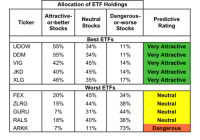
Summary Large Cap Blend style ranks second in 2Q15. Based on an aggregation of ratings of 53 ETFs and 908 mutual funds. UDOW is our top rated Large Cap Blend ETF and GQLOX is our top rated Large Cap Blend mutual fund. The Large Cap Blend style ranks second out of the 12 fund styles as detailed in our 2Q15 Style Ratings report . It gets our Attractive rating, which is based on aggregation of ratings of 53 ETFs and 908 mutual funds in the Large Cap Blend style. Figures 1 and 2 show the five best and worst rated ETFs and mutual funds in the style. Not all Large Cap Blend style ETFs and mutual funds are created the same. The number of holdings varies widely (from 15 to 1364). This variation creates drastically different investment implications and, therefore, ratings. Investors seeking exposure to the Large Cap Blend Style should buy one of the Attractive-or-better rated ETFs or mutual funds from Figures 1 and 2. Figure 1: ETFs with the Best & Worst Ratings – Top 5 (click to enlarge) * Best ETFs exclude ETFs with TNAs less than $100 million for inadequate liquidity. Arrow QVM Equity Factor ETF (NYSEARCA: QVM ) IS excluded from Figure 1 because its total net assets are below $100 million and do not meet our liquidity minimums. Figure 2: Mutual Funds with the Best & Worst Ratings – Top 5 (click to enlarge) * Best mutual funds exclude funds with TNAs less than $100 million for inadequate liquidity. ProShares UltraPro Dow30 ETF (NYSEARCA: UDOW ) is our top-rated Large Cap Blend ETF and GMO Quality Fund (MUTF: GQLOX ) is our top-rated Large Cap Blend mutual fund. Both earn a Very Attractive rating. One of our favorite stocks held by Large Cap Blend funds is Johnson & Johnson (NYSE: JNJ ). In 2014, Johnson & Johnson earned an after-tax operating profit ( NOPAT ) of almost $17 billion; its highest ever in our model. The company has been very consistent over the last decade with regard to its financial performance. NOPAT has grown by 8% compounded annually since 2004 and Johnson & Johnson’s return on invested capital (NASDAQ: ROIC ) has also remained above 14% every year over the last decade. This consistency has allowed the company to continually increase economic earnings every year over this same time frame. Despite the growth in the business, the stock is currently undervalued. At its current price of $98/share, JNJ has a price to economic book value (PEBV) ratio of 1.0. This ratio implies the market expects Johnson & Johnson’s NOPAT to never grow from current levels. Meanwhile, if Johnson & Johnson can grow NOPAT by 7% compounded annually for the next 5 years , the company is worth $140/share- a 43% upside from current levels. These expectations could be easily surpassed given the company’s long and consistent history of generating shareholder value. Ark Innovation ETF (NYSEARCA: ARKK ) is our worst-rated Large Cap Blend ETF and Lazard Enhances Opportunities Portfolio (MUTF: LEOOX ) is our worst-rated Large Cap Blend fund. ARKK earns a Dangerous rating and LEOOX earns a Very Dangerous rating. One of the worst stocks held by Large Cap Blend funds is recent Danger Zone stock Athenahealth (NASDAQ: ATHN ). Over the last three years many of the key financial metrics of the company have deteriorated. Athenahealth’s ROIC has declined from 14% in 2011 to just 1% in 2014. NOPAT has also had a very similar path, declining 42% compounded annually since 2011. In addition, for the past three years, Athenahealth’s cost of capital ( WACC ) has exceeded its ROIC. This has caused the company to earn negative economic earnings and is an indication that the company is destroying shareholder value. Athenahealth’s stock price, however, has not reflected the fundamental deterioration of its underlying business. Since going public in 2007, the stock price has more than tripled. However NOPAT for Athenahealth has declined by 50% since 2007. To justify its current price of $117/share, the company would need to grow NOPAT 60% compounded annually for the next 11 years . This seems very optimistic considering the declining business operations as described above Figures 3 and 4 show the rating landscape of all Large Cap Blend ETFs and mutual funds. Figure 3: Separating the Best ETFs From the Worst Funds (click to enlarge) Figure 4: Separating the Best Mutual Funds From the Worst Funds (click to enlarge) Sources: Figures 1-4: New Constructs, LLC and company filings D isclosure: David Trainer owns JNJ. David Trainer and Allen L. Jackson receive no compensation to write about any specific stock, style, style or theme. Disclosure: The author is long JNJ. (More…) The author wrote this article themselves, and it expresses their own opinions. The author is not receiving compensation for it. The author has no business relationship with any company whose stock is mentioned in this article.