Tag Archives: applicationtime

Ivy Portfolio July Update

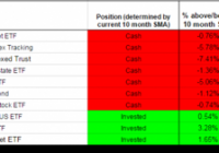
The Ivy Portfolio spreadsheet track the 10 month moving average signals for two portfolios listed in Mebane Faber’s book The Ivy Portfolio: How to Invest Like the Top Endowments and Avoid Bear Markets . Faber discusses 5, 10, and 20 security portfolios that have trading signals based on long-term moving averages. The Ivy Portfolio spreadsheet tracks both the 5 and 10 ETF Portfolios listed in Faber’s book. When a security is trading below its 10 month simple moving average, the position is listed as “Cash”. When the security is trading above its 10 month simple moving average the positions is listed as “Invested”. The spreadsheet’s signals update once daily (typically in the late evening) using dividend/split adjusted closing price from Yahoo Finance. The 10 month simple moving average is based on the most recent 10 months including the current month’s most recent daily closing price. Even though the signals update daily, it is not an endorsement to check signals daily or trade based on daily updates. It simply gives the spreadsheet more versatility for users to check at his or her leisure. The page also displays the percentage each ETF within the Ivy 10 and Ivy 5 Portfolio is above or below the current 10 month simple moving average, using both adjusted and unadjusted data. If an ETF has paid a dividend or split within the past 10 months, then when comparing the adjusted/unadjusted data you will see differences in the percent an ETF is above/below the 10 month SMA. This could also potentially impact whether an ETF is above or below its 10 month SMA. Regardless of whether you prefer the adjusted or unadjusted data, it is important to remain consistent in your approach. My preference is to use adjusted data when evaluating signals. The current signals based on June 30th’s adjusted closing prices are below. As of the close May 29, the PowerShares DB Commodity Index Tracking ETF (NYSEARCA: DBC ) , the iShares S&P GSCI Commodity-Indexed Trust ETF (NYSEARCA: GSG ), the Vanguard REIT Index ETF (NYSEARCA: VNQ ) and the iShares TIPS Bond ETF (NYSEARCA: TIP ) were below their 10 month moving average. This month those 4 ETFs remain below their moving average. In addition, the Vanguard Total Bond Market ETF (NYSEARCA: BND ), the SPDR Dow Jones International Real Estate ETF (NYSEARCA: RWX ), TIP and the Vanguard FTSE Emerging Markets ETF (VWO ) are now also below their 10 month moving average. The spreadsheet also provides quarterly, half year, and yearly return data courtesy of Finviz . The return data is useful for those interested in overlaying a momentum strategy with the 10 month SMA strategy: (click to enlarge) (click to enlarge) I also provide a “Commission-Free” Ivy Portfolio spreadsheet as an added bonus. This document tracks the 10 month moving averages for four different portfolios designed for TD Ameritrade, Fidelity, Charles Schwab, and Vanguard commission-free ETF offers. Not all ETFs in each portfolio are commission free, as each broker limits the selection of commission-free ETFs and viable ETFs may not exist in each asset class. Other restrictions and limitations may apply depending on each broker. Below are the 10 month moving average signals (using adjusted price data) for the commission-free portfolios: (click to enlarge) (click to enlarge) Disclosures: None

Has CEFL Done As Badly As It Looks?

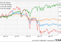
Summary CEFL’s share price has reached all-time lows. After accounting for reinvested dividends, CEFL’s total return doesn’t seem all that bad. If we exclude the two “rebalancing months” at the turn of this year, CEFL has actually done pretty well. Introduction The UBS ETRACS Monthly Pay 2xLeveraged Closed-End Fund ETN (NYSEARCA: CEFL ) is a 2X leveraged fund of close-ended funds [CEF] that sports a juicy 21.8% yield, according to Lance Brofman’s recent article . However, recent events have caused CEFL’s share price to fall to an all-time low since its inception in Dec. 2013, something that is frequently mentioned in the comment streams of articles on CEFL. The following chart shows the price return of CEFL compared to two other funds from Jan. 1st, 2014 to May 31st, 2015 (the reason for this date range will become apparent later). The YieldShares High Income ETF (NYSEARCA: YYY ) tracks the same index, the ISE High Income Index, as CEFL, but is unleveraged. The PowerShares CEF Income Composite ETF (NYSEARCA: PCEF ) is also a fund-of-CEFs but it tracks a different index. The broader U.S. market SPDR S&P 500 Trust ETF (NYSEARCA: SPY ) is shown for comparison. YYY data by YCharts As can be seen from the above chart, Jan. 1st, 2014 to May 31st, 2015, CEFL declined by -16.1%, which is approximately twice that of YYY at -8.45%, whereas PCEF declined by only -2.02%. SPY had a price return of 15.66%. Undoubtedly, CEFL’s price-only action has been ugly. Effect of reinvesting dividends What if dividends are accounted for? The following chart shows the total return of the same four funds, i.e. with dividends reinvested. YYY Total Return Price data by YCharts We can see from the above graph that if dividends are accounted for, CEFL’s total return becomes positive, at +7.89%. YYY had a total return of +3.81% over this period, while PCEF had a total return of +9.70%. SPY’s total return was +18.21%. Effect of last year’s rebalancing shenanigans As I have written about previously ( I , II , III ), CEFL/YYY holders were seemingly shafted during the index’s annual rebalancing event in Dec. 2014. The CEFs that were to be added to the index exhibited unusual increases in both price and volume, whereas the CEFs that were to be removed from the index exhibited unusual increases in volume but decreases in price. This apparent “frontrunning” caused CEFL/YYY to sell low and buy high, resulting in significant losses for the funds (and ergo, its investors) upon rebalancing. Moreover, CEFL/YYY continued to underperform in Jan. 2015 as the newly-added CEFs, whose prices were artificially inflated to aberrant levels, exhibited mean reversion. All of this discussion can be found in greater detail in my previous articles linked above. The following chart shows the monthly total returns for the four funds from Jan. 2014 to May 2015. Data were obtained from Morningstar . (As of time of writing, monthly return data for Jun. 2015 were not yet available). We notice that from the above chart that YYY/CEFL had their worst performances in Sep. 2014 and Dec. 2014. However, to get a better feel for the effect of rebalancing, the following chart shows the monthly returns for only YYY and PCEF (as both are unleveraged), with the difference being drawn as a line. From the above chart, the effect of the rebalancing shenanigans on YYY/CEFL becomes clear. Although YYY showed the lowest absolute performances in Sep. 2014 and Dec. 2014, the two months where it underperformed most on a relative basis (compared to PCEF) were Dec. 2014 (-2.48%) and Jan. 2015 (-2.78%), i.e. the two months associated with the rebalancing event. Given that both YYY and PCEF are CEF fund-of-funds, this underperformance lends further credence to my hypothesis that YYY/CEFL holders were significantly disadvantaged by the rebalancing event. Total return profiles with and without rebalancing shenanigans From the monthly return data, I reconstructed the total return profiles for the four funds from Jan. 2014 to May. 2015. Note that the final total return percentages for the funds are within 1% of the numbers reported by YCharts shown above (see second chart of this article), indicating that the reconstruction methodology I used was reasonably accurate. Now, let’s pretend we were living in an alternate universe where YYY/CEFL holders were not shafted by the rebalancing event. To model this, I changed YYY’s monthly returns for Dec. 2014 and Jan. 2015 to be the same as PCEF’s (since both are fund-of-CEFs), and made CEFL’s monthly returns for those two months twice that of YYY’s. The following chart shows the reconstructed total return profiles for the four funds. Wow! What a difference two months makes! Instead of languishing with a +7.4% total return from Jan. 2015 to May. 2015, CEFL jumps to the top of the pack with a total return of +18.3%, edging out even SPY. An alternative approach is to assume that the months of Dec. 2014 and Jan. 2015 never happened . The following chart shows the reconstructed total return profiles for the four funds, except that Dec. 2014 and Jan. 2015 are skipped. In other words, the monthly total return for Feb. 2014 was applied to value of the funds at end-Nov. 2014. Similar results are observed with the two rebalancing months skipped. CEFL again comes out on top with a 23.2% total return, beating SPY by nearly 2%. Additionally, the two graphs above both show that once we account for rebalancing shenanigans using either of the two approaches, YYY and PCEF have very similar total returns, which might be expected because both funds screen for high-yielding CEFs for inclusion. Discussion and conclusion In many comment streams of articles regarding CEFL, many commentators opine that CEFL is a broken product due to its poor price performance, not to mention its high fees and inclusion of return of capital [ROC]-paying CEFs. While it is true that CEFL’s price has declined by 20% since inception and is currently at all-time lows, its total return, which includes reinvested dividends, has been positive. (This is true even when accounting for CEFL’s horrendous performance in Jun. 2015, which was not included in this analysis). Moreover, this article showed that a significant part of YYY/CEFL’s underperformance can be explained by the rebalancing shenanigans that occurred in Dec. 2014, followed by further underperformance in Jan. 2015 as the artificially-inflated CEFs in the index reverted to the mean. Accounting for those two rebalancing months using either one of two approaches resulted in a vastly improved total return profile for CEFL that was superior even to that for SPY over the period of Jan. 1st, 2014 to to May 31st, 2015. Additionally, we showed that YYY and PCEF had very similar total return profiles once those two rebalancing months were accounted for as well. Based on this analysis, I would conclude that CEFL is not an inherently broken product – except for its current rebalancing mechanism. My opinion is that UBS should really do something about the rebalancing protocol to ensure that CEFL/YYY holders do not get ripped off again this year. As for myself, I will be selling all of my CEFL in early December or even before that, and watch events unfold from afar. Further analysis on the constituents and properties of CEFL can be found in my three-part series “X-Raying CEFL”. Disclosure: I am/we are long CEFL. (More…) I wrote this article myself, and it expresses my own opinions. I am not receiving compensation for it (other than from Seeking Alpha). I have no business relationship with any company whose stock is mentioned in this article.

Correlation Of Commodities With World Stock Indexes: The Short Opportunity

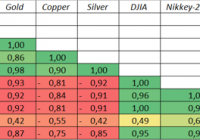
Summary This article is made to show the correlation relationships of oil, gold, copper and silver price with DJIA, S&P 500, NASDAQ, CSI-200, Nikkey-225 and ASX-200. The main idea is that the cycles of these fundamental commodities’ prices are the origins of the change in the stocks’ quotations. Investors can use this information to make investment decisions according to the current fundamental situation. The main conclusions about the future prices of the indexes are given in the section “Conclusions”. Introduction: This article was made to show the way to determine if the stock indexes are overvalued or undervalued according to the fundamental power of commodities. In fact, the correlation relationships among commodities and different indexes were discovered long before me (e.g., Sam Ro on Business Insider showed the correlation of different commodities with S&P 500). Using this information, investors can determine if the stock index is overvalued (undervalued) or not. Main tools for this research were the correlation analysis and the linear regression analysis. Correlation analysis measures the power of the relationship between 2 assets. If the correlation is 1, it means, that the price change of the first asset for 1% will make the price of the second asset change by 1%. If the correlation is -1, absolutely negative, it means that the change of price for 1 asset by 1% will tend to a -1% price change of another asset. The linear regression analysis is a formal tools to investigate the actual formula for the correlation relationship. Usually written in the form “Y = a + bx”, where a and b are investigated by the least-squared method (more formally, ordinary least squares method – OLS). For example, if a is 2 and b is 3, the formula looks like “Y = 2 + 3x”. If x is 3, Y tends to be 2 + 3 * 3 = 11. These technics are extremely useful when there is a significant change of the factors, which happens nowadays. And I do want to determine the fact that according to my analysis, most top indexes are extremely overvalued. Body of research: Without a shadow of a doubt, it is evident that main indexes are the “mirrors” of the future economic development of the country. Obviously, if the country’s structure of GDP is mostly connected with the mining and manufacturing industry, the prices for such commodities as oil, gold, copper and silver strongly affect the perspectives of the future economic growth. Oil is used as the main source of energy; Gold and silver are widely used in the electronic industry; Copper, in fact, is used everywhere. The main hypothesis of this article is: first – if the prices for these commodities really affect the price of the main world’s indexes? second – if the first is true, how can we measure this effect? As you can see in the Table 1, there are several strong relationships among assets: Brent is positively correlated with all types of commodities, mostly with copper, and negatively correlated with all main indexes. The strongest negative correlation is with CSI-200, so it confirms the fact, that cheap oil makes the economics of China grow faster. The weakest correlation is with ASX-200, so Australian stocks are the most “oil-neutral” among other considered indexes; WTI shows the same tendency as Brent; Gold has the strongest negative correlation among all commodities with the top American indexes. In my opinion, the main reason for this fact is that gold has always been the main substitute for USD currency. Strong dollar means a low price of gold, so they are negatively correlated by nature. As the Japanese yen is one of the 4 widely used currencies in the World, Nikkey-225 is strongly negatively correlated with the price of gold. CSI-200 is a Chinese index and it is least negatively correlated with this metal; Silver shows the same tendency with gold for the similar reasons, stated above; Copper, the main indicator of economical development, shows a negative correlation with all indexes. However, it is not as strong as other commodities. Table 1. The Correlation Matrix (click to enlarge) Source: information found in the Internet, author’s calculations According to these facts, we can make several conclusions: All the commodities are positively correlated with each other and negatively correlated with main indexes; The most powerful indicators are Gold, Brent (CSI-200), and Silver When determining the formula for DJIA, Nikkey-225, S&P 500 and ASX-200 I will use Gold. Brent price will be used for creating the CSI-200 formula. The linear regression model for DJIA with the gold factor shows the 86% reliability of this factor. (click to enlarge) The linear regression model for Nikkey-225 with the gold factor shows the 85% reliability of this factor. (click to enlarge) The linear regression model for S&P 500 with the gold factor shows the 85% reliability of this factor. (click to enlarge) The linear regression model for CSI-200 with the Brent factor shows the 63% reliability of this factor. However, the main reason for such a low level of reliability is a low price of Brent (rounded by a red circle). (click to enlarge) The linear regression model for ASX-200 with the gold factor shows the 76% reliability of this factor. (click to enlarge) Forecast: I consider 3 scenarios which can affect the prices of the Brent and gold. For the target Brent price of $65 and the Gold price of $1184 (“Basic scenario”) the target index values are: DJIA = 17 264 (-2,26%) Nikkey-225 = 17 253 (-14,76%) S&P 500 = 1988 (-3,82%) CSI-200 = 4678 (-21,80%) ASX-200 = 4426 (-18,92%) For the target Brent price of $40 and the Gold price of $1336 (“Negative scenario”) the target index values are: DJIA = 15 912 (-9,91%) Nikkey-225 = 14 860 (-26,58%) S&P 500 = 1797 (-13,06%) CSI-200 = 5640 (-5,72%) ASX-200 = 4073 (-25,93%) For the target Brent price of $80 and the Gold price of $1100 (“Positive scenario”) the target index values are: DJIA = 18 011 (1,97%) Nikkey-225 = 18 576 (-8,22%) S&P 500 = 2094 (1,31%) CSI-200 = 4101 (-31,45%) ASX-200 = 4622 (-15,33%) (click to enlarge) Conclusions: Commodities, especially gold and Brent, strongly correlate with the stock indexes ; According to the target Brent price of $65 and the gold price of $1184 (“Basic scenario”), all the remaining indexes tend to fall in price; If Brent is $40 and the gold price is $1336 (“Negative scenario”), most American indexes will dramatically decline in price. Nikkey-225 will fall for more than 25%. In spite of the fact, that low oil price is favorable for China, CSI-200 will fall by 5,72%; The “Positive scenario”, which main assumptions are $80 for Brent and $1100 for gold, provides a small opportunity for DJIA and S&P 500 to rise. But CSI-200 can terribly go down in price for more than 36%; My opinion In fact, the correlation relationships can change during the time, that’s why there is a probability that these models so not work. But my advice is to be careful in long positions with all of these indexes, especially for CSI-200 and Nikkey-225, which seem to be overbought. Technical information The time frame for the investigation was chosen as from 08/01/2011 to 06/01/2015 monthly, or 47 points. The main reason for such a frame was the lack of data, but according to the central limit theorem, the time frame is quite enough to determine the tendency, using correlation and regression analysis tools. All the data was given at the beginning of the month. If there were no trades at the 1st day of the month, the data was taken for the 2nd or the 3rd day. The correlation and regression analysis metrics were measured using Excel Add-ins. Disclosure: I/we have no positions in any stocks mentioned, and no plans to initiate any positions within the next 72 hours. (More…) I wrote this article myself, and it expresses my own opinions. I am not receiving compensation for it (other than from Seeking Alpha). I have no business relationship with any company whose stock is mentioned in this article. Additional disclosure: All the provided data can not be properly used for making investment decisions until consultation of the professional.