Tag Archives: applicationtime

Risk? What Risk?

By Dominique Dassault Equity Risk Is Increasingly Non-Existent… By The Numbers The concept of risk for hedge fund managers is a constant concern. The internal monologue goes something like this…”what’s my downside if I initiate this position… how much can I lose if I am not right?” The real answer is that you really have no idea… despite best efforts… even with stop losses [which I abhor]. The true, measurable risk of any position is only exactly known after you liquidate the position. Plus, risk management is more capital management than single stock management. Little did he know how it would all end… Cartoon via wallstreetsurvivor.com How much capital are you assigning to each position in the context of the entire portfolio capital? And are your different positions correlated or not? Even if they are [not], historically, there is no guarantee that correlation [or not] will continue. Anyway… back to risk. Every day my prime broker blasts me with a report loaded with scores of trading metrics calculated over many time frames [mostly the last twelve months]. It is all very interesting but the only real metrics I care to focus on are total returns and risk-adjusted returns. Most clients could not care less about risk-adjusted returns… but I sure do. And, as many are aware, the holy grail of risk metrics is the Sharpe Ratio [as calculated according to the title of this post]. The most interesting precept of the Sharpe Ratio, in my opinion, is that it treats volatility as random… both upside and downside volatility. No way to predict it in either direction so both directions are assigned the same discounting value. Basically, according to Bill Sharpe, all volatility is a penalty against your performance. I get it. Still, in a perfect world, what if most of the volatility experienced by a portfolio of equities was actually favorable? So rare… if not impossible… but still at least worthy of consideration. And so the Sortino Ratio [or as I refer to it as the Gain/Pain Ratio] was born… essentially, it is exactly as the Sharpe Ratio but stratifies favored and unfavored volatility. Favorable volatility is not penalized. Unfavorable volatility is scored as a legitimate demerit. It has always seemed fairer to me. (click to enlarge) The difference between the Sharpe and Sortino ratios Naturally, both ratios are relevant and higher values for both measurements reflect better risk-adjusted returns. And portfolio managers realize that, no matter the ratio, both need to be positive…or you are losing money. However, given full investment of capital, the Sharpe Ratio can be strongly positive yet still not offer high absolute returns. Conversely, if your Sortino Ratio is high, you are probably delivering very strong absolute returns… again, assuming full investment of capital. An Era of Painless Gains Given all of this… What is a good numerical value for both ratios? Generally, over time, any value > 1.5 is pretty good and numbers > 2.0 are stellar. Be advised the data may vacillate, a little bit, based on the time frame used in your calculation i.e. weekly or monthly. Recently, I constructed a model that required one, three and five-year Sharpe Ratios for the S&P 500. I also decided to include the Sortino Ratio. Prior to the results, I hypothesized that the numbers ought to be pretty impressive given the endless equity “bull” since March 2009, but I was still curious to get the exact data. Plus, a weekly price chart of the S&P 500, since 2009, visually reflects the anomaly of very limited drawdowns in the context of extremely strong returns. The calculations are as follows and as Mrs. Doubtfire once said…”Effie… Brace Yourself.” Sharpe Ratio 1-Year = 1.37 3-Year = 1.86 5-Year =1.0 Sortino Ratio 1-Year = 2.65 3-Year = 3.41 5-Year = 1.69 Collectively, these numbers are clearly impressive but even more so in that they are calculated from a passive, long only strategy. This is a hedge fund manager’s worst nightmare as, for five years, most “hedging” has proved to be only performance degrading. (click to enlarge) S&P 500 index – since the 2009 low, hedging has essentially just been a performance drag, with the possible exception of the 2011 correction. Furthermore, the Sortino Ratio data are nothing short of staggering. What they really say = Plenty of Gain with Very Little Pain … and it really is unsustainable if only because it has become much too easy to generate positive returns with very little effort, pain or savvy. To the Ignorant the Spoils It actually seems, at times, as though there is this mysteriously large buyer that suddenly appears whenever the equity market most “needs it”… and the subsequent buying is so aggressive and so desperate… not the style of the mostly steady “hands” I personally know. It just seems too good to be true and the Sortino Ratio numerically reflects that belief. Plus, we all know that the economic fundamentals are not as smooth as the weekly or monthly charts of the S&P 500 would suggest. Remember that equities typically offer the most risk of any asset class… not the lowest risk as the above data set suggests. Nevertheless, Yellen and Bernanke must be “psyched” as their “wealth effect” model has been so effective… actually too effective as the market distortions grow ever larger… and more market bears become contorted “road-kill.” To be sure these distorting effects may be entirely assigned to The Fed… the debt monetizing, interest rate suppressing “Masters of the Universe” who always get what they want while answering to nobody. They’ve literally trounced and expectorated on the concept of “moral hazard” and, it seems, purposely reconfigured and redefined its meaning into: We have no economic morals and this poses an enormous hazard to the performance of hedged money managers. The spoils go to the ignorant only – the Fed’s true heroes. Charts by: Advisor Central, BigCharts

Value Or Momentum? Try Both

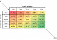
Let’s go back in time 30 years. Remember those “Taste great/less filling” Miller Lite beer commercials from the mid-1980s? You could roughly divide the world’s beer-drinking population into two rival factions: Those that insisted that Miller Lite tasted great… and those that insisted it was less filling. I believe many men lost their lives fighting over this in bars. And I suppose as far as causes go, it’s as good of a cause as any to die for. I consider Miller Lite to neither taste particularly great nor be particularly easy on my stomach. As a native Texan, my heart will always belong to Shiner Bock. But I digress. We’re not here today to discuss beer dogmatism but the far more practical world of investing. As with Miller Lite fans, you can roughly divide the investing world into two camps: Those who favor value strategies and those that favor momentum strategies. Both camps will insist that the academic research – and real world experience – prove that “their way” beats the market over time. And both camps are absolutely right. Simple value screens like Joel Greenblatt ‘s ” Magic Formula ” have beaten the market by a wide margin, and research has shown that a strategy of screening stocks based on simple momentum criteria also beats the market over time. So if value works… and momentum works… what would it look like if we combined the two? Pretty good, actually. Quant guru Patrick O’Shaughnessy wrote an excellent piece last year in which he parses the universe of stocks into value and momentum buckets. Take a look at the following table, taken from O’Shaughnessy’s article. (click to enlarge) The bottom row of the table represents the top 20% of all stocks by momentum. The returns get gradually better as you move down the value scale. In other words, momentum stocks that are cheap outperform momentum stocks that are expensive. And it’s not by a small margin. The cheapest high-momentum stocks returned 18.5% per year, whereas the most expensive high-momentum stocks returned 11.6%. And viewing it through a value lens tells the same story. The right-most column represents the cheapest stocks in the sample using a composite of value metrics. All value-stock buckets performed well. But as you move down the column, the returns get a lot better. In other words, cheap stocks that have recently shown momentum perform better than cheap stocks that don’t. This is a fancier way of repeating the old trader’s maxim to never try and catch a falling knife. Cheap stocks can always get cheaper. What should we take away from this? Value investing works. Momentum investing works. And combining value and momentum works best of all. This article first appeared on Sizemore Insights as Value or Momentum? Try Both. Disclaimer: This site is for informational purposes only and should not be considered specific investment advice or as a solicitation to buy or sell any securities. Sizemore Capital personnel and clients will often have an interest in the securities mentioned. There is risk in any investment in traded securities, and all Sizemore Capital investment strategies have the possibility of loss. Past performance is no guarantee of future results. Original Post

It Is Not Possible That Valuations Matter Only At The Margins

By Rob Bennett You will often hear people say that valuations matter only at the margins. That is, valuations matter when prices are very high and when they are very low. Outside of that, it is okay to ignore the effect of valuations. I see this as dangerous thinking. My view is that either valuations matter or they do not. If they matter, they always matter. If they don’t matter, they never do. I am not able to make sense of the idea that valuations matter in some circumstances, but not in others. The first point that needs to be made is that there is a practical sense in which the claim that valuations only matter at the margins is true. Stocks generally offer a significantly better long-term value proposition than other asset classes. So, when stocks are priced at only a bit more than their fair value price, they remain a good investing choice. In a practical sense, then, a high stock allocation makes sense until the overvaluation reaches such a point that the mispricing is extreme. The problem is that there is no one valuation level at which stocks are transformed from a good choice to a bad one. Stocks are a little less appealing when the P/E10 level is 18 than they are when the P/E10 level is 15. And they are, of course, even less appealing when the P/E10 level is 21. And then even less appealing when the P/E10 level is 24. And even less appealing when the P/E10 level is 27. What is the investor to do? When does he lower his stock allocation, and by how much? It’s tricky. Stocks became a bit less appealing when the P/E10 level rose from 15 to 18, and then again when it moved from 18 to 21, and from 21 to 24, and from 24 to 27. But as the PE10 level moved from 15 to 27, the feedback being received by the investor was all positive. The risk of owning stocks was becoming greater. The investor should have been lowering his stock allocation in an effort to keep his risk profile constant. But at the moment when the P/E10 value reached the insane level of 27, the investor who failed to lower his stock allocation as the P/E10 value moved to 18, and then to 21, and then to 24, and then to 27 was feeling good about those decisions. So he was left disinclined to changing it much, even when prices had gone to “the margins” of 27 and above. What Jack Bogle says about this is that investors should not change their stock allocations in response to price increases. But if they feel that they absolutely must change their allocation at the margins, they should not lower them by more than 15 percent. Bogle has never explained how he came up with the 15 percent figure. I use the historical return data as my guide. The data shows that stocks are likely to offer an amazing long-term return when prices are at low levels or at fair value levels, and then the long-term return drops and drops as prices continue to rise. The data shows that most investors should have been going with a stock allocation of about 80 percent in the early 1990s and about 20 percent in the late 1990s and early 2000s. That’s a change not of 15 percentage points, but of 60 percentage points. Bogle’s recommendation is off by 400 percent, according to the 145 years of historical data available to us today. How many people know that? People don’t know how dangerous it is to own stocks when they are selling at high valuation levels, because most advisors buy into the idea that valuations matter only at the margins. If you only consider valuations at the margins, you are missing out on most of the story of how the mispricing of stocks derails investor retirement plans. Stocks don’t suddenly become dangerous when the P/E10 value hits 27. They are virtually risk-free when the P/E10 value is 15. Then, they become more risky at 18. And more risky at 21. And more risky at 24. And more risky at 27. Unfortunately, the growing risk is a silent one. Stocks are far more risky when the P/E10 value is 21 than they are when it is 15. But years can go by before that risk evidences itself in portfolio destruction. Valuation risk plays out the way that cancer risk plays out for people who smoke three packs of cigarettes each day. Heavy smokers often “get away” with their behavior for decades before they contract a disease that kills them. However, the deep reality is different from the surface one. Someone who smokes three packs of cigarettes each day from age 16 to age 66 and then dies at age 67 from lung cancer was not avoiding the risk of smoking for 50 years; he was avoiding only the practical consequences of taking on a risk that would one day cause him to pay a terrible price. Disclosure: None.