Scalper1 News
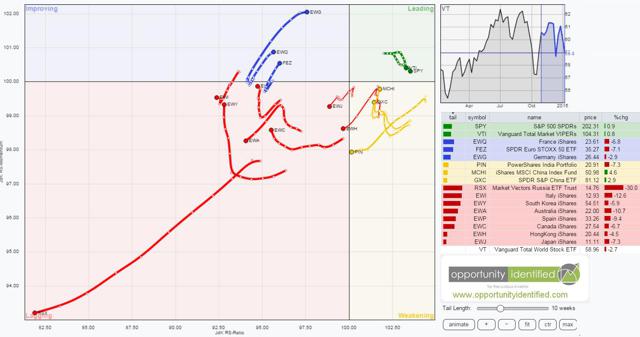 RRG charts help us focus on those areas of the investment universe that deserve it. This article looks at the relative strength of the world’s largest markets, using the total world ETF from Vanguard as our benchmark. If you are looking to invest in stocks, the U.S. is still the best place (at this time) to be. We live in the golden age of investing. Never before have individual investors had so much available to them for gaining investment knowledge, finding great investment opportunities, and the ability to take advantage of them at such a low cost. Our parents could only dream of having investment communities like Seeking Alpha, investment blogs like ours , almost limitless fundamental information online, and technical analysis tools only one click of a mouse (“what’s that?” says your grandpa) away. And with the advent of ETFs, common investors can invest in pretty much whatever and wherever they want. Want to buy timber? Go for it. There’s an ETF for that, the iShares S&P Global Timber & Forestry Index ETF ( WOOD). How about palladium? Got you covered with the ETFS Physical Palladium Shares ETF ( PALL). Want to invest in foreign markets like South Korea? Be my guest, the iShares MSCI South Korea Capped ETF ( EWY). Do you really like coffee? Try the iPath Dow Jones-UBS Coffee ETN ( JO). With sugar? Sure, the Path Dow Jones-UBS Sugar Total Return Sub-Index ETN (NYSEARCA: SGG )! Investors today have the investment world at their fingertips. In this week’s RRG™ analysis, we’re going to look at the relative strength of the world’s largest markets, using the Vanguard Total World Stock ETF (NYSEARCA: VT ) as our benchmark. Basically, we want to see where in the world we should be focusing our attention. Accordingly, the following ETFs representing most of the world’s largest stock markets will be compared against VT: SPDR S&P 500 Trust ETF ( SPY) Vanguard Total Stock Market ETF ( VTI) iShares MSCI Canada ETF ( EWC) iShares MSCI France ETF ( EWQ) iShares MSCI Germany ETF ( EWG) iShares MSCI Italy Capped ETF ( EWI) iShares MSCI Spain Capped ETF ( EWP) SPDR EURO STOXX 50 ETF ( FEZ) PowerShares India Portfolio ETF ( PIN) S PDR S&P China ETF ( GXC) iShares MSCI China ETF ( MCHI) iShares MSCI South Korea Capped ETF ( EWY) iShares MSCI Hong Kong ETF ( EWH) iShares MSCI Japan ETF ( EWJ) iShares MSCI Australia ETF ( EWA) Market Vectors Russia ETF ( RSX) Generally speaking, when looking at the ETFs above in the RRG™ below, those in the green leading quadrant are what you want to own; those within the yellow weakening quadrant should be on your watch-list (as they might be deteriorating), those within the red lagging quadrant should be avoided and those in the blue improving quadrant should be on your shopping list. In the RRG™ below, the long tails represent the movement of each country’s ETF over the past 10 weeks in comparison to the world ETF, VT. So what do we see? The first thing to notice is the chart of VT in the upper right corner. Global stocks as a whole are down since July. Accordingly, when we analyze this chart, we want to be cognizant of the fact that maybe stocks as a whole are not where we want to be. That being said, if we are looking for stock opportunities, we see that we should be in the U.S. (SPY and VTI have been leading the last 10 weeks) and looking for potential opportunities in Germany, France, and Europe as they have moved from lagging to improving over the past 10 weeks. And finally, we should also look to China as they are subtly rotating from weakness towards leading. In conclusion, if we have to be in stocks, we should be in the United States and looking for potential opportunities in Germany, France, Europe, and China. [1] Note: The terms “Relative Rotation Graph” and “RRG” are registered trademarks of RRG Research . (click to enlarge) Scalper1 News
Scalper1 News