Scalper1 News
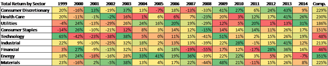
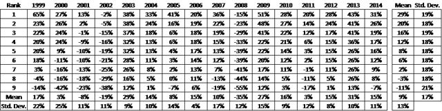
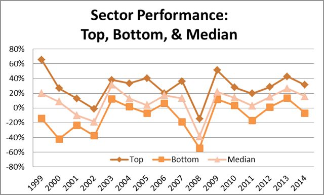
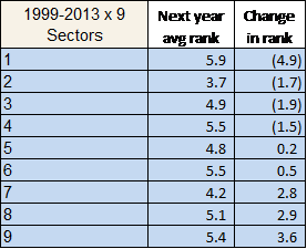
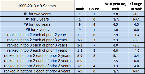 Over the past 16 years, on average, the top ranked sector had a return of 29% which is 9% points higher than the second performing sector. The spread from the top performing sector versus the bottom has consistently been 30% points or more and on average it was 40% points higher. Being a top third sector for four consecutive years has historically meant a drop in ranking of 4 spots. 2015 will be the year Health Care will mean-revert (XLV)(VHT). It is commonly known that things tend to move to the mean over time. What appears to be an aberration in the data from one observation is likely corrected in repeated observations. Virtually any repeated measurements of random data will converge to a bell-shaped curve. In statistics, this is called the central limit theorem (CLT). More specifically, the theorem suggests that the arithmetic mean of a sufficiently large sample of random iterations will be normally distributed. Whether the theory is fully understood or not, investors have been using the theorem to understand and make implications about the range of different market sector performances. If one sector has performed well in one year and outperformed the rest, it is anticipated that it will mean-revert at some point and underperform. This expectation of future performance is an application of the CLT. Note a major assumption behind this theorem is that the observations (in this case, sector total returns) must be independent and identically distributed. The assumption of independence has been a common topic of debate and we will avoid it here. This study looks at total returns for 9 US sectors using SPDR ETFs available for the past 16 years (1999 to 2014). A brief summary table of performances by year is given below: (click to enlarge) Looking at 2014, Utilities was the top performer followed by Health Care. Energy was the only sector below zero. From a 16-year compounded standpoint, Energy was the top with a 350% return which is 300% points above Technology and Financial sectors over the same time period. Next, is an analysis of comparable returns, sorting by rank. The table below is the same data with the performances ranked by year. For example, the #2 ranked sector in 2006 had a 19% total return. On average, the top ranked sector had a return of 29% which is 9% points higher than the second performing sector. The spread from the top performing sector versus the bottom has consistently been 30% points or more and on average it was 40% points higher. The standard deviation of returns across sectors in a given year has ranged from 4% (in 2006) to as high as 25% (in 2000). (click to enlarge) (click to enlarge) Parametric Scenario Analysis: I thought it would be interesting to evaluate a few scenarios and what it meant in the following year to help make some implications for 2015. First a quick summary on the current situation: Utilities and Health Care (NYSEARCA: XLV )(NYSEARCA: VHT ) were the top sectors in 2014, with Materials and Energy at the bottom Health Care has been a top performing sector: in the top 2 in both the prior two years and in the top 3 the all of the past 4 years Materials has been a laggard sector: a bottom 2 performer in the previous two years I first evaluated over the prior 15 years, what happened on average to the sector ranking in the following year. I did not look at absolute performance. For the top performing sector, the average ranking dropped the most to 5.9 in the following year. Similarly, the lowest performing sector increased the most in rank on average to 5.4. Next I looked at scenarios over consecutive periods. How has a sector performed after 2-4 years of excessive outperformance or underperformance? For example, I tracked the number of scenarios where a sector was the worst performer for 3 years in a row and what happened the following year (it happened once with Technology sector in 2000-2002 and in 2003 it rebounded to be the top performer). Some interesting findings over 1999-2013: A sector has never been the top performer for 3 consecutive years, nor has a sector ever been in the bottom third for four consecutive years A sector has been the worst performer for two consecutive years on 4 different occasions A sector in the bottom third for three consecutive years increased in rank by nearly 5 Implications for 2015: 1. Utilities and Health Care were the top sectors in 2014, with Materials and Energy at the bottom. History would suggest a reversion to the mean with Utilities being the worst impacted and the Energy benefiting. 2. Health Care has been a top performing sector: in the top 2 in both the prior two years and in the top 3 the all of the past 4 years Being a top performer for two years has not historically shown serious detrimental effects in the following year, however being a top third sector for four consecutive years has historically meant a drop in ranking of 4 spots. History would suggest Health Care will mean-revert. 3. Materials has been a laggard: a bottom 2 performer in the previous two years The prior 8 times this happened, the average ranking increased, but only to the 5th ranked sector. One more year in the bottom third would more conclusively imply outperformance on a historical standpoint. Scalper1 News
Scalper1 News